No Paint, No Problem: How to Make Your Living Room Look Completely Different
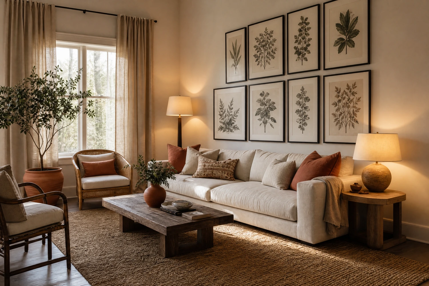
Paint is the first thing most people reach for when a living room stops feeling right, and it is also the thing most people never quite get around to doing. Whether the lease forbids it, the landlord said no, the budget is not there yet, or the room is simply not bad enough to justify the mess and the commitment, the walls stay as they are and the room stays stuck. But paint is not what makes a living room look good. The right rug, the right light, the right arrangement, and a few considered changes to every surface in between will change a living room more visibly and more lastingly than a fresh coat of anything. This guide covers twelve of those changes, each one framed by the specific visual problem it solves, so you can identify exactly what your room needs and address it directly.
Before: Furniture Against Every Wall. After: A Room That Actually Feels Inviting

The most common living room layout problem has nothing to do with the walls and everything to do with the furniture in front of them. When every piece sits flush against the perimeter, the center of the room becomes an empty void that reads as wasted space rather than as generous floor area, and the seating feels stiff and disconnected, like chairs in a waiting room rather than a space anyone actually wants to spend time in. Floating the sofa 12 to 18 inches from the wall and angling the seating inward toward a central point, whether that is the coffee table, the fireplace, or the television, immediately changes the room from a perimeter arrangement to a conversation zone. This single move costs nothing and consistently produces the most dramatic visible shift of any change on this list.
The focal point the seating faces matters as much as the float. Every well-arranged living room has one clear visual anchor that the furniture addresses and the eye is drawn to on entering. If the room currently has two competing focal points, such as a fireplace on one wall and a television on another, choose which one takes priority and arrange the seating to face it, with the secondary focal point placed at a slight angle rather than in direct competition. Once the main arrangement is settled, identify where the natural light enters the room and make sure the primary seating takes advantage of it rather than blocking it. Sunlight moving through a room with well-placed furniture reads as a feature. Sunlight blocked by a sofa pushed against the window reads as a loss.
Pro Move: Before moving anything, tape the footprint of each piece of furniture on the floor with masking tape and test the arrangement visually. It takes twenty minutes and saves you from discovering that an arrangement does not work only after you have moved a three-seater sofa twice.
Before: A Flat, Featureless Floor. After: A Room With a Clear Center
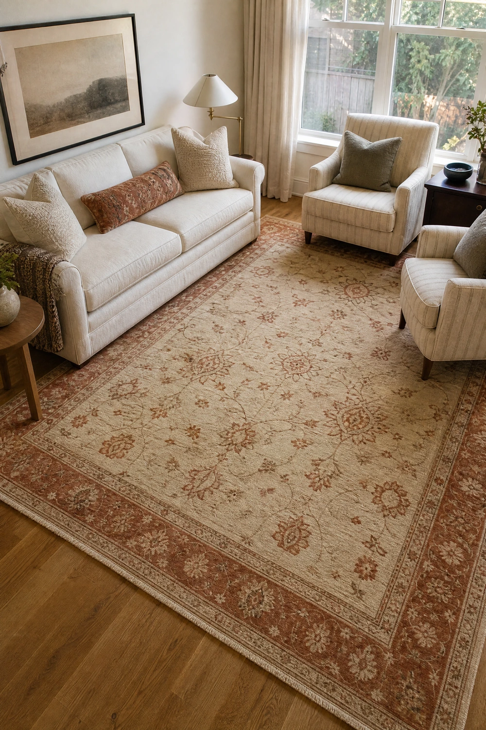
A living room with no rug, or with a rug that is too small for the seating around it, has a fundamental spatial problem that no amount of wall decoration or accessory styling can fully correct. The floor is the largest surface in the room and the one that determines how the furniture relates to itself and to the space. Without a rug to anchor the seating zone, the furniture floats disconnected from each other and from the room, and the floor becomes a background rather than a design element. A large area rug, properly sized so that at least the front legs of every major seating piece sit on it, unifies the arrangement and creates a visual boundary that makes the room feel organized and complete rather than assembled and accidental.
The rug size question is where most people make a costly mistake by going too small. In a standard living room, a rug smaller than 8 by 10 feet will read as undersized against most sofa configurations, and the floor around it will be more visible and more distracting than if there were no rug at all. A rug in a natural material like wool, jute, or a wool-cotton blend is the most versatile choice because the texture adds warmth and depth to the floor plane without competing with the other colors and materials in the room. A patterned rug in a room with patterned upholstery is usually one pattern too many. In most living rooms, a solid or subtly textured rug in a warm neutral lets everything on top of it do the visual work while the rug itself holds the composition together.
Reality Check: If the current rug is the right design but the wrong size, layer it over a larger, cheaper natural fiber rug beneath it. The layered rug look reads as intentional and adds texture, and it corrects the size problem without buying a new rug outright.
Before: One Ceiling Light That Flattens Everything. After: A Room That Feels Warm and Layered
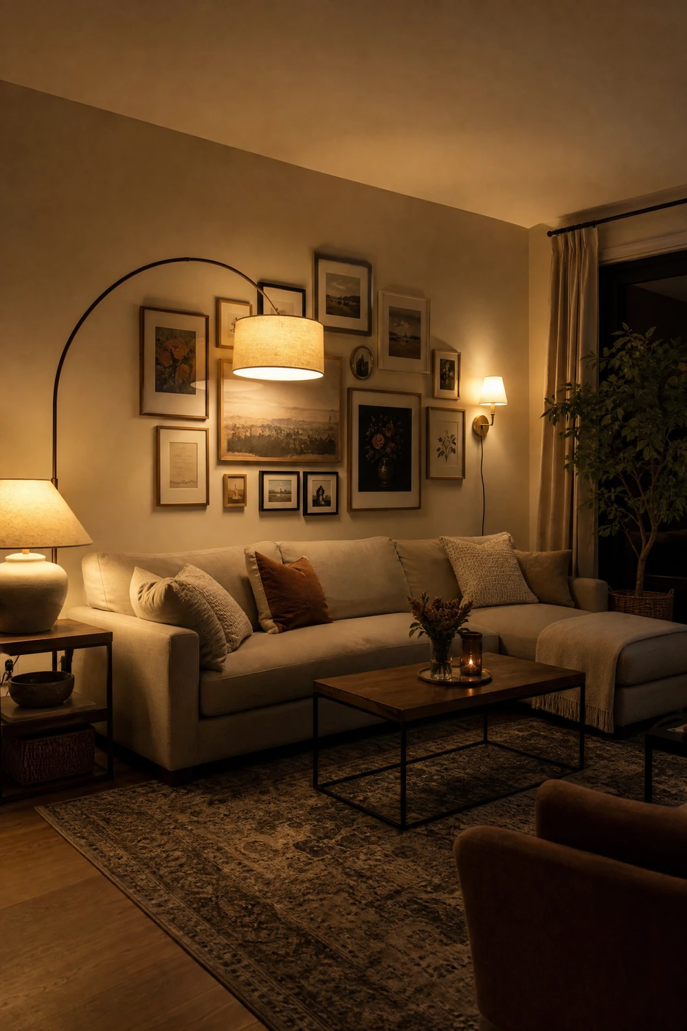
Overhead lighting is the single biggest reason living rooms look flat, cold, and slightly institutional regardless of how well-furnished they are. A single ceiling fixture illuminating the room from above at the same intensity in every direction removes all shadow, all depth, and all warmth from the space and makes it look like a room that is being inspected rather than lived in. The fix is not to add better overhead lighting but to stop relying on overhead lighting for atmosphere entirely. Floor lamps and table lamps placed at standing and seated height, running on warm white bulbs between 2700K and 3000K, create pools of light at the level where the room is actually experienced. This layering of light sources, two or three at different heights and positions, is what makes a living room feel genuinely warm rather than merely bright.
The visual quality of the lamp itself matters because it is functioning as a decorative object as well as a light source. A floor lamp with a sculptural base, a table lamp with a ceramic or rattan form, or a clip-on picture light above the fireplace or main art piece each add presence to the room even when they are switched off. Bulb temperature is non-negotiable: any bulb above 3500K in a residential living room will produce a light that works against the warmth of every other material in the space. The investment in warm bulbs is under twenty dollars and the change in how the room feels is immediate. Switch off the overhead light and look at the room lit only by lamps. That version of the room is almost always better, and it requires no renovation and no paint.
Quick Tip: Plug-in wall sconces are a genuinely good option for living rooms that need more light without more floor lamps. They mount with a single hook and the cord runs down the wall behind the sofa or beside the bookshelf, invisible once the lamp is on. They add a layer of light at a height that floor and table lamps do not reach.
Before: A Bare Wall That Makes the Room Feel Unfinished. After: A Focal Point the Room Is Built Around
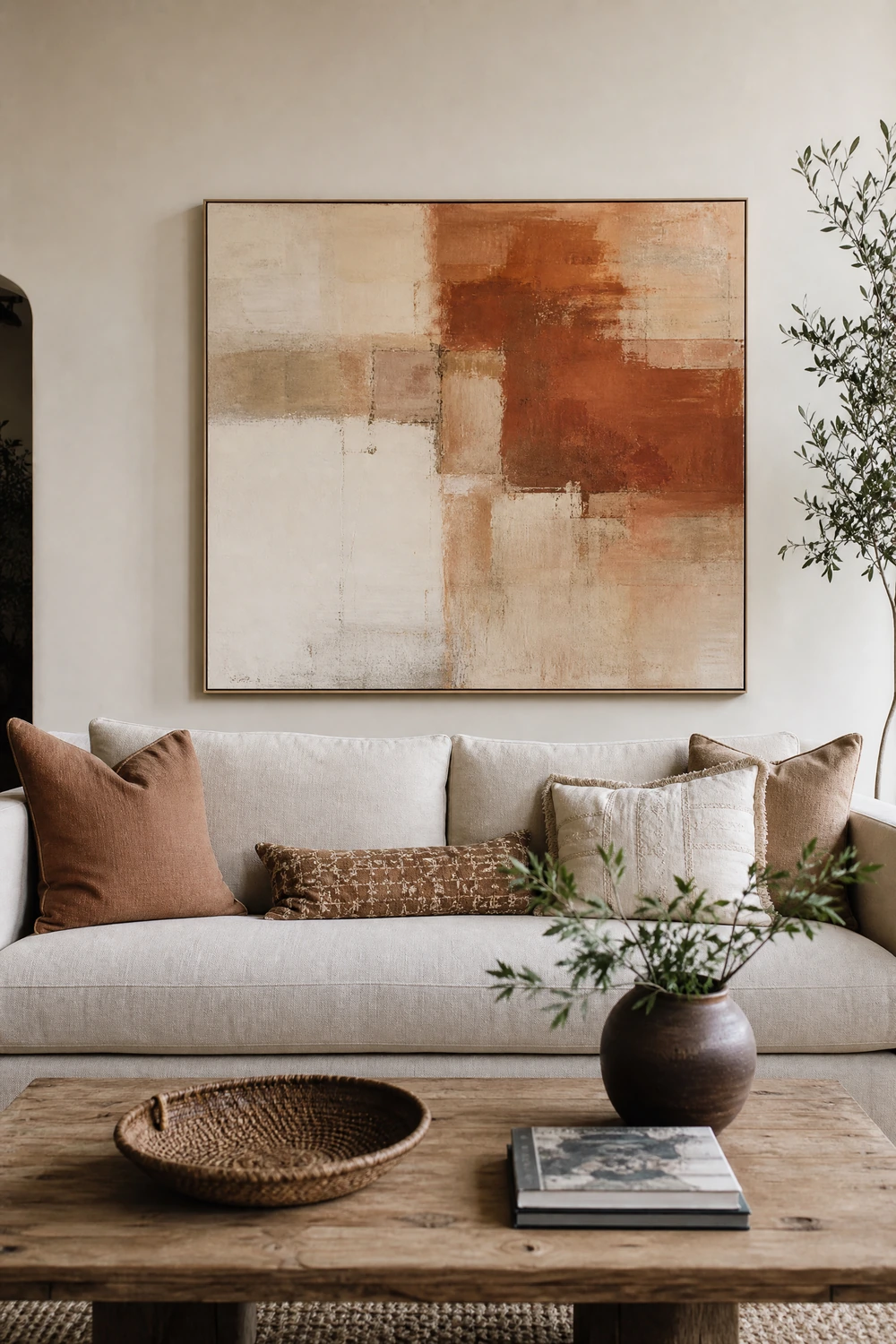
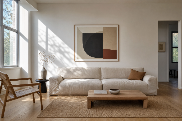
A living room wall that has nothing on it, or one small piece of art hung slightly too high in the middle of a large blank expanse, is the most visible symptom of a room that has not been given proper attention. The wall above and behind the main sofa is the room’s primary focal point and the first thing anyone sees on entering. Leaving it empty or underscaled is the equivalent of leaving the front of a house unpainted: everything else may be fine, but the first impression dominates. A single large-scale piece of art, at least 36 by 48 inches for most sofas, hung with its center at 57 to 60 inches from the floor and sitting 6 to 8 inches above the sofa back, anchors the entire room and gives the seating arrangement something to refer to.
A gallery wall is the alternative for those who have multiple smaller pieces or prefer a layered, collected look over a single statement. The key to a gallery wall that reads as designed rather than chaotic is laying the arrangement out on the floor before committing to a single nail hole, maintaining consistent spacing between frames, and including a variety of frame sizes rather than matching sets. Mixing art with mirrors and objects in similar frames creates visual interest while maintaining cohesion. Leaning art against the wall rather than hanging it is a valid and increasingly popular approach that reads as deliberately casual and avoids the commitment of holes entirely. A large canvas or framed print leaning on the mantel or against the wall behind the sofa changes the room just as significantly as one that is hung, with none of the installation.
Designer Advice: When building a gallery wall, use paper templates cut to the exact size of each frame and tape them to the wall before hanging anything. Arrange the templates until the grouping feels right, then use the template positions to mark your nail holes. It takes an extra twenty minutes and eliminates the holes that come from changing your mind mid-installation.
Before: Windows That Make the Room Feel Low and Unfinished. After: Ceilings That Feel a Foot Taller
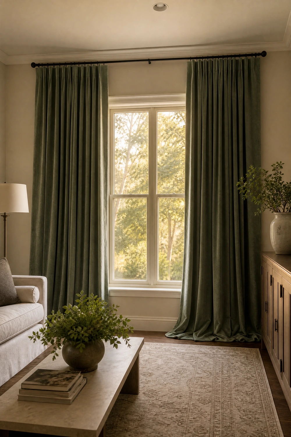
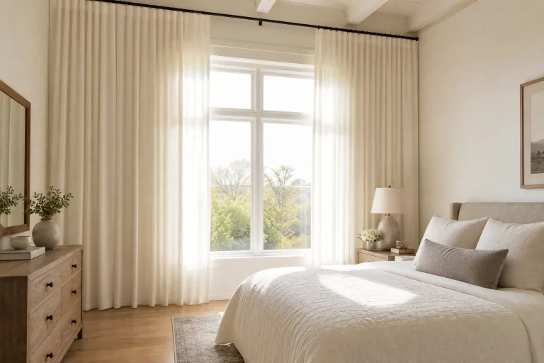
Curtains that are hung just above the window frame and that end just below the sill, or curtains that are the right length but hung on a rod that does not extend beyond the window, are making the room feel lower and the windows feel smaller than they actually are. This is one of the most correctable mistakes in any living room and one that costs relatively little to fix. The curtain rod should be positioned as close to the ceiling as possible, not above the window, and should extend 8 to 12 inches beyond the window frame on each side. Floor-length panels that just barely touch or very slightly puddle at the floor complete the effect. The ceiling reads as taller, the window reads as larger, and the wall itself feels more architectural without anything having been done to it.
The fabric and color of the curtains shapes the room as much as their placement. In a living room that is not being painted, the curtains take on some of the color and mood-setting work that paint would normally do. Heavy velvet panels in a dusty jewel tone, deep teal, a warm plum, a forest green, or a rich burgundy, add the richness and saturation that a neutral or beige wall cannot provide, and they do it in a way that is completely removable and completely deposit-safe. Linen or cotton in white or off-white works at the opposite end of the spectrum, adding softness and brightness to a room that already has color elsewhere. The curtains should be chosen in relation to what the rest of the room needs, not in isolation, and their placement should be resolved before any other wall-adjacent decisions are made.
Heads Up: Budget curtain panels from high street retailers are often sold in 84-inch lengths, which are too short for high-hung rods in rooms with standard ceiling heights. Measure from the rod to the floor before buying and look for 96-inch or 108-inch panels if the rod is positioned near the ceiling.
Before: A Sofa That Looks Tired and Generic. After: The Room’s Most Expensive-Looking Piece
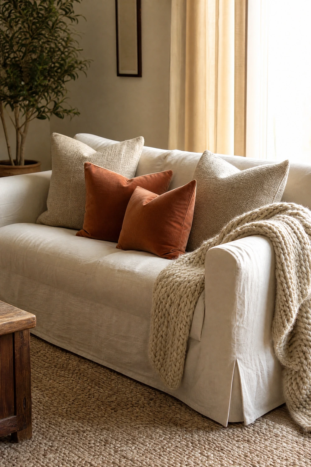
The sofa is the largest piece of furniture in most living rooms and the one that sets the tone for everything around it. A tired, pilling, or simply outdated sofa does not need to be replaced to look significantly better. A well-fitted slipcover in a linen, cotton canvas, or heavy cotton-blend fabric transforms a sofa in an afternoon, covers wear and color problems completely, and gives the piece a fresh identity that reads as a deliberate design choice rather than a cover-up when the slipcover is properly fitted. The difference between a good slipcover and a cheap one is significant: a cheap slipcover bunches, slips, and constantly reminds the room that something is being hidden. A properly fitted slipcover from a brand like Comfort Works or Bemz, made to the sofa’s exact model dimensions, reads as upholstery.
Beyond the sofa itself, the cushions and throws on and around it carry a disproportionate amount of the room’s visual personality. Two sleeping-size cushions in cases that match the sofa cover, two larger Euro squares in a textured linen or boucle behind them, and one or two accent cushions in a contrasting material, velvet, embroidered cotton, or a bold pattern, create the kind of layered arrangement that reads as considered and styled. A throw draped over one arm in a material different from the cushions, a chunky knit or a woven cotton, adds a third layer of texture that makes the sofa look intentionally curated. These are not decorative extras. In a living room that is not being painted, the sofa is doing the work the walls are not, and it deserves the attention.
Reality Check: Throw pillows bought as a matching set always look cheaper than the same number of pillows sourced individually in different but related textures. The matching set reads as a purchase. The individual pieces read as a collection. The difference in cost is negligible.
Before: Shelves That Look Like Storage. After: Shelves That Look Like Design
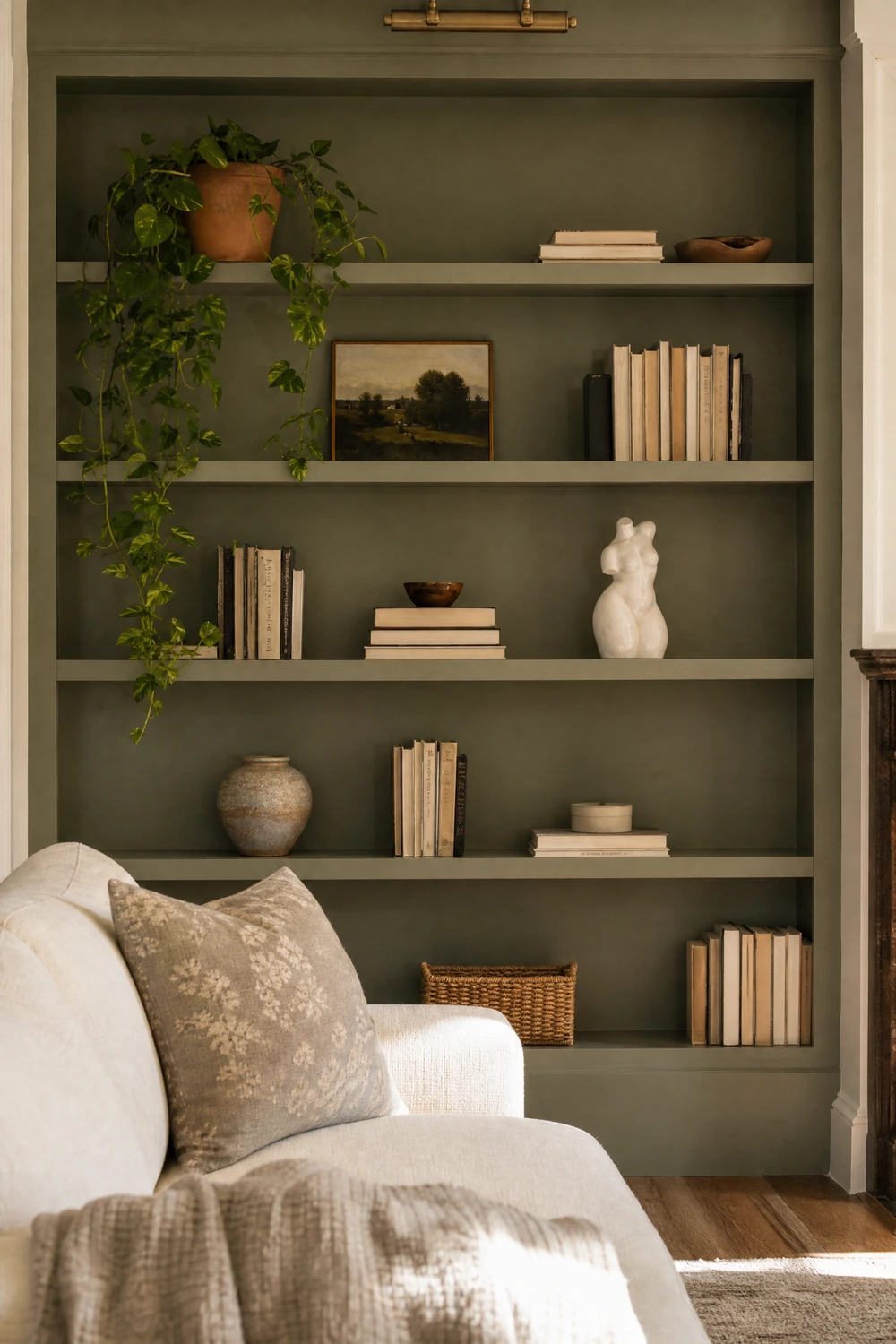
Open shelving in a living room is one of the highest-risk surfaces in any home because it sits at eye level, holds a significant amount of visual information, and is almost always either over-filled with books and objects that compete for attention or under-styled in a way that reads as unfinished. The difference between a shelf that reads as storage and one that reads as design is the same in every case: editing. Remove two-thirds of what is currently on any open shelf, then arrange what remains with deliberate variation in height, material, and orientation. Some books vertical, some horizontal in stacks. One tall object, one low object, one living element. A deliberate gap between groupings. The shelf that results from this process, with the same objects it started with, will look like it was styled by someone who knew what they were doing.
The back panel of a bookshelf is an often-overlooked surface that can add significant visual depth to a living room without touching the walls. Painting the back panel of a freestanding shelving unit in the room’s accent color, or lining it with a peel-and-stick wallpaper in a pattern that would be too much at full wall scale but works perfectly contained within the shelf frame, turns a piece of furniture into a design feature. This costs the price of one small sample pot of paint or a single roll of peel-and-stick paper and takes an afternoon, including the time it takes to empty, treat, dry, and refill the shelf. The result is a bookshelf that looks custom and considered in a way that no amount of object-arrangement alone can achieve.
Pro Move: Group objects on shelves by color as well as by type. Books with warm-toned spines together, objects in natural materials in one cluster, ceramics in a similar glaze in another. Color grouping on a shelf reads as intentional curation even when the objects themselves are entirely unrelated.
Before: A Room With No Color Story. After: A Room That Feels Pulled Together

A living room that feels visually disconnected, where each piece is individually fine but the room as a whole does not cohere, is almost always missing a color story. A color story is not a theme or a strict palette. It is simply the repetition of two or three colors in different objects across the room so that the eye can move between them and register the space as a considered whole rather than a collection of separate purchases. In a room that is not being painted, the color story lives entirely in the textiles, the accessories, and the art, which means those elements need to be chosen and arranged with more intention than they would in a room where the wall color provides the backbone. The wall color in an undecorated room is neutral. Everything else carries the palette.
The most reliable approach is to identify one color that already exists in the room, in the sofa, the rug, or a piece of existing art, and then repeat it deliberately in two or three additional objects. A rust-toned cushion, a terracotta plant pot, and a small ceramic vase in a similar warm tone bring the color together across different surfaces and heights without requiring a single paint stroke. The repetition does not need to be exact: three objects in slightly different shades of the same general color family will read as a considered palette. Three objects in the exact same color will read as a set. Slight variation in shade and material is what makes a color story feel curated rather than coordinated.
Designer Advice: Stand in the doorway of the room and look at it from the position a visitor would. Identify which color appears most frequently and which surfaces are contributing nothing to the palette. Those empty surfaces are where the next color repetition belongs.
Before: A Coffee Table That Holds Whatever Landed There. After: A Surface That Anchors the Room
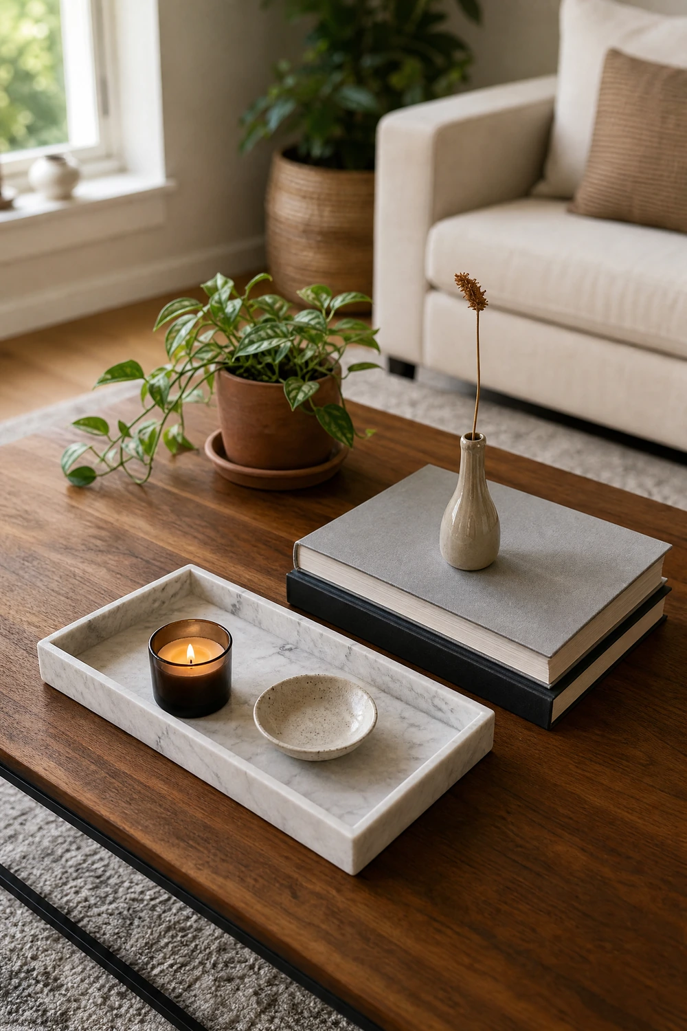
The coffee table is the room’s most central surface and the one most consistently treated as a landing zone for remote controls, magazines, and objects that arrived and never left. In a living room that is not being painted, the coffee table is one of the primary surfaces doing decorative work, which means it deserves the same intentional styling as a shelf or a mantel. The starting point is clearing it completely, then adding back with a specific structure: a tray to create a contained zone within the larger surface, one or two books with visually interesting spines stacked horizontally, one object of height like a small sculptural vase or candle holder, and one living element like a small plant or a fresh stem in a narrow vase. This four-element approach gives the surface enough variety to hold the eye without tipping into clutter.
The coffee table itself is also worth reconsidering if it is not contributing to the room visually. A solid dark wood table in a room with dark upholstery makes the seating zone feel heavy and dense. A glass or acrylic top, a light-toned rattan or cane, or a marble surface with a lighter profile will open up the room and let the rug beneath it breathe. Swapping a coffee table is one of the less expensive furniture changes available and one of the more impactful, because the coffee table sits at the visual center of the main seating zone and everything else in the arrangement orients around it. A secondhand or thrifted coffee table in a material and scale that suits the room better than the current one can be found for well under a hundred dollars and changes the room significantly.
Quick Tip: A tray on the coffee table is not optional in a styled room. It creates a contained zone that the eye reads as intentional, and it means the objects inside it are grouped rather than scattered. Without the tray, the same objects read as clutter. Inside the tray, they read as a vignette.
Before: A Mantel or Console That Does Nothing. After: The Room’s Most Styled Moment
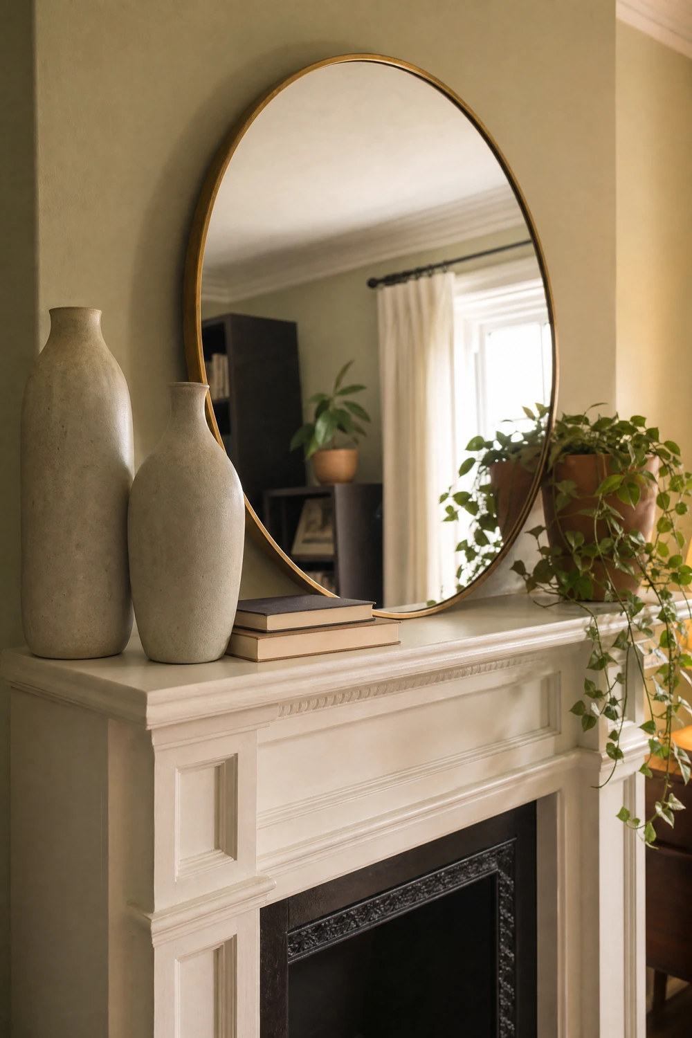
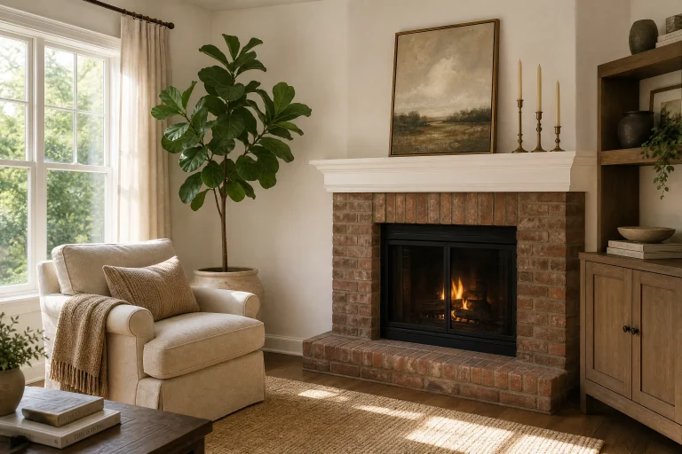
The fireplace mantel and the console table behind the sofa are the two surfaces in a living room most likely to either be left entirely bare or used as convenient storage for whatever needs a home. Both are high-visibility surfaces that sit at standing eye level and occupy prominent positions in the room, which means that a poorly styled mantel or console actively makes the room feel less finished, and a well-styled one contributes enormously to the sense that the room has been given proper attention. A mantel styled with a large mirror or piece of art leaning against the chimney breast, flanked by two objects of similar height on either side and one or two lower objects in front, creates a symmetrical arrangement that reads as considered without being formal.
The console table behind the sofa is a different styling challenge because it is often seen from the doorway rather than from up close, which means scale matters more than detail. A large lamp on one end, a stack of books in the center, one large plant or tall dried botanical arrangement, and one smaller object on the other end gives the console a left-to-right visual rhythm that reads well from a distance. The lamp on the console also adds a third light source to the room behind the sofa level, which is a height that neither floor lamps nor ceiling fixtures typically reach, and which creates a warm glow visible from the doorway that makes the whole room feel more inviting from the entrance.
Heads Up: Symmetry on a mantel reads as formal. Asymmetry reads as more relaxed and contemporary. For a mantel that feels current rather than traditional, place the mirror or art off-center, with a grouping of objects weighted to one side and a single contrasting object on the other. The imbalance is intentional and it reads as styled.
Before: A Room With No Life in It. After: A Space That Feels Genuinely Inhabited
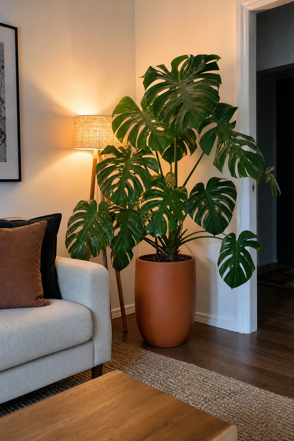
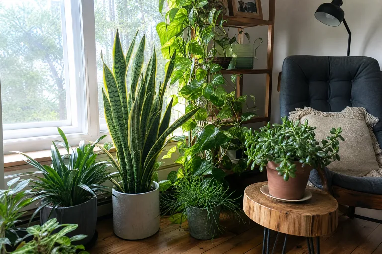
Plants do something in a room that no amount of furniture, art, or accessories can replicate: they signal that someone actively cares for the space. A room with healthy, well-kept plants reads as lived-in and loved in a way that a perfectly decorated but plantless room never quite achieves. In a living room specifically, one large architectural plant, a fiddle leaf fig, a monstera, a bird of paradise, or a tall snake plant, in a statement pot positioned in a corner or beside the sofa immediately adds organic scale and vertical interest that no piece of furniture provides. The pot is as important as the plant: a terracotta pot, a matte ceramic in a warm neutral, or a woven basket planter reads as a considered choice. A plastic nursery container, even holding a beautiful plant, reads as temporary.
For rooms with lower light levels or for those who are not confident plant keepers, dried botanicals have become a genuine design option rather than a compromise. A generous arrangement of dried pampas grass in a tall ceramic floor vase, a bunch of dried eucalyptus tied with linen ribbon on a shelf, or a stem of dried lunaria in a smaller vessel beside the sofa each add the organic texture and muted earth tones that living plants provide, without the maintenance or the light requirements. The key with dried botanicals is to go larger than feels comfortable. A small wispy bunch in a thin vase reads as an afterthought. A full, generous arrangement in a vessel with visual weight reads as a considered design choice that anchors the surface it sits on.
Reality Check: One large plant in a good pot does more for a living room than four small ones in mismatched containers. The size and the pot make the plant read as a design element. Multiple small plants in unrelated pots read as a collection habit rather than a decorating choice.
Before: Walls That Look Bare Despite the Art on Them. After: A Room With Real Visual Depth

Peel-and-stick wallpaper has improved so considerably in quality over the past few years that it now deserves serious consideration as a no-paint wall treatment rather than a compromise solution. Applied to a single accent wall, it adds the depth, pattern, and personality that paint delivers, in a format that is entirely removable and leaves no permanent damage. A textured grasscloth-look, a subtle linen weave, a large-scale botanical, or a soft geometric applied to the wall behind the sofa changes the room as dramatically as painting that wall would, and it comes down cleanly when you want to change it or when you move. Brands like Chasing Paper, Tempaper, and Spoonflower now produce designs that are genuinely indistinguishable from real wallpaper in person, and they are available at price points that make a single-wall treatment very accessible.
For those who prefer not to add any wall covering at all, architectural detailing applied to the lower portion of the wall can change the room significantly without any paint. Peel-and-stick dado rail molding, adhesive panel molding arranged in a grid pattern, or a wainscoting effect created with thin timber strips all add dimension and visual interest to a wall that is currently flat, and they can all be removed without damage when needed. The molding can be left in the natural wall color for a subtle textured effect, or painted to match a skirting board for a more classic architectural look. Either way, the wall stops being a blank background and starts being a surface that contributes to the room, without a drop of wall paint and without any permanent commitment.
Designer Advice: When applying peel-and-stick wallpaper, start from the center of the wall rather than the edge so that any pattern mismatch occurs at the sides where it is less visible. Use a level for every strip and smooth from the center outward to prevent air bubbles. A helper makes the process significantly easier and the result significantly better.
No-Paint Living Room Makeover: What Changes What
| The Change | What It Fixes | Paint Required? | Approx. Cost |
| Float the furniture and rearrange | Stiff, disconnected, waiting-room feel | No | Free |
| Add a properly sized area rug | Furniture floating with no visual anchor | No | $80-$300 |
| Layer lamps, swap bulbs to 2700K | Flat, clinical overhead-only lighting | No | $20-$100 |
| Large art or gallery wall at correct height | Bare, unfinished focal wall above sofa | No | $30-$200 |
| Floor-length curtains hung near ceiling | Low ceilings, small-looking windows | No | $40-$120 |
| Slipcover and restyle sofa cushions | Tired, generic, or dated sofa | No | $60-$200 |
| Edit and restyle open shelving | Shelves that read as storage, not design | No | Free-$20 |
| Introduce and repeat one accent color | Disconnected room with no color story | No | $20-$60 |
| Style the coffee table with a tray system | Central surface used as a landing zone | No | $15-$40 |
| Style the mantel or console at eye level | High-visibility surfaces doing nothing | No | Free-$50 |
| Add one large plant in a statement pot | Room feels lifeless and unloved | No | $30-$80 |
| Peel-and-stick wallpaper on one wall | Flat walls with no depth or personality | No | $40-$150 |
What Paint Actually Does and Why You Do Not Need It
Paint changes the color of a wall. Everything else that makes a living room feel good, the warmth of the light, the scale and arrangement of the furniture, the texture of the rug and cushions, the presence of art at the right height, the styling of every surface, the organic life that plants bring, none of it has anything to do with the wall color. A room with the right rug, warm layered light, a properly styled sofa, large-scale art at the correct height, and floor-length curtains hung near the ceiling will feel significantly better than the same room freshly painted but otherwise unchanged. Paint is useful. It is not the point. The changes in this guide are the point, and none of them require a paintbrush.