Minimalist Home Decor Looks That Actually Feel Good to Live In
Minimalism has a bit of an image problem. Ask most people what it means and they picture cold, white rooms with one chair and a single potted cactus. In practice, the minimalist homes that people actually love living in look nothing like that. They have warmth. They have texture. They have a sense of purpose in every corner without that nagging feeling that something is missing. The difference between a minimalist room that feels intentional and one that just feels bare usually comes down to the specific choices made with color, materials, light, and the few objects that are allowed to stay.
What follows are 23 ideas pulled from real interior design practice, not just magazine shoots. Each one covers a different approach so you can pick what fits your space, your lifestyle, and your budget. Whether you are starting from scratch or just trying to quiet down a room that has slowly filled with too much stuff, there is something here worth trying.
Working With Neutral Palettes That Actually Have Depth
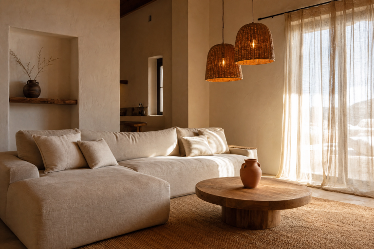
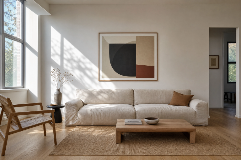
1. Warm White Walls With Linen and Raw Wood
This is the most approachable entry point into minimalist decorating and also one of the most livable. Start with a warm white on the walls, something with a slight yellow or pink undertone like a soft cream or an off-white, rather than a stark bright white that reads clinical under most lighting conditions. Pair those walls with natural linen curtains that pool slightly on the floor, a low-profile sofa in oatmeal or sand, and a raw oak or ash coffee table with visible grain. The wood grain and the linen weave do the visual work that patterns would usually do in a busier room. Add a single oversized jute rug to ground the space and keep overhead lighting warm at around 2700K to prevent the room from feeling too cool. This combination works in both small apartments and larger living rooms, though in tight spaces, keep the sofa legs visible so the floor reads as continuous and the room feels open.
Designer Note: Avoid mixing too many wood tones in one room. Pick one and repeat it across two or three pieces for a cohesive look.

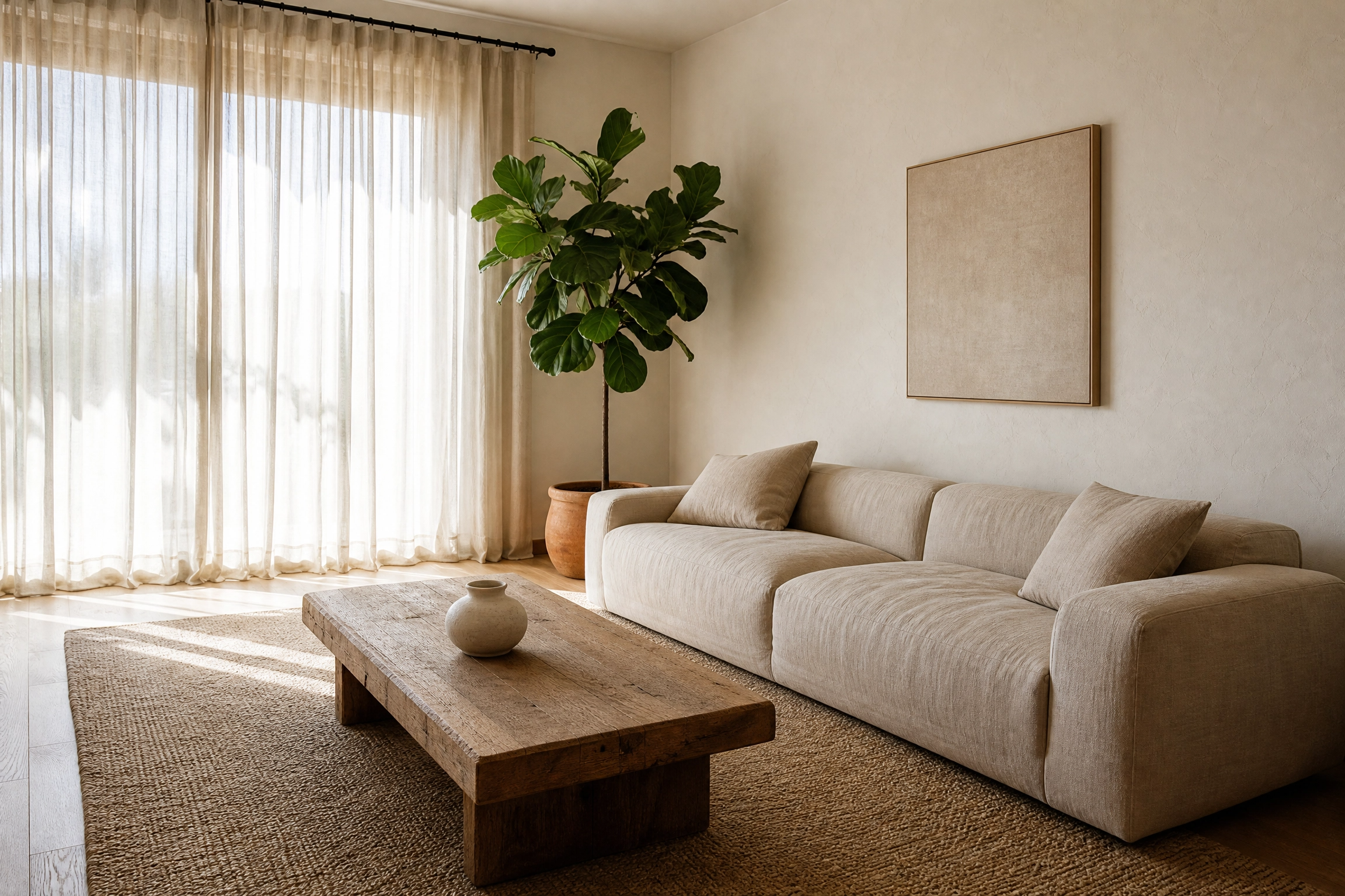
2. Greige Walls With Layered Ivory Textiles
Greige, the blend of grey and beige that became popular in Scandinavian interiors, is one of those colors that seems boring on a paint chip and genuinely beautiful on a wall. It shifts depending on the light, reading more grey in the morning and warmer toward evening, which gives a minimalist room a sense of subtle life throughout the day. Layer ivory textiles at different weights in a greige room: a heavy boucle throw over a sofa arm, a flat-weave cotton cushion cover, and a waffle-knit blanket folded on a chair. The variation in texture within a single color family is what prevents the room from feeling flat. Keep window treatments simple with a plain roller blind or a linen panel in a tone-on-tone shade. Artwork, if you include it, should be one piece with a lot of negative space, perhaps a simple line drawing in a thin black frame.
Designer Note: Greige works especially well in north-facing rooms that get cool, indirect light all day. In south-facing rooms with warm afternoon sun, it can shift quite golden.
3. A Single Earthy Accent in an Otherwise Neutral Room
One of the most effective minimalist moves is choosing a single color to appear in small, deliberate doses throughout a room rather than committing to an accent wall or bold furniture. A deep terracotta or warm clay works well for this: a ceramic vase on a shelf, a single cushion on the sofa, and a small woven basket near the entry. Because the color appears in objects rather than on large surfaces, it reads as intentional and collected rather than decorative in an obvious way. The neutral base, whether cream, white, or greige, stays dominant, and the earthy accent provides the visual interest without tipping the room into maximalism. This approach is budget-friendly because you are working with accessories rather than paint or upholstery, and it is easy to update seasonally.
Designer Note: Use the rule of three: repeat your accent color in at least three places in the room for it to read as a design choice rather than a mistake.

Furniture Choices That Do More With Less
4. A Low-Profile Sofa as the Room’s Focal Point
In minimalist interiors, the sofa is often the one piece where you should put real budget and thought. A low-profile sofa, meaning one where the back sits at roughly 28 to 30 inches high rather than the typical 34 to 36 inches, gives a room a calmer, more horizontal feel. It also makes ceilings read as higher, which is useful in apartments or rooms with standard 8-foot ceilings. Look for tight, clean upholstery in a fabric like performance linen, a tightly woven wool blend, or a high-quality bouclé. Avoid button-tufting or rolled arms, which add visual noise. The legs matter, too: tapered solid wood legs in a natural or dark stain give the sofa lift and prevent it from looking like a heavy block on the floor. One honest limitation to note is that low sofas are not always comfortable for people who have trouble getting up from low seating, so consider who is actually going to use the room daily.
Designer Note: If a new sofa is not in the budget right now, you can get a similar effect by removing decorative throw pillows down to two or three and choosing a simple solid-colored slipcover.

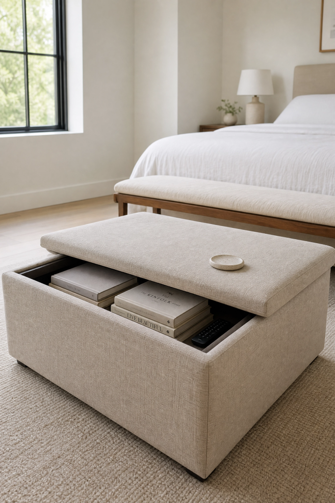
5. Multi-Function Furniture That Earns Its Place
In minimalist decorating, every piece of furniture should justify its presence, and the cleanest way to do that is to choose items that serve more than one purpose. A storage ottoman in a neutral linen or leather becomes a coffee table, extra seating, and hidden storage for blankets or remote controls all at once. A bench at the foot of a bed does triple duty as a seating perch, a place to lay out clothes, and a visual anchor for the bedroom layout. A dining table with a concrete or stone top and a slimmer profile can double as a workspace when needed. The key with multi-function pieces is to choose ones that look like they belong in the room regardless of which function they are serving at any given moment. Furniture that looks utilitarian or overtly storage-focused tends to undermine the calm visual quality that minimalism is after.
Designer Note: When shopping for multi-function pieces, measure your space carefully. A storage ottoman that is too large for the room will eat up negative space, which is one of minimalism’s most important design tools.
6. Floating Shelves Instead of Bulky Storage Units
Wall-mounted floating shelves accomplish something that freestanding bookcases rarely do in a minimalist room: they let the floor breathe. When shelving sits on legs or a base that touches the floor, it interrupts the continuous floor plane and makes a room feel smaller and heavier. Floating shelves in a simple material, white-painted MDF, raw oak, or black powder-coated metal, keep things feeling open while still giving you a place to store and display a curated selection of objects. The edit is everything here. Aim for no more than three to five items per shelf, and include at least one shelf that is partially empty. In practice, this means rotating what is on display rather than keeping everything out all the time, which is a habit worth building even if it takes a few weeks to get used to.
Designer Note: Group objects in odd numbers and vary their heights within each grouping. A trio of objects at different heights looks designed; a row of matching objects at the same height looks like a shop display.

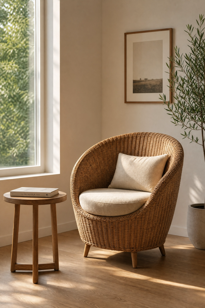
7. A Statement Chair That Carries the Room
In a well-edited minimalist room, a single sculptural chair can do more design work than three average chairs. Think about a curved, organic silhouette in a natural material, a wicker or rattan chair, a molded plywood piece in the tradition of mid-century modern design, or an upholstered accent chair in a slightly contrasting color to the sofa. The chair creates a focal point and a sense of personality without cluttering the space. Position it near a window with a small side table and a floor lamp nearby to create a reading nook, which adds function to what is already doing design work. This is an investment-level suggestion if you are buying new, but vintage markets and online resale platforms often carry genuinely beautiful chairs at a fraction of the cost of new.
Designer Note: A good accent chair should be comfortable enough to actually sit in for an hour. If it is only decorative, it starts to feel dishonest and will eventually get pushed into a corner.
Light as a Design Material
8. Layered Lighting Instead of One Overhead Fixture
One of the most common mistakes in minimalist rooms is relying on a single overhead light source. Even a beautiful overhead fixture used alone tends to flatten a room, wash out textures, and create an office-like uniformity that fights against the warmth minimalism is trying to achieve. Layered lighting means combining at least three types: ambient light from above, task light from a floor or table lamp, and accent lighting from a smaller directional source that highlights a specific area or object. In a minimalist living room, this might look like a simple flush-mount ceiling light kept on a dimmer, a tall arc floor lamp over a reading chair, and a small table lamp on a sideboard. All three should use warm bulbs at 2700K or lower. The cost of adding a floor lamp and a table lamp is relatively low, and the difference in how the room feels after dark is significant.
Designer Note: Dimmers are worth the investment. A single ceiling light used at 30 percent capacity feels completely different from the same light at full brightness.

9. Maximizing Natural Light With Minimal Window Treatment
Natural light is the most effective and most affordable tool in minimalist decorating, and most windows are underutilizing it. Heavy curtains, blinds that are never fully opened, and dark window frames all reduce the amount of light entering a room and make the space feel smaller and more closed off. In a minimalist approach, the goal is to keep window treatment as simple and as sheer as possible. A single linen panel per window in a light cream or white, mounted close to the ceiling rather than at the window frame, makes windows look taller and lets in more light even when the panel is drawn. If privacy is not a concern, skipping curtains entirely and using a simple roller blind only when needed is the cleanest option. Keep window sills clear or use them for a single small plant or object to take advantage of the natural light as a display feature.
Designer Note: Mount curtain rods 4 to 6 inches above the window frame and extend them 6 to 8 inches beyond each side. This makes windows look significantly larger without any structural changes.

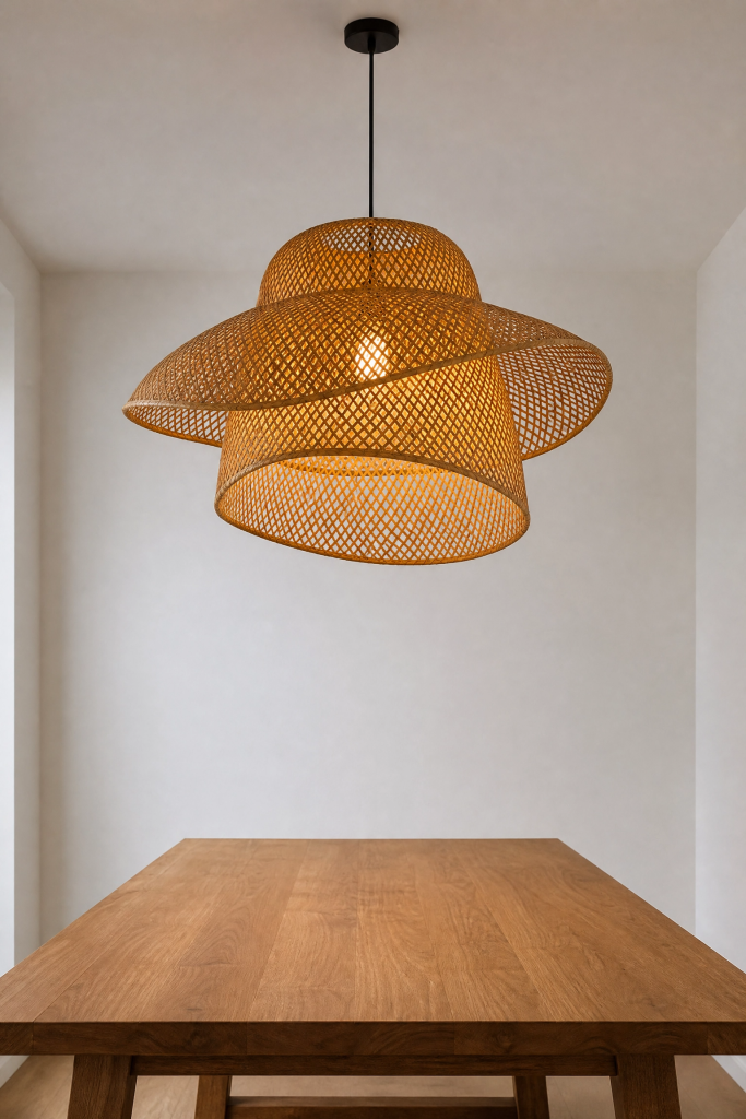
10. A Single Architectural Light Fixture as Sculpture
In minimalist spaces, a light fixture is not just functional, it is often the most striking visual element in the room. Choosing one truly well-designed fixture and letting it stand alone is more effective than filling a space with multiple average ones. A woven rattan pendant over a dining table, a paper lantern in a matte white, a sculptural concrete pendant in a bedroom, or a slender brass arc floor lamp in a living room all carry weight as objects even when they are switched off. The fixture becomes part of the room’s composition rather than an afterthought. This is worth spending on because it is used daily and looked at constantly. Mid-range options from Scandinavian or Japanese-inspired design brands often offer genuinely good design at accessible prices.
Designer Note: When hanging a pendant over a dining table, the bottom of the fixture should sit roughly 30 to 34 inches above the tabletop. Higher than that and it loses intimacy; lower and it obstructs sightlines.
Texture and Material in a Restrained Palette
11. Mixing Natural Materials for Tactile Warmth
One of the most consistent observations from decorating minimalist rooms is that texture does the job color usually does in busier spaces. When the palette is limited to neutrals, the surfaces need to offer enough tactile and visual variety to prevent the room from feeling one-dimensional. The most reliable combination is wood, stone or ceramic, linen or cotton, and one metal. In a living room, this might translate to an oak side table, a concrete or stone candle holder, a linen sofa, and a brass lamp base. Each material reads differently under light, moves differently when touched, and ages differently over time, which gives a minimalist room a sense of history and character without adding visual clutter. This approach works across every budget because natural materials are available at every price point from thrift stores and antique markets up through premium design brands.
Designer Note: Avoid synthetic versions of natural materials where possible. Faux wood, plastic designed to look like concrete, and polyester that mimics linen tend to look convincing in photographs but flat and unconvincing in person.

12. A Textured Plaster or Limewash Wall Finish
A flat painted wall in a minimalist room does the job technically but misses an opportunity. Textured wall finishes, particularly limewash paint and Venetian plaster, add depth and visual interest without introducing pattern or color in the traditional sense. Limewash paint, which is an ancient technique made from slaked lime, creates a mottled, slightly cloudy surface that shifts between tones depending on the light and the angle. Applied in a cream, a warm white, or a soft grey, it gives a wall genuine character that a standard flat or eggshell paint simply cannot replicate. It is also increasingly available as a DIY-friendly product from several paint companies, bringing the cost down significantly from what a specialist application would run. It works particularly well in bedrooms, dining rooms, and entryways, where the surface is close enough to appreciate the texture.
Designer Note: Sample limewash paint on a large patch before committing. It dries significantly lighter than it looks when wet, and the final effect changes considerably depending on how many coats you apply.

13. Stone, Marble, and Concrete as Accent Surfaces
In a minimalist kitchen or bathroom, the choice of surface material is one of the most important design decisions because it carries so much visual weight and it is usually permanent. A honed marble countertop, a concrete sink, or a large-format stone tile floor all do the work of a feature element without needing anything else in the room to compete. The key word is honed rather than polished: a matte or satin finish reads as calmer and more contemporary than a high-gloss polish, which tends to feel more traditional or commercial depending on the context. Budget-friendly alternatives to natural stone include large-format porcelain tiles designed to mimic marble or concrete, which have improved considerably in quality and are now difficult to distinguish in a well-lit room. The honest caveat is that natural marble requires sealing and is susceptible to staining from acids, including lemon juice, coffee, and wine.
Designer Note: If natural stone is outside the budget, use it in one small area, such as a bathroom vanity top or a kitchen island, rather than throughout. A single genuine stone surface reads as a considered design choice.

14. Wabi-Sabi Ceramics and Handmade Objects
The Japanese design philosophy of wabi-sabi, which finds beauty in imperfection, irregularity, and the natural passage of time, is a natural fit with minimalism because it gives permission to include objects that feel personal without filling a space with stuff. A handmade ceramic bowl with an uneven rim, a slightly asymmetric vase thrown on a wheel, or a small sculpture with visible tool marks all carry a kind of quietness that mass-produced objects rarely achieve. These pieces work best displayed singly or in a small grouping of two or three on a shelf, a windowsill, or a dining table, where their imperfections can be noticed up close. They are often affordable and widely available from independent ceramic artists, weekend markets, and online craft platforms.
Designer Note: Grouping objects of different heights but similar tones or materials creates the kind of considered, organic arrangement that characterizes wabi-sabi styling without looking staged.

The Bedroom: Quiet, Functional, and Restorative
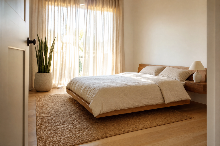
15. A Bed With Presence and Nothing Else
The minimalist bedroom starts with a bed that is genuinely worth looking at, because in a room with very little else, it carries almost all the visual weight. A solid wood platform bed in a pale or medium oak, a simple upholstered bed with a clean, straight headboard in a neutral linen, or a low Japanese-style bed close to the floor all communicate calm without needing much else around them. Layer the bedding in a single color family, mixing a flat sheet, a duvet in a slightly heavier weave, and one or two pillows in a similar but not identical fabric. Keep the pillow count low. In practice, a minimalist bed with high-quality linen in a single tone looks significantly better and is significantly easier to make each morning than a bed stacked with decorative cushions. This approach works at every price point since bedding quality matters more than brand.
Designer Note: A white or light-colored bed benefits from a slightly heavier, textured duvet cover like a waffle weave or linen-cotton blend. It prevents the bed from looking too flat or plain when it is made.

16. Hidden Storage Behind Clean-Lined Joinery
The single biggest threat to a minimalist bedroom is visible clutter, and the most effective long-term solution is built-in or fitted storage that removes clutter from sight without removing it from the room. Floor-to-ceiling wardrobes with flat-front doors in a painted finish that matches the walls effectively disappear into the room and create a calm, unified backdrop. If built-in joinery is not possible, freestanding furniture with simple panel doors, like a clean-lined armoire or a sideboard with solid fronts rather than glass, achieves a similar result. Under-bed storage in drawers or on a slatted base with boxes is another practical option for small bedrooms. The goal is that when you stand in the doorway, nothing is demanding your attention other than the things you chose to display.
Designer Note: Painting wardrobe doors and walls the same color is one of the most effective tricks for making storage disappear. It works especially well in small bedrooms where fitted joinery tends to dominate.

17. Bedside Simplicity With One Good Lamp
The bedside table is a small surface but an important one in a minimalist bedroom because it tends to accumulate objects quickly. A charging cable, a book, a glass of water, a phone, a hand cream, and suddenly a tiny surface looks overwhelmed. The minimalist approach is a bedside table with at least one drawer, a single lamp with a warm bulb, the book currently being read, and nothing else visible on the surface. A wall-mounted swing-arm lamp is an even cleaner option because it removes the lamp from the table surface entirely, freeing up the whole top for a single object or leaving it clear. Choose a lamp with a shade that diffuses light gently rather than directing it harshly, which makes the bedside reading experience calmer and easier on the eyes.
Designer Note: A small tray on the bedside table is a practical trick for keeping the surface looking tidy. It creates a defined zone for small objects and makes the area look intentional even when slightly full.

Living Spaces That Breathe
18. Negative Space as a Design Element
Negative space, the empty areas in a room that are not filled with furniture or objects, is one of the most misunderstood concepts in minimalist design. Many people treat empty space as something to be filled, a problem waiting for a solution. In a well-considered minimalist room, negative space is a deliberate design choice that gives other elements room to be noticed. An empty corner with only a floor lamp creates a moment of visual rest that makes the seating area across the room feel more distinct and intentional. A clear stretch of wall between two artworks makes both pieces feel more considered than if they were hung close together. In practice, this means editing your space down until you notice each piece individually rather than reading the room as a mass of things.
Designer Note: If a corner feels too empty, resist the urge to fill it with furniture. A single tall plant in a simple pot or a sculptural floor lamp is usually enough.

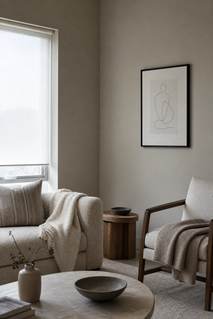
19. A Single Large Artwork Rather Than a Gallery Wall
Gallery walls are popular and they can look beautiful, but in a minimalist room they tend to introduce too much complexity at the eye level where you spend most of your visual attention. One large artwork, framed simply or unframed depending on the style, makes a stronger statement and requires no arrangement decisions once it is up. The work itself can be bold or quiet, abstract or figurative, but the frame and mat should be simple. A thin black or natural wood frame suits most minimalist interiors without competing with the artwork. In terms of scale, err larger than feels comfortable on first instinct. A piece that is 80 percent of the width of the sofa below it looks confident; a piece that is 50 percent of the sofa width often looks like it was chosen because it happened to be available.
Designer Note: For large walls, a single piece of art measuring at least 36 by 48 inches makes a stronger visual statement than two or three smaller pieces, and it costs less to frame.

20. Plants Used With Restraint
Plants add life and organic form to a minimalist room without adding visual clutter, but only when used with some restraint. The maximalist approach of dozens of small pots scattered around a room is the opposite of what works here. Two or three plants chosen for their form, a tall fiddle leaf fig in a corner, a trailing pothos on a high shelf, or a single sculptural cactus on a windowsill, do more for a minimalist room than a collection of smaller plants competing for attention. The pots matter as much as the plants themselves: simple ceramic pots in neutral tones or natural materials like terracotta carry the minimalist ethos better than decorative or patterned containers. If maintaining living plants is challenging, a single high-quality faux plant in a good pot is a more honest solution than dead or struggling real plants.
Designer Note: Limit the total number of plants in a single room to three unless the room is very large. More than that and the space can start to feel like a greenhouse rather than a considered interior.

21. A Considered Entryway That Sets the Tone
The entryway is the first thing you and your guests experience when entering a home, and in a minimalist house it sets the expectation for everything else. A narrow console table or a simple floating bench, a single mirror, and one hook or a minimal coat rack are usually enough. Keep the floor clear except for one small rug in a natural material. A mirror is particularly useful here because it serves a functional purpose while also bouncing light and making the space feel larger, which matters in most entryways that tend to be on the smaller side. If the entryway has a closet, use it: all coats, bags, and shoes stored inside means the visible space stays clean and calm. A small ceramic bowl or tray on the console for keys is the one concession to practical clutter that works well here.
Designer Note: If your entryway has no natural light, a warm lamp on a timer that comes on in the evening makes an enormous difference to how the space feels when you come home.

Kitchens and Dining Rooms Done Simply
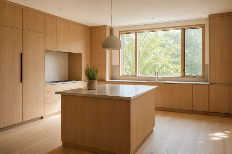
22. Flat-Front Cabinetry in a Warm White or Muted Tone
Kitchen cabinetry is the dominant visual element in most kitchens, which means the style and finish of the doors drives almost everything else about how the room feels. Flat-front cabinet doors, sometimes called slab fronts, are the defining feature of minimalist kitchen design because they remove all the raised panels, decorative moulding, and hardware complexity that traditional cabinetry carries. A warm white or a soft muted tone, sage green, warm grey, or dusty blue, gives the cabinets presence without competing with everything else in the room. Handle-free push-to-open or recessed finger-pull mechanisms keep the surface completely clean. Pair flat-front cabinets with a simple stone or large-format tile countertop and keep the backsplash in a single material: a large subway tile in a brick lay, a honed marble slab, or a simple concrete surface. The restraint in material choices is what makes this look work.
Designer Note: Flat-front cabinets show fingerprints more than shaker-style doors, particularly in a high-gloss finish. A matte or satin finish hides marks better and tends to age more gracefully.

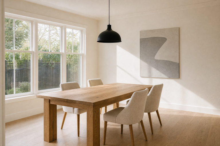
23. A Dining Space That Feels Deliberate
The dining room or dining area is often an afterthought in home decorating, furnished with a table and chairs that were practical at the time and never revisited. In a minimalist home, the dining space benefits from the same level of attention as the living room. A table in a single honest material, solid wood with visible grain, a cast concrete top, or a simple glass top on a metal frame, paired with chairs that are visually lightweight, open-back designs, slender metal legs, or transparent acrylic, keeps the space feeling open even when all the seats are occupied. A single pendant light hung low over the table creates intimacy and defines the dining zone within an open-plan space. Keep the table surface completely clear when not in use except for one considered object, a ceramic bowl, a small plant, or a single candle. This makes the space feel ready rather than abandoned.
Designer Note: Chairs with open backs read as visually lighter than chairs with solid backs, which matters in smaller dining spaces where the furniture can feel heavy and crowd the room.

Final Thoughts
What makes minimalist home decor genuinely appealing to live with, rather than just look at in photographs, is the sense of intention behind every choice. Each piece of furniture, each surface finish, each lamp and plant and ceramic object earns its place by doing something specific, either functional, visual, or both. The result is a home that is calmer to be in, easier to keep tidy, and more responsive to the things you actually care about, whether that is natural light, quality materials, or simply space to think.
None of the 23 ideas here require a complete renovation or a large budget. Most of them are about editing what you already have, being specific about what stays, and replacing what does not serve the room with something that does. Start with one room, or even one corner of one room, and go from there. The process of removing the unnecessary to make room for what genuinely matters, which is what minimalism is really about, tends to get easier and more instinctive over time.
If you take only one thing from this article, let it be this: minimalism is not about having less for its own sake. It is about having exactly what you need to feel comfortable, functional, and good in your own home. That is a very personal number. Trust your own sense of what that looks and feels like.
Frequently Asked Questions
What is the difference between minimalist and Japandi interior design?
Minimalism as a broad design movement emphasizes simplicity, clean lines, and the removal of excess. Japandi is a specific style that blends Japanese and Scandinavian design principles, which both happen to share a minimalist sensibility. Japandi tends to incorporate slightly warmer tones, natural materials like bamboo and washi paper, and the Japanese concept of wabi-sabi, which celebrates imperfection and age. Standard Western minimalism can sometimes be cooler and more industrial in character. In practice, many people use the terms interchangeably, and there is significant overlap between them.
How do I make a minimalist room feel warm and not cold?
Warmth in a minimalist room comes from three places: the color temperature of your light sources, the texture of your materials, and the undertones in your neutral palette. Use warm white bulbs at 2700K rather than daylight bulbs, choose neutrals with yellow or pink undertones rather than purely cool greys, and include natural materials like wood, linen, cotton, and rattan that have inherent warmth. A single larger rug in a natural material also makes a significant difference to how warm a room feels underfoot and visually.
Is minimalist design suitable for families with children?
It can be, with some practical adjustments. The key is building in proper storage so that toys, school bags, and everyday items have a home and can be put away easily rather than left out on surfaces. Choosing durable, easy-to-clean materials is important: performance fabrics on sofas, wipeable surfaces on coffee tables, and machine-washable rugs all make a minimalist aesthetic more livable with kids. The honest answer is that the level of visual calm that adult-only minimalist spaces achieve is harder to maintain with young children, but a more relaxed version that prioritizes clear floors, organized storage, and quality over quantity is entirely achievable.
What is the best way to start decorating in a minimalist style without spending a lot of money?
Start by removing rather than buying. Go through each room and take out anything that is not functional, genuinely loved, or visually contributing to the space. Put it in boxes and store them for a month. If you do not miss anything in those boxes, donate or sell it. Once the room is pared back, you can see much more clearly what it actually needs rather than what you think might improve it. Often the answer involves a fresh coat of paint in a warmer neutral, some simple changes to window treatment, and better lighting, none of which require large expenditure.
Can minimalist decor work in a small apartment?
Minimalist decor is often at its most effective in small spaces because the principles directly address the challenges that small rooms present: a feeling of being crowded, not enough light, and a lack of clear function in each area. Keeping the floor plane as clear as possible, using wall-mounted shelving instead of freestanding units, choosing furniture with visible legs, and maximizing natural light are all minimalist principles that also happen to be the most effective strategies for making small spaces feel larger and more livable.
How many decorative objects is too many in a minimalist room?
There is no universal number, but a useful working principle is that every object should be either beautiful, meaningful, or both. In a typical living room, this tends to mean no more than five to eight visible objects total outside of furniture, light fixtures, and plants. Group objects in small clusters of two or three rather than spreading them evenly across all surfaces, and leave some surfaces completely clear. If you are unsure whether something belongs, take it out of the room for a week and see if you notice its absence.