Black and Cream Living Room Ideas That Actually Look Good Together

Black and cream is one of the most requested living room palettes and one of the most frequently gotten wrong. The mistake is almost always proportion: too much black turns the room oppressive, too little and the palette never reads as intentional. The ratio that designers consistently return to is roughly 70 percent cream and 30 percent black. Cream sets the mood. Black sets the edge. When those proportions hold, the room feels sophisticated and grounded. When black tips past 40 percent, the cream stops feeling like the dominant tone and starts feeling like relief. These 27 ideas are organized by the role each element plays in the room, from the foundational surfaces through to the finishing details, so you can build the palette correctly rather than just assembling it at random.
CATEGORY ONE: THE FOUNDATION — WALLS, FLOORS, AND RUGS
1. Choose the Right Cream for Your Walls
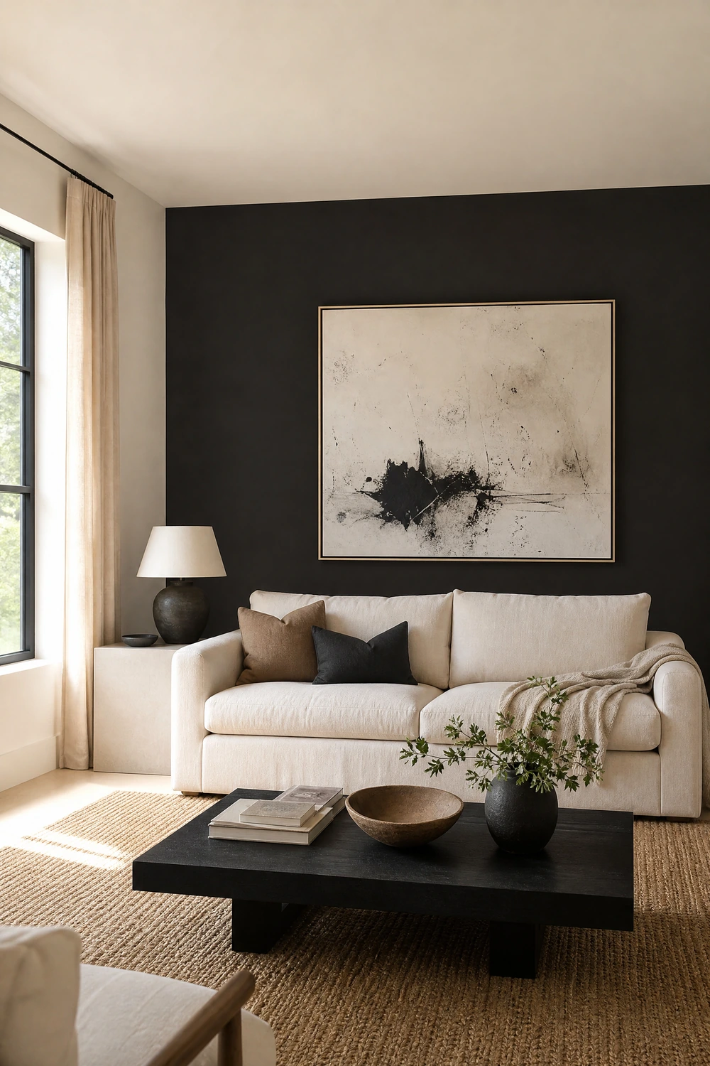
Cream is not a single color. It ranges from warm yellow-whites to cool grey-whites, and the wrong undertone will fight your black accents rather than frame them. Warm creams with yellow or pink undertones work best against true black because they create a soft, intentional warmth rather than the cool, clinical contrast that grey-whites produce. Hold any cream sample next to pure white to check the undertone: a warm cream reads peachy or yellow, a cool cream reads grey or slightly blue. North-facing rooms need warmer creams to avoid a flat, cold look. South-facing rooms can handle cooler cream without losing warmth. Test on the actual wall and look at both daylight and lamp light before committing.
Designer Advice: Avoid cold near-whites like pure white next to matte black. The pair reads as black-and-white, which is a different palette entirely. A true warm cream is what keeps the room feeling rich rather than graphic.
2. Paint One Wall Matte Black as a Focal Anchor
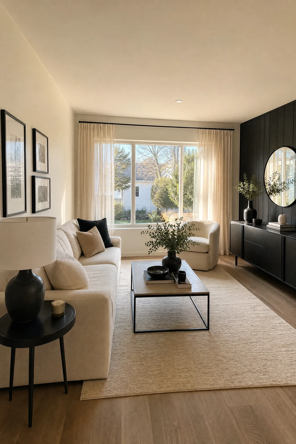
A single matte black wall, specifically matte rather than gloss, does something a full-room neutral cannot: it creates visual depth that makes the space feel larger and more intentional. The matte finish absorbs light softly rather than reflecting it harshly, which prevents the wall from reading as oppressive and gives the room a gallery-like quality that gloss paint never achieves. The focal wall behind the sofa or the fireplace wall are the strongest candidates, because these are the surfaces the room naturally faces and the ones with the most surrounding cream to balance the contrast. Black works best on one wall. Two or more and the balance tips.
Reality Check: Test the wall color in both daylight and evening lamp light before committing. A deep black wall that reads as dramatic in afternoon sun can feel overwhelming in evening light if the room lacks sufficient warm layered lamps to push back against it.
3. Use Dark-Stained or Black Oak Flooring as the Room’s Ground
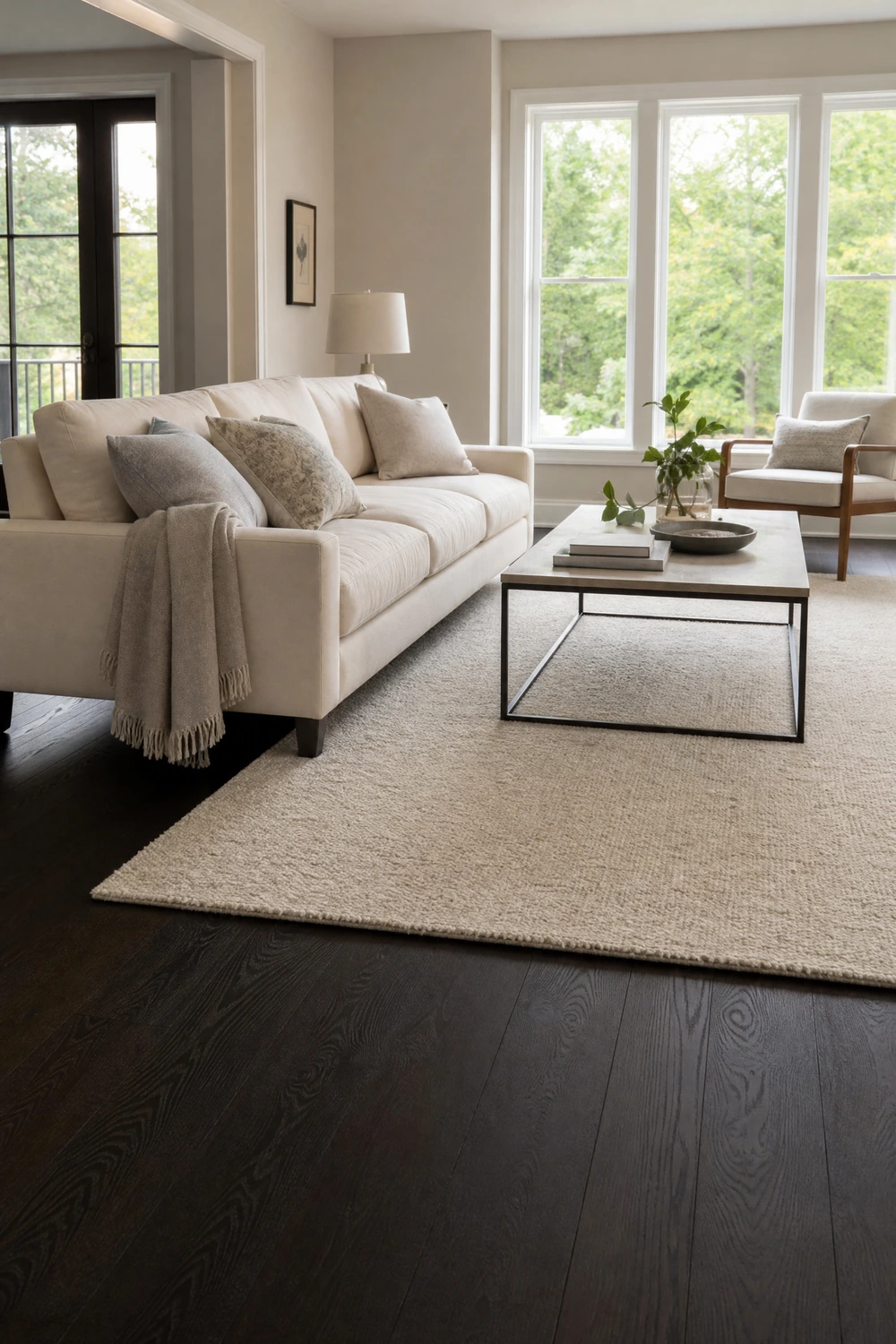
Dark-stained hardwood or black oak flooring provides the room with a dramatic ground that allows cream furniture to read as light and intentional sitting above it. The floor becomes the room’s primary black element, which means every other black accent above floor level can be used more sparingly without the palette losing its edge. Dark flooring with cream walls and cream upholstery is a ratio that almost always works because the darkest element is literally underfoot: it anchors without dominating the eye line. A large cream area rug layered on top of dark floors brings warmth at floor level while keeping the palette consistent.
Pro Move: If the existing flooring is light and cannot be changed, use a very large rug in cream or a warm neutral across the entire seating zone to create the same visual effect of a light ground beneath cream furniture.
4. Anchor the Seating Zone With a Cream Area Rug
A cream or warm ivory area rug is one of the most important foundational decisions in a black and cream living room because it sets the floor’s tone within the palette and defines the seating zone’s boundary. On a dark floor, a cream rug creates a soft landing that makes the furniture above it feel cohesive and grounded. On a light or natural wood floor, a cream rug maintains the warmth of the palette while adding texture at floor level. The rug should be large enough for the front legs of every seating piece to sit on it, which means going no smaller than 8 by 10 feet in most living rooms.
Heads Up: A cream rug requires maintenance. Choose a performance fabric or a flatweave wool that can be spot-cleaned easily, and avoid placing it in direct sunlight where uneven fading will make it look dingy rather than warm.
5. Layer a Black-Patterned Rug Over a Cream Base

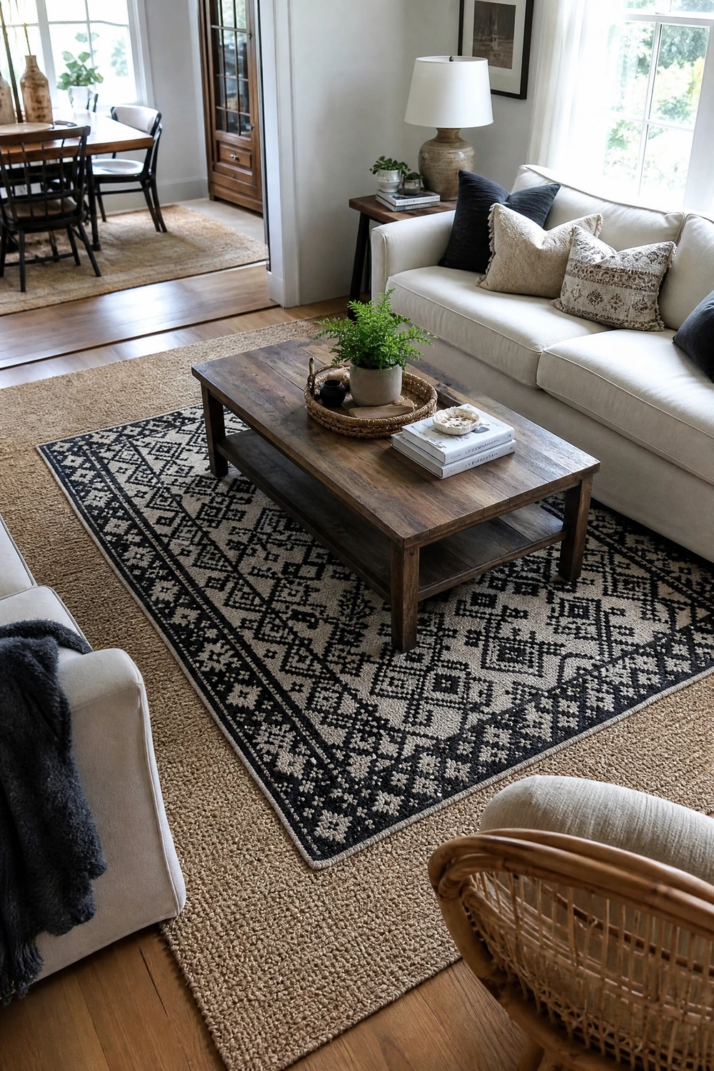
Layering a smaller black-and-cream geometric or abstract rug over a larger cream or natural fiber base rug introduces pattern into the palette at floor level without committing to a full-room graphic look. The cream base rug handles the scale and sets the tone, while the patterned layer adds visual interest and a contained dose of black at a level where it reads as designed rather than heavy. This approach also works practically: the base layer extends beyond the patterned piece on all sides, which softens the edges of the darker pattern and prevents it from looking like an island in the room.
Designer Advice: Choose a lower-contrast pattern for the layered rug in a smaller room. A bold black-and-cream chevron or high-contrast geometric will dominate a compact space. A softer, more tonal pattern in similar values gives the same layered effect without demanding attention.
6. Add Black Architectural Details to the Room’s Structure
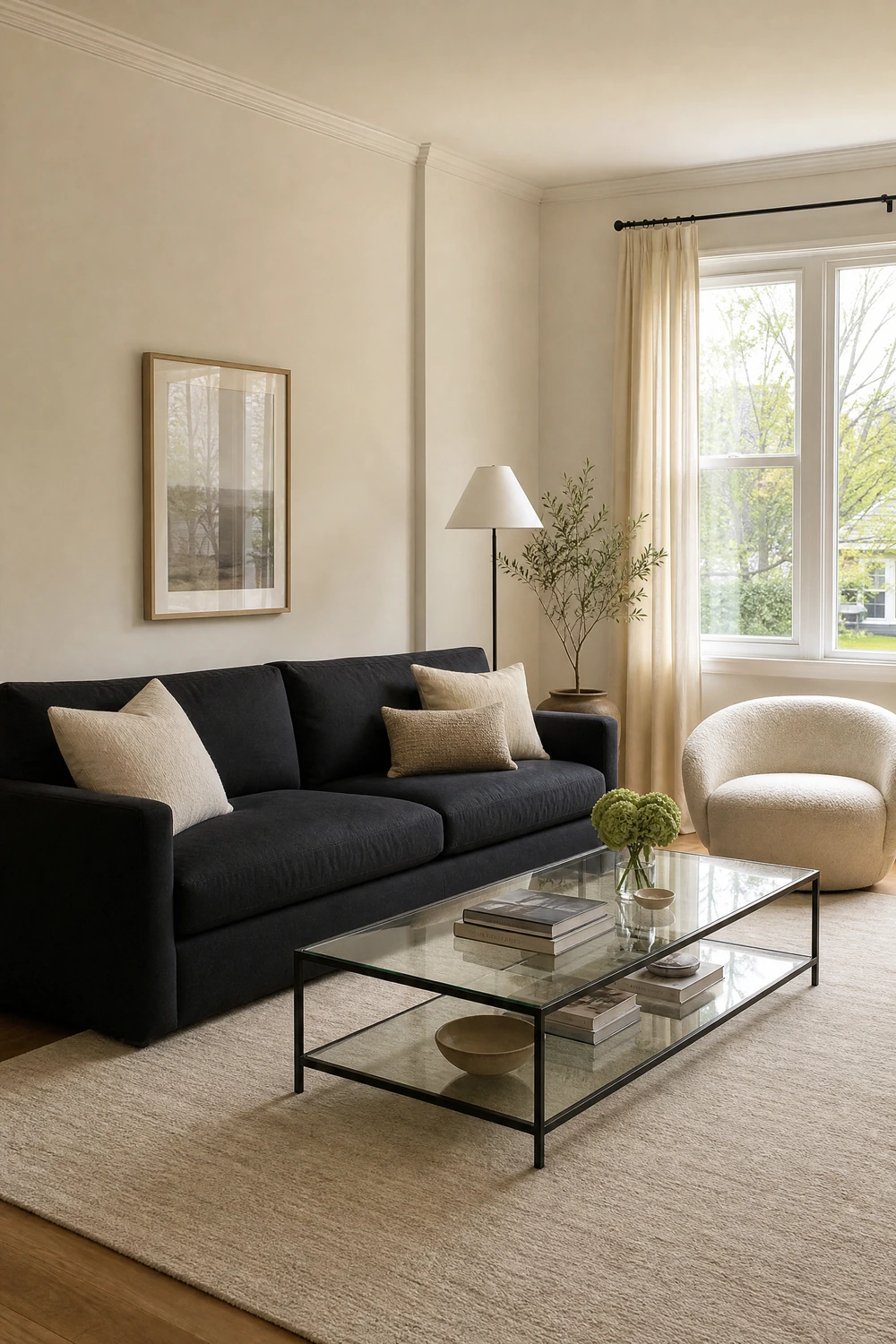
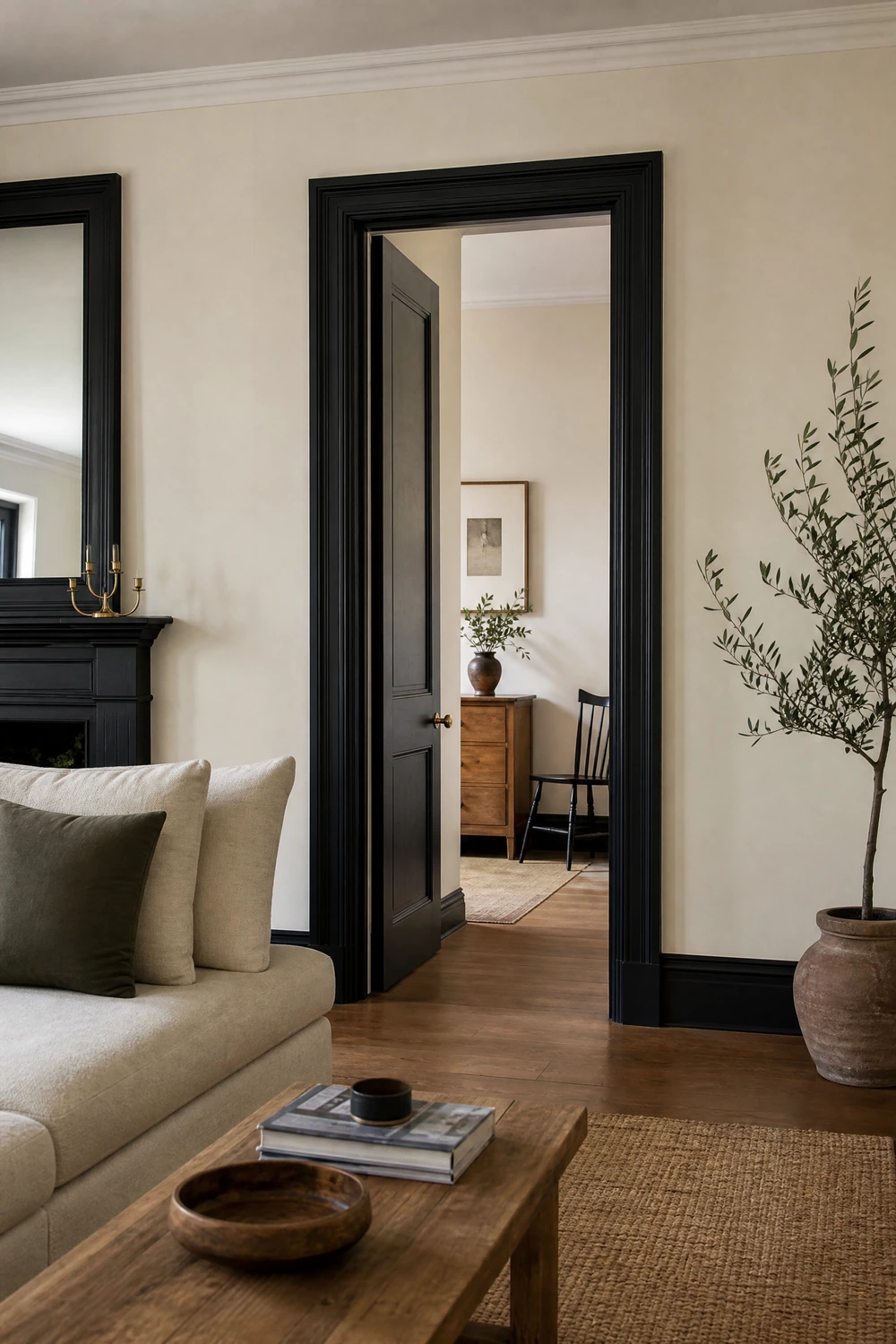
Black window frames, black skirting boards, black door frames, or a black fireplace surround are the architectural version of the palette that most decorating articles overlook entirely. These structural black elements establish the palette at a level that no piece of furniture or accessory can reach, because they run the full height of the room and frame every other element within it. A room with black-painted skirting boards and door frames reads as designed from the architecture outward, which gives every cream element above them a clearly defined edge and context. This is the approach interior designers use to make a room feel considered from the bones rather than decorated on the surface.
Quick Tip: If painting architectural details is not possible, black curtain rods extended wall to wall with cream curtains deliver a similar framing effect at window level and at a scale that has a significant impact on the room’s overall composition.
CATEGORY TWO: THE ANCHOR PIECES — MAIN FURNITURE
7. Choose a Cream Linen Sofa as the Room’s Dominant Piece
A cream linen sofa in a black and cream living room carries the 70 percent of the palette that the room depends on and sets the entire room’s mood. The texture of linen specifically, its slight weave and matte surface, prevents the cream from reading as flat or clinical, which is the risk with cream in a high-contrast palette. A linen sofa in an undyed or warm-toned cream sits comfortably against both a matte black accent wall and cream walls without reading as too close in tone to either. For upkeep, pre-washed or performance linen is more practical than untreated linen and maintains its appearance significantly better under regular use.
Reality Check: A cream sofa requires a more disciplined maintenance routine than a darker upholstery. Performance linen or a treated fabric is worth the slight additional cost over untreated linen, particularly in homes with children, pets, or high daily use.
8. Use a Black Sofa as the Room’s Single Dominant Dark Piece
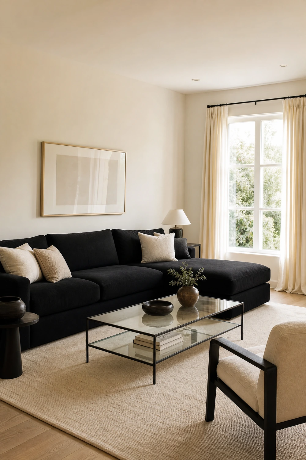
A black sofa is the high-risk, high-reward option in this palette: it places the room’s largest piece of furniture on the dark side of the ratio, which means everything else in the room needs to compensate in the direction of cream. Cream walls, a cream or warm natural rug, cream or warm-toned curtains, and cream or warm-toned cushions create the surrounding lightness that keeps a black sofa from making the room feel heavy. The mistake most people make with a black sofa is adding more black elsewhere, a black coffee table, black shelving, black lamp bases, compounding the dark side of the ratio until the cream reads only as relief. With a black sofa, every other major element should push toward cream or warm neutral.
Designer Advice: If the sofa is black, keep the coffee table light: glass, acrylic, pale rattan, or light wood. A black sofa above a black or dark coffee table creates a concentrated dark zone at the center of the room that makes the space feel enclosed regardless of how much cream surrounds it.
9. Choose Furniture With Black Legs and Cream Upholstery
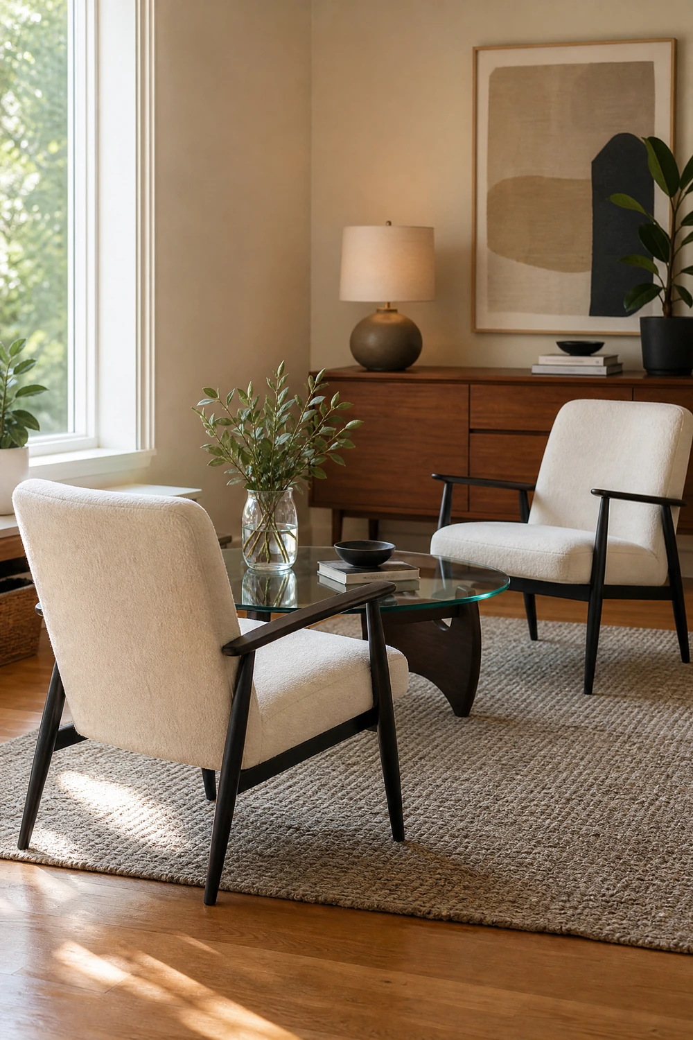
A sofa or armchair with a black metal or painted wood frame and cream upholstered cushions embodies the palette in a single piece of furniture, which makes it one of the most reliable and most proportionally correct choices in a black and cream room. The black frame provides definition and structure while the cream upholstery carries the warmth, and together they demonstrate the same 70/30 ratio that the whole room is aiming for. Mid-century modern silhouettes, with their tapered black legs and generous seat cushions in cream or oatmeal fabric, are particularly effective in this palette because the exposed leg also creates visible floor space that prevents the furniture from feeling heavy.
Pro Move: Furniture with visible legs always makes a room feel more open than furniture that sits to the floor. In a black and cream room where the palette can trend toward visual weight, legs are a practical tool for keeping the room feeling airy rather than dense.
10. Add a Black Console Table Behind the Sofa
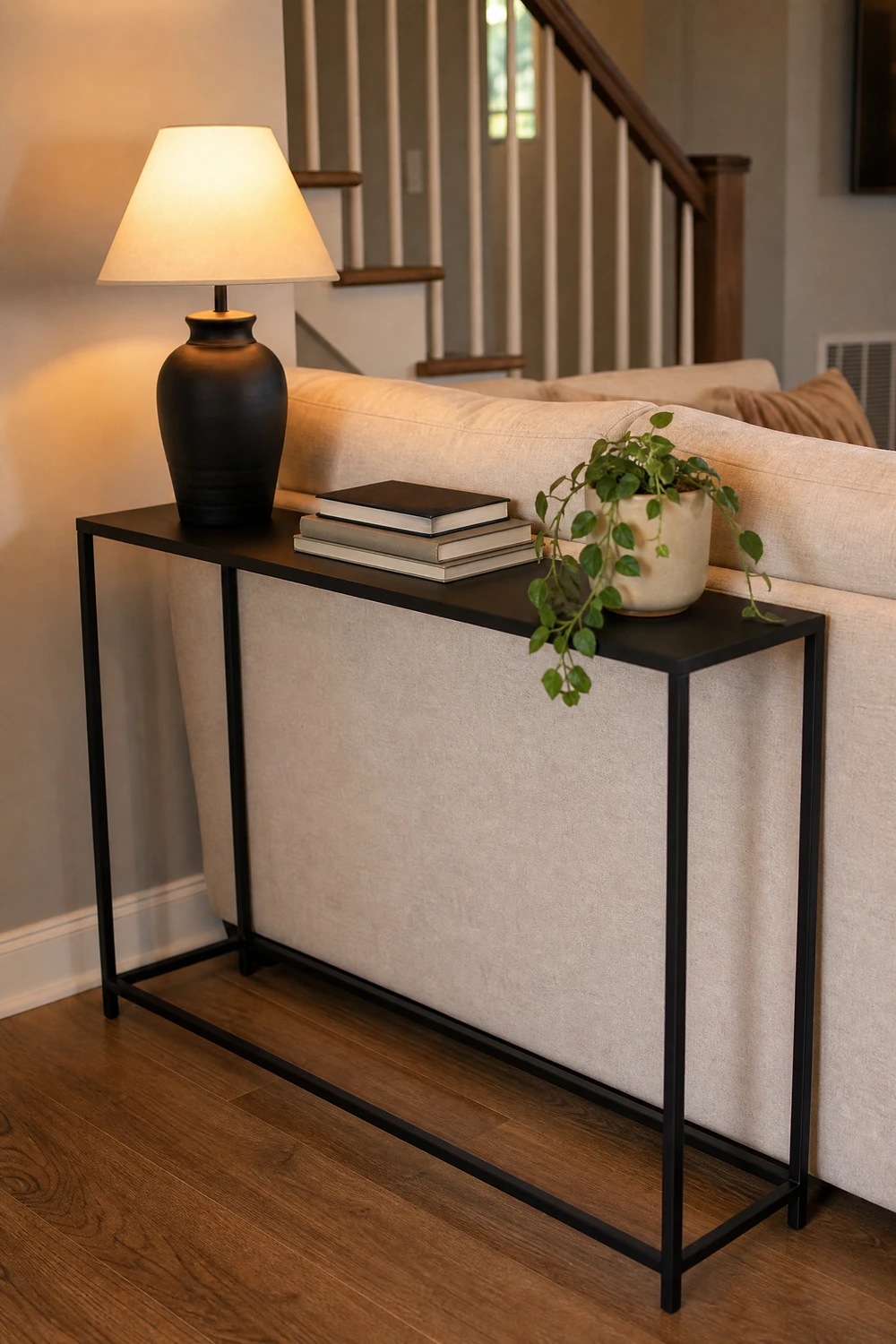
A slim black console table behind the sofa serves the room in two ways simultaneously: it adds a surface at a height between the sofa back and the ceiling that would otherwise be visually empty, and it introduces black at a level where it reads as a deliberate structural element rather than an accessory. Styled with a lamp on one end, a stack of books, and one or two objects in cream or warm metal, the console becomes one of the most visible and most styled surfaces in the room. A console with slim metal legs keeps the black element feeling light rather than solid, which is important when the sofa is already occupying significant floor space.
Quick Tip: The lamp on a console table behind the sofa adds a light source at a height that neither floor lamps nor ceiling fixtures typically reach, creating a warm glow visible from the doorway that makes the whole room feel more welcoming on entry.
11. Use a Glass or Acrylic Coffee Table to Keep the Center Open

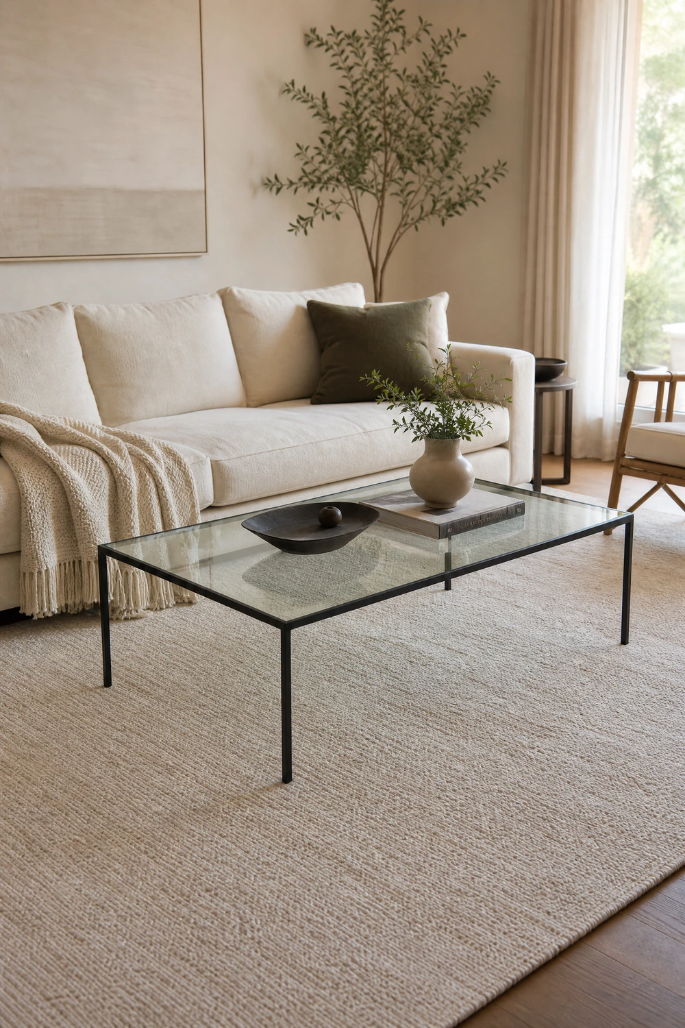
In a black and cream living room where the palette can become visually heavy, a glass or clear acrylic coffee table is one of the most useful furniture choices available because it occupies the floor plan without blocking the sightline across it. The rug beneath it remains fully visible, the floor plane appears unbroken, and the seating arrangement reads as more open and less dense than it would with a solid dark or light table at the same scale. A glass top with black or gold metal legs bridges the palette while keeping the center of the room as visually clear as possible.
Designer Advice: A glass coffee table is easier to maintain than it appears and harder to scratch than acrylic. Wipe it down weekly with a glass cleaner and avoid placing rough-bottomed objects directly on the surface. Fingerprints are the real challenge, not scratches.
CATEGORY THREE: THE CONTRAST ELEMENTS — BLACK ACCENTS
12. Use Black Picture Frames Throughout the Room
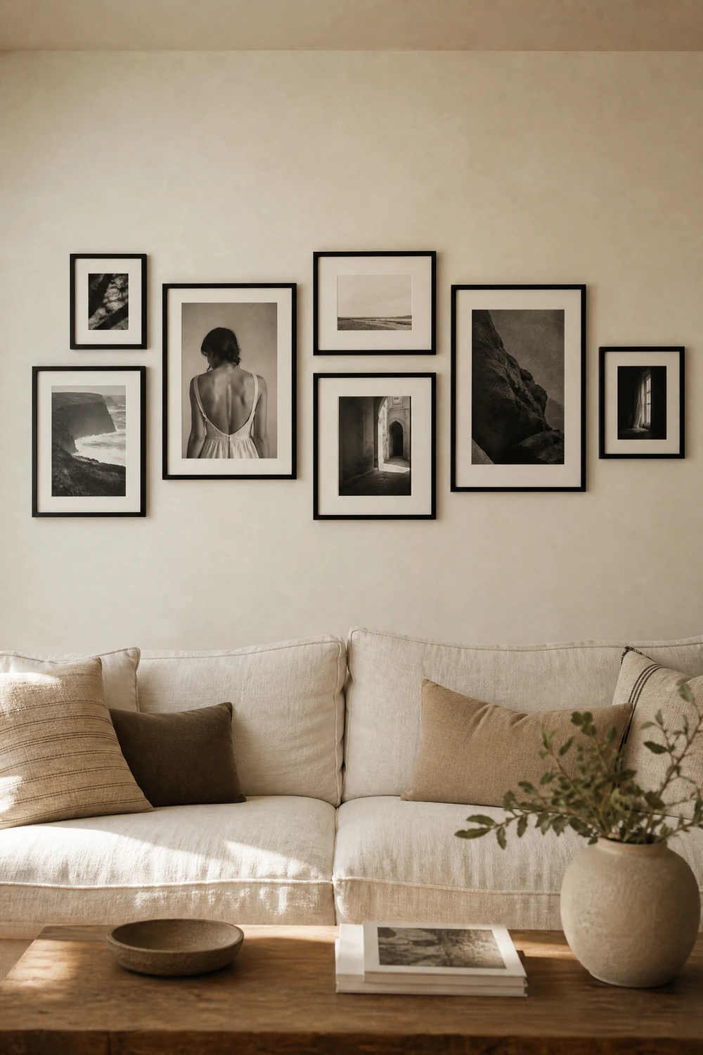
Black picture frames are the easiest and most cost-effective way to carry the palette through the room’s vertical surfaces without adding visual weight at furniture level. A gallery wall of black-framed prints above the sofa, a pair of black-framed mirrors flanking the fireplace, or a single large black-framed canvas above the console each add the dark element at eye level in a format that reads as decorative rather than structural. The frame color ties every piece of art and mirror to the palette regardless of the content inside the frame, which makes the gallery wall feel cohesive even when the prints themselves are varied in subject and style.
Reality Check: Mix frame widths within a gallery wall rather than using identical thin frames throughout. A mix of a wide black frame, a medium, and a thin one in the same color reads as collected and curated. All matching thin frames can read as a decorating kit rather than a considered collection.
13. Hang Black Curtain Rods Extended Well Beyond the Window

A black curtain rod extended 8 to 12 inches beyond the window frame on each side, hung as close to the ceiling as possible, does two things simultaneously: it frames the window with a clean architectural line in the room’s accent color, and it tricks the eye into reading the ceiling as higher and the window as larger. Cream curtains hung on a black rod create the ideal contrast relationship between the two palette colors at the window, with the pale fabric softening the frame and the dark rod giving it definition. This is the treatment that makes a standard window read as an architectural feature rather than an aperture in the wall.
Pro Move: For a more dramatic treatment, choose cream curtains with a black edge or border along the leading edge. The black trim echoes the rod, ties the curtain into the palette, and adds visual interest without requiring a patterned fabric.
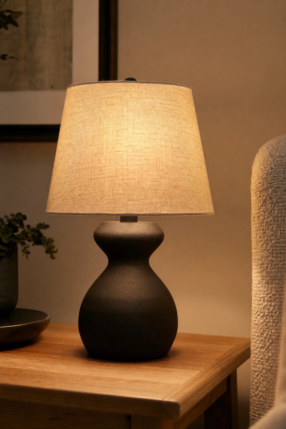
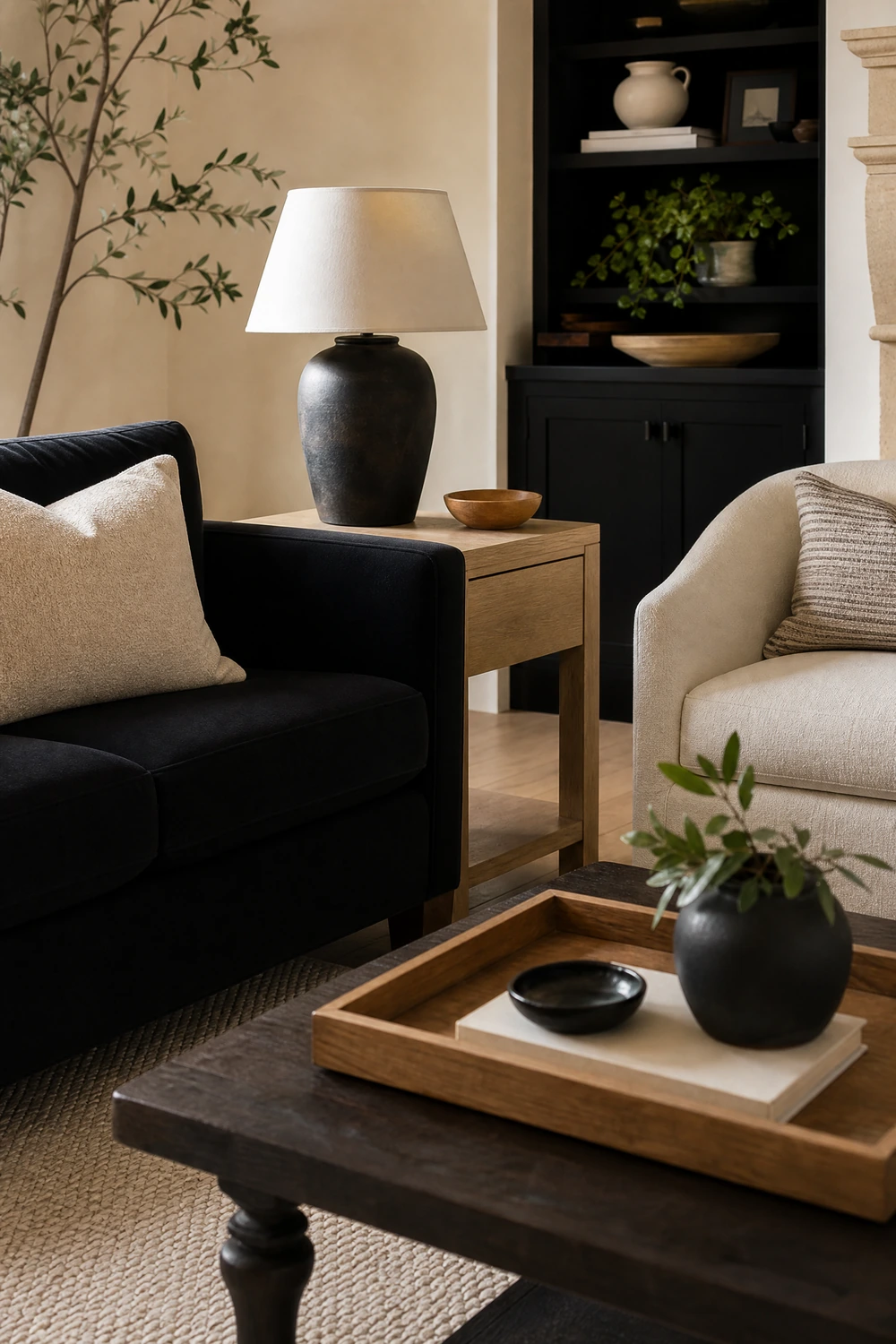
14. Add Matte Black Lamp Bases as Accent Lighting
Lamp bases in matte black are the accent lighting choice that most effectively carries the palette through the room’s layered lighting without tipping the ratio too far toward black. The base reads as a small black element at standing or seated height, while the shade, in cream, linen, or warm white, pushes the top half of the lamp back toward the dominant cream tone. One or two matte black lamp bases in the room is enough to register as deliberate. Three or four and the black starts compounding at eye level in the same way that too many black frames or accessories would. Matte finish specifically reads as softer and more intentional against cream than gloss or metallic black.
Heads Up: Count the black lamp bases alongside every other black element in the room before adding one. A black sofa, black frames, a black console, and black lamp bases is already a significant quantity of the dark tone. Adding more should be a deliberate decision, not a habit.
15. Install Black Shelving on a Cream Wall

Black floating shelves or a black freestanding bookshelf against a cream wall creates one of the most graphic and most effective expressions of the palette in the room, because the shelving spans from floor to ceiling or from shelf level to ceiling and carries the black element vertically in a way that no single piece of furniture does. The cream wall visible between and around the shelves ensures that the black reads as structure rather than as a block of color, and the objects displayed on the shelves, in cream, natural wood, warm metal, and green from plants, add warmth and variety to what could otherwise feel stark. Styling the shelf back panel in cream rather than painting it black prevents the shelving from becoming too dense.
Designer Advice: Paint the back panel of a black bookshelf in the same cream as the wall rather than leaving it black. This keeps the shelving reading as open and integrated rather than as a dark mass against the wall, and it maintains the 70/30 ratio even within the shelving itself.
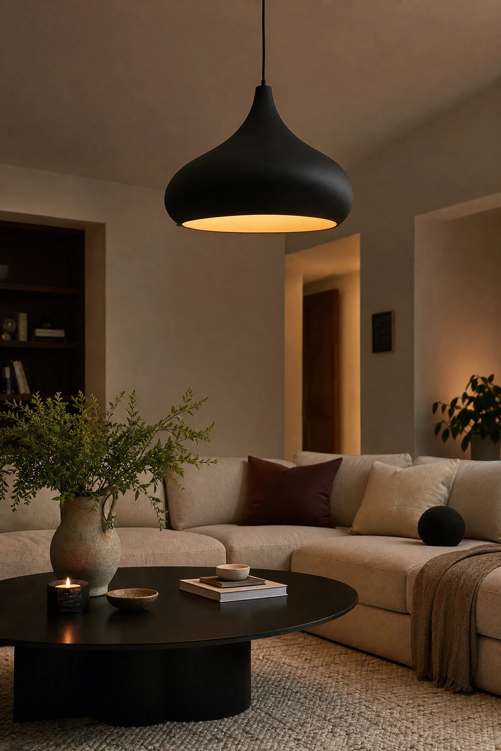
16. Choose a Statement Black Light Fixture
A black pendant, chandelier, or statement ceiling fixture is one of the most high-impact single changes in a black and cream living room because it positions the dark accent at the highest point in the room and creates a visual anchor that everything below it relates to. A black industrial pendant above a reading area, a matte black chandelier with exposed bulbs over the seating zone, or a sculptural black pendant in an organic form above the coffee table each add drama and definition at a level that no floor-based element reaches. The fixture should be chosen for both its design and its light quality: warm bulbs between 2700K and 3000K are essential in a palette that can trend toward cold if the lighting is not carefully managed.
Quick Tip: A black fixture with warm bulbs produces a warmer, more amber glow than the same fixture with neutral bulbs, because the black shade concentrates the light downward rather than diffusing it upward. This directional quality makes the light feel more intimate and more suited to the palette.
CATEGORY FOUR: THE WARMTH LAYER — TEXTILES AND ACCESSORIES
17. Layer Cream Textiles in at Least Three Different Textures

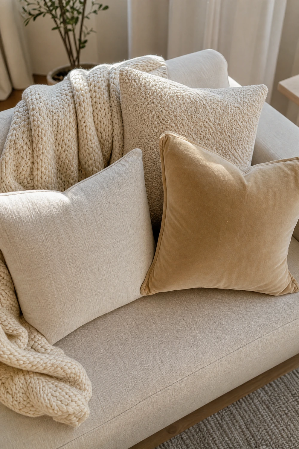
Cream is not a single visual experience. Cream linen reads differently from cream boucle, which reads differently from cream velvet, which reads differently from cream knitted wool. In a palette as restrained as black and cream, the textural variation within the cream elements is what gives the room warmth, depth, and interest rather than feeling flat and monochromatic. A cream linen sofa covered with a cream boucle cushion, a cream waffle-weave throw, and a cream knit pillow is a room that reads as rich and considered even before the black elements are introduced. Aim for at least three distinctly different cream textures across the cushions, throws, and soft furnishings in the room.
Designer Advice: Lay cream swatches from different materials side by side before buying. Some creams have warm yellow or pink undertones and some are cooler and greyish. All the cream textiles in the room should lean in the same direction, either warm or cool, to avoid the palette reading as inconsistent.
18. Add a Cream Boucle or Teddy Fabric Armchair
A cream boucle or teddy fabric armchair is the single piece of furniture that most effectively softens a black and cream room and prevents it from reading as too sharp or too graphic. The looped, tactile surface of boucle catches light differently at different angles, which adds visual movement to a palette that is otherwise quite still, and the plush quality of the fabric signals warmth and comfort in a way that flat woven or leather upholstery cannot. Positioned beside the sofa or in a reading corner, a cream boucle chair anchors that zone of the room in the light, warm, dominant half of the palette while the surrounding black accents give it definition.
Reality Check: Boucle is a delicate fabric that pills easily under heavy friction. Avoid placing it in a high-traffic zone or using it as a daily-use seat if the room is busy. As an accent chair in a more occasional seating position, it holds up well and remains visually excellent.
19. Introduce Natural Wood as a Warming Third Element
A strict two-color palette of black and cream without any organic warmth risks reading as cold or corporate, and natural wood is the most effective corrective. A light oak side table, a walnut coffee table, a rattan side chair, or a wooden shelf bracket each add warmth and organic texture to the palette without introducing a competing color. Wood reads as a neutral in the context of black and cream because its tone sits between the two, adding middle-ground warmth that the two contrasting extremes cannot provide on their own. This third element is particularly important in rooms with dark floors or a matte black accent wall, where the high contrast between the two palette colors risks making the space feel austere.
Quick Tip: Medium-toned woods, light to medium oak, walnut, or ash, bridge the black and cream palette most effectively. Very dark wood reads as a third shade of black. Very pale wood reads as an extension of the cream. The middle tones add warmth and contrast simultaneously.
20. Use Plants to Break the Monochrome and Add Life

A living room built on black and cream without any organic color becomes a graphic exercise rather than a home, and a well-placed plant is the most natural correction. A large architectural plant, a fiddle leaf fig, a monstera, or a tall snake plant, in a matte black or cream ceramic pot brings green into the palette in a way that reads as intentional addition rather than competing color. Green is the one color that works without disruption in a black and cream room because it reads as natural and organic rather than as an accent color competing with the palette. A trailing pothos on a black shelf, a small plant in a white ceramic pot on the console, or a large floor plant in a corner each add life without unsettling the scheme.
Designer Advice: Choose pot colors that are already in the palette: matte black, cream, or natural terracotta for warmth. A brightly colored or metallic pot introduces a new element that competes with the scheme. The pot should disappear into the palette while the plant itself provides the organic contrast.
21. Style with Cream Candles and Matte Black Holders
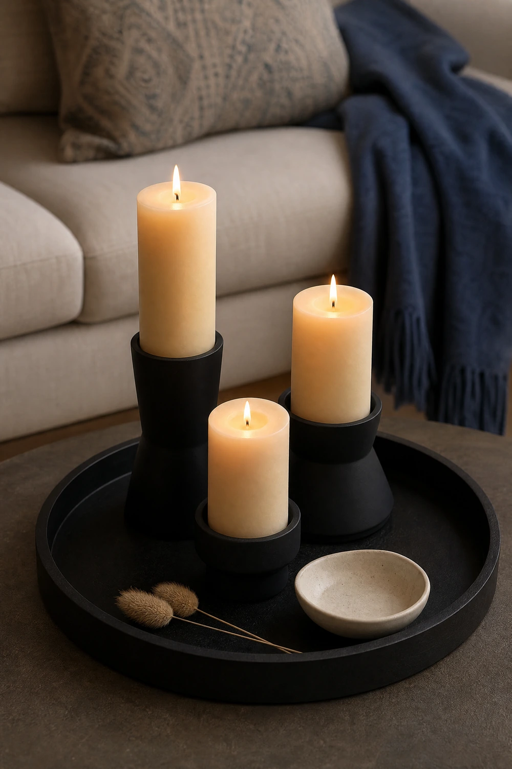
Cream pillar candles in matte black holders, or matte black candles in cream ceramic holders, are the tabletop accessory that most directly expresses the palette at the scale of the coffee table or mantel. The combination works on a tray, in a cluster of two or three, or as a single statement piece, and it adds the warm light of the flame to a palette that can sometimes benefit from visual warmth beyond what the lamp and daylight provide. Choose holders in a matte rather than gloss finish, because matte black reads as soft and considered next to cream, while gloss reads as hard and slightly graphic in a way that tips the palette toward black-and-white.
Pro Move: Group three candles of different heights on a tray rather than placing them individually across the surface. The grouped arrangement reads as a vignette rather than scattered decoration, and the varying heights create visual rhythm within the palette at coffee table or mantel level.
CATEGORY FIVE: THE METALLIC BRIDGE — GOLD AND BRASS ACCENTS
22. Add Brushed Brass as a Warm Third Metal
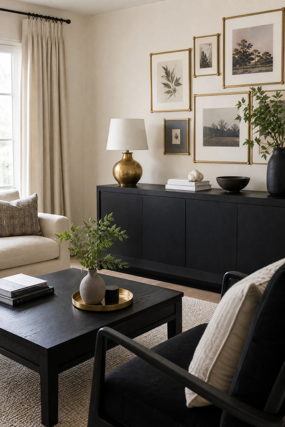
Black and cream is a palette that benefits significantly from a warm metallic accent because the two primary tones sit at opposite ends of the warmth scale and can feel visually tense without a middle tone to bridge them. Brushed brass, aged gold, or warm antique bronze each add warmth and a sense of richness that the palette cannot generate on its own. A brass lamp base, brass picture frame hardware, a brass tray on the coffee table, brass cabinet pulls on a media unit, or a brass candle holder on the mantel each introduce the warm metal at a small scale that enriches rather than competes. The key is brushed or matte rather than highly polished brass, which reads as too reflective and too 1980s in a contemporary black and cream context.
Heads Up: Keep metal finishes consistent across the room. Mixing brushed brass with chrome with copper introduces three competing metal tones that disrupt the palette’s clarity. Pick one metal family and apply it consistently across lamps, frames, hardware, and accessories.
23. Use a Brass or Gold Statement Mirror as a Focal Point

A large mirror with a brushed brass or aged gold frame above the fireplace, above the console, or leaning against the focal wall adds both the warm metallic accent and the reflective surface that a black and cream room particularly benefits from. Black absorbs light and cream reflects it softly, which means a room with significant black elements can feel darker than intended without a reflective surface to bounce light back into the space. A large mirror positioned opposite or adjacent to a window addresses the light problem and the palette simultaneously, and a brass or gold frame warms the contrast between the reflected black and cream surfaces without introducing a competing color.
Reality Check: A mirror in a black and cream room should have a frame with visual weight to avoid the effect of a frameless mirror, which can read as a window to nowhere rather than as a decorative object. A substantial frame in warm metal reads as part of the room’s design, not just a practical addition.
CATEGORY SIX: THE ART AND DISPLAY LAYER
24. Build a Black-Framed Gallery Wall Above the Sofa
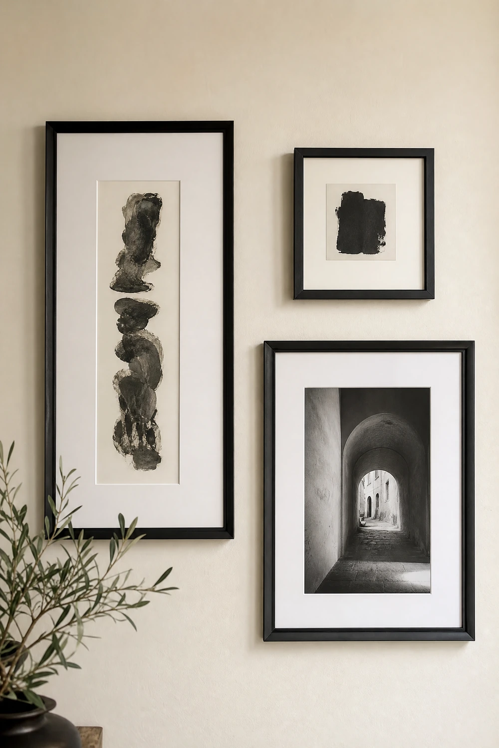
A gallery wall of black-framed prints, photographs, or illustrations above the sofa is one of the most effective wall treatments in a black and cream room because it carries both palette colors in a single display: the black frames provide the accent color, the cream walls between the frames maintain the dominant tone, and the art inside the frames adds content and personality without introducing a competing palette. The most successful gallery walls in this scheme use art that is predominantly black, cream, or monochrome, with occasional pieces in a warm neutral or a muted tone that aligns with the palette rather than fighting it. Vary the frame widths and the sizes of the pieces rather than using a matching set.
Designer Advice: Lay the gallery wall arrangement on the floor before hanging a single nail. Map the overall shape first, then fill it with individual pieces. The overall silhouette of the grouping, whether rectangular, organic, or asymmetrical, matters as much as the individual frames within it.
25. Display a Single Large-Scale Black and White Artwork
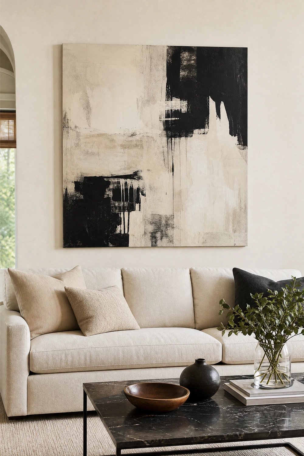
A single large-scale piece of art in black, white, cream, or monochrome placed above the sofa or on the focal wall is the alternative to a gallery wall that delivers higher visual impact at lower complexity. The scale is what makes it work: a piece that fills at least half the width of the sofa behind it anchors the wall and the furniture simultaneously in a way that smaller pieces cannot. Abstract, photographic, or graphic art in the palette’s colors functions as both an expression of the scheme and a personality element, and because the art stays within the black and cream range it never disrupts the palette regardless of the subject or style of the piece.
Quick Tip: Art does not have to be expensive to read as considered in a black and cream room. A large canvas painted in cream and black with simple abstract marks, a large-format black and white print in a good frame, or a striking piece of architectural photography all work at the right scale.
26. Style Open Shelves With a Black and Cream Object Edit
A black bookshelf or open shelving unit styled with objects that stay within the black and cream palette creates one of the most graphic and most controlled displays available in this scheme. Books with black or cream spines grouped together, cream ceramics of different heights, black metal bookends, a small plant in a black or cream pot, and a framed black and white print or two arranged deliberately with breathing room between groupings reads as a considered collection rather than storage. The edit is everything: remove any object that introduces a competing color and the display immediately becomes more powerful. What remains should be either black, cream, natural wood, warm metal, or green from a plant.
Reality Check: A shelf in a black and cream room that holds objects outside the palette, brightly colored books, coloured ceramics, items in varied materials with no palette relationship, disrupts the scheme at the most visible level. Either remove the outliers or display them inside closed storage.
27. Add Geometric or Abstract Pattern Through One Textile
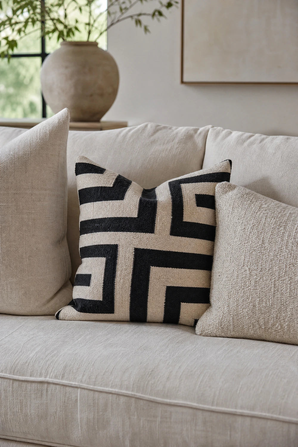
A strictly tonal black and cream room without any pattern can feel flat over time, because the eye has no movement to follow across the surfaces. Introducing one piece with a graphic black and cream pattern, a geometric cushion cover, a patterned throw, a printed rug, or patterned curtains, adds the visual movement that a tonal room needs without introducing a new color. The pattern should stay within the palette strictly: black and cream, or black, cream, and a warm neutral that sits within the scheme. One patterned element is enough in most rooms. Two competing patterns in a tonal palette read as confusion rather than interest, because there is no surrounding color contrast to mediate between them.
Pro Move: Place the patterned piece in the room’s most central or most viewed position: the largest cushion on the sofa, the rug under the seating zone, or the curtains at the window. The pattern earns more when it is the room’s deliberate focal point than when it competes with other elements for attention from a peripheral position.
Black and Cream Living Room: The Proportioning Guide
| Element | Palette Role | Tone | Notes |
| Walls | Foundation | Cream (dominant) | Warm undertone: yellow or pink base, not grey |
| Large area rug | Foundation | Cream or warm neutral | Size up: minimum 8×10 for most rooms |
| Main sofa or armchairs | Anchor | Cream (if dark floor/wall) or black (if cream dominant) | Never both a black sofa AND a black accent wall |
| Curtains | Structure | Cream fabric, black rod | Rod near ceiling, extended beyond frame each side |
| Coffee table | Central accent | Glass, light wood, or black with light top | Keep center open; avoid solid dark tables with a black sofa |
| Shelving or console | Display structure | Black | Style with cream and natural wood objects; paint back panel cream |
| Cushions and throws | Warmth layer | Cream in 3+ textures | Linen, boucle, velvet, knit: vary the material, match the tone |
| Lamp bases | Accent lighting | Matte black | Max 2-3 black bases; balance with cream shades |
| Art and frames | Display | Black frames, monochrome content | Gallery wall or one large-scale piece, not both |
| Metallic accents | Warm bridge | Brushed brass or aged gold | One metal family only; consistent across all hardware and accessories |
| Plants | Life and colour | Green in black or cream pot | One large plant reads better than multiple small ones |
| Pattern | Movement | Black and cream geometric or abstract | One patterned piece maximum; placed in the most central position |
The One Rule That Makes It Work
Every decision in a black and cream living room comes back to the same question: which side of the ratio does this push toward? A new lamp base, a new shelf, a new frame: each one either adds to the 70 percent cream or the 30 percent black, and the room’s entire visual success depends on keeping that proportion roughly in balance. When something feels off in a black and cream room, the answer is almost always that the black has crept past 40 percent without anyone noticing. Walk through the room, count the black elements, and remove or replace one. The room will improve immediately. The palette is not difficult. It just requires counting.