Green and Cream Bathroom Ideas That Start With the Right Shade of Green
Green and cream is one of the most naturally beautiful bathroom colour combinations available, rooted in the same organic relationship between foliage and stone, fern and limestone, leaf and parchment that has made this pairing feel instinctively right in interiors for centuries. But the word green covers an extraordinary range of bathroom experiences. A sage green bathroom with cream walls feels calm, organic, and gently spa-like. A forest green bathroom with cream accents feels botanical, warmly dramatic, and lushly layered. A deep emerald bathroom with cream stone feels rich, jewel-like, and genuinely luxurious. And a bathroom where green and cream come through tile, pattern, and material rather than solid wall colour feels the most complex and most personally expressive of all.
This article is organized by the specific shade of green first, because choosing the right green is the decision that determines every other choice in the room: which cream will sit alongside it without reading as dingy, which fixture finish connects the two tones, which tile material suits the depth of the green, and how much natural light the room needs to carry the palette comfortably. Find the shade of green that matches the bathroom you want, work through the ideas within that group, and then use the tile and pattern group at the end to find the most specific and most material-rich expressions of the combination that apply to any of the green shades above.
Sage and Soft Green With Cream: Calm, Organic, Earthy
Sage green is the most universally liveable version of green in bathroom design because it sits in the specific territory between grey and green where neither quality dominates and the result reads as genuinely natural and calm. Cream alongside sage is the most organic and most restoring combination available in a bathroom palette, and the two colours together consistently produce the spa-like atmosphere that most bathroom design aims for.
1. Sage Green Walls With a Cream Painted Vanity
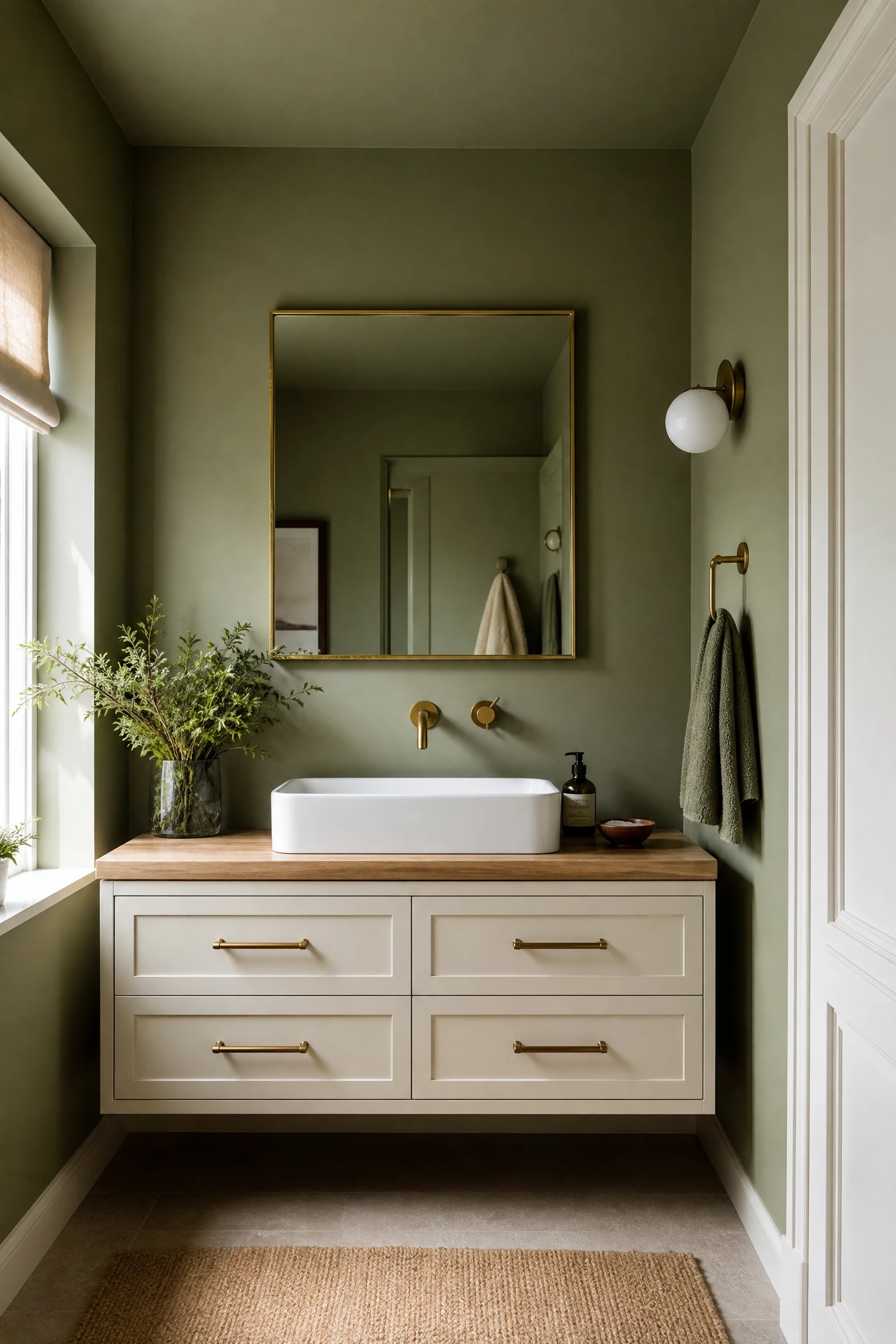
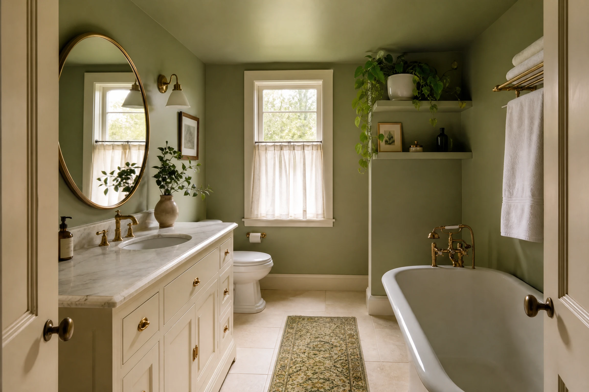
Sage green walls with a cream painted vanity is the most balanced and most considered starting point for a green and cream bathroom because it assigns each colour a clear role: the sage green envelops the room as the atmospheric backdrop, and the cream anchors the room at furniture level with warmth and material weight. The contrast between the two colours is gentle rather than sharp because sage and cream share a similar depth of saturation, and the result is a bathroom that reads as one cohesive palette rather than a green room with a white vanity that happens to be slightly off-white. Warm cream, in a tone with a yellow or ochre rather than grey undertone, suits sage green most naturally because both colours share a connection to the warm, earthy palette of the natural world. A cream vanity with a natural timber countertop, brushed brass hardware, and a simple rectangular basin in white ceramic is the most organic and most considered companion for sage green walls.
Pro Move: Paint both the walls and the ceiling in the same sage green rather than keeping the ceiling white. A sage green ceiling above sage green walls creates an enveloping quality that makes the bathroom feel genuinely immersive and spa-like, and the cream vanity reads as a warm focal point within the green rather than a contrasting element in a two-tone room. The cream vanity and the brass hardware become the only visual warmth in a room that is otherwise a single cohesive colour, which makes them register with unusual clarity and presence.
2. Cream Walls With Sage Green Accents and Natural Timber
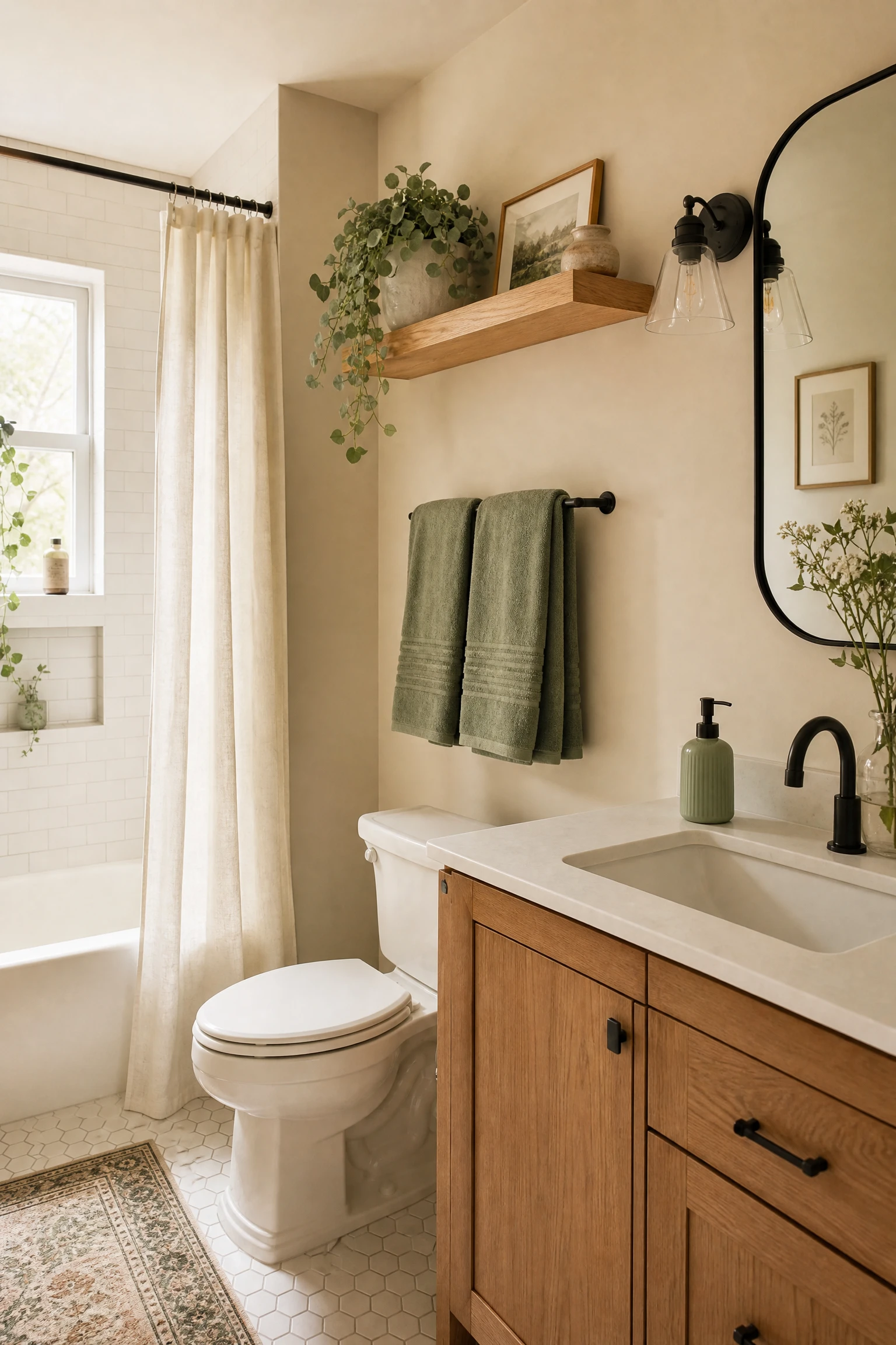
In a bathroom where the structural commitment of painting walls green feels too significant, cream walls with sage green accents through textiles, accessories, and one painted element, alongside natural timber in the vanity, mirror frame, or shelf, creates a version of the palette that reads as warm and nature-connected without requiring any irreversible decisions. A cream wall bathroom with sage green towels, a sage bath mat, sage green ceramic accessories, one trailing plant in a cream ceramic pot, and a natural oak floating shelf is a bathroom that reads as green and cream without any green paint on the walls. The sage comes through the organic, changeable elements, which also means the palette can be updated or shifted without any repainting. The cream walls allow maximum light reflection, which makes this the most practical version of the combination for bathrooms with limited natural light.
Designer Advice: In a cream-walled bathroom with sage green accents, use at least three separate positions where the sage appears: wall level in the towels and bath mat, mid-level in a ceramic accessory or small object, and high level in a trailing plant or framed print. The repetition of the sage tone at different heights creates the sense of a cohesive designed palette rather than a set of green accessories in an otherwise cream room.
3. Sage Green Vanity in a Cream Tiled Bathroom
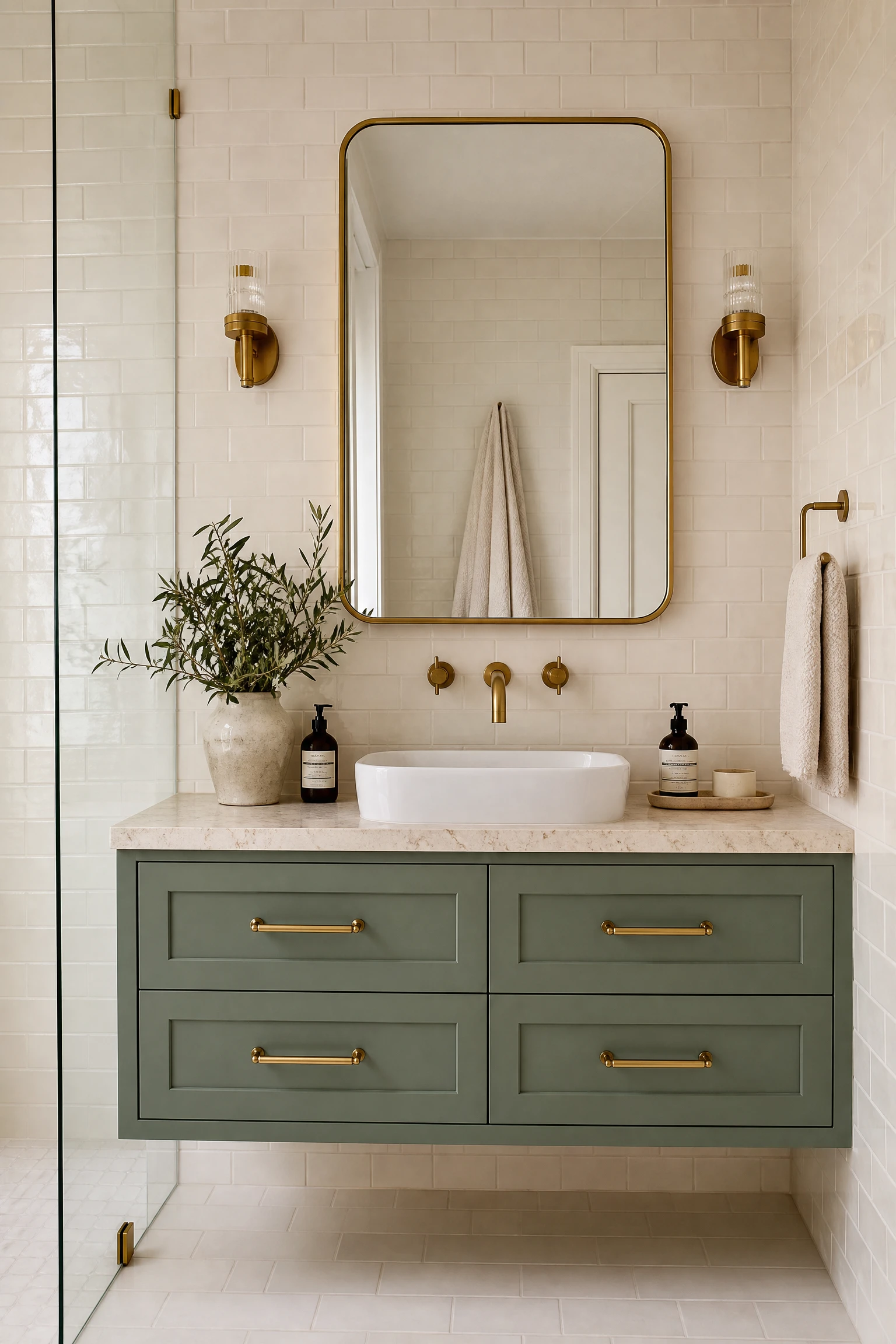
A sage green painted or lacquered vanity in a bathroom where the tile is cream or off-white throughout creates the most focused version of the palette because the green is contained to a single piece of furniture and the cream tile provides the neutral backdrop that lets the vanity read clearly as a colour choice rather than a default. This combination works particularly well in smaller bathrooms where the full wall area cannot absorb a coloured paint without the room feeling enclosed. The sage vanity provides the botanical warmth and personality of the palette, the cream tile maintains the brightness and spaciousness, and the combination together reads as more sophisticated than the same tile with a standard white vanity. Brushed brass hardware on the sage vanity connects the warmth of the cream tile with the warmth of the green, and the result is a bathroom with a material richness that is genuinely surprising from such a modest and affordable set of changes.
Quick Tip: Paint the inside of the sage green vanity cabinet in the same sage colour as the exterior. When the doors are open during daily use, the sage interior is visible and extends the colour into the practical, functional interior of the vanity. This small detail costs nothing but makes the paint decision feel thorough and deliberate rather than a surface-level change.
4. Soft Mint or Pale Green in a Small Bathroom With Cream Fixtures
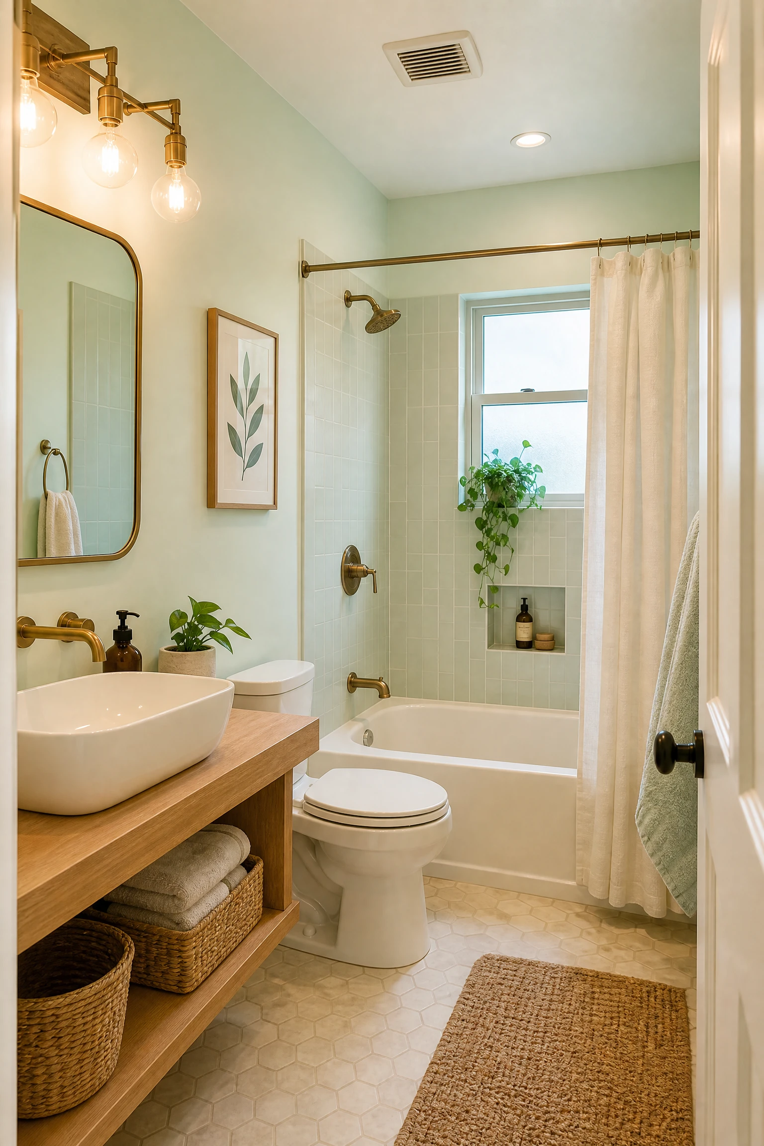
Very pale mint or soft pistachio green, lighter in saturation than sage but sharing the same warm-green quality, creates the most light-enhancing and most space-expanding version of the green and cream bathroom because both the pale green and the cream reflect maximum light back into the room. In a compact bathroom without a window or with a small north-facing window, pale mint walls with cream fixtures, a cream or warm white vanity, and cream-toned stone or ceramic tile creates a bathroom that feels genuinely brighter than the same space with white walls, because the slight warmth and organic quality of the mint reads as more atmospheric and more considered than pure white while reflecting almost as much light. Cream fixtures in this context means choosing a warm-toned white for the toilet, sink, and bath rather than a bright clinical white, which would fight the warmth of the mint and create a harsher contrast than the combination needs.
Heads Up: Pale mint and very light green paint colours have a yellow-green quality that can make skin tones appear slightly greenish under certain artificial light conditions, specifically under cool or fluorescent overhead bathroom lighting. Warm-toned bulbs at 2700K to 3000K in all bathroom light sources prevent this colour-casting effect and maintain the flattering, organic quality of the pale green palette in evening conditions when artificial light is the primary source.
5. Sage Green Panelling Below a Cream Upper Wall
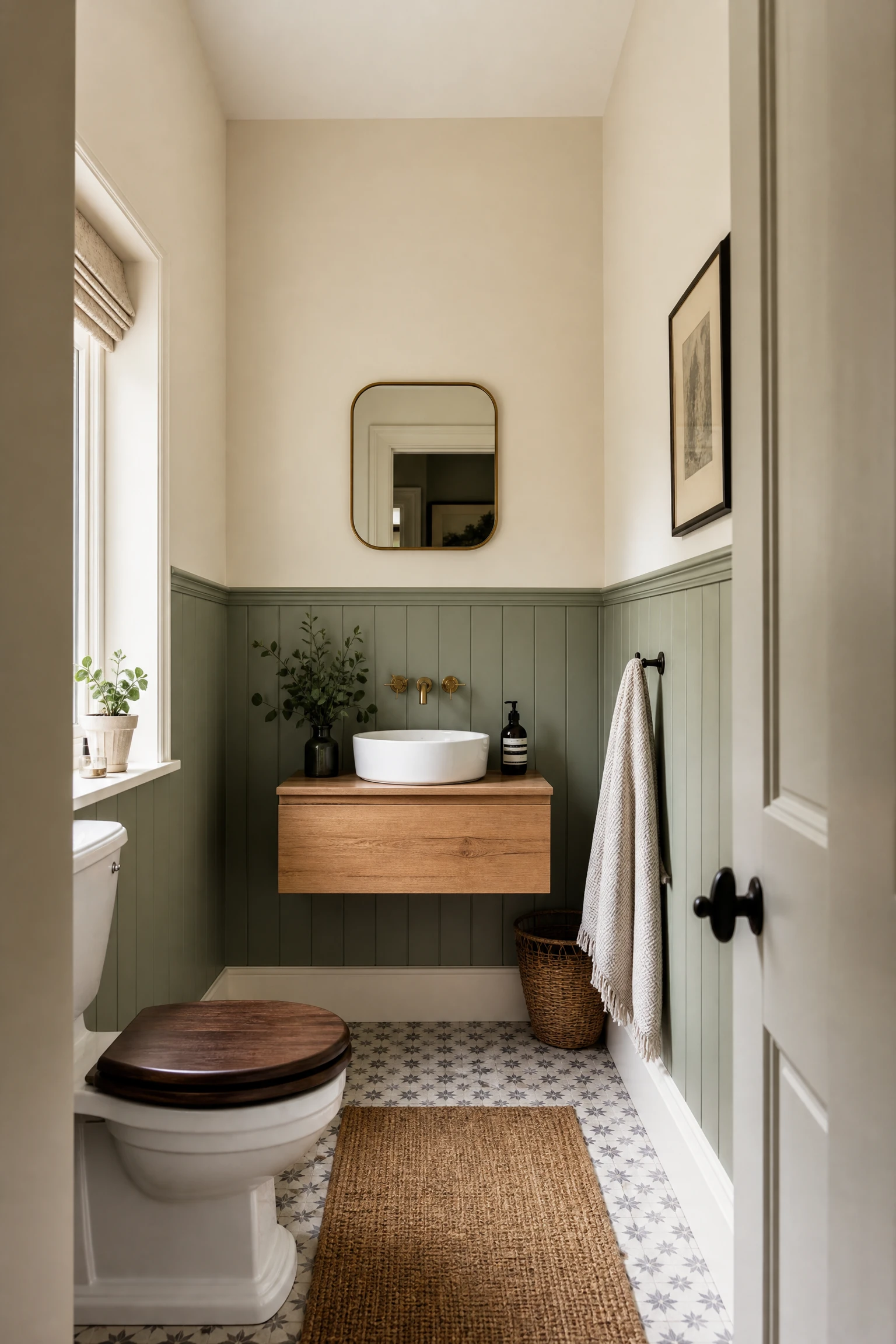
Two-tone wall panelling with sage green painted lower panels and a cream upper wall creates the most architectural and most historically grounded version of the sage and cream bathroom, because the combination references the Victorian and Edwardian bathroom tradition of painted lower wall wainscoting alongside plaster upper walls in a way that feels genuinely domestic and genuinely characterful rather than simply decorative. The sage green panelling provides the colour energy and botanical quality of the palette at the zone below dado rail height where it is most tactile and most noticed at daily use height, and the cream upper wall keeps the room bright and open above eye level where the visual weight of a coloured wall would be most felt. This combination also works across a very wide range of bathroom sizes: in a small bathroom, the two-tone division makes the room feel taller by drawing the eye to the horizontal line of the dado rail. In a large bathroom, the panelling adds architectural depth that a plain painted wall cannot.
Reality Check: Painted tongue-and-groove or MDF panelling in a bathroom requires a durable, washable finish to survive the moisture and splashing of daily bathroom use. A minimum of eggshell or satin paint finish on the panels, ideally with a bathroom-specific paint that has additional moisture resistance, is the practical requirement. Flat or chalky finish paints on bathroom panelling, however beautiful the colour, will mark, absorb moisture, and peel within months.
| Green Shade | Cream Pairing | Best Brass Tone | Mood | Light Requirement |
| Sage green | Warm ochre-cream | Brushed or aged brass | Calm, spa-like, organic | Any, most versatile |
| Soft mint | Warm cream fixtures | Brushed gold | Fresh, light, botanical | Any, best for small rooms |
| Forest green | Aged parchment cream | Unlacquered brass | Dramatic, rich, botanical | Good natural light |
| Olive green | Sandy warm cream | Antique brass or bronze | Earthy, Moroccan, layered | Any |
| Deep emerald | Cool marble cream | Polished or brushed brass | Luxurious, jewel-like | Generous light needed |
| Dark hunter green | Ivory or bone cream | Burnished brass or gold | Rich, moody, classic | Strong light required |
Forest and Olive Green With Cream: Warm, Botanical, Dramatic
Forest green and olive green share a warmth and depth that sage lacks, and alongside cream they create a bathroom that feels genuinely enveloping and botanically rich rather than simply calm. These are the greens that belong to ferns, dense hedgerows, Mediterranean hillsides, and English walled gardens, and alongside cream they produce bathrooms that feel like genuine retreats with a strong sense of place.
6. Forest Green Painted Walls With Cream Stone Floor
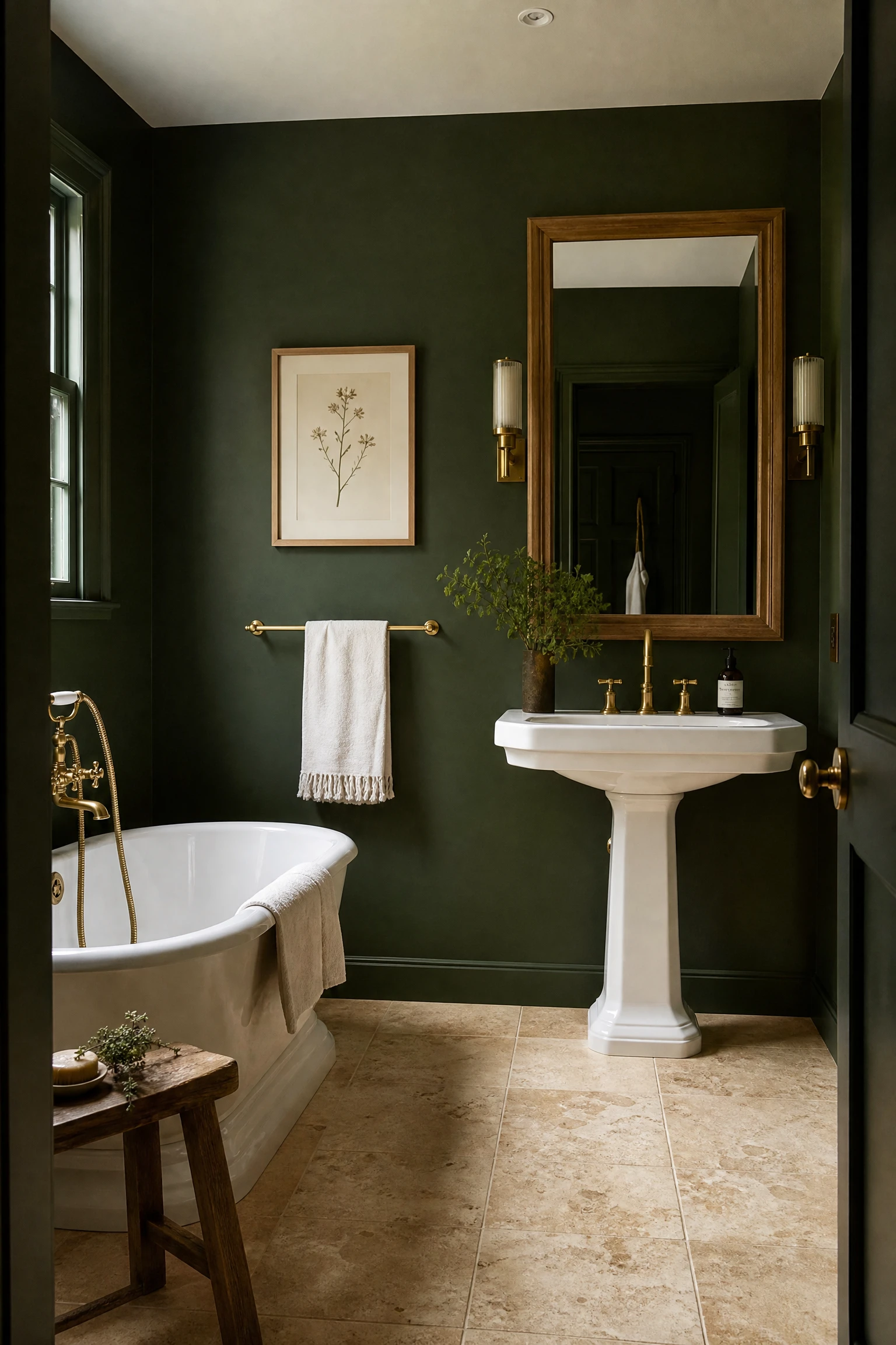
Forest green painted walls, in a tone like Farrow and Ball Calke Green, Vardo, or Studio Green, alongside a cream or warm stone floor in limestone, travertine, or a cream-toned large-format porcelain, creates the most naturally lush version of the green and cream bathroom because the relationship between dark botanical green walls and warm fossil-toned stone floor directly references the material palette of a garden or greenhouse where dark foliage grows above warm stone. The warmth of the cream stone at floor level prevents the forest green walls from reading as heavy or oppressive, because the floor is the lightest and warmest element in the room and provides visual relief at the point where it is most needed. White fixtures, a white or cream free-standing bath if the bathroom is large enough, and brushed brass or unlacquered brass fixtures complete the palette without introducing any element that fights the organic warmth of the green and cream relationship.
Pro Move: Choose a cream stone floor with visible veining, fossil inclusions, or natural variation in tone rather than a perfectly uniform cream tile. The natural imperfection and variation of a genuine limestone or travertine, or a high-quality stone-effect porcelain that replicates this quality, creates a floor surface that has the same organic, living quality as the forest green walls and makes the relationship between the two palette colours feel genuinely connected rather than simply colour-coordinated.
7. Forest Green Vanity With Cream Marble Countertop
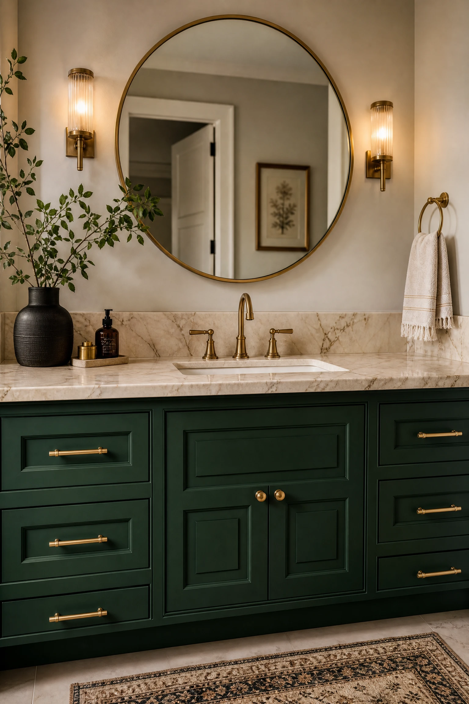
A forest green painted or lacquered vanity with a cream or warm-toned marble countertop is one of the most luxurious single furniture decisions available in a green and cream bathroom, because the contrast between the botanical depth of the green and the mineral warmth of the cream marble creates a material relationship that reads as genuinely expensive regardless of the actual cost of the individual pieces. Cream-toned marble, whether genuine Crema Marfil, Botticino, or a high-quality porcelain that replicates these warm marble tones, has a warmth and fossil richness that connects naturally to the organic quality of forest green. Brushed or unlacquered brass hardware on the forest green vanity introduces a metallic warmth that bridges the two palette colours and prevents either the green or the cream marble from reading as too cool or too detached from the other.
Designer Advice: A forest green vanity with a cream marble countertop needs a mirror frame in a warm material, either natural timber, brushed brass, or an antique-effect finish, to complete the connection between the green and cream palette at eye level. A standard frameless mirror or a mirror in a cold chrome or silver frame in this context creates a visual interruption between the warm palette of the vanity below and the warm palette of the surrounding room.
8. Olive Green Walls With Cream Woodwork
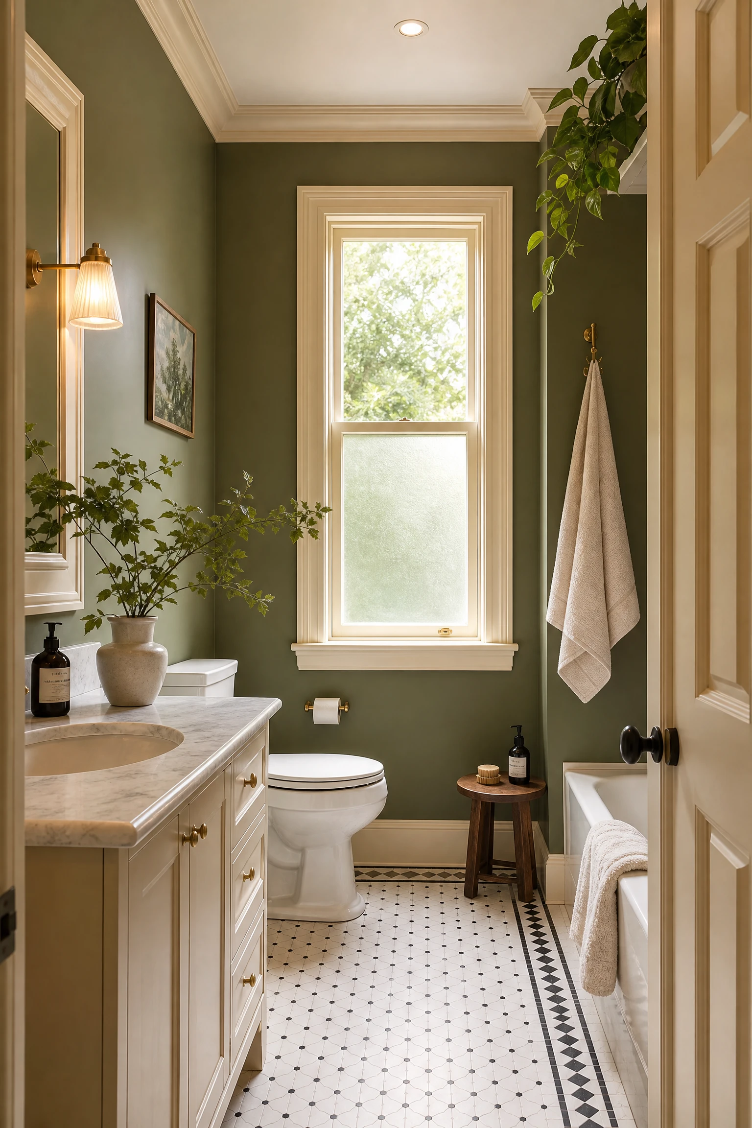
Olive green walls with cream painted woodwork, including skirting boards, door architrave, window frames, and any built-in timber shelving in the bathroom, create the most sophisticated and most timeless version of the olive and cream bathroom because the cream woodwork does not just provide contrast with the olive but actively frames and defines every architectural element of the room. The olive green recedes behind the cream woodwork outlines and the bathroom reads as a precisely considered two-tone composition where the structure of the room is made visible through the cream that traces it. Olive green specifically suits this approach because its warm, slightly yellow-green quality connects naturally to the warmth of an aged or antique cream, and the two tones together produce the specific quality of a well-kept period interior where both colours have been chosen to honour the architecture of the room rather than to impose a contemporary palette onto it.
Quick Tip: Use the same cream colour on all the woodwork elements in the room, including the skirting, architrave, window frame, and any cupboard or shelf unit, rather than different whites or creams on different elements. The visual coherence of a single cream throughout the woodwork is the quality that makes this combination read as designed rather than assembled, and even a small variation in cream tone between the skirting and the shelf can be visible in raking light.
9. Forest Green Shower Enclosure With Cream Surrounding Walls
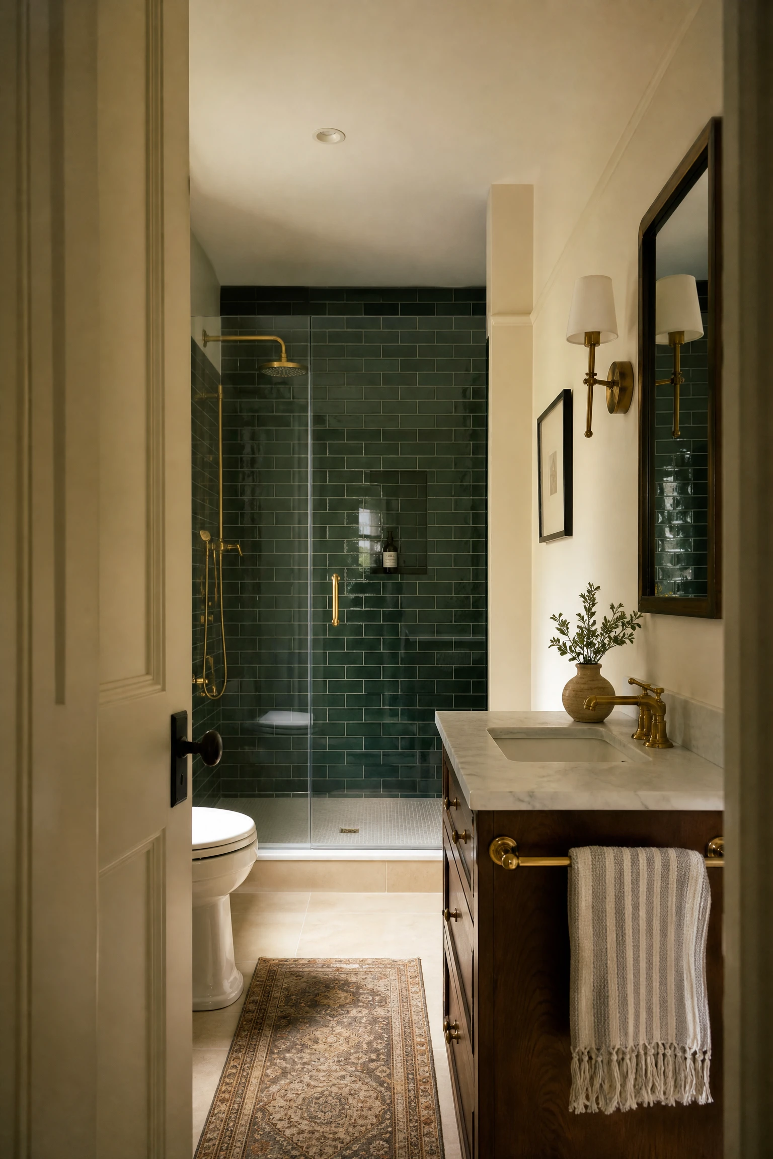
Tiling the shower enclosure in a forest green tile, whether in a classic subway format, a large-format stone-effect tile, or a zellige-style handmade green tile, and keeping the surrounding bathroom walls in a warm cream paint or cream tile creates the most dramatic spatial division available in the green and cream bathroom, because the shower becomes a distinct, jewel-like zone within the larger cream room. Looking into a green-tiled shower from a cream-walled bathroom creates a sense of depth and discovery that a uniformly coloured shower enclosure never achieves, and the green tiles visible through the glass or open entrance of the shower function almost like a work of art in the bathroom, seen from the vanity or the door as a richly coloured panel within the cream room. This approach also has the practical advantage of concentrating the most expensive or most labour-intensive element, the coloured tile, within the shower enclosure where its surface area is limited, rather than across the full bathroom.
Heads Up: Handmade or zellige-style green tiles vary significantly in tone between tiles and between tile batches, which creates a lively, artisanal surface quality but can also create visible colour variation if tiles from different batches are mixed. Always order the full quantity of tiles needed for the project from the same batch number at the same time, and order 10 to 15 percent more than the calculated area to account for cuts, breakages, and future replacements.
10. Olive and Cream With Moroccan or Global Textile Accents
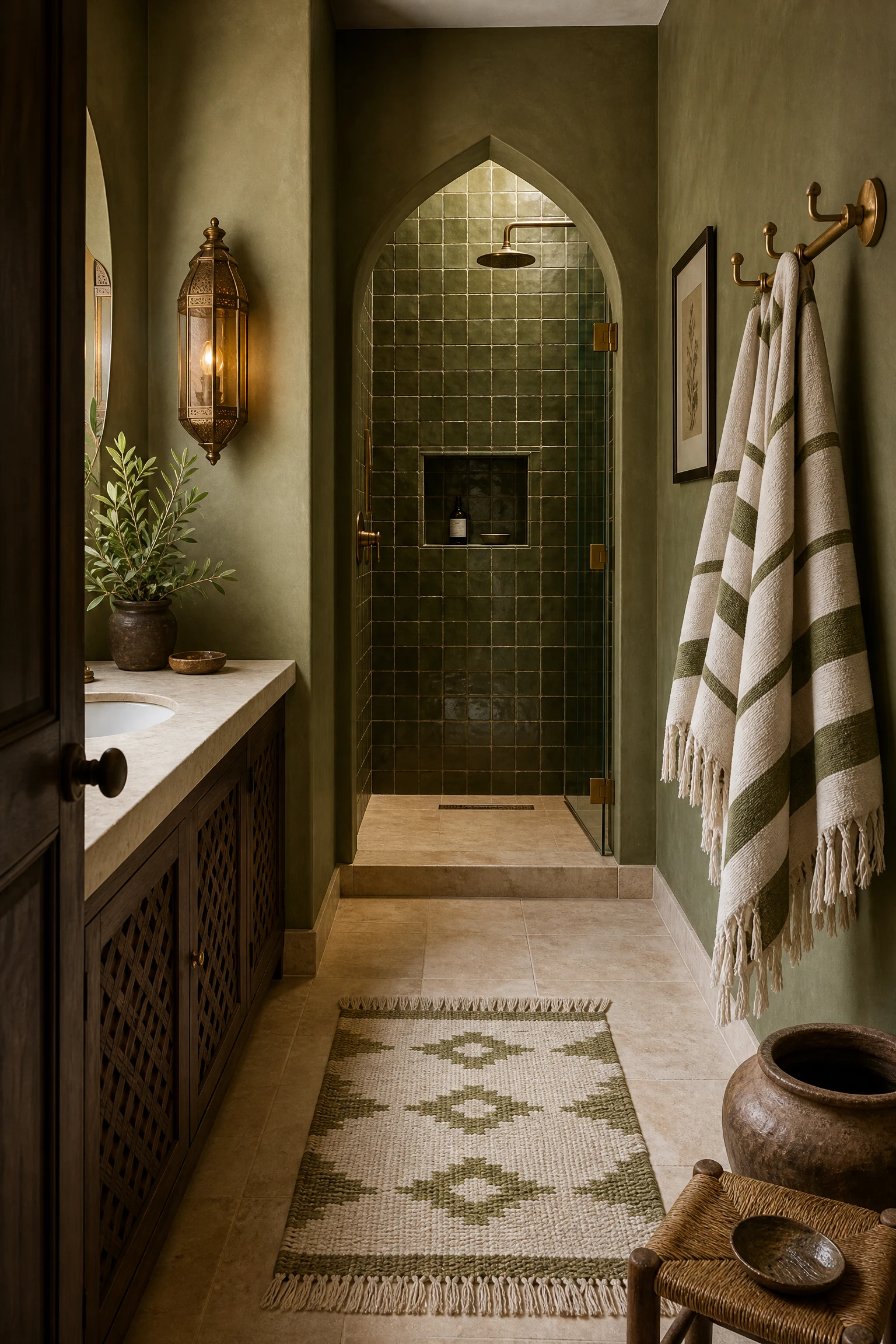
An olive green and cream bathroom that draws on Moroccan, Mediterranean, or broadly global textile traditions, with a handwoven bath mat in warm olive and cream tones, a zellige-inspired tile in the shower, brass lantern-style light fittings, and ceramic accessories in warm earthy glazes, creates the most characterful and most personally expressive version of this palette. The olive green in a global-inspired bathroom reads less as a specifically botanical green and more as an earthy, mineral tone that connects to Mediterranean architecture, Moroccan tiles, and Middle Eastern craft traditions, all of which have used warm olive-toned greens and creams alongside natural materials for centuries. The addition of global textile accents, a handwoven rug, a printed cotton towel in traditional patterns, or a hammam-style peshtemal in cream and olive stripes, completes the cultural reference and makes the palette feel genuinely specific rather than generically earthy.
Reality Check: A globally-inspired olive and cream bathroom works best when the natural materials, warm brass, handmade ceramics, and woven textiles are genuinely handmade or genuinely artisan in quality rather than mass-produced versions that simulate the look without the material quality. The authenticity of the materials is what makes the combination read as collected and considered rather than themed and decorative.
Dark and Deep Green With Cream: Rich, Moody, Luxurious
Dark and deep greens, including emerald, hunter green, bottle green, and deep British racing green, create the most dramatic and most genuinely luxurious version of the green and cream bathroom. Alongside cream, these deep greens create a room that reads as a private, jewel-like retreat that is completely distinct from the spa-like calm of sage or the botanical warmth of forest green. These combinations need good lighting and confident styling, but when they are executed well they produce bathrooms that feel genuinely extraordinary.
11. Deep Emerald Walls With Cream Stone and Brass
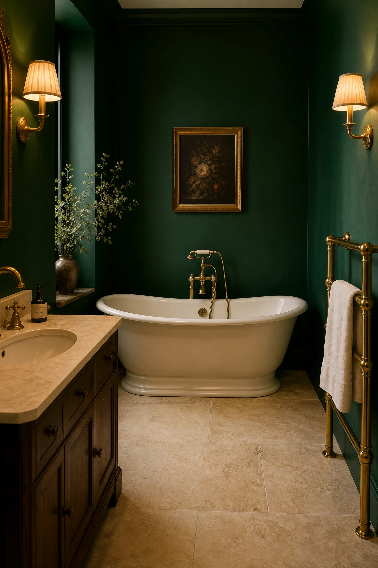
Deep emerald green walls, in a fully saturated jewel-tone green rather than a muted or dusty version of the colour, alongside cream stone flooring and warm brass fixtures create the most opulent and most visually striking version of the green and cream bathroom. The depth and richness of emerald green reflects light from brass fixtures in a way that no lighter green can replicate: the warm gold of a brass tap against a fully saturated emerald wall creates a visual relationship that reads as genuinely luxurious rather than simply well-coordinated. The cream stone floor provides the necessary warm relief from the intensity of the emerald walls and prevents the bathroom from reading as a single dominant colour mass. White or cream free-standing fixtures, a roll-top bath or a pedestal sink, maintain the brightness at the centre of the room while the green walls create the enveloping, richly coloured atmosphere around them.
Pro Move: In a deep emerald bathroom, use warm-toned bulbs at 2700K in all light sources and consider adding a secondary warm light source, a wall sconce with an amber glass shade or a pendant with a warm linen shade, alongside the standard ceiling fitting. Emerald green walls in cool or daylight-spectrum light can read as blue-green or slightly cold. In warm-toned artificial light, the same walls take on a richly jewelled quality that is one of the most beautiful colour-light relationships available in interior design.
12. Hunter Green Vanity in a Cream and Marble Bathroom
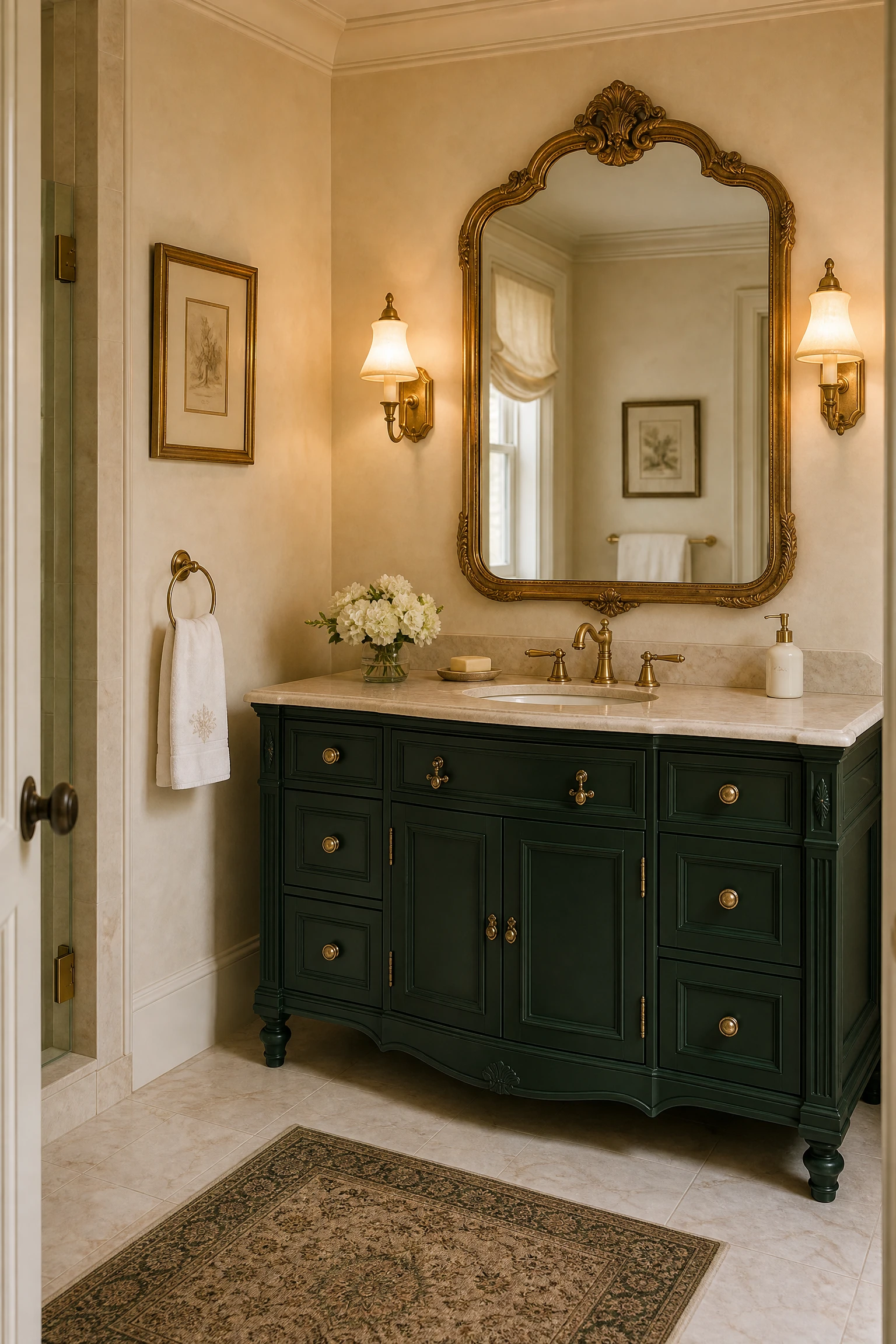
A hunter green painted vanity, in a deep, slightly blue-toned British racing green or a deep bottle green, within a bathroom where the walls are cream or warm white and the floor and shower are in a cream marble or stone, creates the most classic and most timeless version of the deep green and cream palette at furniture scale. Hunter green has a formality and depth that lighter greens lack, and in a cream and marble bathroom it functions almost like a piece of fine furniture in a formal sitting room: the vanity reads as a deliberate and significant design choice that anchors the room aesthetically rather than simply providing storage and a basin. Polished or burnished brass hardware on a hunter green vanity, a large round or arched mirror in a gilt or warm brass frame, and warm lighting from a pair of traditional wall sconces complete the combination in a way that reads as genuinely considered and genuinely enduring.
Designer Advice: Hunter green in the specific paint formulations of quality heritage paint brands, Farrow and Ball, Little Greene, or Fired Earth, has a depth and luminosity that cheaper equivalents cannot replicate, because the pigment quality in premium paints creates a richer, more complex surface that changes subtly with the light rather than reading as a flat block of colour. For a bathroom feature as permanent as a vanity, the investment in a quality paint is justified by the resulting depth of colour.
13. Deep Green Ceiling in a Cream Bathroom
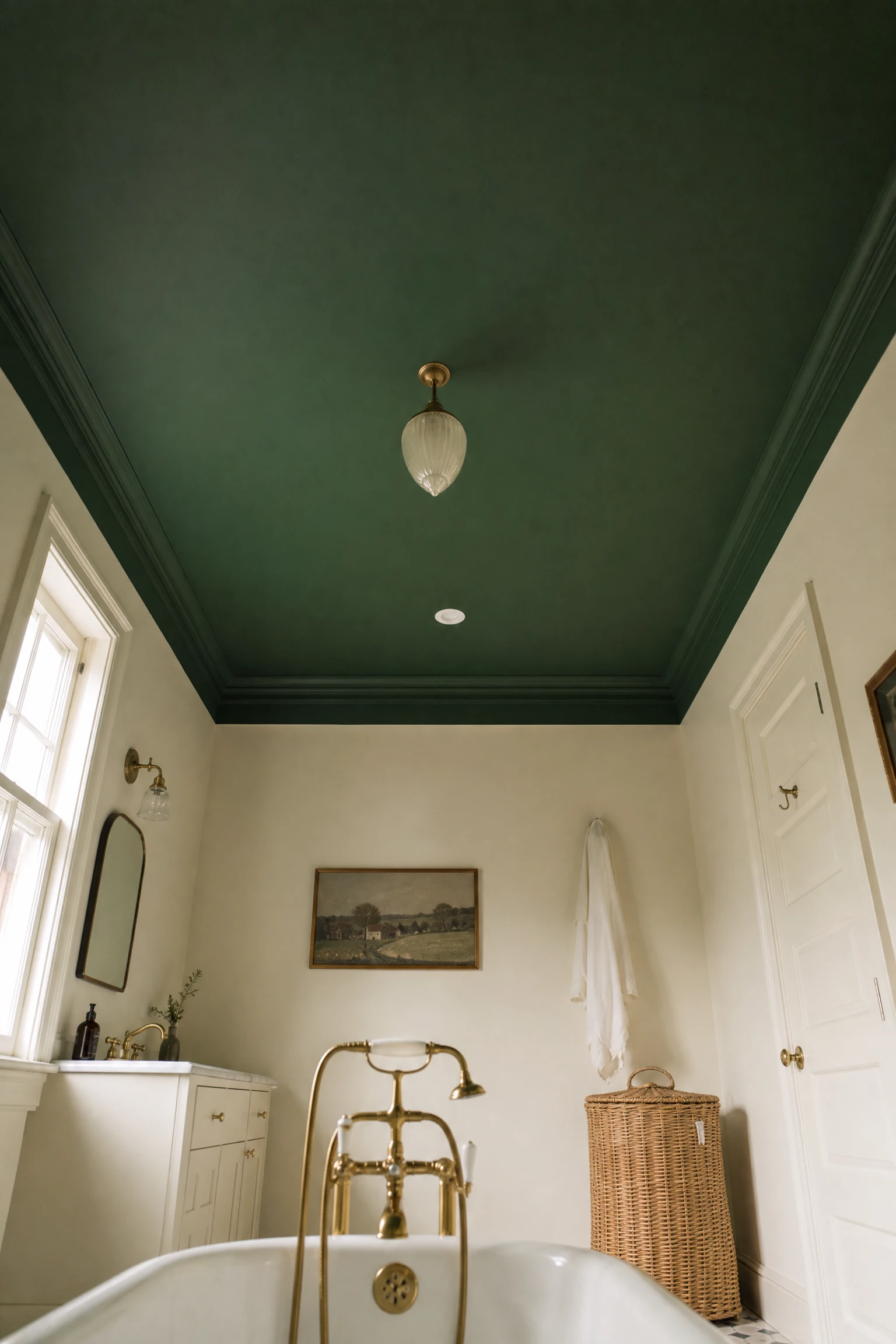
Painting the bathroom ceiling in a deep green, whether emerald, bottle green, or a rich forest tone, while keeping the walls in cream or warm white and the floor in a natural material, creates one of the most unexpected and most dramatically beautiful small-scale applications of deep green in a bathroom. The ceiling is the surface that most affects the perceived atmosphere of a room without dominating the visual field at standing height, and a deep green ceiling in a cream bathroom creates the specific effect of being under a canopy of foliage in a room that is otherwise warm and light. Looking up at a deep green ceiling from a cream-walled bathroom, particularly when lying in a bath, creates a visual experience that is genuinely distinctive and memorable in a way that any amount of accessory or tile work cannot replicate. The ceiling approach also has the practical advantage of being a low-effort, low-permanence change: a ceiling is painted more quickly than a wall and requires less preparation, and repainting it to a different colour is a weekend project.
Reality Check: A deep green ceiling makes the room height appear lower rather than higher, because the dark ceiling absorbs light from above rather than reflecting it. In bathrooms with high ceilings, this quality creates the cocoon-like intimacy that makes the effect so beautiful. In bathrooms with standard or low ceilings, the same dark ceiling can make the room feel cramped. Test the ceiling height against your comfort before committing: a standard 2.4 metre ceiling can carry a deep green ceiling comfortably, while a very low 2.1 metre ceiling may feel oppressive with a saturated dark tone overhead.
14. Full Dark Green and Cream Colour Drenching
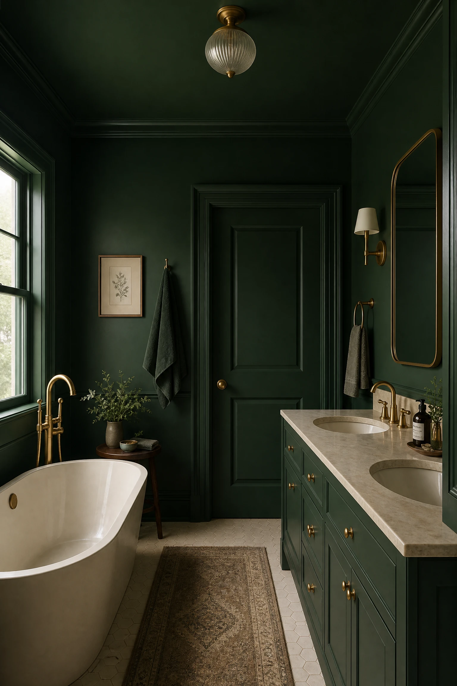
Colour drenching a bathroom in a deep green, painting not just the walls but the ceiling, the door, the window frame, the skirting, and any built-in timber in the same deep green tone, while keeping the fixtures, fittings, and furniture in cream or warm white, creates the most immersive and most committed version of the dark green and cream bathroom. The technique of colour drenching removes all the visual interruptions created by different-coloured architectural elements and creates a room that reads as a single, enveloping colour experience rather than a painted room. Within the deep green shell created by colour drenching, cream fixtures, a cream-coloured free-standing bath, cream or marble countertops, cream towels, and warm brass hardware each stand out with unusual clarity and presence because they are the only warm, light elements in an otherwise uniformly dark and richly green room. The contrast between the colour-drenched green and the cream elements is the most powerful version of this palette and the one that creates the strongest impression on entering the room.
Quick Tip: When colour drenching in a deep green, use a slightly lighter version of the green on the ceiling than on the walls, even if the difference is only one shade lighter on the same paint card. The ceiling naturally receives less light than the walls and a deep colour applied uniformly to both reads as darker on the ceiling than intended. The lighter ceiling version maintains the visual connection to the wall colour while preventing the ceiling from becoming the darkest and heaviest element in the room.
“Green and cream is the colour palette of the natural world itself. Every forest floor has this relationship: the deep canopy of leaves above, the warm pale stone and parchment of the ground below. A bathroom built on this combination borrows its beauty from something far older than interior design.”
15. Deep Green Wainscoting With Cream Upper Walls and Ornate White Fixtures
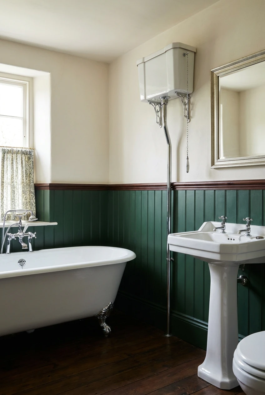
Deep green wainscoting or tongue-and-groove panelling from floor to dado rail height in a bathroom with cream upper walls and white or cream ornate period fixtures, a roll-top bath with ball-and-claw feet, a high-level cistern toilet, a traditional pedestal sink, creates the most classic and most specifically historical version of the deep green and cream bathroom, rooted in the Victorian and Edwardian bathroom tradition where deep greens and rich creams were the standard palette of the well-appointed domestic bathroom of that era. The combination of the deep green lower panelling and the cream upper wall places the most visually weighted colour at the lower portion of the room where it grounds the space without reducing the light reflection at the upper wall level, and the white period fixtures provide the neutral centrepieces around which the green and cream palette organizes itself. Chrome or nickel fixtures in this context are appropriate for the period quality of the design; brass would push the combination toward more contemporary territory.
Heads Up: Deep green panelling in a period-style bathroom needs to be in a genuinely deep, fully saturated green rather than a muted or dusty green that will read as faded and slightly tired against the cream upper wall. The visual success of this combination depends on the contrast between the depth of the green and the warmth of the cream being clearly legible: a muted or grey-green alongside cream can read as a colour that failed to commit rather than one that was carefully chosen.
Green and Cream Through Tile and Pattern
In this group, green and cream come through the material surface of the bathroom rather than through solid wall paint or cabinet colour. Tile, pattern, and material finish deliver both colours simultaneously within a single surface, creating the most complex and most enduring expression of the combination because the texture and material quality of tile adds a dimension that paint alone cannot achieve.
16. Cream Zellige Tiles With Green Grout
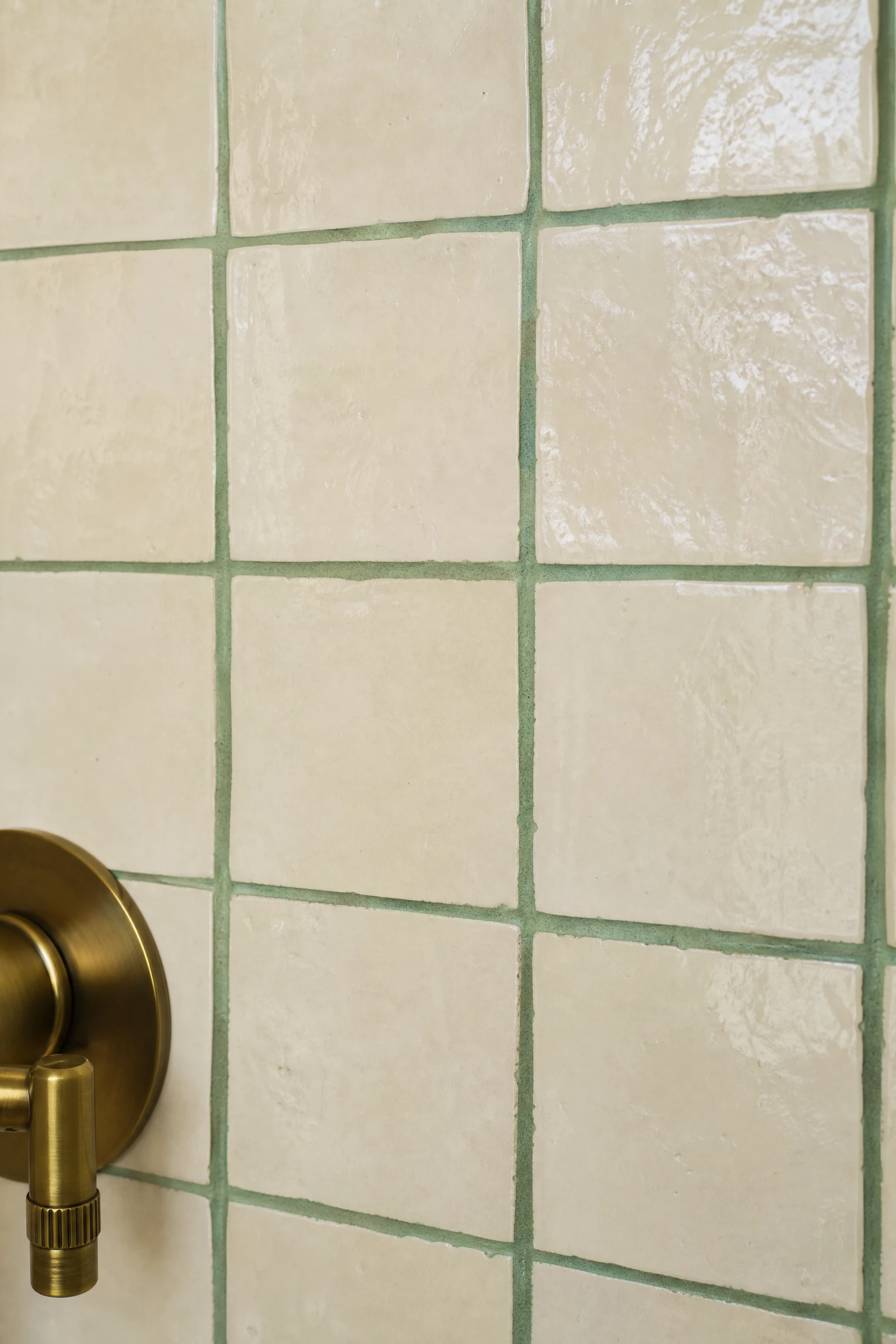
Cream or off-white zellige tiles, the small handmade Moroccan tiles with a slightly irregular glaze and surface texture, grouted with a sage or forest green grout, create a bathroom surface where the green and cream relationship exists at the smallest possible scale: between each individual tile and the line between them. The overall impression from across the bathroom is a warm cream surface with a subtle green grid, and at close range the combination reveals itself as a richly textural and material-rich surface where both colours are active and present. The green grout on cream zellige in a bathroom with natural timber vanity, brass fixtures, and warm cream-painted walls reads as one of the most gently artisanal and most genuinely characterful bathroom surfaces available, and the maintenance requirement of sealing coloured grout is the only practical consideration that needs to be planned for before installation.
Designer Advice: Choose a sage or medium green grout rather than a very dark green grout with cream zellige. A very dark green grout against cream tiles creates a very strong visual grid that reads as graphic and slightly heavy at scale. A softer sage green grout creates a more gentle, more organic grid that reads as a surface quality rather than a dominant pattern.
17. Green and Cream Encaustic or Cement Floor Tiles
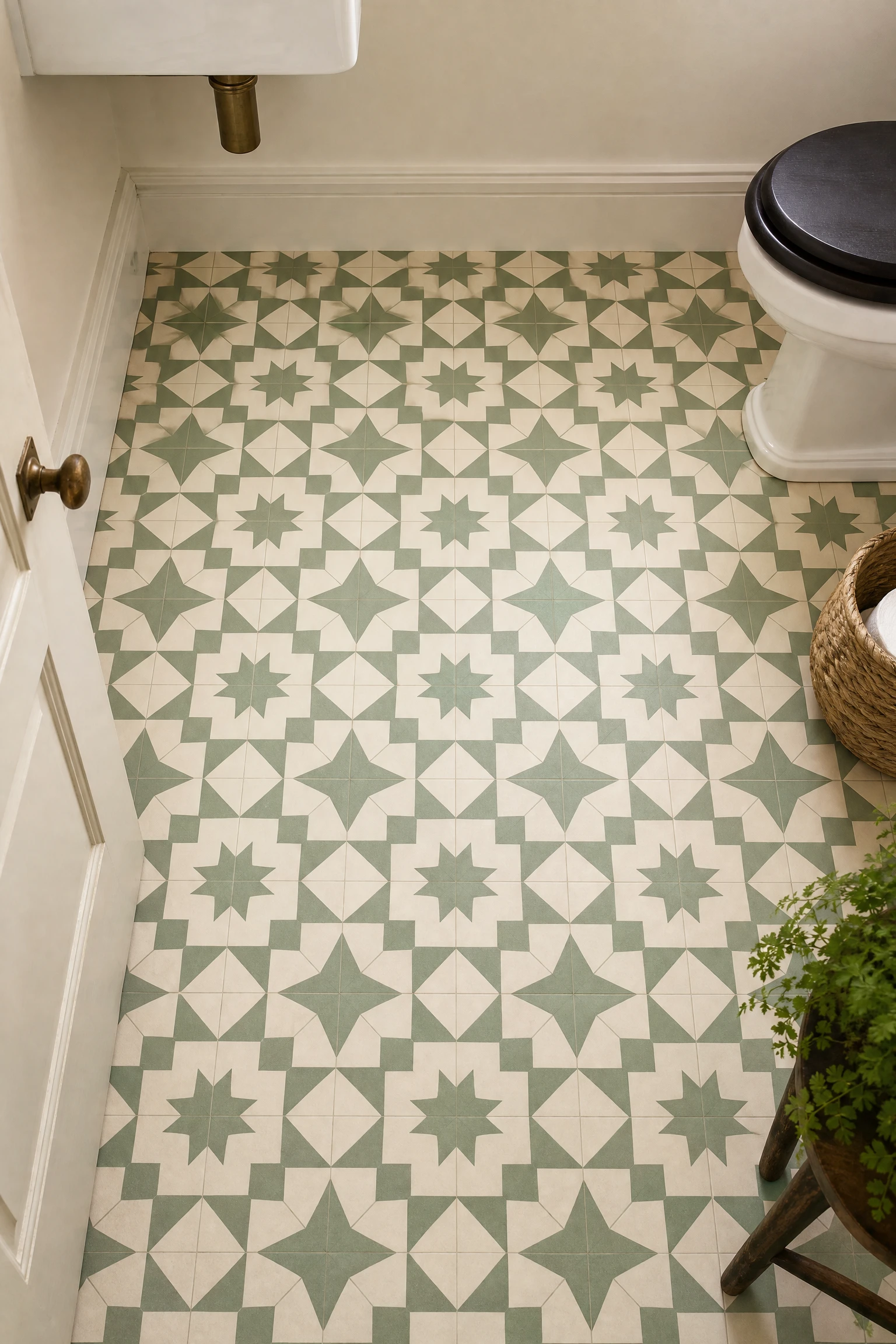
Encaustic or cement-look floor tiles in a pattern that carries both green and cream in their design, whether a classic Victorian-inspired geometric, a Moroccan star and cross pattern, a simple two-colour hexagonal arrangement, or a floral encaustic in sage and cream, create a bathroom floor that establishes the full green and cream palette from the ground up, allowing the walls to be kept in a neutral cream or warm white that serves as the calming backdrop for the patterned floor to perform against. The green and cream floor tile approach is both the most historically rooted, as genuine encaustic floor tiles were the standard floor covering in Victorian domestic bathrooms, and the most currently fashionable application of this palette. The combination of a green and cream patterned floor with cream painted walls, a natural timber vanity, and brass fixtures creates a bathroom with a layered, collected quality that is simultaneously vintage and completely current.
Quick Tip: Keep the walls and all other surfaces in the bathroom completely plain and neutral when using a green and cream patterned floor. A patterned floor in a bathroom with patterned walls creates visual competition that makes both surfaces read as less considered than either would be with a plain background. The floor pattern is the design statement; everything else should support it without competing.
18. Green and Cream Striped Wall Tile
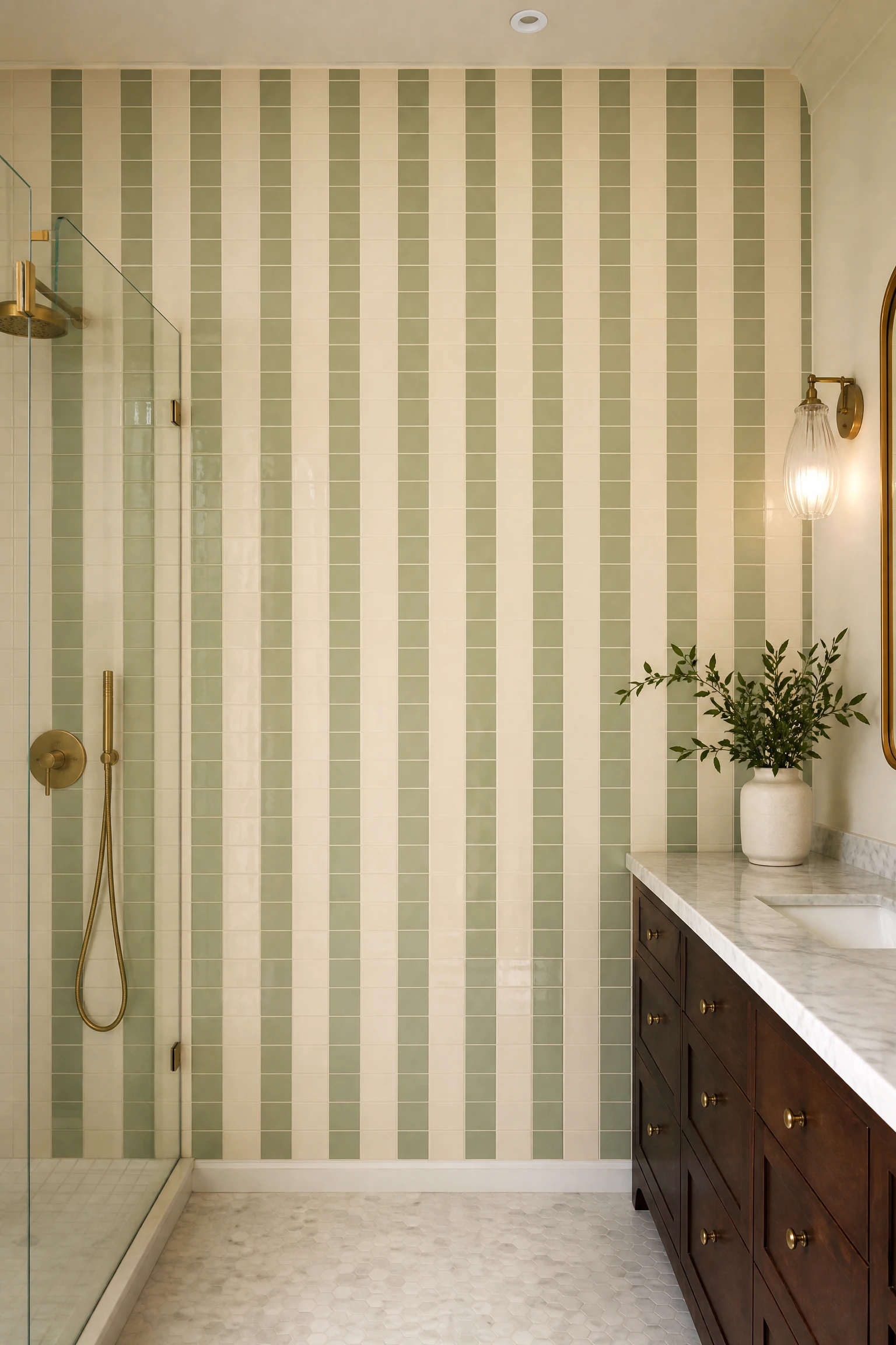
Vertical or horizontal striped wall tiling in alternating green and cream tiles creates one of the most graphic and most deliberately designed surfaces available in the green and cream bathroom, and the specific tile format determines the character of the result significantly. Narrow vertical stripes in slim cream and sage green tiles create a refined, almost Art Deco quality that suits a contemporary bathroom with clean lines and restrained accessories. Wide horizontal bands in contrasting green and cream subway tiles create a bolder, more playful result that suits a bathroom with personality and character. The grout choice within a striped tile arrangement should be in the lighter of the two tile colours to maintain the clarity of the stripe pattern rather than creating a third colour element that interrupts the two-tone composition.
Reality Check: Striped wall tiling requires extremely precise installation to maintain the alignment of the stripes across the full height of the wall and through any corners, window reveals, or electrical fitting cutouts. A stripe that drifts even slightly from true vertical or horizontal becomes increasingly visible as the eye follows it across the surface. Specify a highly experienced tiler and request a test section of at least four or five stripe widths before the full installation proceeds.
19. Green Handmade Tile Shower in a Cream Bathroom
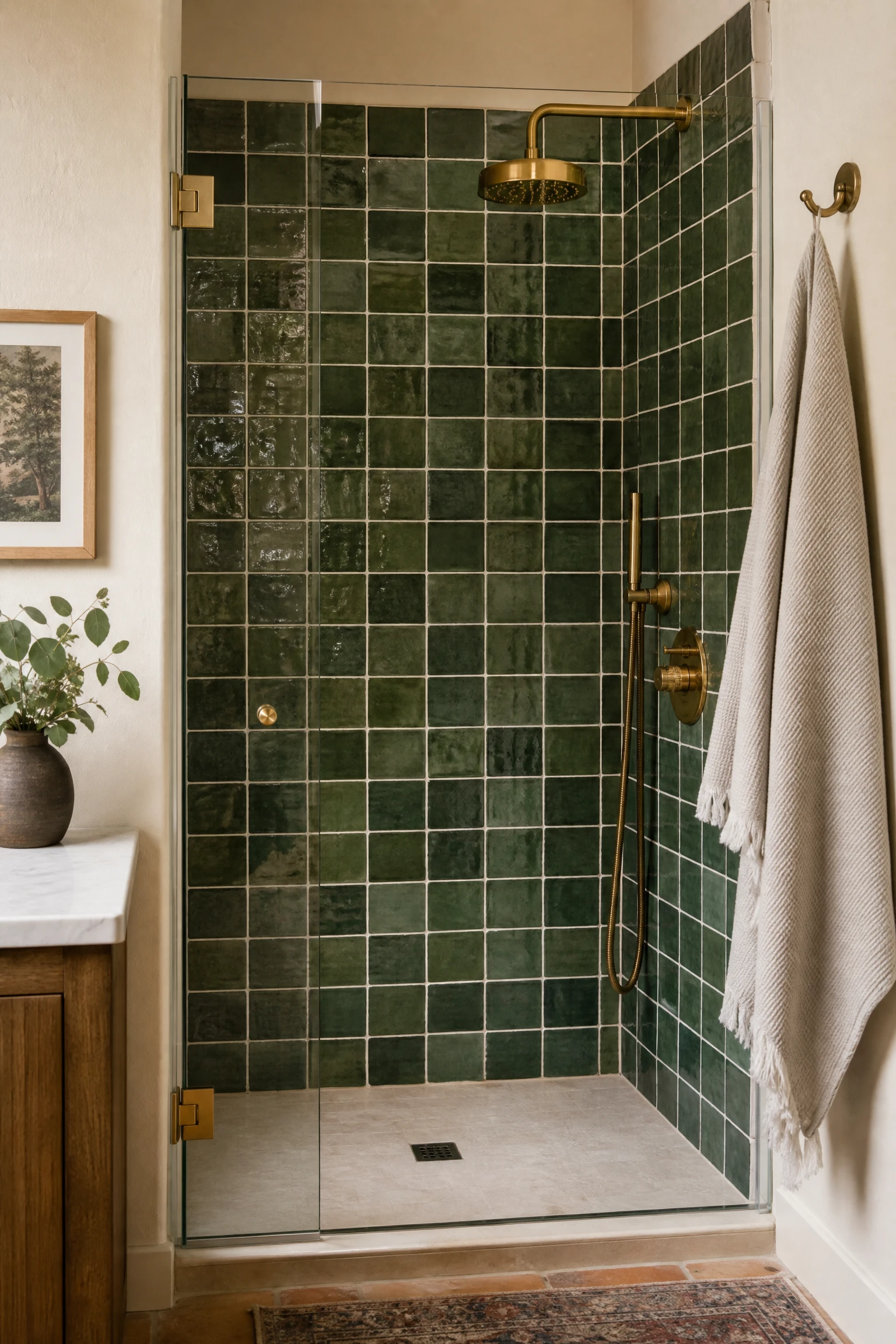
A shower enclosure or shower wall tiled in handmade green tiles, in a format that emphasises their individual artisanal character, whether small square glaze-variation tiles, handmade hexagonal tiles in a forest green glaze, or large rectangular handmade tiles with visible glaze variation, creates the most material-rich and most visually complex expression of the green element in a cream bathroom. Handmade tile surfaces change in apparent colour across the full surface as the glaze catches light at different angles, and the combination of this living, shifting green tile quality with the warm stillness of cream walls and cream stone creates a bathroom where the eye is constantly engaged and delighted without the room ever feeling busy or overstimulated.
Pro Move: Use white or warm cream grout with handmade green tiles rather than matching the grout to the tile colour. The cream grout lines create the visual framework that reveals each individual tile as a distinct object with its own glaze character, and the warm cream line between each tile reinforces the connection to the cream palette of the surrounding bathroom. Matching green grout would blur the tile individuality and reduce the handmade surface to something that reads more like a uniform painted wall.
20. Cream Marble With Green Veining
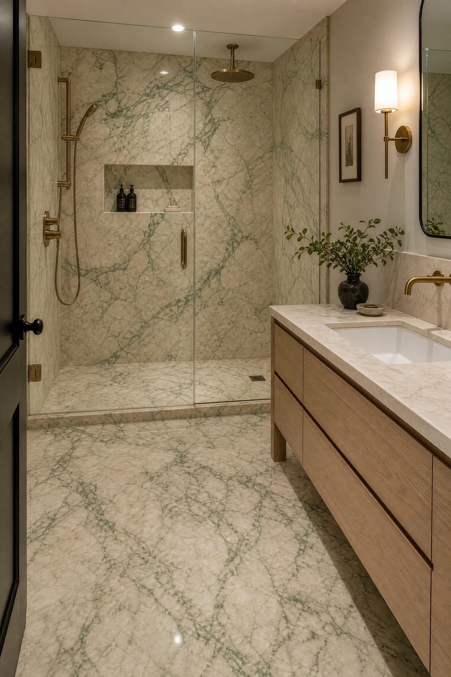
Cream or warm white marble with visible green veining, whether genuine marble like Verde Alpi, Green Onyx, or certain varieties of Irish Green, or a high-quality porcelain that replicates the cream and green veining pattern of natural stone, creates a bathroom surface where green and cream exist within a single continuous material rather than as two separately applied colours. The veining of green through a cream marble surface reads as natural and organic in a way that no painted or tiled application of the same two colours can replicate, and a bathroom tiled floor to ceiling in a cream marble with green veining creates the most naturally beautiful and most enduringly sophisticated version of the green and cream combination available. The cost of genuine natural marble with green veining is significant, but the quality and material presence of a green-veined marble in a bathroom is one of the few design investments that reliably increases both the apparent quality and the resale value of the bathroom over the long term.
Heads Up: Green veining in natural marble often contains minerals, particularly serpentine or chlorite, that require careful sealing to prevent the stone from absorbing water and staining around the veining lines. Genuine green-veined marble needs sealing on installation and annual resealing thereafter to maintain the integrity of the stone and prevent the green veining from darkening or spreading as moisture penetrates the mineral inclusions. Always consult the stone supplier for the specific sealing requirements of the particular marble selected.
21. Green and Cream Through Botanical Wallpaper
A botanical print wallpaper in green and cream tones on a single feature wall in the bathroom, most naturally the wall behind the bath or the wall opposite the door, creates the most pattern-rich and most personally expressive version of the green and cream combination, because the botanical print encodes a specific narrative within the palette: the relationship between living plant material and the warm neutral of a background surface. Large-scale botanical wallpapers in deep greens with cream or ivory backgrounds have a particular luxury quality when used in a bathroom because the scale of the botanical motif sits correctly in a larger bathroom and the cream background maintains the light and warmth of the room while the green botanical elements provide the drama and personality. Peel-and-stick botanical wallpaper is available in credible quality from multiple suppliers and provides a renter-friendly or commitment-free version of this approach that can be removed without wall damage.
Designer Advice: Paint the remaining three walls of the bathroom in a tone drawn from the cream background of the wallpaper rather than in a white or a contrasting colour. The specific cream of the wallpaper background provides the most harmonious wall paint choice because it ensures the wallpaper reads as an extension of the room palette rather than as a panel applied to a different room. Sample the wallpaper first and select the paint to match the background cream rather than the other way around.
22. Sage Green Hexagonal Mosaic Tiles
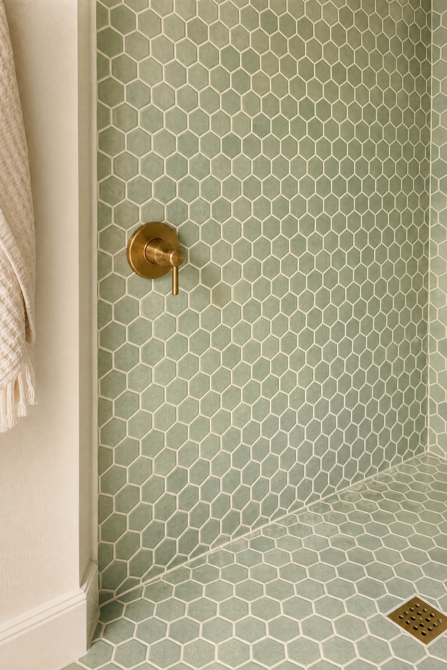
A wall or floor section covered in small hexagonal mosaic tiles in a sage green glaze creates a surface with both pattern and colour simultaneously, and the tight grid of the small hexagonal format creates a gentler and more refined version of the green presence than larger tile formats. In a shower wall, a sage green hexagonal mosaic from floor to ceiling creates a rich, spa-like surface with a depth and texture that flat painted walls never achieve. On a bathroom floor, the same tiles in sage green with cream grout create a floor that reads as warm and organic from across the room and reveals the individual tile beauty at close range. Pairing sage green hexagonal mosaics with cream painted walls and natural timber creates the most Japandi-influenced version of the green and cream bathroom: calm, material-focused, gently decorative, and genuinely beautiful in its restraint.
Quick Tip: Hexagonal mosaic tiles come on mesh-backed sheets for ease of installation, but the alignment between sheets needs careful management to maintain the continuous hexagonal grid pattern across the full tiled area. Request a full sheet and a half-sheet sample from your supplier and practice the sheet-joining technique before the main installation to ensure the pattern continues seamlessly at every sheet junction.
23. Green and Cream Checkerboard Floor
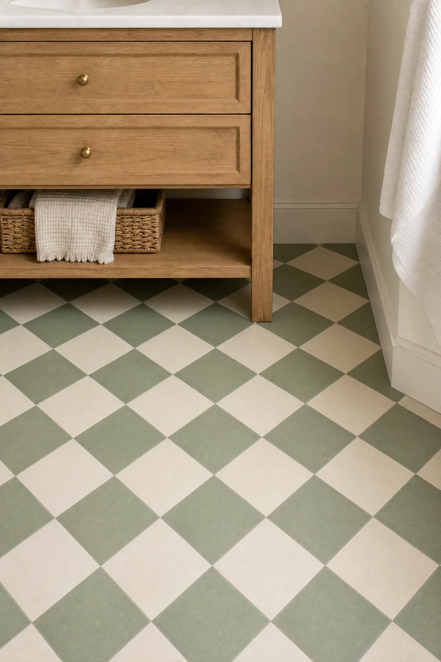
A checkerboard floor in alternating sage or forest green and cream tiles is the most graphic and most playful application of the green and cream palette in a bathroom, and it creates a room with an instant character and personality that no other single design decision delivers as quickly. The checkerboard floor has a long history in bathroom design, from Victorian and Edwardian period bathrooms to contemporary interpretations that use the classic pattern in modern colour combinations, and in green and cream it reads simultaneously as nostalgic and completely current. The scale of the check matters significantly: small checks (10 by 10 cm or 15 by 15 cm) read as refined and intricate at close range. Larger checks (30 by 30 cm or 40 by 40 cm) read as bolder and more graphic from across the room. Laying the squares diagonally on the floor, rather than aligned with the walls, gives the pattern more dynamism and disguises minor irregularities in the room geometry.
Pro Move: Use matte or honed tile finishes rather than polished or gloss for a green and cream checkerboard floor. A polished checkerboard floor creates strong reflections that make the pattern busy and slightly disorientating in a small bathroom. A matte or honed finish creates a warmer, more grounded surface that reads as rich and considered rather than graphic and slightly overwhelming.
24. Cream Wall Tile With a Green Feature Niche
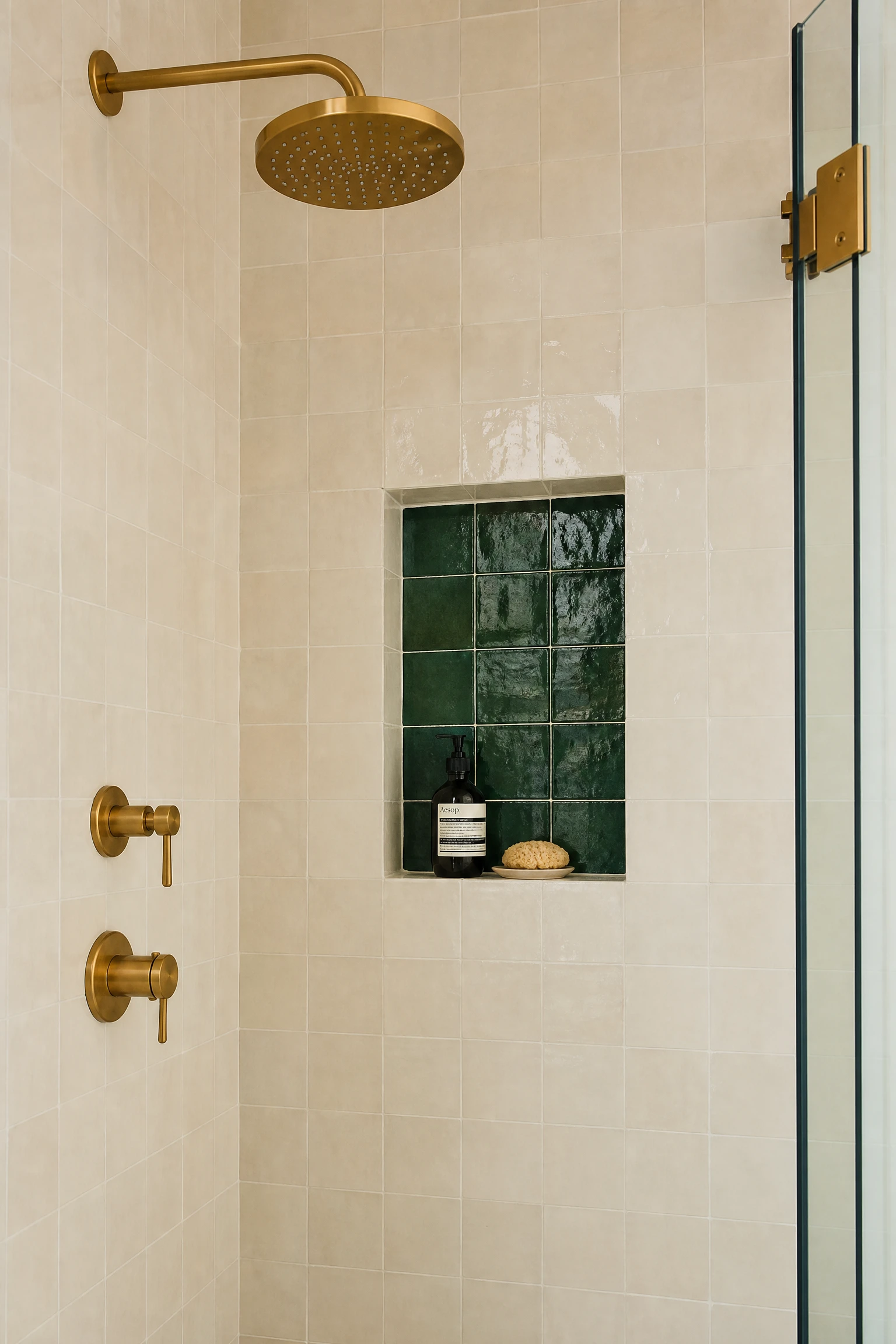
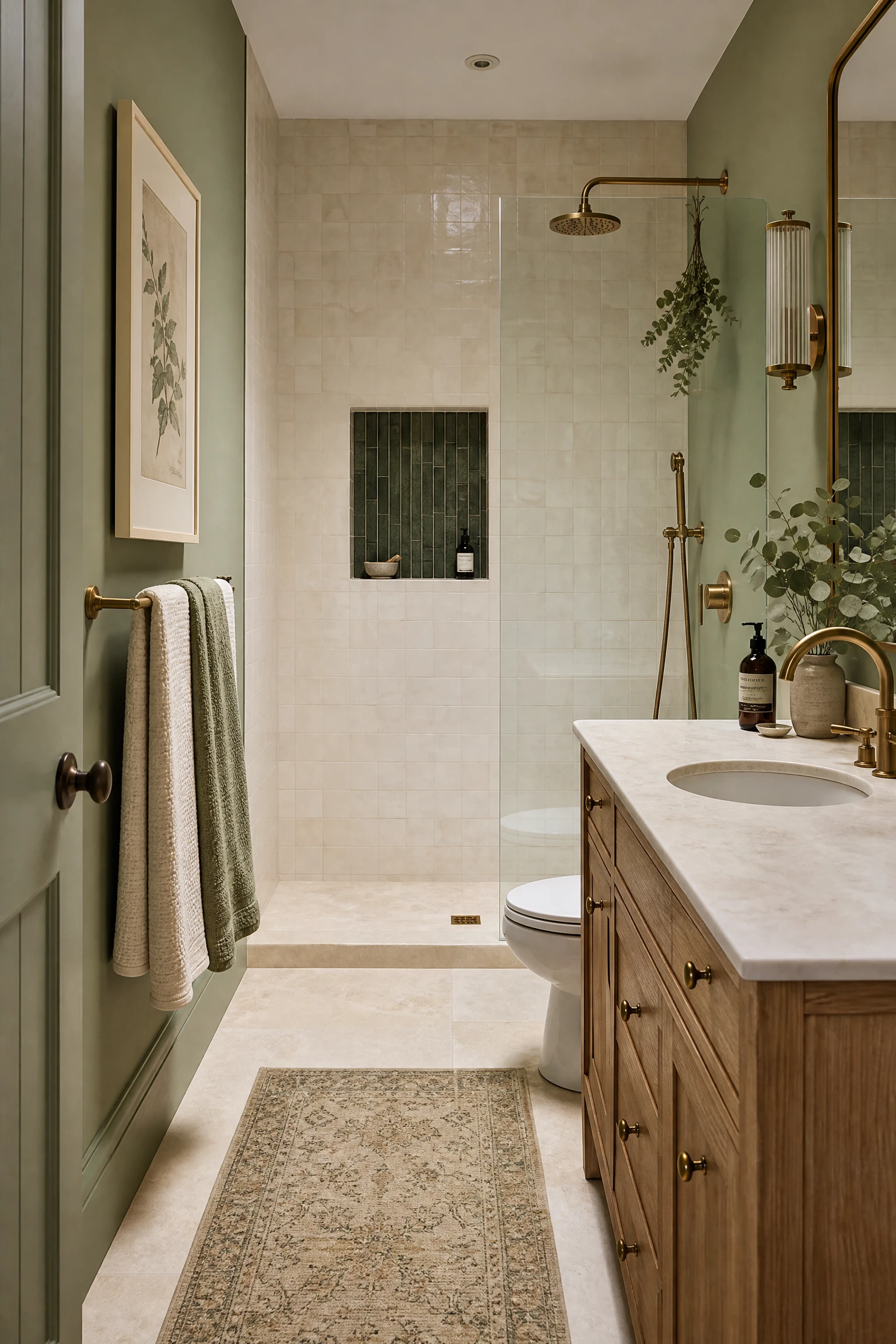
A bathroom where the full wall tile is in a cream or warm white ceramic or stone, with a single recessed shower or bath niche tiled in a contrasting deep green, creates a contained and precise application of the green element that reads as a deliberate architectural accent rather than a general colour choice. The green niche, whether tiled in a zellige, a handmade tile, a green stone, or a simple green glazed ceramic, becomes the colour focal point of the bathroom in a highly specific and highly controlled position that can be changed by retiling the niche alone if the design direction shifts. This approach is particularly effective in a shower enclosure where the niche is the most visible surface within the shower when the door or screen is open, and where the surrounding cream tile creates the clean, spa-like backdrop that makes the green niche read as a jewel-like centrepiece within the white shower environment.
Reality Check: A tiled niche that uses a different tile from the surrounding wall must be planned in advance of the tile installation rather than added afterwards, because the niche recess needs to be formed in the wall structure before tiling begins. Retiling a niche after the surrounding wall is complete is possible but significantly more labour-intensive. Specify the niche tile contrast in the initial tiling brief so the installer can plan the tiling sequence and niche perimeter details appropriately.
25. Green and Cream Through Natural Plant Material
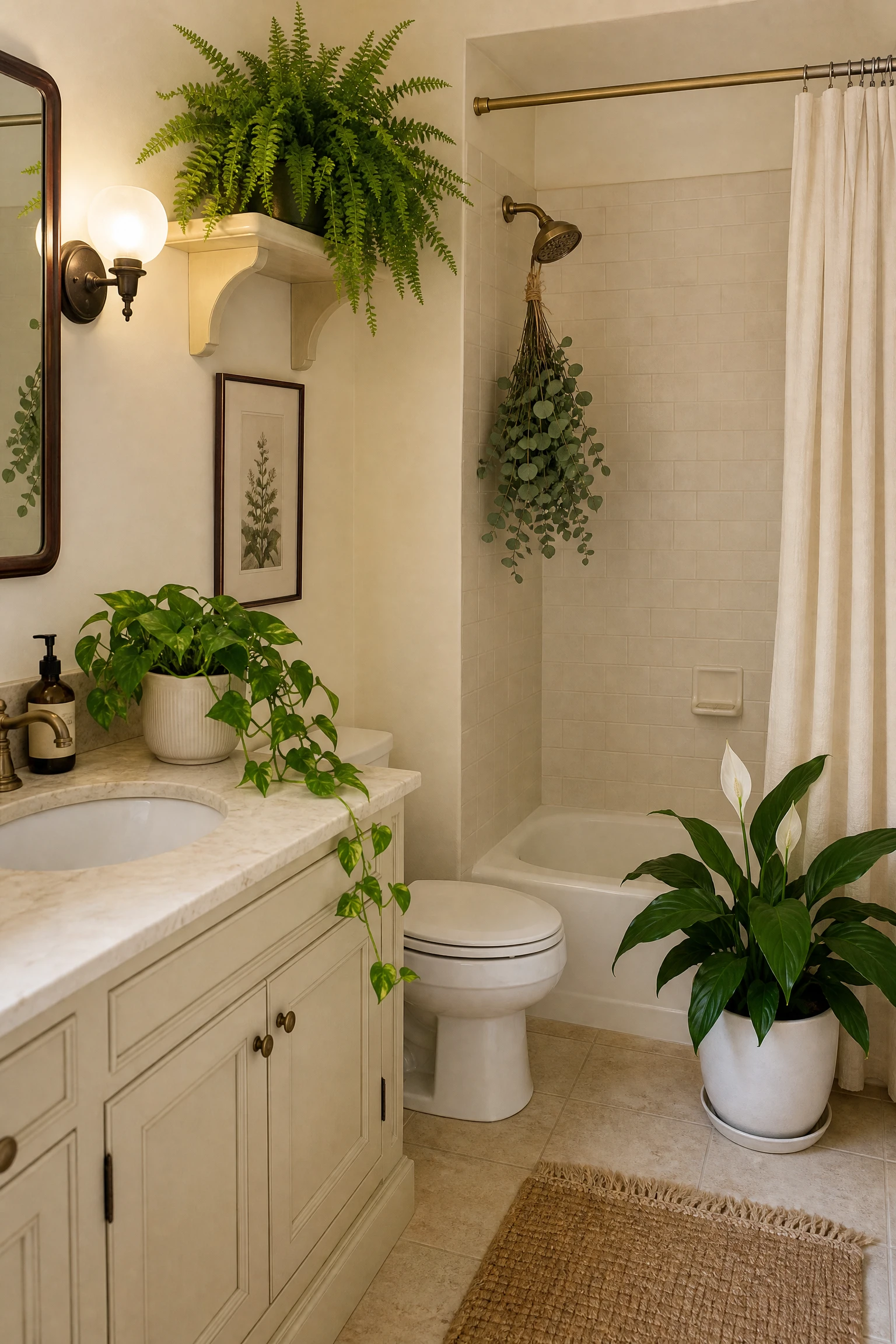
A bathroom where the green and cream palette arrives partly or primarily through living plant material, large-leafed plants in cream ceramic or natural stone pots, eucalyptus hung from the shower head, moss-green trailing plants on shelves, and botanical artwork in cream frames on white walls, creates the most genuinely organic and most alive version of the green and cream bathroom. The green of living plants against cream walls and cream accessories creates the palette of a conservatory or greenhouse, and the ongoing growth and change of the plants means the room never looks exactly the same twice. This is the lowest-commitment and most easily adjustable version of the green and cream palette, and it suits any existing cream bathroom that needs green warmth without any structural or paint changes. The plant selection for a bathroom must account for the specific light and humidity conditions of that room: peace lilies, pothos, and Boston ferns all thrive in the warm, humid conditions of an actively used bathroom and provide the lush, rich green material that makes the palette most effective.
Designer Advice: Cluster bathroom plants together in a single grouped arrangement at one end of the room or in one corner rather than scattering individual plants across multiple positions. A grouped plant arrangement with three or four plants at different heights creates the lush, garden-like quality that makes the green palette feel genuinely immersive. Individual plants placed separately around the room create a dotted quality that reads as incidental rather than designed.
26. Green-Tinted Glass Shower Enclosure in a Cream Bathroom
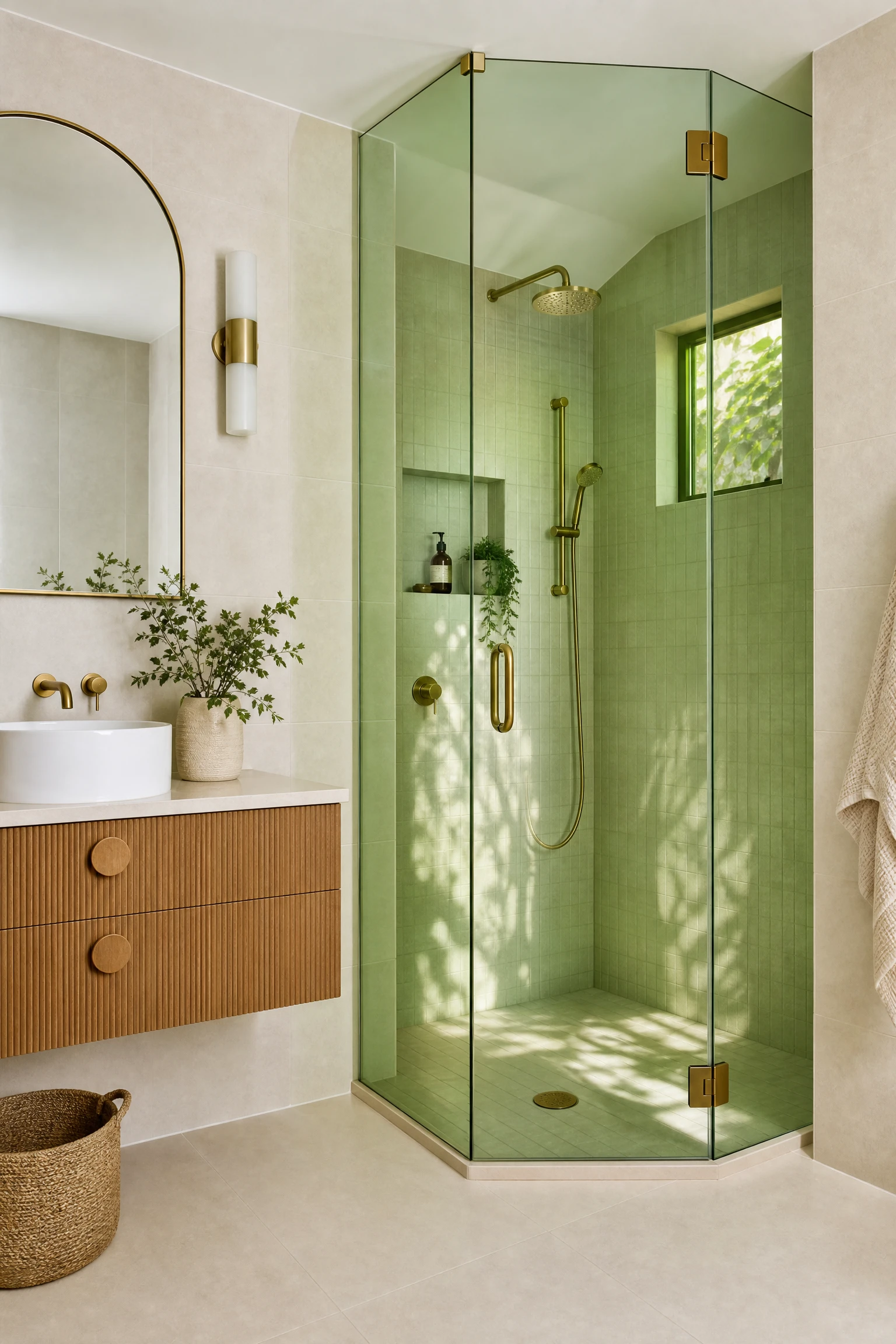
A shower enclosure with tinted or antiqued glass panels in a subtle green tone creates one of the most unusual and most visually sophisticated applications of the green element in a cream bathroom, because the green arrives through the transparency of the glass rather than through an opaque surface, and the resulting effect changes completely depending on whether the shower is lit from within or seen from the outside. From outside the shower, tinted green glass reads as a gently coloured architectural element that connects to the overall green and cream palette. From inside the shower, the green-tinted glass casts a warm, slightly botanical light quality on everything inside, creating a showering experience that is genuinely distinctive. Antique mirror panels with a green tint are a more affordable and more decorative alternative to purpose-tinted safety glass and can be used as decorative panels within a standard shower enclosure frame.
Quick Tip: A very subtle green tint in shower glass reads as sophisticated and distinctive. A strong green tint reads as distracting and can make the bathroom feel like a themed installation rather than a considered design. Request the lightest available green tint specification from the glass supplier and ask for a physical sample panel to be held against the cream bathroom tile before committing to the full order.
27. Cream Wainscoting With Green Upper Wall and Botanical Shower Curtain
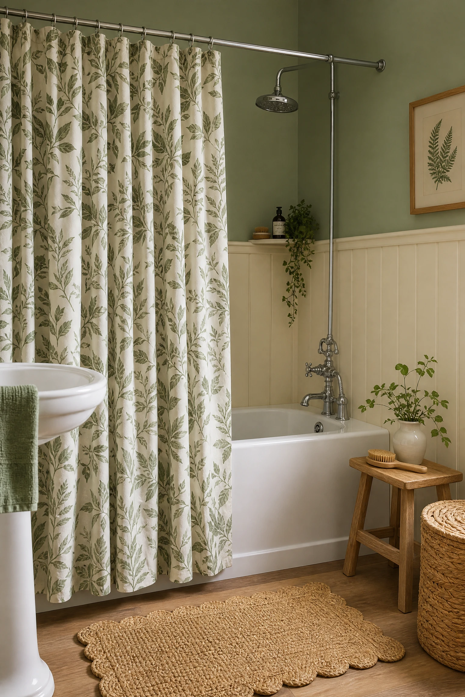
In a bathroom with a shower over bath arrangement, cream painted tongue-and-groove wainscoting from floor to dado height, a sage or forest green upper wall above the dado, and a botanical shower curtain in a green and cream leaf print creates a fully layered and beautifully resolved version of the green and cream bathroom using only paint, timber, and textile, with no tile work or structural changes required. The cream wainscoting provides the warm material grounding of the palette, the green upper wall provides the atmospheric colour presence, and the botanical shower curtain in both palette colours connects the two walls through its print and frames the bath zone as the centrepiece of the room. This combination requires only paint, a standard wainscoting kit from a DIY supplier, and a shower curtain, making it one of the most affordable and most impactful versions of the full green and cream palette available in a bathroom that cannot be retiled or significantly renovated.
Heads Up: Always pair a decorative botanical shower curtain with a plain waterproof liner behind it so the decorative fabric curtain stays outside the shower zone and the waterproof liner handles the direct water exposure. Decorative fabric shower curtains that are used without a liner develop mildew rapidly in the shower zone regardless of how frequently they are washed, because the combination of warm water, soap, and fabric creates ideal conditions for mould growth within weeks of use.
28. The Complete Green and Cream Bathroom: Layering All Four Approaches
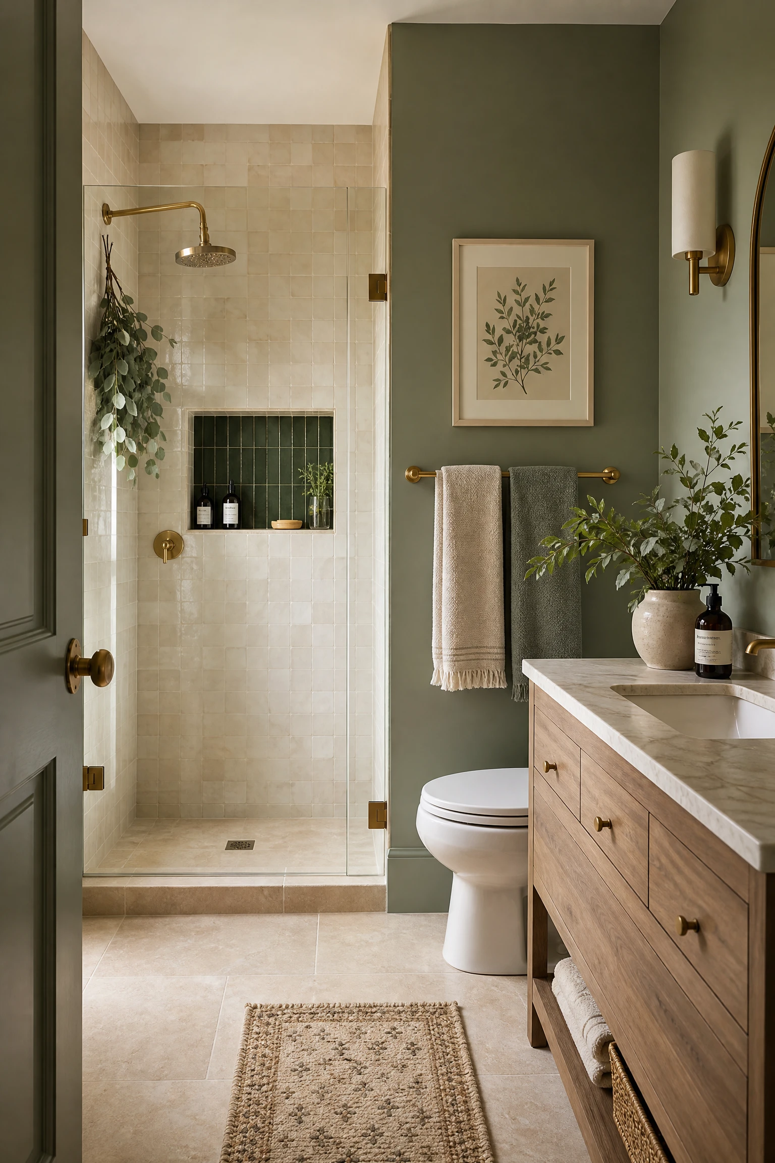
The green and cream bathroom that feels most genuinely complete, most rich in character, and most personally expressive is almost always the one that draws on more than one of the four approaches in this article simultaneously. Sage green painted walls alongside a cream marble floor alongside a forest green handmade tile shower enclosure alongside cream zellige in the niche, natural timber vanity, botanical print in a cream frame on the sage wall, eucalyptus on the shower head, cream and sage towels layered on a brushed brass rail: each element belongs to a different group within the palette, and together they create a bathroom where every surface and every object contributes to the same organic, botanical, warm-toned design story without any single element being required to carry the whole room alone. The principle of layering different expressions of the same palette, different shades of green at different depths, different cream materials at different textures, always produces a more interesting and more deeply satisfying result than applying one shade of green and one shade of cream uniformly across all surfaces and elements.
Pro Move: Before starting any green and cream bathroom project, assemble physical samples of every element you are planning to use, a paint chip or painted sample board in the green, a tile sample in the cream, a fabric sample in any textile, a stone sample in any stone or stone-effect material, and a hardware sample in the chosen metal finish, and arrange them together on a flat surface in the proportions in which they will appear in the room. The combination that looks perfectly balanced in this sample arrangement is the one that will look equally balanced at full room scale.
Final Thoughts
Green and cream is a bathroom palette that rewards both boldness and restraint in equal measure, depending on which shade of green you choose and how you let it enter the room. Sage and cream asks for restraint and consistency and delivers calm. Forest green and cream asks for confidence in natural materials and delivers botanical richness. Deep emerald and cream asks for commitment to the drama of the palette and delivers genuine luxury. And green and cream through tile and pattern asks for patience in the selection and installation of materials and delivers the most enduring and most complex result of all.
The most important decision in a green and cream bathroom is made before any purchase: the specific shade of green and the specific tone of cream that will sit alongside it. Both the green and the cream have undertones that need to be aligned, and the specific warmth of the cream, whether it reads as yellow-cream, pink-cream, or grey-cream, will either connect naturally to the green or fight it in a way that makes both colours look less considered than they are. Test samples in the actual bathroom, in natural daylight and under the specific artificial light conditions of that room, before committing to anything. The green and cream bathroom that looks exactly right on the inspiration board and exactly wrong on the wall is almost always the result of one of those undertones not matching the other in the specific light of the specific room. Get that relationship right and the rest of the bathroom will reward every decision made within the palette.
“Which shade of green feels right for your bathroom: sage and calm, forest and botanical, or deep and dramatic? Drop your answer in the comments below.”
Frequently Asked Questions
What shade of green works best in a bathroom?
The best shade depends on the bathroom size, natural light, and desired atmosphere. Sage green is the most universally liveable and works in any bathroom size or light condition. Forest green suits larger bathrooms with good natural light and creates a more dramatic, botanical atmosphere. Deep emerald and hunter green are best in bathrooms with generous natural light and confident styling, as they absorb more light and require warm, layered artificial lighting to prevent the space from feeling dark. Pale mint and soft green tones are the best choice for small or dark bathrooms where maximum light reflection is needed.
What cream goes with green in a bathroom?
A cream with a warm yellow or ochre undertone rather than a cool grey or pink undertone suits green most naturally, because both a yellow-cream and any shade of green share a warmth that connects them at the undertone level. Cream paints like Farrow and Ball Bone, Benjamin Moore White Dove, Sherwin-Williams Antique White, or Dulux Natural Hessian all have the right warm quality to sit alongside green without the cream reading as dingy or the green reading as too cold. Avoid creams with a distinctly pink undertone alongside cooler or more blue-toned greens, as the contrast between the pink undertone and the green can create an uncomfortable clash at the colour undertone level.
What metal finish works best with green and cream bathrooms?
Brushed brass or unlacquered brass is the most consistently successful metal finish in a green and cream bathroom because the warm gold tone of brass bridges the warmth of the cream and the organic quality of the green in a way that chrome or nickel do not. Unlacquered brass develops a natural patina over time that deepens its warmth and connects it even more directly to the organic, botanical quality of the palette. Brushed gold or champagne gold are good alternatives to brass with a slightly more contemporary feel. Matte black works well in a more graphic or contemporary green and cream bathroom but loses some of the organic warmth that makes brass so specifically suited to this palette.
Can green and cream work in a small bathroom?
Yes, and in some ways the combination is more effective in a small bathroom than a large one because the warmth and organic quality of green and cream makes a compact space feel genuinely inviting rather than simply compact. In a small bathroom, use a lighter shade of green on the walls or limit the green to the vanity, tile, and accessories, and keep the walls in a warm cream that reflects the maximum available light. A sage green vanity with cream walls and cream stone floor in a small bathroom creates the full green and cream atmosphere without any sense of enclosure. Avoid very dark greens like emerald or hunter on the full walls of a small bathroom without generous natural light.
What plants work best in a green and cream bathroom?
Boston ferns are the most thematically appropriate plant for a green and cream bathroom because their warm mid-green fronds directly echo the palette and their preference for warmth and humidity makes a regularly used bathroom an ideal environment. Trailing pothos adds a lush, botanical quality and tolerates the lower-light conditions of many bathrooms. Peace lilies provide both green foliage and occasional white flowers that suit the cream element of the palette. Eucalyptus hung from the shower head or placed in a vase on the vanity adds both organic green material and a fresh scent that reinforces the spa-like quality of the palette. Avoid plants that require direct sunlight in bathrooms without windows.
Is green and cream a timeless bathroom palette?
Yes. The green and cream combination in bathrooms has roots that extend centuries further back than any contemporary trend: the relationship between botanical green foliage and warm stone or parchment cream is one of the most fundamental colour relationships in the natural world, and it has been used in domestic interiors across cultures and eras because it is genuinely beautiful and genuinely comfortable to be surrounded by. Victorian and Edwardian bathrooms used it in painted panels and tiled floors. Twenties Art Deco bathrooms used it in green marble and cream fixtures. Contemporary bathrooms use it in sage vanities and cream stone. The specific application changes but the fundamental relationship between the two colours is one that has never looked dated and is unlikely to.