Silver and Purple Bedroom Ideas That Feel Rich, Not Themed
Silver and purple is one of the most inherently rich colour combinations available in a bedroom, but it is also one of the easiest to get wrong. The palette tips into themed territory the moment the purple becomes too saturated, the silver becomes too shiny, or both colours appear in equal quantities on every surface simultaneously. Done right, purple and silver create the most consistently romantic and most specifically considered bedroom palette available, with a depth and richness that cream and gold or grey and white cannot quite achieve. The key is the shade of purple chosen above everything else, because lavender, lilac, dusty violet, plum, and aubergine each create entirely different rooms with the same silver accents beside them. These ideas start with that decision and move through every layer of the bedroom, from the walls through the bed, the lighting, the textiles, and the finishing details. Silver and purple rewards specificity: the exact shade of each colour determines whether the room reads as rich and intentional or loud and unresolved.
CATEGORY ONE: CHOOSE YOUR PURPLE FIRST
1. Soft Lavender for a Serene, Romantic Bedroom
Soft lavender, a pale purple with a slightly blue-grey undertone, is the most consistently versatile and most universally flattering shade of purple for a bedroom because it reads as calming rather than stimulating and as romantic rather than dramatic. Lavender walls with silver accents create a room that feels like early morning light, cool and soft and gentle, with the silver adding the reflective quality that keeps the pale purple from reading as flat or washed out. Lavender is particularly effective in bedrooms with limited natural light because its blue-grey quality adds a freshness that warm neutrals cannot provide, and because it relates naturally to the silvery tones of morning light. In terms of sleep science, lavender is genuinely associated with reduced anxiety and improved sleep quality, which makes the colour choice practically as well as aesthetically appropriate for a bedroom.
Designer Advice: Lavender walls need warm elements to prevent the room from reading as cold. Warm wood furniture, cream or warm white bedding, and soft warm-toned lighting in 2700K rather than cool white all counteract the natural coolness of the lavender-silver combination and keep the room feeling serene rather than clinical.
2. Dusty Violet for a More considered Contemporary Look
Dusty violet, a purple that is significantly muted by grey rather than by white, is the most contemporary and most design-forward shade of purple for a bedroom in 2025. Where lavender reads as pretty and romantic, dusty violet reads as considered and architectural, sitting in the same register as dusty sage or faded terracotta as a colour that has matured beyond its saturated original form. Against silver accents, dusty violet creates a room that feels grown-up and specific rather than generically pretty, and it suits a wide range of furniture styles from mid-century modern through to contemporary minimalist. In terms of proportion, dusty violet can be used across all four walls without becoming overwhelming, because the grey in the tone prevents it from advancing toward the viewer in the way that a bright or saturated purple would.
Quick Tip: Dusty violet paint looks significantly different in daylight versus lamplight. In natural daylight it reads as more grey-blue. In warm lamplight it reads as more warmly purple. Test the sample in both conditions before committing, and choose based on the evening version since that is when the bedroom is primarily experienced.
3. Deep Plum for a Dramatic, Intimate Bedroom
Deep plum, a dark, red-toned purple that sits between burgundy and violet, creates the most dramatic and most intimate version of the silver and purple bedroom. Against silver accents, deep plum produces a high-contrast combination that reads as genuinely rich in the same way that deep jewel-toned rooms lit by warm lamplight do, with the silver catching and holding the light while the dark purple absorbs it around the accents. A deep plum bedroom requires a commitment to layered warm lighting rather than overhead lighting, because cool overhead light on a dark purple wall reads as gloomy while warm lamp and candlelight makes the same wall read as rich and cocooning. This shade of purple is specifically suited to larger bedrooms with good ceiling height where the dark tone does not feel oppressive.
Reality Check: Deep plum on all four walls of a small bedroom with limited natural light will make the room feel significantly smaller and darker than a lighter shade would. In a small bedroom, use deep plum on one accent wall only, or use it exclusively in textiles and accessories against lighter walls.
4. Lilac and Silver for a Youthful, Light-Filled Room
Lilac, a lighter, slightly pinker purple than lavender, creates the most playful and most light-filled version of the silver and purple palette. Where lavender reads as serene and dusty violet as considered, lilac reads as optimistic and airy, which suits younger bedrooms, guest rooms, or spaces that need to feel cheerful and welcoming rather than dramatic. Against silver accents, lilac creates a combination with the specific quality of metallic party decorations made beautiful, the shimmer of silver beside the lightness of lilac producing something that reads as celebratory without being garish. Lilac walls with silver accessories and white bedding create a room that feels both finished and light, which is a difficult combination to achieve in darker palettes.
Designer Advice: Lilac and silver needs a grounding element to prevent it from reading as a themed room rather than a designed one. Warm wood furniture, a natural fibre rug in a warm neutral, or a single piece of art in earthy tones each add the grounding that the light, bright combination needs to feel settled rather than floaty.
CATEGORY TWO: THE WALLS
5. Paint All Four Walls in Dusty Violet or Lavender for a Wrapped Effect
Painting all four walls in the same purple tone, whether dusty violet, lavender, or a muted lilac, creates a fully immersive colour experience that gives the bedroom the cocooning quality most associated with genuinely restful spaces. An all-over purple bedroom, when the shade is well-chosen and the lighting is warm and layered, reads as richly designed rather than heavily decorated, because the colour is a background for everything placed within it rather than a competing decorative statement. The silver accents, the white or cream bedding, the warm wood furniture, and the metallic light fittings each read more clearly and more beautifully against a unified purple ground than they would against a patchwork of white walls and purple accents.
Pro Move: Extend the wall colour onto the ceiling for the most immersive effect, particularly with lavender or dusty violet. A purple ceiling of the same shade as the walls removes the hard boundary between wall and ceiling and creates a room that feels gently enclosed in colour rather than surrounded by it. This treatment is particularly effective in bedrooms with lower ceilings that benefit from the cocooning effect.
6. Use a Deep Purple Accent Wall Behind the Bed
An accent wall in a deeper shade of purple behind the bed, darker than the surrounding walls which can remain in a lighter neutral, cream, warm white, or pale grey, creates a visual headboard effect that anchors the sleeping zone and adds drama without committing the entire room to a dark colour. The accent wall functions as a frame for the bed and the bedding arrangement, drawing the eye toward the sleeping zone and giving the room a clear focal point. The deeper purple behind the bed also makes the silver bedside accessories, lamps, and frames read more distinctly because the darker background creates higher contrast than pale walls would. This approach is particularly effective in rooms with a low ceiling where a deep colour on all four walls would be too heavy.
Quick Tip: Choose a purple for the accent wall that is one or two shades deeper than the surrounding walls rather than an entirely different tone. A lavender room with a slightly deeper dusty violet accent wall reads as a tonal composition. The same lavender room with a deep plum accent wall reads as two different colour decisions rather than one unified palette.
7. Try Purple Wallpaper for Pattern and Depth
A purple wallpaper, whether in a botanical pattern with silver metallic leaf detail, a geometric design that incorporates both purple and silver in a repeated motif, a damask in dusty violet and silver, or a textured grasscloth-look in a muted purple, adds pattern and surface interest to the bedroom walls that flat paint cannot provide. Wallpaper on all four walls creates the most immersive effect. Wallpaper on the accent wall behind the bed, with lighter painted walls on the other three sides, creates a more restrained focal point that suits smaller bedrooms or those who prefer not to commit to a full-room wallpaper. The metallic silver elements in a silver-threaded botanical or geometric wallpaper catch and hold the light differently throughout the day and evening, which gives the room a quality of changing visual richness that flat paint walls lack.
Heads Up: Purple wallpaper with a significant silver metallic element can read as very shiny in rooms with strong directional daylight, because the metallic threads reflect the light source. Check the wallpaper sample in the room’s specific light conditions before ordering. A matte or low-sheen silver detail reads more consistently across light conditions than a high-gloss metallic.
8. Add Silver Moulding or Trim Against Purple Walls
Silver or chrome paint applied to existing coving, picture rails, skirting boards, or door frames in a room with purple walls creates the most specifically architectural version of the silver and purple combination. The silver trim outlines the room’s structure in a metallic tone that provides a clean, graphic contrast with the purple surface it defines, and the effect is closer to the opulence of a formal interior than the casual addition of silver accessories alone could achieve. This approach works particularly well in rooms with original Victorian or Edwardian plasterwork details, where the silver paint applied to cornicing and ceiling roses makes the period features dramatically visible against a purple ground that would otherwise absorb them.
Designer Advice: Use a metallic silver paint with a satin or low-gloss finish on architectural trim rather than a full high-gloss chrome finish. A satin silver on coving and skirting boards reads as intentional and considered. A high-gloss chrome on the same surfaces reads as paint applied with a budget chrome spray can, regardless of how expensive the paint was.
CATEGORY THREE: THE BED
9. Choose a Velvet Headboard in Deep Purple or Plum
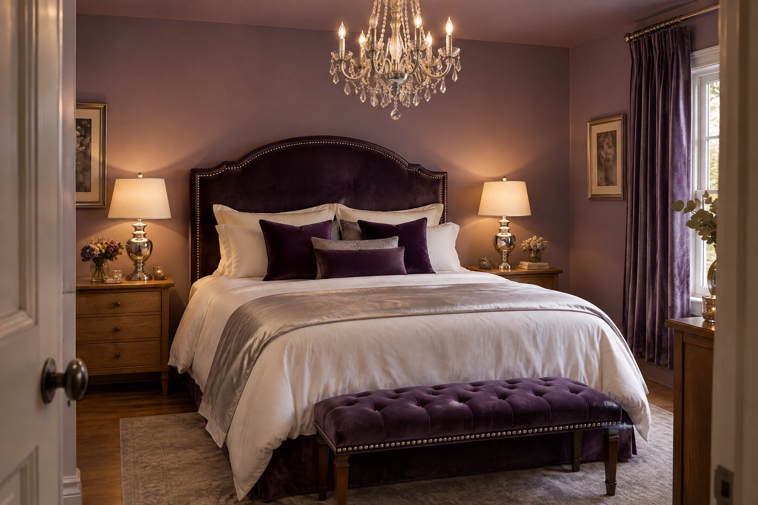
A velvet headboard in deep purple, plum, or dusty violet is the single highest-impact piece of furniture in a silver and purple bedroom because it places the most specifically rich material in the most prominent position at the room’s primary focal point. Velvet in a jewel-toned purple has the particular quality of absorbing light deeply rather than reflecting it, which creates a softness and richness at the head of the bed that no other material or finish provides. Against silver bedside accessories and a lighter purple or neutral wall, a deep purple velvet headboard reads as a luxury hotel statement piece and anchors the entire bedroom in the palette’s most specifically beautiful expression. The fabric choice, velvet rather than fabric, leather, or wood, is what makes the difference between a purple headboard that reads as designed and one that reads as simply a coloured piece of furniture.
Pro Move: A deep purple velvet headboard with silver nail-head trim along the border is one of the most specifically beautiful combinations available in a silver and purple bedroom, because the silver detail on the velvet surface ties the two palette colours together in a single piece of furniture and adds the handcraft quality of individual nail heads to what would otherwise be a plain upholstered surface.
10. Layer the Bed in Silver and White Bedding
The bedding in a silver and purple bedroom does the most work of any textile in the room because it covers the largest surface and sits at eye level from every position in the space. The most effective bedding arrangement for this palette is a layered one: a white or warm cream fitted sheet and duvet cover as the base, providing the light, reflective layer that the purple surroundings need for visual balance. On top of this, a silver satin or silk-effect duvet cover or throw adds the metallic accent at bed level that ties the silver accents elsewhere in the room to the primary furniture zone. Accent cushions in varying shades of purple, from the light lavender of the walls through to a deeper plum, layered with two silver or mirrored decorative cushions, complete the arrangement with the palette’s full tonal range displayed at the bed’s most visible surface.
Reality Check: Silver satin bedding can be beautiful and also extremely cold to sleep on. Choose a silver-toned cotton or a warm-backed satin rather than a pure polyester satin for the practical sleeping layer. The decorative silver bedding can sit on top of the primary sleeping layer and be moved aside at night, so it does not need to be temperature-appropriate in the same way that the sheets and duvet beneath it do.
11. Add a Purple Velvet Throw at the Foot of the Bed
A deep purple velvet throw folded at the foot of the bed, with its plush surface catching the light from bedside lamps and the room’s silver accents reflecting around it, is one of the simplest and most effective finishing touches available in a silver and purple bedroom. The velvet throw at the foot of the bed adds the textile richness and the deep purple tone at a position and scale that makes the entire bed arrangement look more intentional and more styled. It functions as the anchor of the bed’s textile layering and the deepest tone in the palette at furniture level, providing the visual weight at the bottom of the bed that prevents the lighter silver and white bedding above it from looking too pale and too flat.
Designer Advice: Fold the velvet throw in thirds lengthwise and drape it across the foot of the bed with approximately one-third of the fabric folded back over itself to show its full depth and texture. A throw that is simply placed flat on the bed surface does not show the velvet’s pile and richness the way a draped, partially folded arrangement does.
CATEGORY FOUR: LIGHTING
12. Choose a Silver or Chrome Statement Chandelier or Pendant
A silver or chrome chandelier above the bed or above the room’s centre is the lighting element most specifically associated with the silver and purple bedroom, because it positions the metallic accent at the room’s highest point in a scale and with a light-scattering quality that no floor or table lamp can replicate. A chandelier with crystal droplets in a silver or chrome frame catches and refracts the light into hundreds of small reflections across the ceiling and walls, which fills the purple surfaces with moving points of light that change as the ambient light in the room changes. This quality is specifically beautiful in a purple room because the warm reflected points of light against the cool purple surfaces create the most atmospheric and most specifically rich version of the palette that any single element can deliver.
Reality Check: A chandelier in a bedroom needs to be installed at a height that does not interfere with standing or movement in the room. For rooms with standard 8-foot ceilings, a flush or semi-flush ceiling fixture in a chandelier-inspired form, with crystal or drop elements, provides the same aesthetic without hanging into the room’s usable space.
13. Use Warm White Bulbs to Make Purple Look Rich Rather Than Cold
The bulb temperature used in a silver and purple bedroom determines whether the purple reads as rich and romantic or cold and slightly clinical, and this is a decision most people make accidentally rather than deliberately. Cool white or daylight bulbs above 4000K push the purple tone toward the blue-grey end of its range, which can make even a warm purple read as cold and flat. Warm white bulbs in the 2700K range enhance the red tones within most purples, making them read as richer and more specifically purple rather than as grey-blue. Candle-warm bulbs at 2200K, in bedside lamps particularly, produce the most romantic and most flattering light quality in a purple bedroom because the warm flame-adjacent quality of the light makes the purple surfaces glow rather than simply appear.
Quick Tip: In a purple bedroom, replace any cool or neutral bulbs with 2700K warm white LEDs immediately. The change in how the purple tones read is immediate and significant. The same paint colour that looked flat or slightly blue under cool light will read as rich and specifically purple under warm light.
14. Add Silver Bedside Lamps With Warm Shades
Silver bedside lamps, whether in a polished chrome, a brushed silver, or an antiqued pewter finish, placed on each side of the bed are the most important lighting element in a silver and purple bedroom after the overhead fixture, because they provide the warm, low, directional light at seated height that makes the room feel genuinely intimate and the palette genuinely rich. The shade material is as important as the base finish: a cream or soft white linen shade over a silver base produces a warm, diffused glow that flatters the surrounding purple surfaces. A white paper shade or a translucent white glass shade produces a cooler, harder-edged light that pushes the purple toward cool. A shade in a pale blush or warm cream tone warms the light most effectively and reads as specifically appropriate to the silver and purple palette.
Designer Advice: Match the silver finish of the bedside lamps to the other silver elements in the room. Polished chrome beside brushed silver beside pewter beside antiqued silver reads as inconsistent and undermines the metallic accent’s function as a unifying thread. Choose one silver finish and apply it consistently across all the room’s metallic objects.
15. Place Candles on the Bedside Tables for Atmosphere
Candles at bedside table level are the finishing lighting element in a silver and purple bedroom that no electric source can replicate, because the moving candlelight on a purple wall surface and a silver lamp base creates a living, shifting quality of light that changes as the flame moves. A single silver or clear glass hurricane holder with a pillar candle on each bedside table, lit in the evening, adds the warmth and movement that strengthens a well-styled bedroom from looking good into feeling genuinely atmospheric. The scent of the candle contributes to this atmosphere: lavender, violet, or a warm floral with a woody base note each relate to the room’s palette in a way that a generic home fragrance does not.
Pro Move: Choose a candle scent that relates specifically to the purple palette: a real lavender essential oil candle, a violet and cedarwood combination, or a dark rose and musk. The scent and colour palette together create a multi-sensory version of the room’s aesthetic that makes the experience of being in it genuinely distinct from any other bedroom.
CATEGORY FIVE: TEXTILES AND FURNITURE
16. Use Silver Curtains or Purple Curtains With Silver Rods
The curtains in a silver and purple bedroom can approach the palette from two directions: silver curtains bring the metallic element to the window wall at the largest possible scale, or purple curtains in a tone related to the walls bring the dominant palette colour to the window while a silver curtain rod provides the metallic accent at the hanging point. Silver or metallic-threaded curtains in a sheer or semi-sheer fabric diffuse the natural light into the room with a silvery quality that shifts the room’s entire daytime atmosphere, creating a light that itself reads as part of the palette. Purple curtains in velvet or linen hung from a polished chrome or brushed silver rod at ceiling height draw the window wall into the room’s palette while keeping the metallic element as a structural frame rather than the fabric itself.
Quick Tip: Floor-length curtains hung near the ceiling and extending beyond the window frame on both sides make a silver and purple bedroom feel taller, larger, and more opulent regardless of the fabric chosen. The physical length and the installation height do more for the room’s perceived richness than the fabric quality alone.
17. Add a Silver or Mirrored Dressing Table
A dressing table in a silver, chrome, or mirrored finish is the most functionally and most aesthetically appropriate piece of furniture in a silver and purple bedroom because it brings the metallic element to a surface that is both decorative and practical, and because a mirrored or chrome dressing table reflects the room’s purple walls back into itself from a new angle, which adds visual depth and makes the room feel larger. A mirrored dressing table with a purple velvet stool placed before it creates one of the most specifically beautiful silver and purple furniture moments available, because the velvet stool introduces the deep palette colour at a different height and from a different material than the wall surfaces and bedding, and the mirror doubles whatever is most beautiful in the room.
Heads Up: Mirrored furniture requires more maintenance than non-mirrored pieces because fingerprints, dust, and small smudges are immediately visible on reflective surfaces. A dressing table used daily will need wiping down weekly to maintain its appearance. Choose a mirrored piece with a frame that has some visual weight, rather than a frameless mirrored panel, which shows every joint and edge smudge more prominently.
18. Choose Furniture in White, Silver, or Natural Warm Wood
The furniture in a silver and purple bedroom works best in one of three finishes: white or cream-painted pieces that reflect light and provide the room’s brightest surfaces, silver or chrome-finished pieces that extend the metallic accent to the furniture level, or natural warm wood that adds organic warmth and prevents the palette from reading as cold. The mistake most commonly made in a silver and purple bedroom is choosing furniture in dark wood or brown-toned finishes that fight the cool-toned palette rather than complementing it. Dark wood in a purple and silver room creates a conflict between the warm brown tones of the wood and the cool silver-purple palette that makes both elements look less attractive than they would in a more harmonious combination.
Reality Check: Painted white furniture in a silver and purple bedroom should be in a warm white with a yellow or cream undertone rather than a cool blue-white. Cool white furniture beside cool silver accents beside purple walls creates a room where everything reads as cold and slightly clinical. One warm element, warm white furniture or warm wood furniture, provides the colour temperature anchor the palette needs.
CATEGORY SIX: MIRRORS AND METALLIC ACCENTS
19. Hang a Large Silver-Framed Mirror as the Room’s Primary Reflective Element
A large mirror in a substantial silver or chrome frame, hung above the dressing table, above the headboard, or leaning against the primary wall, is the most important single silver element in a purple and silver bedroom because it performs three functions simultaneously: it reflects light from the room’s lamp sources back into the purple surfaces, it creates the visual impression of more space and more depth, and it provides the room’s largest silver accent at a scale that makes the metallic element read as a genuine design choice rather than as an accumulation of small accessories. A mirror that is at least 24 by 36 inches, in a frame with some visual weight and interesting profile rather than a thin frameless edge, delivers all three of these benefits at the scale the room needs.
Pro Move: An ornate or baroque-style silver mirror above a purple velvet headboard creates the most specifically rich and most romantic version of the silver and purple bedroom, because the decorative plasterwork quality of an ornate silver frame relates to the period associations of purple as a colour of opulence and royalty. This combination reads as deliberately theatrical in a way that suits a bedroom aspiring to a genuinely rich atmosphere.
20. Add Silver Picture Frames and Metallic Art
Silver picture frames throughout the bedroom carry the metallic accent across the vertical surfaces at eye level and make the art displayed within them part of the palette’s composition rather than separate decorative elements. Art with purple, violet, lavender, or blue-grey tones in silver frames extends the palette into the displayed imagery and creates a room where even the art collection reads as part of the design intention. Abstract art with silver leaf or metallic medium, photographic prints with a cooler, more silver-toned processing, botanical illustrations in muted purple-grey tones, or a piece of textile art incorporating both colours all work specifically well in a silver and purple bedroom because their content and palette relate directly to the room around them.
Designer Advice: One large-scale piece of art in a single substantial silver frame reads as more designed than six small prints in matching small frames. In a silver and purple bedroom where the palette is already rich and specific, the art does not need to be plentiful: it needs to be significant.
21. Style Bedside and Dresser Surfaces With Silver Accessories
The surfaces in a silver and purple bedroom, the bedside tables, the dresser top, the windowsill, and any shelving, benefit from a consistent approach to silver accessories that treats them as a chosen collection rather than a random assortment of metallic objects. A silver tray on the bedside table corralling a candle, a small plant, and a book. A silver photo frame on the dresser beside a purple orchid or small potted violet. A chrome lamp and a silver jewellery stand together on the dressing table. A mirrored trinket box and a crystal perfume bottle on a small silver tray. Each of these arrangements uses the silver accessory as an organisational and decorative tool simultaneously, which creates surfaces that read as styled rather than accumulated and that contribute to the palette without overwhelming the room with individual metallic pieces.
Reality Check: The rule in a silver and purple bedroom is that silver accessories should outnumber purple accessories at the surface level, because the walls, the headboard, and the bedding are already providing the purple. Adding heavily purple accessories on top of already purple surfaces creates a room where the purple overwhelms the silver rather than the two working together at their correct proportional relationship.
Silver and Purple Bedroom: Purple Shade Guide
| Purple Shade | Mood it Creates | Best Room Size | Best Silver Pairing | What to Avoid |
| Soft Lavender | Serene, romantic, airy | Any size, great for small rooms | Brushed silver, warm pewter, cool chrome | Cool white bulbs and cool white bedding together |
| Dusty Violet | considered, contemporary, grown-up | Any size, especially good for medium rooms | Brushed silver or antiqued silver | High-gloss chrome which reads too hard against the muted tone |
| Deep Plum | Dramatic, intimate, rich | Large rooms with good ceiling height | Polished chrome, crystal-drop fixtures | All four walls dark in a small room; cool overhead lighting |
| Lilac | Light, playful, celebratory | Any size, especially good for light-filled rooms | Polished silver, mirrored surfaces | Too many other accent colours; lilac + silver needs simplicity |
| Aubergine | Moody, rich, jewel-toned | Large rooms only | Aged silver, pewter, mirror | Bright silver or chrome which reads as harsh beside the very deep tone |
The Palette’s Hidden Third Colour
Every silver and purple bedroom has a hidden third colour that most people choose without realising it is a choice: the neutral that sits between the two named palette colours and determines whether the room reads as cool and crisp or warm and romantic. A cool white neutral, white bedding, white furniture, white ceiling, cool grey accessories, pushes the palette toward the cool, graphic, almost futuristic end of its range. A warm neutral, cream bedding, warm wood furniture, soft gold-toned warm white light, pushes it toward the romantic and sumptuous end. Most silver and purple bedrooms look better with a warm neutral than a cool one, because the silver is already providing all the cool, reflective quality the room needs and the warm neutral is what prevents it from feeling cold. Choose the neutral as deliberately as you choose the purple and the silver.