Gray and Blue Bathroom Ideas That Work Surface by Surface
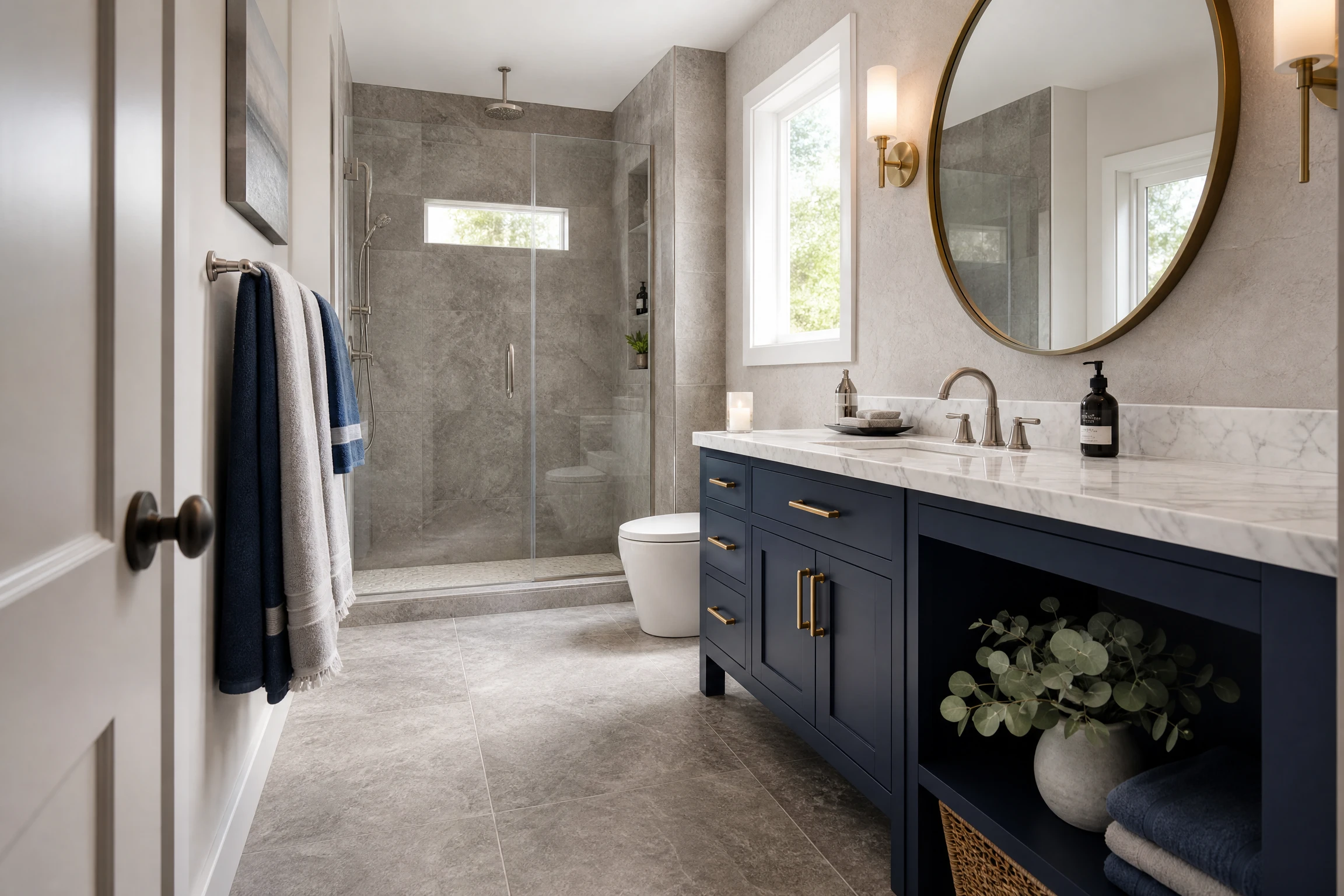
Most gray and blue bathroom inspiration articles show you the finished photograph and tell you the room looks elegant. What they rarely explain is which specific surface decision created that elegance. Was it the tile choice? The vanity color? The grout? The paint undertone? The fixture finish? Gray and blue is one of the most consistently beautiful bathroom palettes available, but it is also one of the easiest to get subtly wrong because both colors have a wide range of undertones, depths, and material expressions that interact very differently with each other depending on which specific surface they appear on.
This article is organized surface by surface so you can find the right gray and blue idea for the specific decision you are facing in your own bathroom: the wall, the tile and floor, the vanity, the fixtures and hardware, or the textiles and accessories. Within each surface category, ideas move from the most classic and accessible to the bolder and more specific. Every idea addresses the specific undertone and depth relationship that makes gray and blue work on that particular surface, and what to watch out for when the combination risks becoming too cold or too flat.
Surface 1: Walls and Paint
The wall color decision in a gray and blue bathroom is the single most powerful atmospheric choice available because it sets the tonal background against which every other element in the room is seen. The specific undertone of whichever color leads the wall, whether you are painting gray with blue accents or blue with gray context, determines whether the bathroom reads as calm and spa-like, crisp and contemporary, moody and dramatic, or flat and cold.
1. Warm Gray Walls With Soft Blue Accents
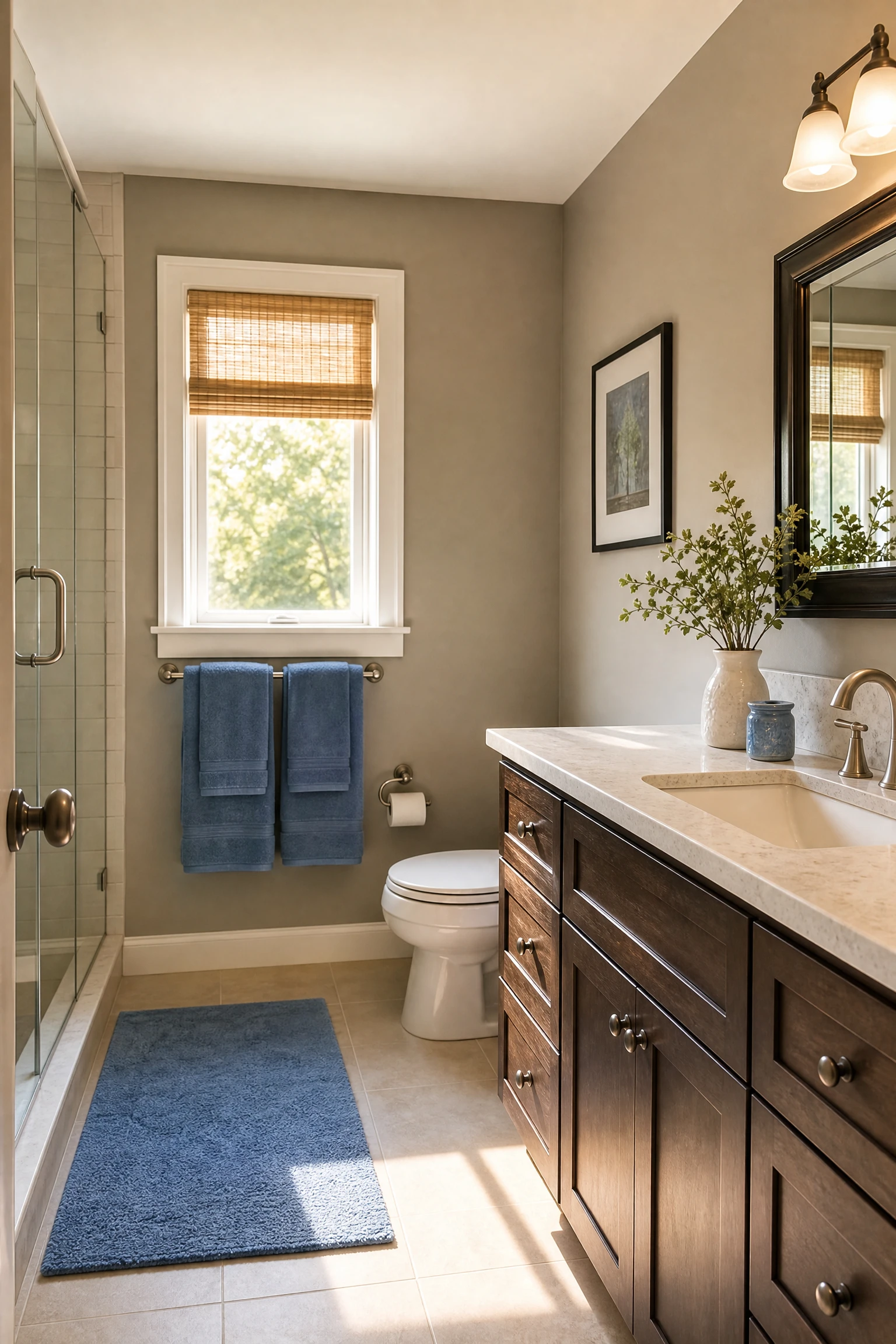
The most common failure in a gray and blue bathroom is choosing a gray with too cool or too blue an undertone, which creates a bathroom that reads as clinical, flat, and slightly cold regardless of how well everything else is executed. A warm gray, one with a slight taupe, greige, or warm stone undertone rather than a cool blue or purple cast, creates the ideal wall background for blue accents because it provides the neutral middle ground that makes the blue accents read as a deliberate design choice rather than a continuation of the same colour family. Warm gray walls in paint like Farrow and Ball Elephant Breath, Benjamin Moore Revere Pewter, or Sherwin-Williams Accessible Beige, paired with soft blue accents in towels, a bath mat, small accessories, and potentially a painted vanity, create a bathroom with genuine warmth that both colors contribute to without either one overwhelming the other. This is the most liveable version of the gray and blue bathroom and the one most likely to remain satisfying over years rather than months.
Pro Move: Order sample pots of your shortlisted warm gray and hold them against a blue fabric sample in the actual bathroom at different times of day before committing. A warm gray that reads as perfectly balanced in morning light can shift toward purple or toward green under cool artificial light, and the specific undertone relationship with your chosen blue changes completely between those two conditions.
2. Blue-Gray Paint as the Wall Color
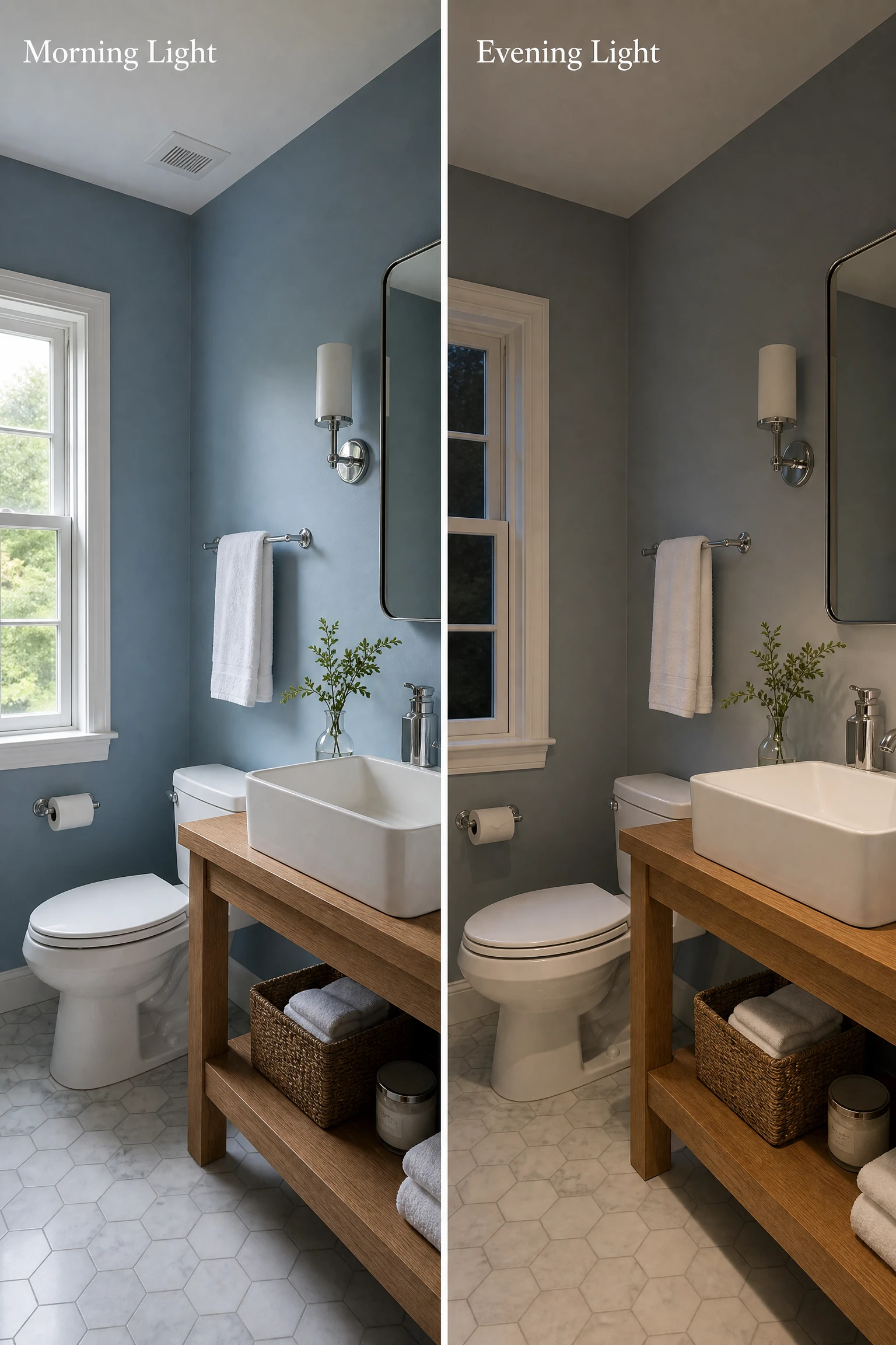
Blue-gray paint, a color that is genuinely ambiguous between the two palette members rather than clearly one with an undertone of the other, is one of the most consistently beautiful and most spa-like wall choices available for a bathroom. Colors like Farrow and Ball Mizzle, Benjamin Moore Palladian Blue, Sherwin-Williams Niebla Azul, or the ever-referenced Farrow and Ball Pavilion Gray all sit in the blue-gray territory where the color reads differently in different light conditions: slightly more blue in natural daylight and slightly more gray under warm evening lighting. This shifting quality is one of the most pleasant qualities of a blue-gray bathroom because the room never looks exactly the same twice and each visit to the space has a slightly different atmospheric quality depending on the time of day. The practical caution with blue-gray paint in a bathroom is north-facing rooms with limited natural light, where a cool blue-gray can read as distinctly cold and slightly unwelcoming. In a south or east-facing bathroom with generous morning light, the same paint color is one of the most beautiful bathroom choices available.
Heads Up: Blue-gray paint colors look significantly different on the small printed swatch or on a screen compared to how they read on a full bathroom wall. The larger the surface, the more the undertone of any paint color intensifies. A blue-gray that reads as gently cool on a swatch can read as distinctly cool blue on four full walls. Always test a minimum A4-size sample painted directly on the bathroom wall before committing.
3. Navy Accent Wall in a Gray Bathroom
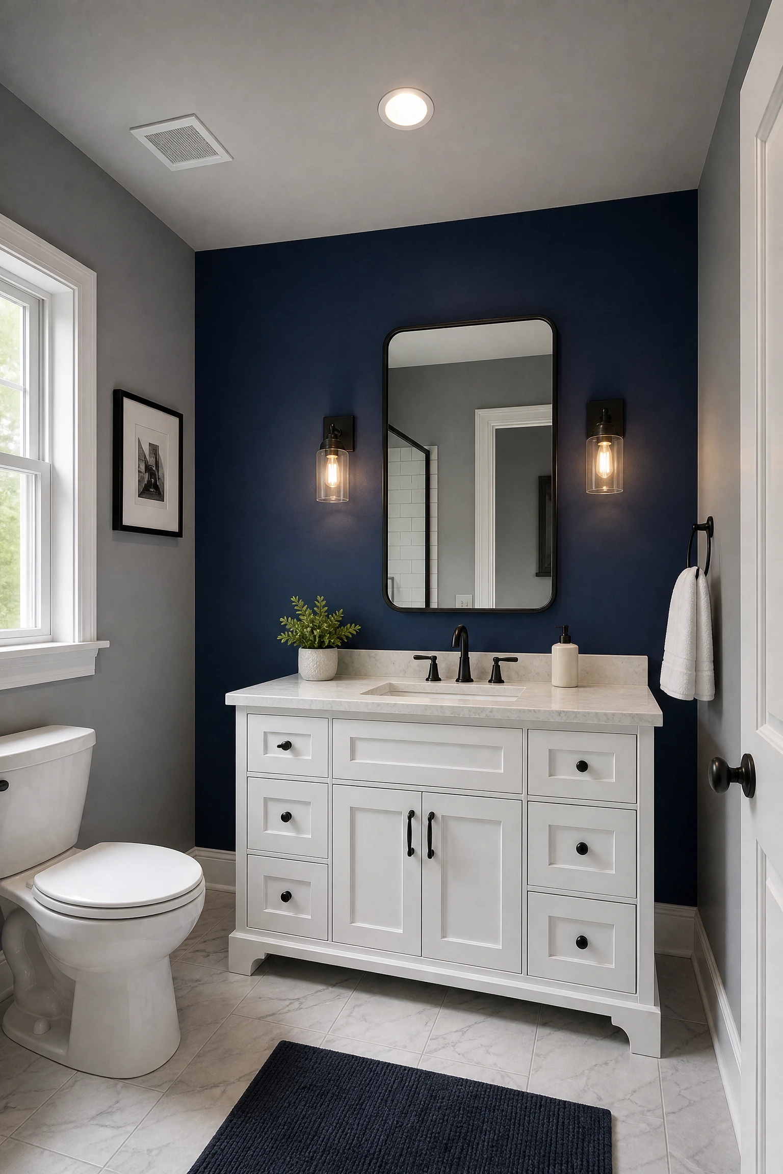
A single navy accent wall in an otherwise gray bathroom, most naturally the wall behind the vanity or the wall at the far end of the bath, creates the most dramatic and most contemporary version of the gray and blue bathroom without requiring the commitment of full navy across all four walls. Against light or mid-tone gray walls on the three remaining sides, a navy accent wall reads as a deeply confident color decision that gives the room a clear focal point and a sense of architectural intention. The contrast between the deep navy and the surrounding gray makes both colors more visible and more specific: the gray looks lighter and crisper than it would surrounded by white, and the navy looks richer and more jewel-like than it would on a white wall. Keep the navy truly dark and fully saturated rather than a muted or dusty navy, which can read as a faded blue or a near-charcoal rather than a confident design choice alongside the gray.
Designer Advice: Paint the ceiling in the same gray as the three non-accent walls rather than white when using a navy accent wall. A white ceiling above a navy wall creates a visual cap that cuts the room horizontally and makes the navy wall feel like a panel that was applied to the room rather than an architectural element of it. A gray ceiling that continues the surrounding wall color lets the navy wall read as a genuine feature wall within a unified space.
4. Pale Sky Blue Walls in a Gray Tiled Bathroom
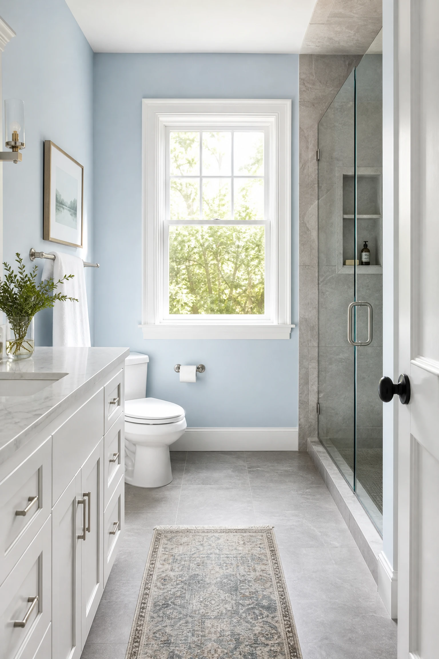
Pale sky blue or powder blue walls in a bathroom with gray tile flooring and a gray stone or tile shower enclosure create the freshest and most light-filled version of the gray and blue bathroom because the pale blue reflects significant natural and artificial light while the gray tile provides the material grounding that prevents the pale blue from reading as airy or insubstantial. This combination is particularly effective in smaller bathrooms where deeper tones on the walls would reduce the perceived size, and in bathrooms with good natural light where the pale blue takes on a genuinely luminous quality in morning sun. The gray tile provides the sophistication and material weight that pale blue alone lacks, and the combination reads as more composed and more considered than either element would achieve separately.
Quick Tip: Choose a sky blue with a very slight warm undertone rather than a cool, slightly grey-blue for bathroom walls that will be seen under a mix of natural and artificial light. A warm-toned sky blue with a touch of green reads as genuinely fresh and alive, while a cool, purely grey-blue can read as faded or slightly institutional under artificial light. The warmth of the undertone is what keeps the pale blue reading as sky rather than as steel.
5. Charcoal Gray Walls With Cobalt Blue Accents
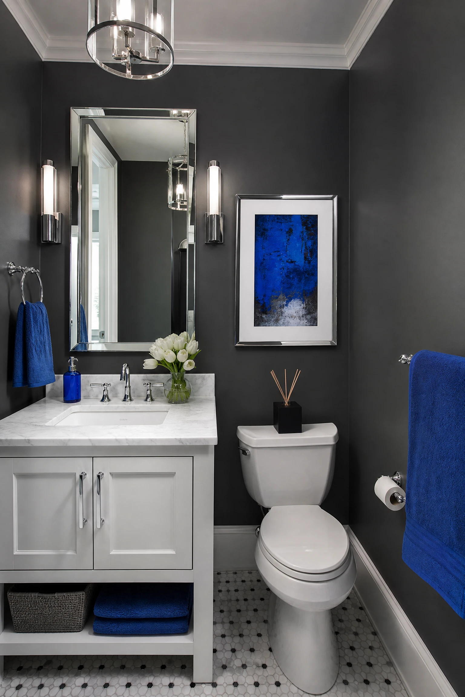
Deep charcoal gray walls with sharp cobalt blue accent elements create the most urban and most graphically confident version of the gray and blue bathroom. This is a combination for a bathroom that should feel dramatic and designed rather than calm and spa-like, and it works best in bathrooms with generous proportions and good lighting where the dark walls have enough space and illumination to breathe. Cobalt blue in towels, a soap dispenser, artwork in the bathroom, or even a painted cabinet door behind the mirror creates the vivid warm-toned contrast that the cool depth of the charcoal walls needs to prevent them from reading as simply dark and heavy. Chrome or brushed nickel fixtures in a charcoal and cobalt bathroom maintain the cool, graphic quality of the combination rather than shifting it toward the warmer territory of brass, which belongs to a different version of the palette.
Reality Check: Charcoal gray walls in a bathroom need significantly more and warmer lighting than pale-walled bathrooms to prevent the space from feeling like a cave. Before committing to charcoal walls, audit every light source in the bathroom and plan for a minimum of three warm-toned light sources at different heights: a ceiling fixture, vanity lighting at face height, and an ambient floor-level or shelf light source. Charcoal walls with inadequate lighting is one of the most consistently regretted bathroom decisions in renovation.
| Wall Approach | Gray Shade | Blue Shade | Mood Created | Light Requirement |
| Warm gray with blue accents | Warm taupe-gray | Soft powder or sky blue | Calm, spa-like, warm | Any light condition |
| Blue-gray paint | True blue-gray mix | Inherent in the paint | Shifting, atmospheric | South or east facing best |
| Navy accent wall | Mid-tone cool gray | Deep fully saturated navy | Dramatic, contemporary | Good natural light needed |
| Sky blue on gray tile | Gray tile as grounding | Pale powder sky blue | Fresh, luminous, airy | Any, best with natural |
| Charcoal with cobalt | Deep dark charcoal | Sharp vivid cobalt | Urban, graphic, bold | Requires layered artificial |
Surface 2: Tile and Flooring
Tile is the material that most defines a bathroom in terms of both aesthetics and longevity, and in a gray and blue bathroom the tile choices carry more design weight than any other single decision because they are permanent, they cover the largest surface areas, and they create the textural and material foundation that every other element in the room needs to relate to.
6. Gray Large-Format Tiles With Blue Grout

Large-format gray porcelain or stone tiles laid on the bathroom floor or shower walls with a blue grout line create a combination that introduces the blue palette color through the most unexpected and most visually contemporary possible application: the grout joint rather than the tile itself. From across the bathroom, the floor or wall reads as gray. At close range, the blue grout lines create a grid pattern that gives the gray tile surface a visual depth and a color presence that standard gray or white grout never achieves. This approach is reversible in the sense that the grout can be replaced with a different color if the blue feels too specific over time, and it is significantly more affordable than sourcing blue tile or blue stone because the tile itself can be a standard and widely available gray product. The specific shade of blue grout matters: a mid-tone slate blue or steel blue reads as sophisticated and architectural. A bright primary blue grout reads as playful and graphic. A very pale blue grout reads as nearly white from a distance and the effect is subtle.
Designer Advice: Seal colored grout on installation and reseal annually. Unsatisfactorily sealed colored grout absorbs moisture, soap, and cleaning product residue and can develop a mottled or stained appearance that affects the intended blue tone over time. A penetrating grout sealer applied within 48 hours of grouting and annually thereafter maintains the color integrity of the grout for the life of the tile installation.
7. Blue and Gray Geometric Floor Tiles
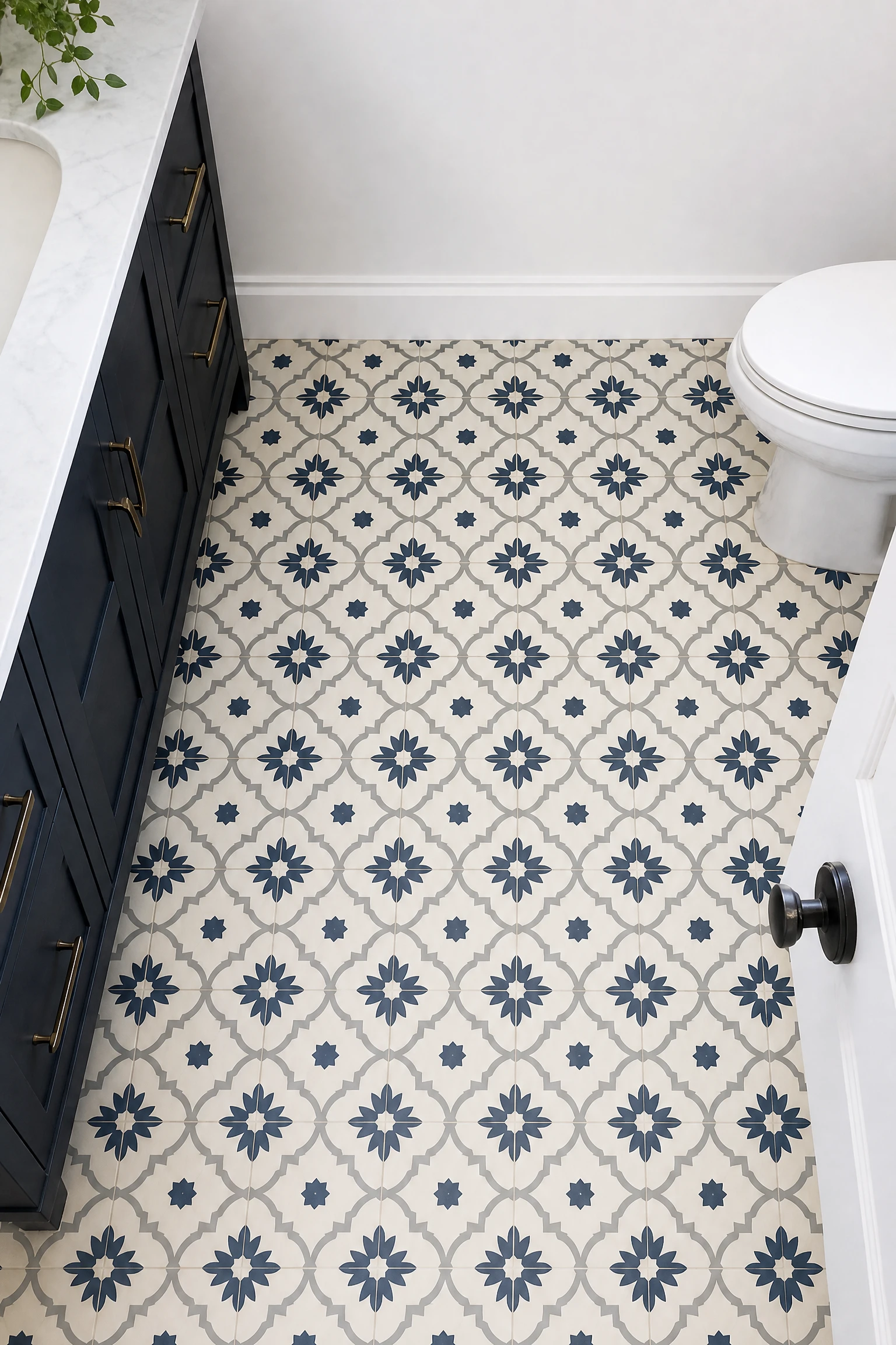
A geometric floor tile pattern that carries both blue and gray in its design, whether a Moroccan-inspired star and cross pattern, a classic encaustic-style geometric, a chevron in alternating blue and gray, or a hexagonal arrangement in two tones, creates the most pattern-rich and most visually complex version of the gray and blue bathroom from the floor upward. The pattern distributes both colors across the full floor surface in a proportion that the tile designer has already resolved, which removes the decision about how much of each color to use and where. With a geometric blue and gray floor, the walls can be kept in a single pale neutral, the vanity in white or light timber, and the fixtures in simple chrome, and the room will feel completely considered because the floor is doing all the color and pattern work. Keeping everything above the floor level deliberately restrained is the key to making a patterned gray and blue floor read as designed rather than busy.
Heads Up: Geometric floor tiles in two or more colors are significantly more demanding to lay than single-color tiles because the pattern alignment must be maintained across the full floor area including cuts at edges, doorways, and around toilet and bath fixtures. Always use an experienced tiler who has specific experience with geometric pattern tiles rather than a generalist who works primarily with standard format tiles. The pattern alignment quality is what separates a floor that looks professionally designed from one that looks amateur.
8. Blue Subway Tile Shower With Gray Stone Floor
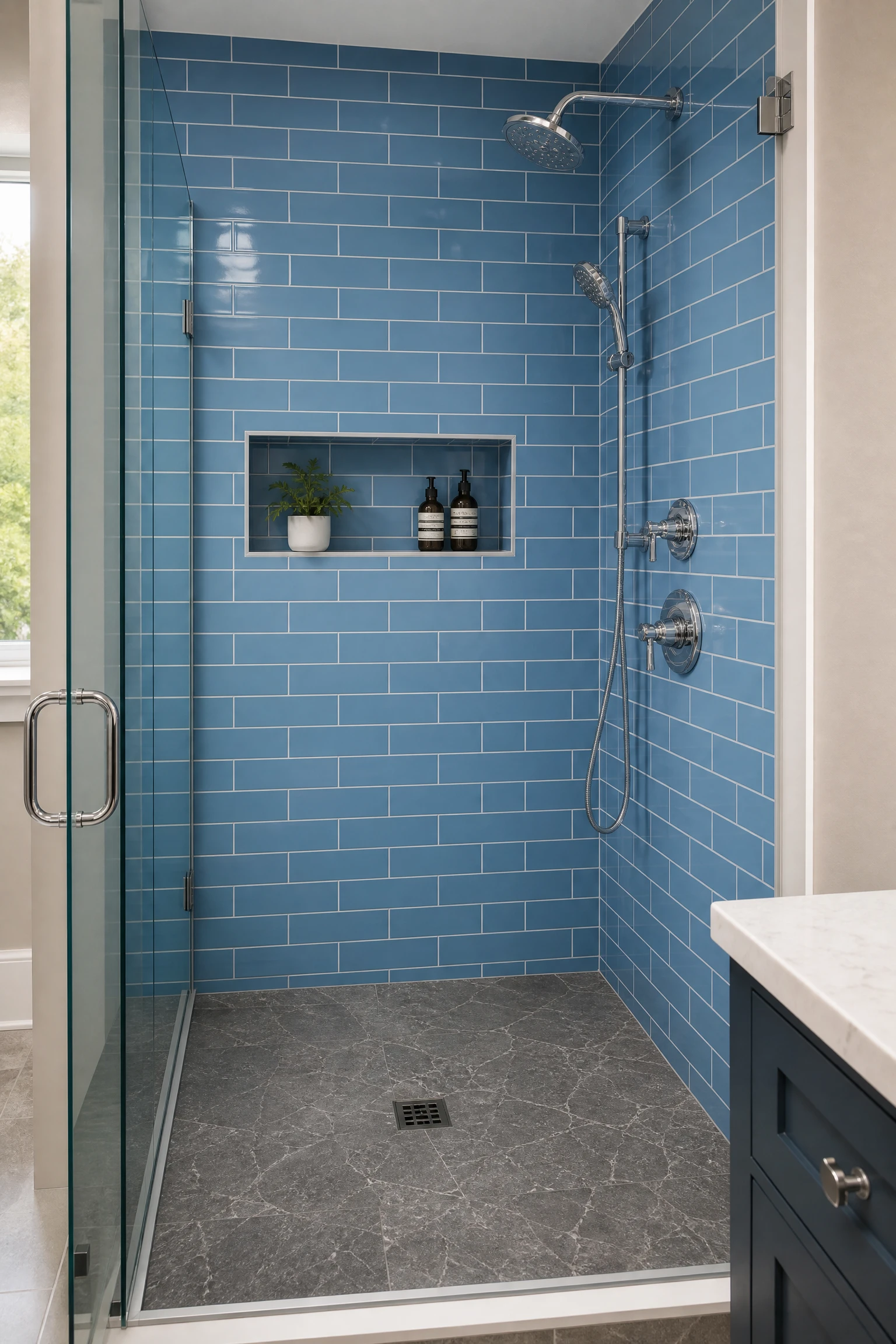
A shower enclosure tiled in blue subway tile, whether in a classic 3×6 inch format in a traditional brick pattern or in a larger 4×8 or 4×12 format in a stacked or herringbone arrangement, alongside a gray stone or stone-effect porcelain floor creates one of the most reliably classic and most enduringly appealing gray and blue bathroom combinations. The blue subway tile gives the shower enclosure a clear color identity and a pattern-rich surface that reads as both contemporary and historically grounded, and the gray stone floor provides the material weight and the warm-neutral counterpoint that the blue needs to read as confident rather than cold. The grout choice for the blue subway tile is the most important secondary decision: white grout creates the crispest, most classic result. Gray grout creates a more contemporary, slightly moodier result. Dark charcoal grout creates the most dramatic and most graphic result.
Quick Tip: Choose a blue subway tile with a slightly varied or reactive glaze rather than a perfectly uniform flat glaze for the most interesting and most visually rich shower wall. Handmade or artisan-look tiles with slight variation in the blue tone between tiles create a depth and movement across the shower wall that machine-manufactured tiles with perfectly uniform color cannot replicate.
9. Gray Marble or Veined Stone in a Blue Bathroom

Gray marble or veined gray stone, whether genuine marble like Carrara or Bardiglio, or the now-exceptional stone-effect porcelain that replicates the veining of natural stone at a fraction of the cost and maintenance requirement, works specifically well in a blue bathroom because the natural veining in gray marble often carries blue, silver, or blue-gray tones in its patterns that connect the gray stone surface to the blue palette elements of the room. A Carrara marble with fine gray veining on a white ground creates the lightest and most classic version. Bardiglio marble with deeper blue-gray veining creates the moodiest and most dramatic. Calacatta marble with warm gold veining alongside the gray creates the most luxurious version, with the gold adding warmth that prevents the gray and blue combination from tipping cold. The stone surface does not need to be gray throughout: a stone-effect tile with a predominantly white ground and gray veining reads as gray-and-white in the overall palette but provides the material connection to the gray side of the bathroom color story.
Pro Move: Use the same stone or stone-effect tile on both the bathroom floor and the shower walls for a continuous visual effect that makes small bathrooms appear significantly larger. The elimination of the visual boundary between floor and shower wall creates a spa-like quality that is genuinely difficult to achieve through any other means, and the single continuous material reads as a deliberate architectural decision rather than a budget-driven tile choice.
10. Dark Gray Floor Tile as the Room Anchor
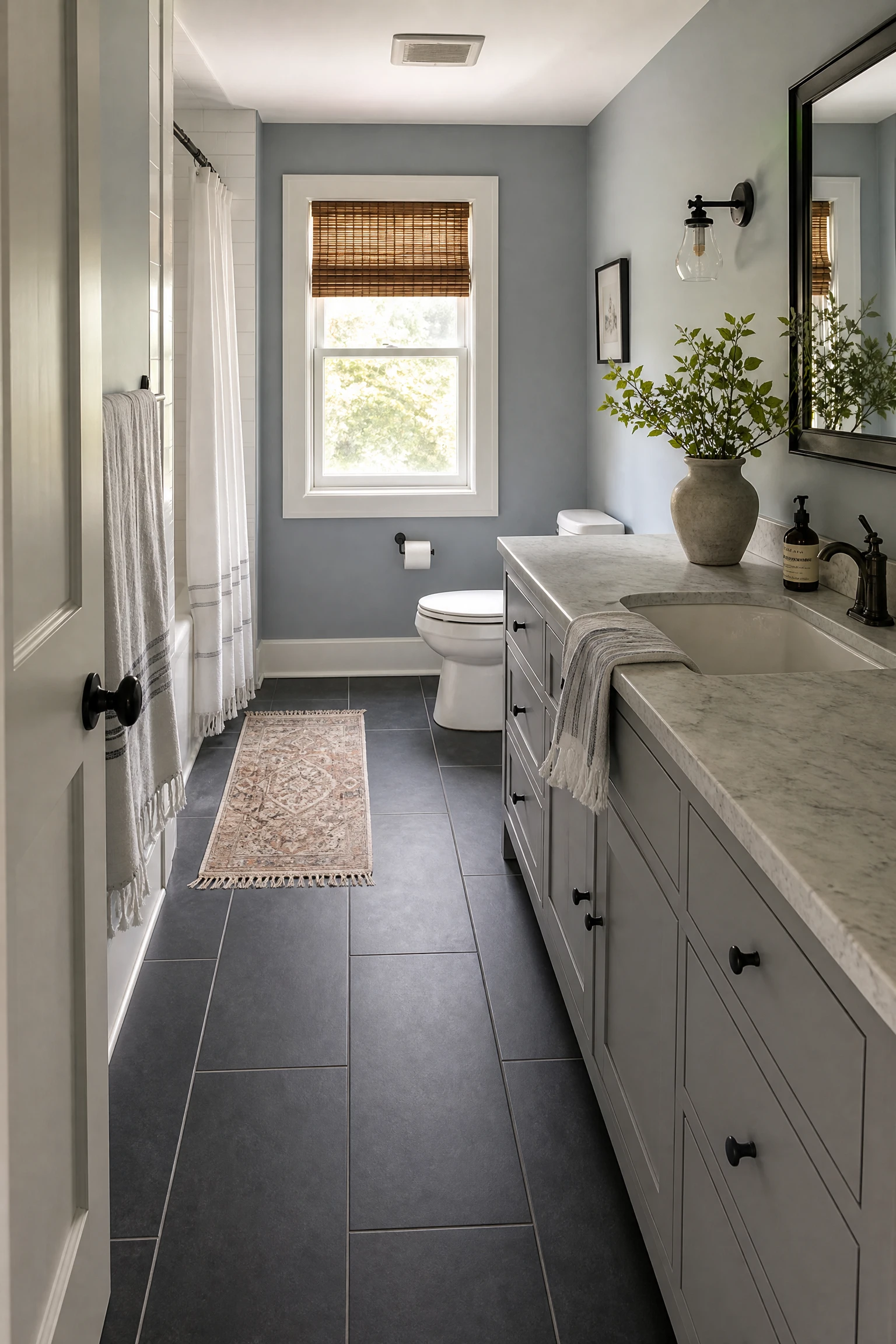
A dark gray floor tile, whether in a large format dark slate-effect porcelain, a honed dark granite, or a concrete-finish tile in a deep charcoal tone, anchors the gray and blue bathroom at the lowest level and creates a visual weight at the floor that allows the walls, vanity, and accessories above it to be in lighter and more varied tones without the room feeling ungrounded. In a gray and blue bathroom where the walls are in a lighter blue-gray tone and the vanity is in a soft navy or blue-gray, a dark gray floor brings all the elements together by providing the darkest tone in the palette at the point where the eye naturally settles on entering a room. The floor also reads as a grounding reference point that prevents the cooler blue-gray tones above it from feeling as though they are floating without material anchor.
Reality Check: Dark gray floor tiles in a bathroom with limited natural light can make the room feel smaller than it actually is because the dark floor reduces the apparent depth of the space. In bathrooms with good natural light, this is less of a concern because the light bounce from windows and surfaces compensates for the light absorbed by the dark floor. In bathrooms with limited natural light, choose a mid-tone gray floor rather than a very dark one and ensure the ceiling and at least one wall surface are in a light reflective tone.
Surface 3: Vanity and Cabinetry
The vanity is the primary furniture piece in any bathroom and the one element that most defines the character and aesthetic direction of the space. In a gray and blue bathroom, the vanity color is usually the decision that determines which of the two palette colors leads and which provides the counterpoint. It is also the most impactful change available in an existing bathroom that does not require tile work or structural changes.
11. Navy Vanity in a Gray Bathroom
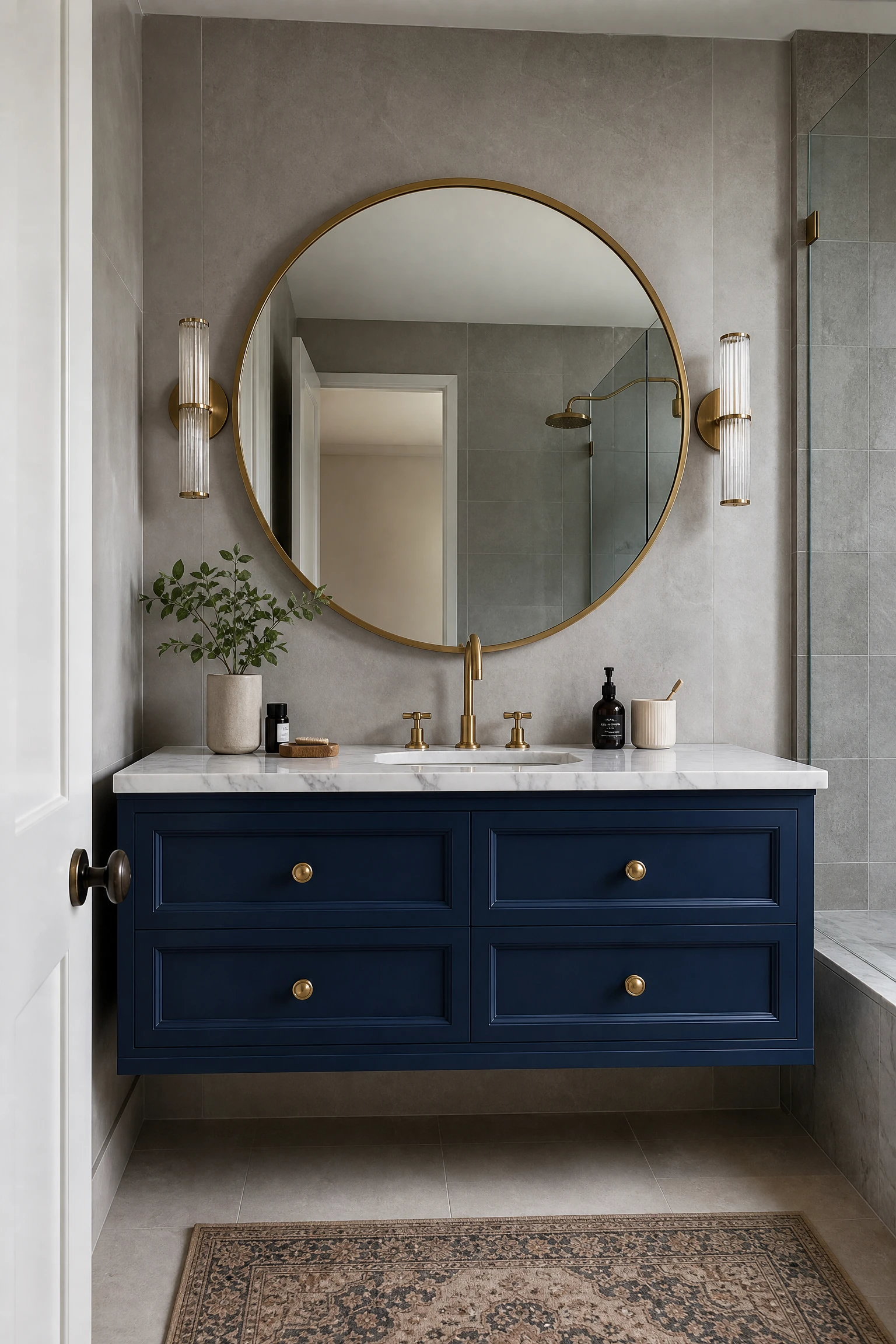
A navy painted or navy lacquered vanity in a bathroom with gray tile walls, gray stone floor, and white fixtures is the most popular and most reliably sophisticated single application of color in a gray and blue bathroom because the navy grounds the palette at furniture scale without requiring any wall paint commitment. The navy vanity functions almost like a piece of furniture in the bathroom rather than a fitted installation, particularly when it has simple timber or painted legs that give it a slightly freestanding quality. Against gray walls and gray tile, the navy reads as a deliberate color choice rather than a default, and the contrast between the warm depth of the navy and the cooler tone of the surrounding gray creates a visual focal point around the vanity that gives the bathroom a clear center of design interest. The countertop choice is the critical companion decision: white marble or white quartz over a navy vanity is the most classic and most photographed combination. A warm timber countertop over a navy vanity is a more contemporary and materially warmer alternative.
Designer Advice: Paint an existing bathroom vanity in navy rather than replacing it as the starting point for a gray and blue bathroom transformation. A standard MDF vanity unit sanded, primed, and painted in a quality chalk or semi-gloss paint in a deep navy costs a fraction of a replacement vanity and delivers a result that is visually indistinguishable from a purchased navy-painted unit in most bathroom environments. The primary requirement is thorough preparation: inadequate sanding and priming is the most common cause of a painted bathroom vanity that chips and peels within the first year.
12. Gray Vanity With Blue Hardware
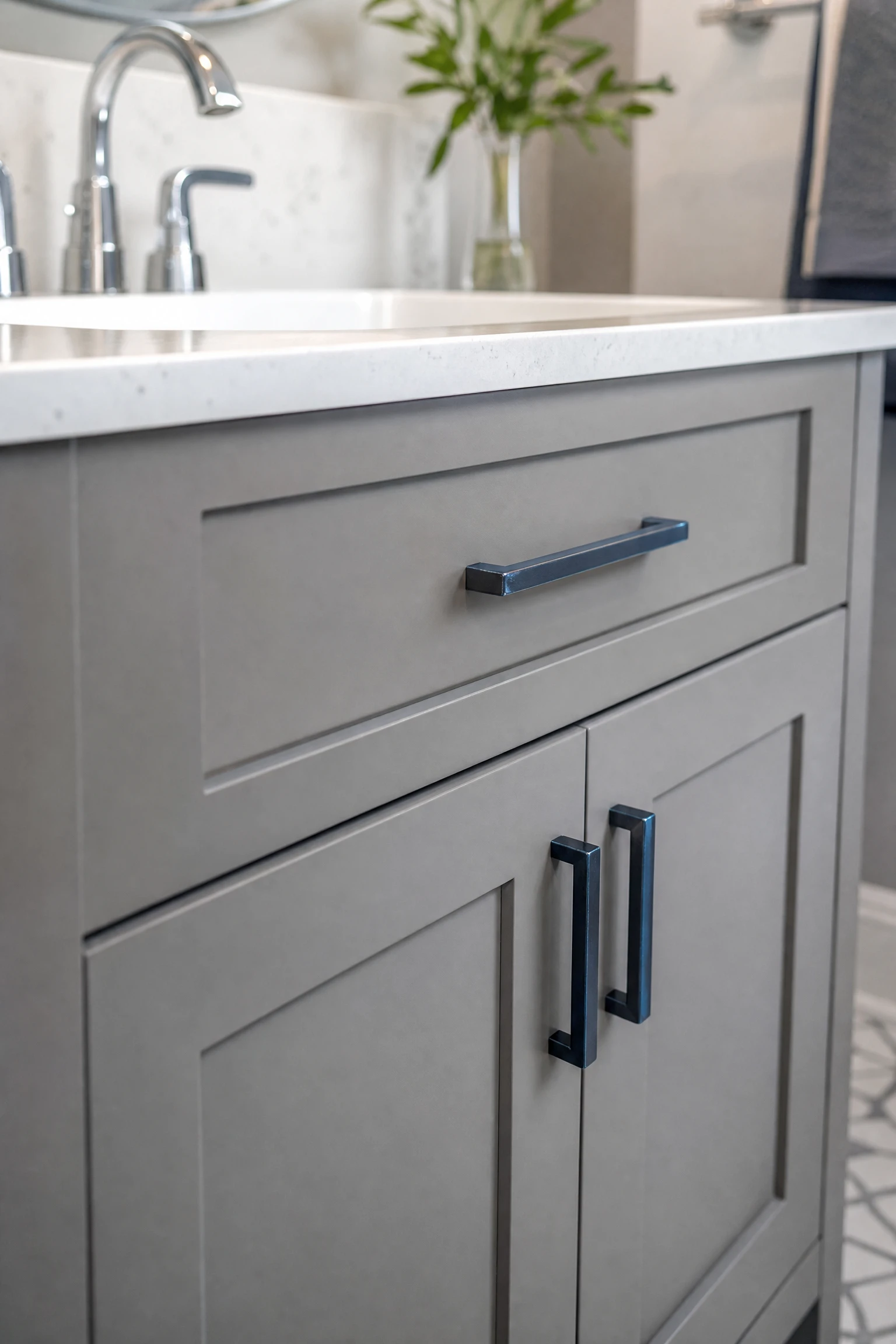
A gray painted or gray lacquered vanity with hardware in a blue-toned metal, whether gunmetal, steel blue, or blue-oxide brass, creates the most refined and most unexpected version of the gray and blue palette at vanity scale because it delivers both colors within a single piece of furniture rather than assigning each to a different element. This approach is rare enough in bathroom design to create a genuinely distinctive result, and it allows the surrounding bathroom to be more neutral and more restrained because the color relationship has already been established within the vanity itself. The hardware choice is the decision that requires the most care: a blue-toned gunmetal or a blue-oxide finish reads as high-end and considered. A painted blue hardware handle reads as DIY and slightly precarious in a bathroom environment where hardware is used and touched multiple times daily.
Quick Tip: Blue-toned metallic hardware is a specialty finish that is not available from every hardware supplier. Check the specific finish description carefully before purchasing: many finishes described as steel blue or gunmetal have warm bronze undertones that will fight a cool gray vanity rather than connecting to it. Request physical samples of the hardware against the vanity paint color before placing a full order.
13. Light Gray Floating Vanity in a Navy Room
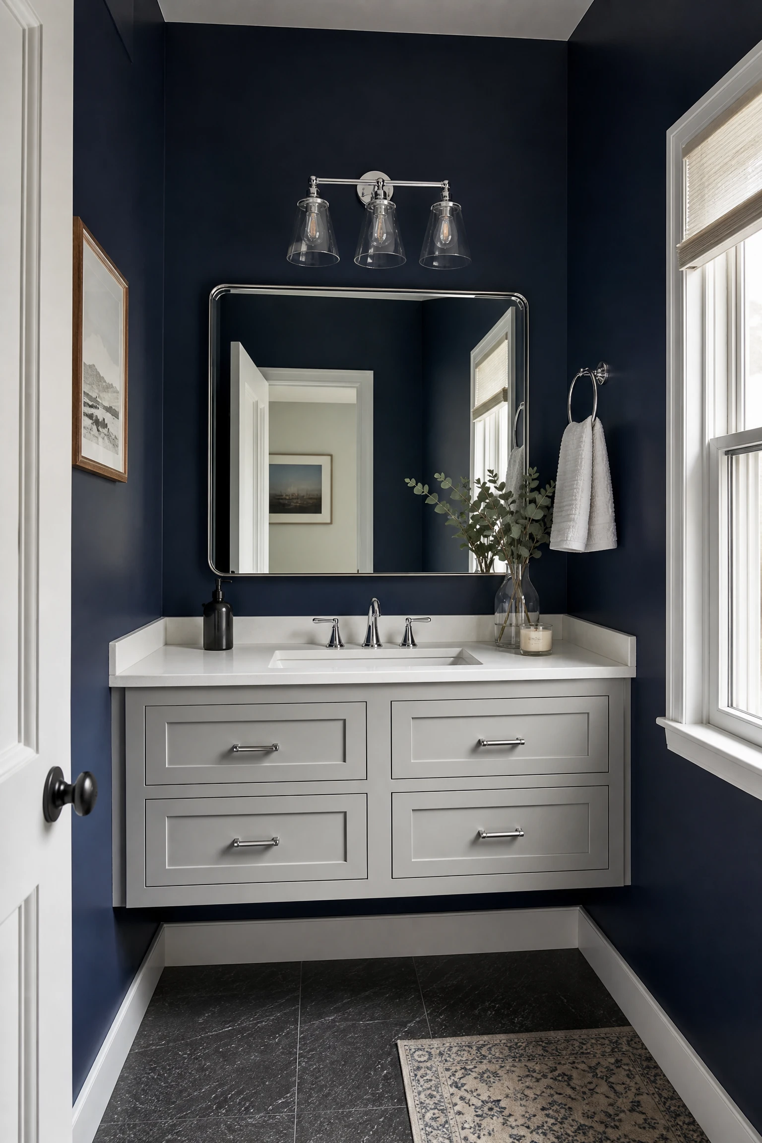
A light gray floating vanity with a thin profile and a white stone or quartz countertop in a bathroom with navy or deep blue walls creates the most visually balanced version of the gray and blue bathroom because it places the lighter of the two colors at the furniture level and allows the dark blue walls to recede around it. The floating design is critical for this combination: a vanity with legs or a raised base above the floor maintains the visual continuity of the floor surface beneath and around it, which prevents the dark-walled bathroom from feeling bottom-heavy and enclosed. The light gray vanity against navy walls creates a visual focal point that is bright and clean within the dramatic dark environment and provides the necessary visual relief that prevents the dark bathroom from feeling oppressive.
Heads Up: Light gray lacquered vanities show water splashes, toothpaste marks, and fingerprints more readily than white or dark-finish vanities and require frequent wiping to maintain the clean, pale appearance that makes them look so effective against dark walls. In a bathroom used by multiple people daily, a light gray finish in a semi-gloss or satin sheen is significantly more practical than a flat or chalky finish that holds surface marks.
14. Blue-Gray Painted Vanity as the Color Bridge
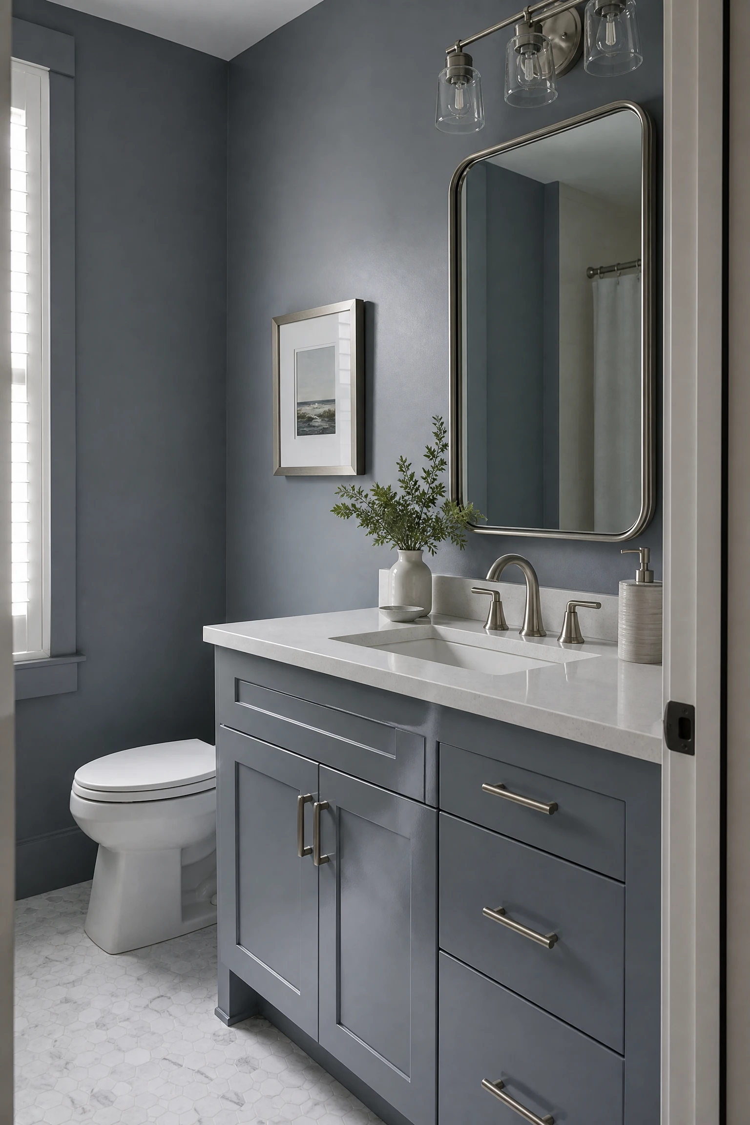
A vanity painted in a true blue-gray, a color that sits ambiguously between the two palette members rather than being clearly one or the other, is the most harmonious and most visually cohesive vanity choice in a gray and blue bathroom because it acts as a bridge between the gray and blue elements of the room rather than assigning each color to separate surfaces. This approach is particularly effective when the wall paint is a gray with blue undertones, because the blue-gray vanity reads as a continuation of the wall palette at a slightly deeper or more saturated version, creating a tonal bathroom where the depth of the palette increases as it moves toward the center of the room. Paint colors like Farrow and Ball Downpipe, Benjamin Moore Hale Navy Gray, or Sherwin-Williams Bluish all sit in this genuinely ambiguous blue-gray territory.
Pro Move: When painting a vanity in a blue-gray that is also being used on a wall, apply the vanity paint in a semi-gloss or eggshell finish while keeping the wall in a flat or matte finish. The slight sheen difference between the vanity and the wall creates a visible distinction between the furniture element and the architectural surface even when the color is identical, which prevents the vanity from disappearing into the wall and losing its identity as a piece of furniture.
“Gray and blue in a bathroom is not a colour scheme. It is a material relationship. Get the undertones aligned on the surfaces that matter most and everything else follows naturally.”
Surface 4: Fixtures and Hardware
Fixtures and hardware are the smallest surface area elements in the bathroom but they have a disproportionate effect on the perceived quality and the stylistic direction of the space. In a gray and blue bathroom, the specific metal finish of the taps, towel rails, light fittings, and mirror frames determines whether the palette reads as cool and contemporary, warm and luxurious, or naval and masculine.
15. Chrome Fixtures in a Blue and Gray Bathroom
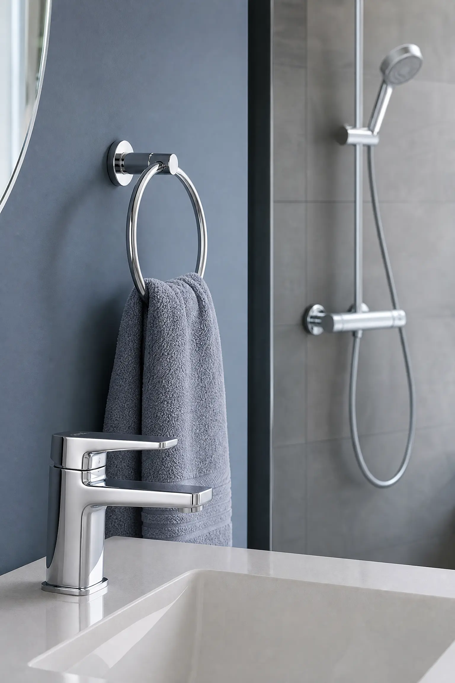
Chrome is the most natural and most historically aligned fixture finish for a gray and blue bathroom because its cool silver tone shares the cool temperature of both palette colors and creates a consistent metallic presence throughout the room without introducing a competing warm tone. In a bathroom where the tiles are gray, the walls are blue-gray, and the vanity is navy or gray, chrome fixtures, tap, shower head, towel rail, towel ring, toilet roll holder, and mirror frame, create a unified metallic palette that reads as precise and contemporary without any visual temperature conflict. The limitation of chrome in a gray and blue bathroom is that it can amplify the cool quality of the palette to a point where the room feels cold and clinical, particularly in bathrooms with limited natural light and cool-toned artificial lighting. A single warm element, either natural timber on the vanity shelf or countertop, a warm-toned bath mat, or a pendant light with a warm bulb, is sufficient to counteract this risk.
Reality Check: Chrome tap fittings require regular cleaning to maintain the bright reflective appearance that makes them look so clean and contemporary. In a hard water area, limescale deposits on chrome build rapidly and are visible immediately against the bright reflective surface. Consider a chrome finish rated for hard water resistance or plan a regular cleaning schedule with a limescale remover before choosing chrome fixtures in a bathroom with hard water supply.
16. Brushed Brass Hardware in a Blue and Gray Bathroom
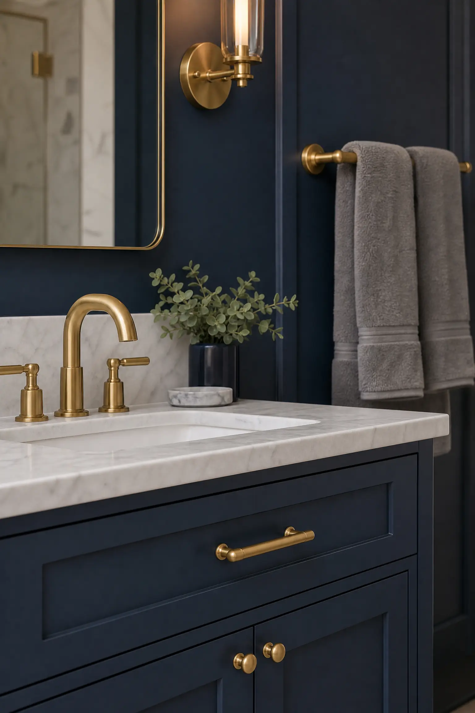
Brushed brass or warm gold hardware in a gray and blue bathroom creates the most luxurious and most material-rich version of the palette by introducing a third tone that bridges the coolness of both the gray and blue with a warm metallic warmth that prevents the room from tipping into cold or clinical territory. A gray tile bathroom with a navy vanity and brushed brass hardware, including the basin tap, towel bar, and cabinet hardware, reads as genuinely hotel-like in the quality of its material combination, and the contrast between the warm brass and the cool gray and blue creates the specific visual interest that makes a bathroom feel designed rather than merely decorated. Brushed brass rather than polished brass is the right choice for a contemporary gray and blue bathroom: polished brass reads as slightly traditional or ornate in a cool-toned contemporary palette, while the matte warmth of brushed brass reads as perfectly aligned with the current direction of bathroom design.
Designer Advice: Choose hardware in a single brass finish tone across all elements in the bathroom, including the tap, shower fitting, towel rails, toilet roll holder, and any light fittings. Mixed metallic tones in a bathroom read as unresolved rather than layered, and in a palette where gray and blue are already doing significant visual work, adding multiple competing metallic tones is one too many visual decisions for the space to absorb.
17. Matte Black Fixtures as a Graphic Accent
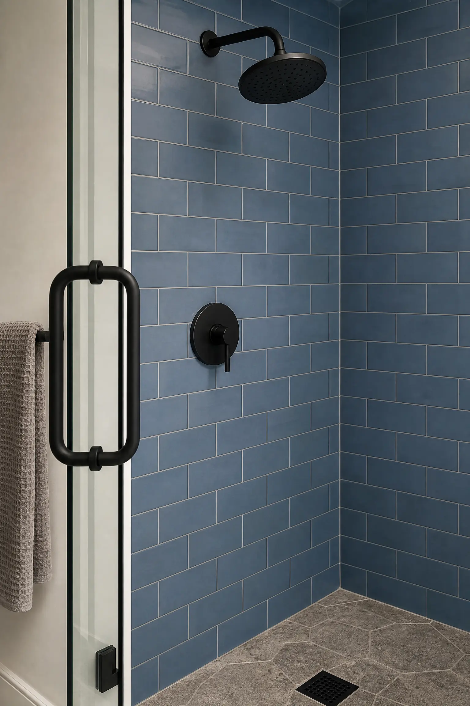
Matte black fixtures in a gray and blue bathroom create the most graphic and most contemporary version of the palette because black is a non-color that provides maximum contrast against both the gray and blue surfaces without introducing a competing palette member. A matte black basin tap against a white marble countertop and a navy vanity, or a matte black shower system against blue subway tiles with gray grout, reads as precisely considered and completely intentional in a way that chrome or brass against the same surfaces does not always achieve. The matte finish is critical: polished black reads as harder and more industrial than the warmer, slightly softer quality of matte black, and in a bathroom where the goal is sophisticated rather than edgy, the matte version maintains the quality of the combination without pushing it into a direction that may feel too specific to a particular design era.
Quick Tip: Matte black tap fittings are more susceptible to visible water marks and mineral deposits than chrome or brass alternatives because the flat matte surface has no reflective quality to disguise surface residue. Daily wiping with a soft dry cloth after use is the maintenance requirement for matte black fixtures that look as good in daily life as they do in the installation photograph.
18. Nickel or Gunmetal for a Sophisticated Bridge
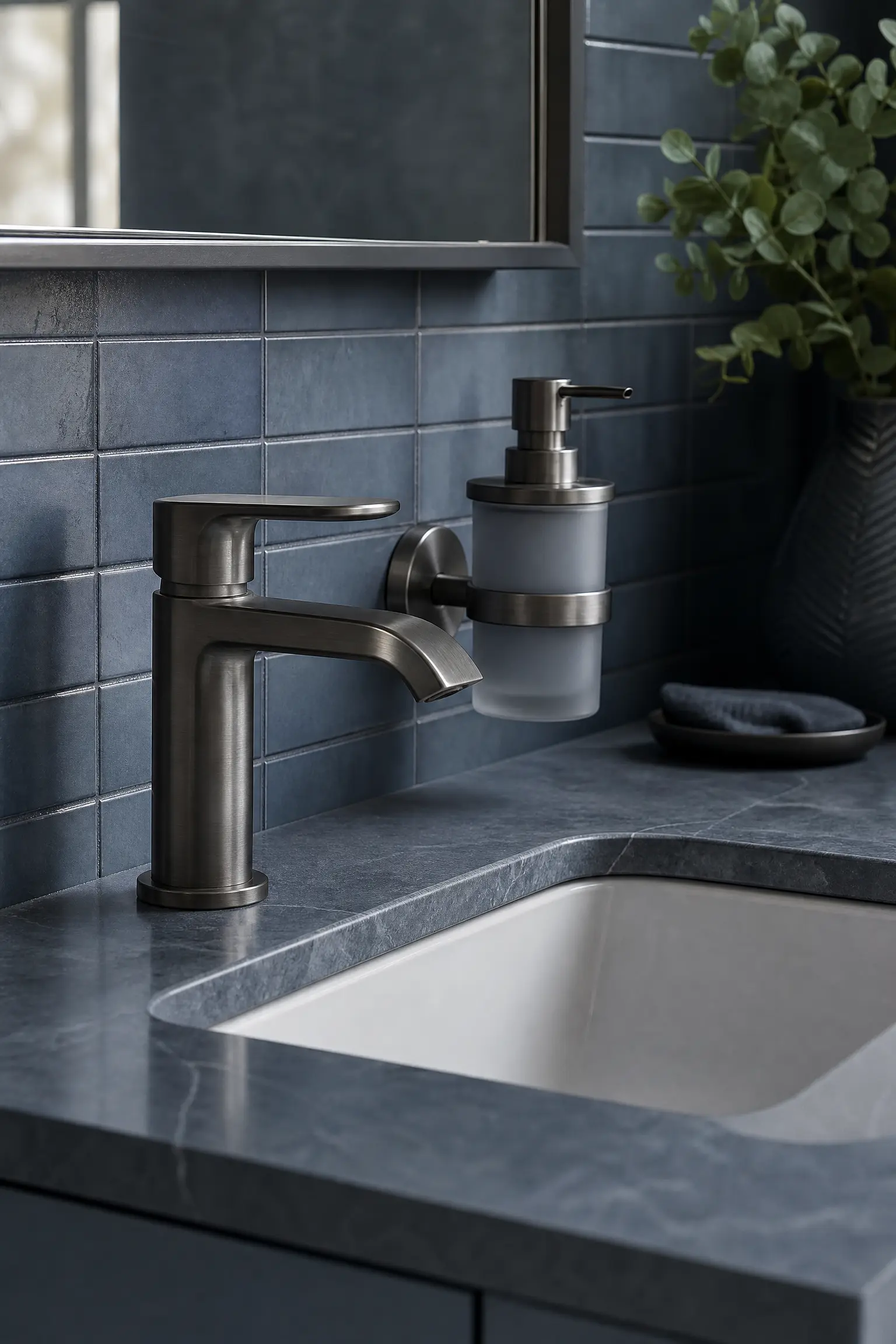
Brushed nickel or gunmetal fixtures occupy the visual territory between chrome and black and are the ideal fixture finish for a gray and blue bathroom where the palette is very cool and crisp and neither the warmth of brass nor the graphic quality of matte black is appropriate. Brushed nickel has a slightly warm silver tone that reads as more refined and less industrial than polished chrome, and gunmetal has a deep gray-blue tone that directly echoes the palette of the bathroom. In a very sophisticated blue-gray bathroom where the walls, floor, vanity, and accessories are all in a carefully calibrated gray-blue palette, gunmetal fixtures feel like a natural extension of the color story rather than a separate metallic decision, and the result is a bathroom with a level of material coherence that is genuinely unusual and genuinely impressive.
Heads Up: Gunmetal and deep nickel finishes vary considerably between manufacturers in their actual tone and depth of color. What one supplier labels gunmetal another labels brushed pewter or antique nickel, and these finishes can look very different from each other in practice. Request physical samples of any specialty metal fixture finish before purchasing the full set, as catalog photography rarely captures the specific quality of specialty finishes accurately.
Surface 5: Textiles and Accessories
Textiles and accessories are the most affordable, most changeable, and most immediately impactful of all the gray and blue bathroom decisions because they can be added, swapped, and refreshed without any structural or trade work. They are also the category most often underestimated in terms of their effect on the overall quality of the bathroom, because a well-styled set of textiles and accessories in a precise gray and blue palette elevates even an ordinary bathroom, while a mismatched or randomly assembled collection of textiles reduces even an otherwise well-executed bathroom to something that looks unfinished.
19. A Layered Towel Arrangement in Navy, Gray, and White
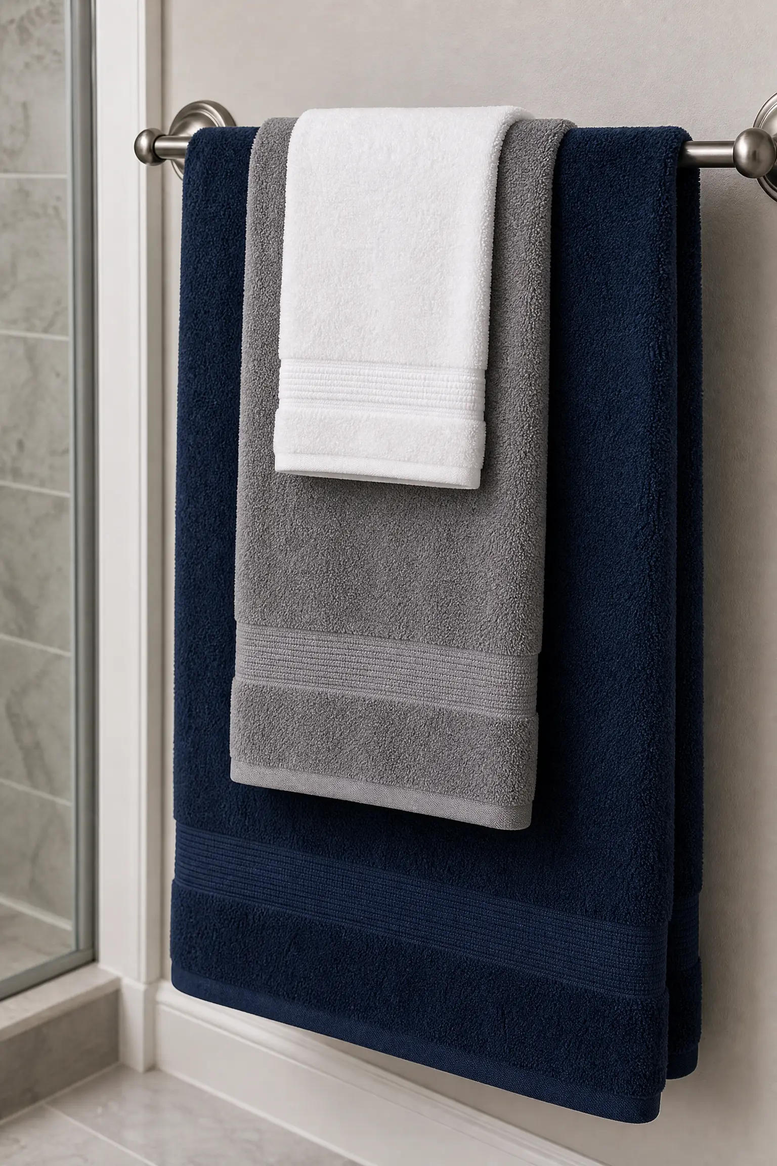
The towel arrangement in a gray and blue bathroom is the most immediately visible textile decision and the one that most directly determines whether the bathroom reads as styled or simply as a place where towels happen to hang. A layered arrangement using three tones within the palette, deep navy, mid-tone gray, and white or near-white, provides the tonal range within the palette that gives the bathroom depth and visual interest at the most visible and most frequently changed element in the room. A large navy bath towel folded to show a clean edge, a mid-tone gray hand towel folded to the same width and placed in front of it, and a small white face cloth or washcloth folded and placed in front of both creates a layered arrangement that is both functional and genuinely styled. The key is the folding: towels folded to show a consistent clean edge, all at the same width, and stacked in depth order from largest to smallest, create the hotel quality that casual towel placement never achieves.
Pro Move: Buy towels in the same material and weight within the palette set. Towels that share the same weave and pile weight fold to the same dimensions and hang at the same height, which is the specific consistency that makes a hotel-standard towel arrangement possible in a domestic bathroom. Mixing a thin gym towel with a thick Egyptian cotton bath sheet in the same arrangement creates a visible inconsistency in fold depth and hanging height that reads as accidental rather than considered.
20. A Bath Mat in Contrast to the Floor
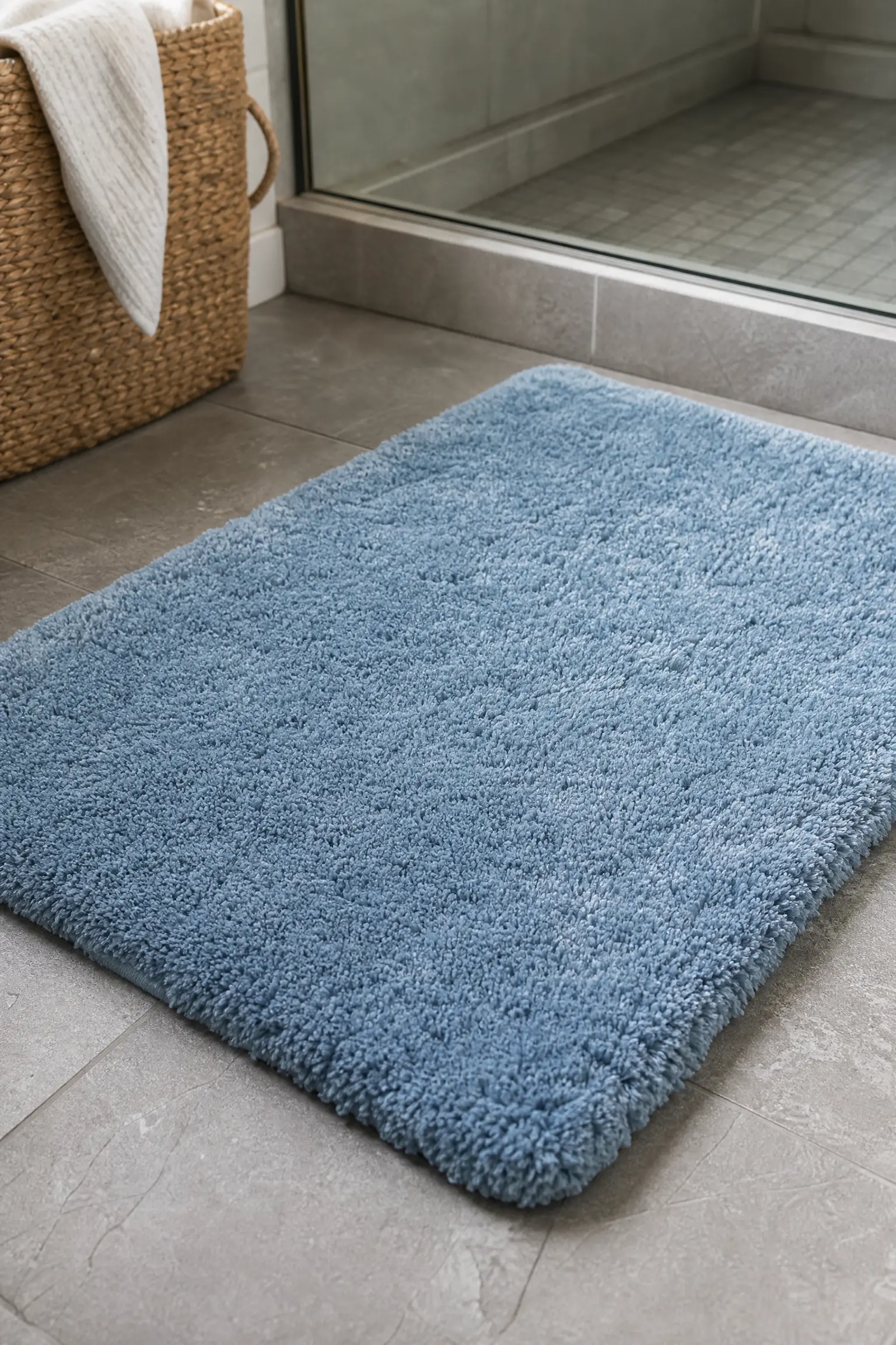
The bath mat is one of the most underestimated design decisions in a bathroom because it sits at the lowest visible level of the room and is the first thing anyone steps onto after leaving the shower or bath. In a gray and blue bathroom with a gray tile floor, a bath mat in a contrasting pale blue or warm navy creates a visible textile element at floor level that connects the floor color to the wall and vanity palette and introduces softness and warmth in the position where it is most physically felt. In a bathroom with a blue tile floor or blue-gray walls, a gray bath mat with a slight texture or a simple geometric weave provides the neutral counterpoint at floor level. The bath mat should be sized generously for the space in front of the shower or bath rather than undersized, as a too-small mat looks as if it was chosen for a different, smaller bathroom and creates a proportion problem that is visible every time the bathroom door is opened.
Quick Tip: Replace the bath mat seasonally or at minimum twice a year. A bath mat that has been in daily use for more than six months shows pile compression, slight discoloration at the high-use areas, and a general flatness that makes even a beautiful bathroom look slightly tired. A fresh bath mat in the right color is one of the cheapest and most impactful annual bathroom updates available.
21. Gray and Blue Artwork or Prints
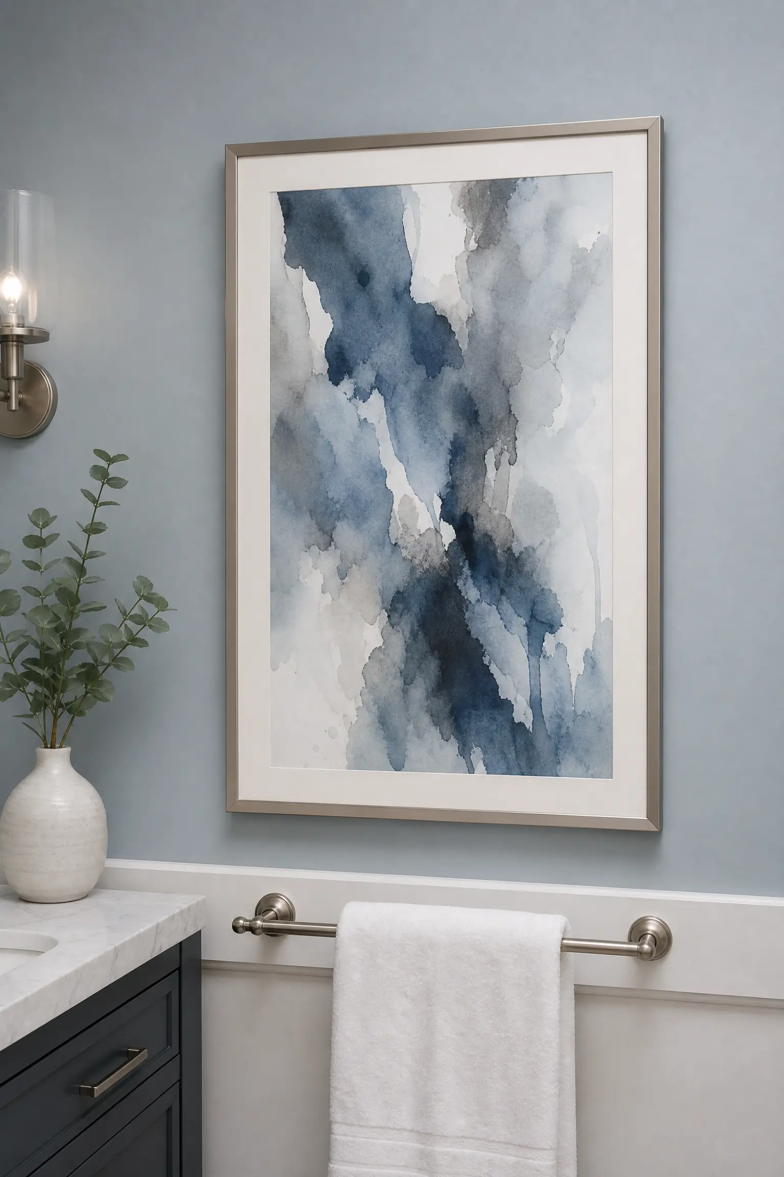
Artwork in a bathroom is a design choice that most homeowners underutilize, treating the bathroom walls as purely functional surfaces rather than as opportunities for the same personal expression available in every other room of the home. In a gray and blue bathroom, one well-chosen piece of art, a large-format abstract print in blue and gray watercolor tones, a botanical print with blue foliage and gray-white background, a photographic print of a seascape, shoreline, or sky that carries both palette colors in its tonal range, or a graphic geometric print in navy and gray, creates a focal point that gives the bathroom a personal identity beyond its color palette. The artwork should be in a sealed frame with glass, and the frame should relate to the existing hardware and fixture finish: a silver or aluminum frame with chrome fixtures, a warm timber frame with brass hardware, a black frame with matte black fittings.
Reality Check: Bathroom humidity and steam can damage paper-based prints and the cardboard backing of framed prints over time, particularly in bathrooms without adequate ventilation. Use acrylic or canvas prints rather than paper prints in bathrooms, or ensure paper prints are sealed behind glass with a sealed frame back and that the bathroom has sufficient ventilation to prevent moisture buildup on the glass surface.
22. Plants as the Living Green Bridge
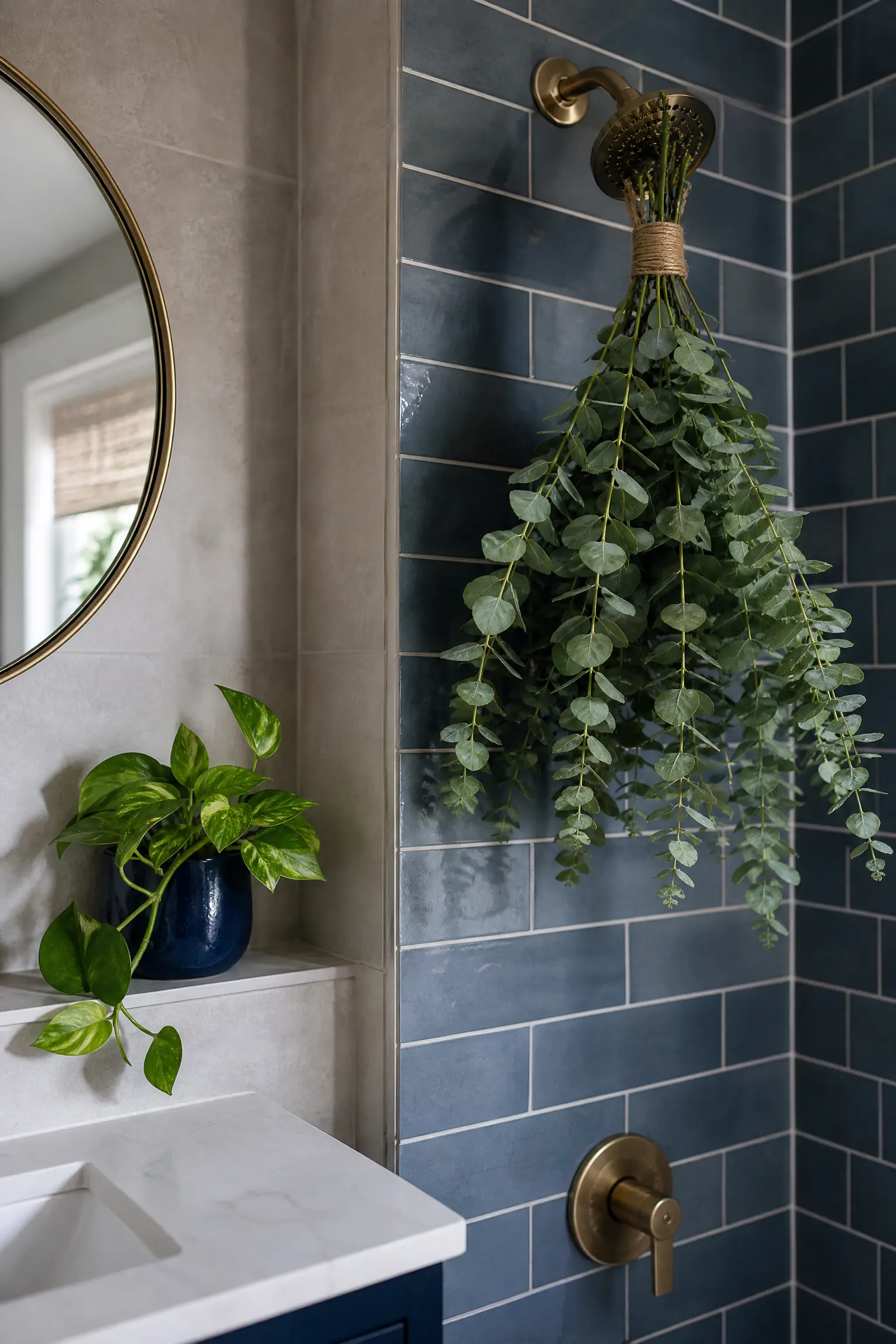
Indoor plants in a gray and blue bathroom serve the same bridging function they serve in other cool-toned color combinations: the green of living foliage sits between the cool blue and the neutral gray on the color wheel and creates an organic warmth and connection to the natural world that softens the palette and prevents it from reading as too cool or too clinically precise. Eucalyptus stems in a simple gray or blue ceramic vase, a trailing pothos on the highest shelf, a fern on the windowsill, or a small olive tree in a floor corner all introduce the green note that makes the gray and blue palette feel genuinely spa-like rather than simply color-coordinated. The container for the plant is as important as the plant itself in a gray and blue bathroom: a simple matte gray or navy ceramic pot reads as part of the palette. A plastic nursery pot reads as an afterthought.
Designer Advice: A bunch of fresh or dried eucalyptus hung from the shower head with a simple piece of twine is the single fastest and most affordable way to introduce organic green material into a gray and blue bathroom. The steam from the shower activates the natural oils in the eucalyptus leaves and fills the bathroom with a clean, fresh scent that reinforces the spa-like quality of the palette. Replace with fresh stems every two to three weeks.
23. Ceramic Accessories in a Consistent Palette
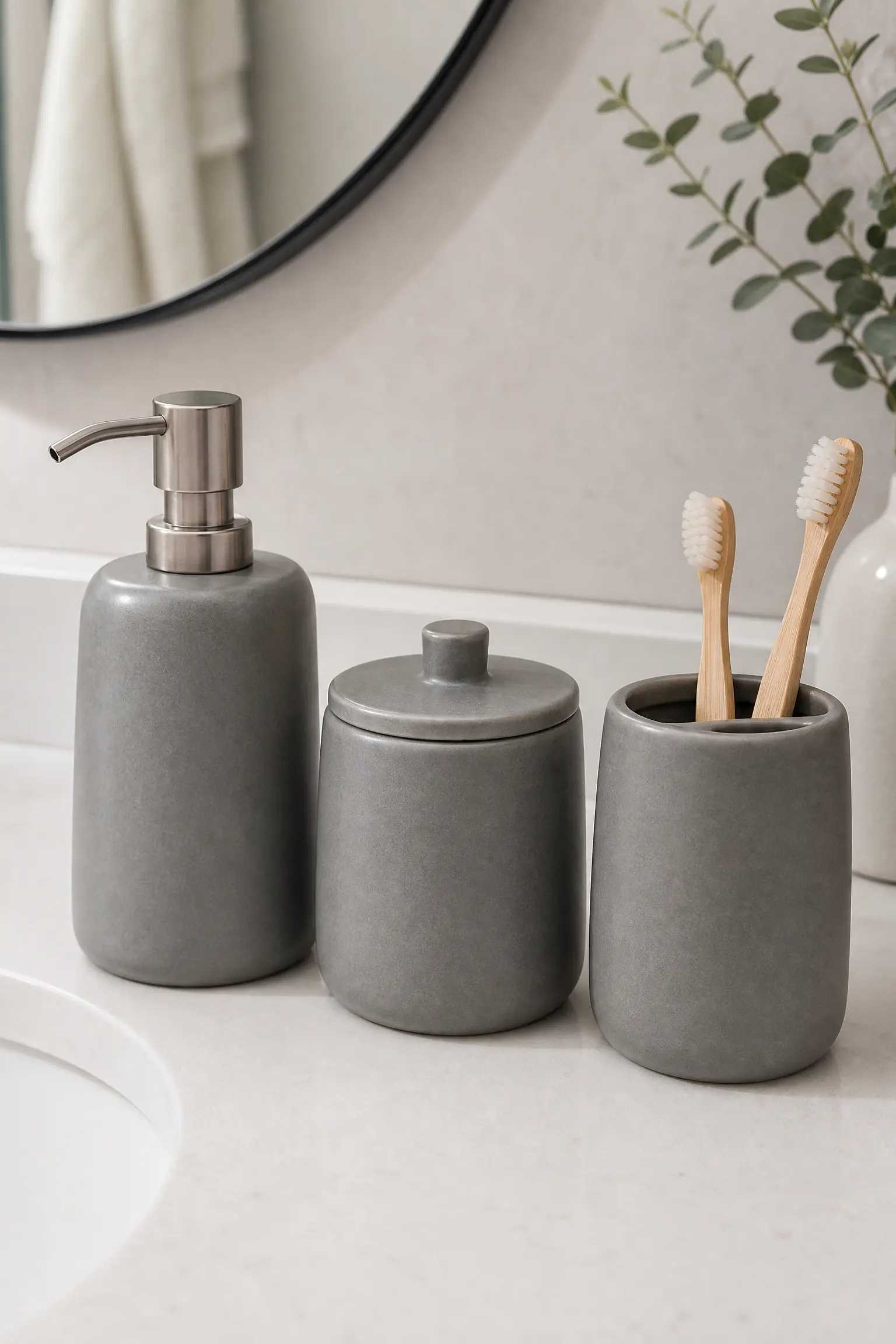
Soap dispensers, toothbrush holders, tumbler cups, and small storage containers are the smallest objects in the bathroom and the ones most likely to be purchased without reference to the overall palette, resulting in a collection of mismatched containers in different colors, different materials, and different design languages that creates visual noise regardless of how well every other decision in the room has been made. In a gray and blue bathroom, choosing ceramic accessories in a consistent matte gray, soft blue, or a blue-gray glaze across all the counter objects creates a palette coherence at the smallest scale that makes the counter look genuinely organized and genuinely designed rather than assembled from multiple separate purchases over time. A set of three matching matte ceramic accessories in a consistent mid-tone gray, a soap dispenser, a small storage pot, and a toothbrush holder, costs between fifteen and forty dollars and changes the quality of the bathroom counter from random to resolved.
Quick Tip: Choose ceramic accessories with a matte or satin glaze rather than a high-gloss glaze in a gray and blue bathroom. Matte and satin ceramic surfaces connect more naturally to the matte or soft-sheen qualities of most bathroom tiles and painted surfaces, while high-gloss ceramic accessories can read as slightly cheap or as a different design register from the more sophisticated matte or satin finishes elsewhere in the room.
24. A Mirror That Contributes to the Palette
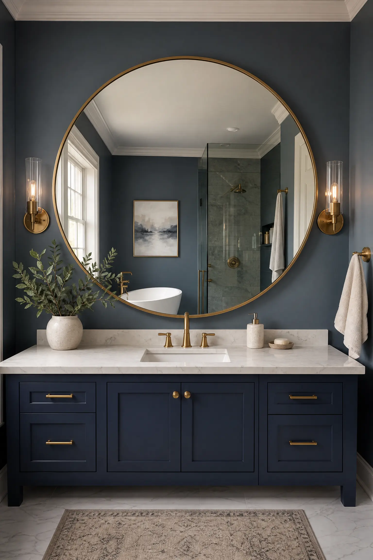
The bathroom mirror is one of the largest objects on the vanity wall and the one whose frame contributes most to the visual palette of the bathroom above the vanity. In a gray and blue bathroom, a mirror with a frame in a tone that relates to one of the palette colors, a brushed gray or nickel frame that echoes the gray elements, a navy or deep blue frame that echoes the blue, or an unlacquered brass frame that provides the warm metallic complement to both cool palette colors, creates a visual connection between the mirror and the rest of the room rather than treating it as a neutral reflective surface that belongs to no particular aesthetic. An oversized mirror that extends wider than the vanity below it also reflects more of the bathroom behind and beside the viewer, which creates a sense of depth and makes the room appear larger, particularly valuable in smaller gray and blue bathrooms where the cool palette can already read as slightly expansive.
Pro Move: Choose a mirror that is at least as wide as the vanity below it and ideally five to ten centimetres wider on each side. A mirror that is narrower than the vanity creates an awkward visual proportion where the mirror appears to float in the middle of the wall rather than anchoring the vanity arrangement. A mirror that extends to or slightly beyond the full width of the vanity creates the sense of the two elements being designed for each other even when they were purchased separately.
25. Scent as the Final Layer of the Gray and Blue Atmosphere
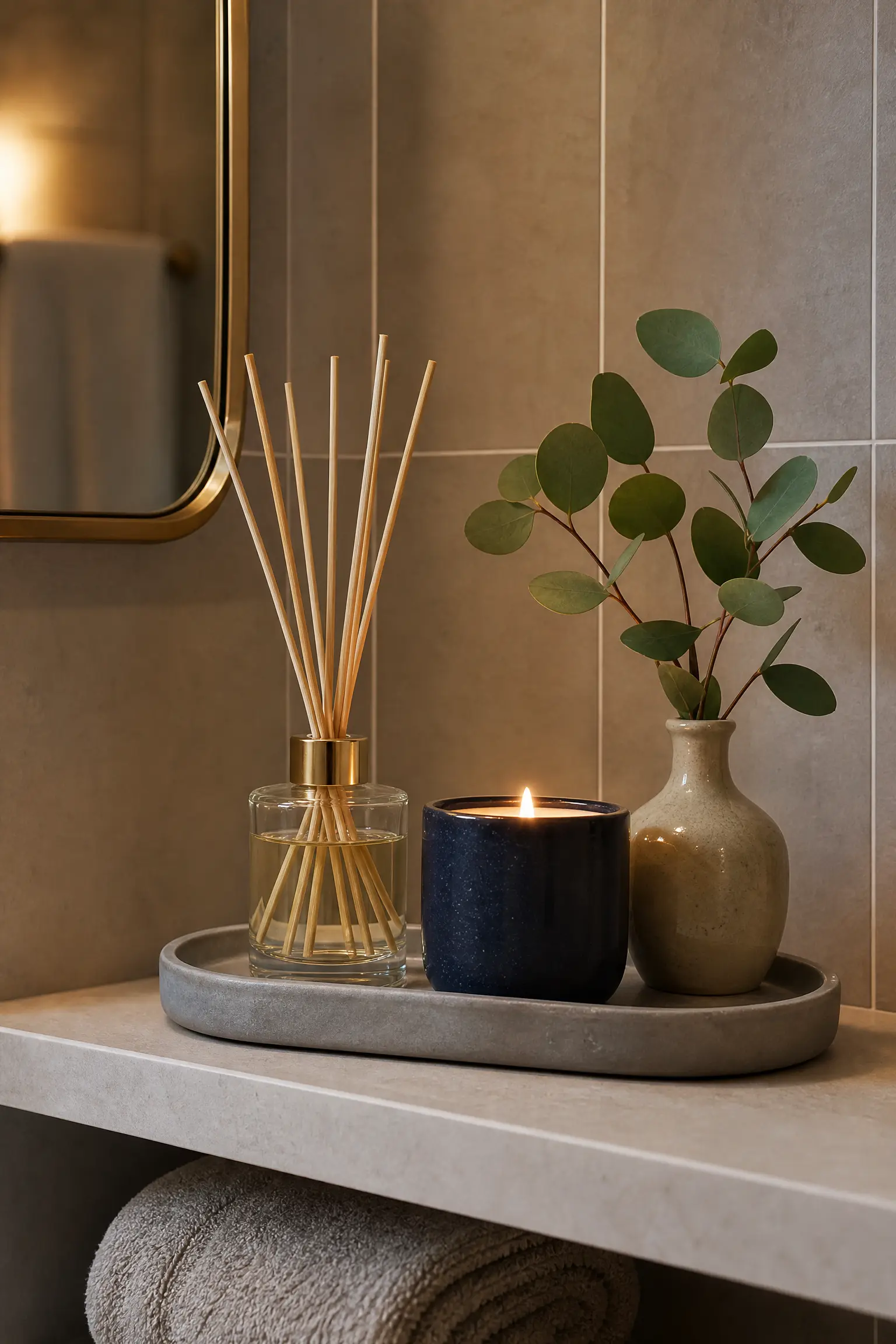
Scent is the bathroom design element that almost every article and photographic inspiration source ignores completely despite being the sense that most powerfully determines how a bathroom feels to be in rather than how it looks. A gray and blue bathroom that smells of clean linen, fresh eucalyptus, ocean air, or light florals reinforces its visual palette at a sensory level and creates the specific quality of spa-like atmosphere that the color combination aims for but cannot deliver through visual means alone. A reed diffuser with a marine, aquatic, or clean linen fragrance, a natural soy wax candle in a simple gray or navy ceramic vessel, a small essential oil diffuser on the shelf, or the fresh eucalyptus hung from the shower head all introduce the scent dimension that completes the gray and blue bathroom experience and makes it genuinely restorative rather than simply visually attractive. The scent should be light and clean rather than heavy or sweet: a gray and blue bathroom with a heavy floral or spiced scent is fighting its own palette in the sensory register.
Designer Advice: Place the scent source in the bathroom at a height and position where it will be encountered on entering the room, ideally at nose height on the shelf opposite the door or above the vanity, rather than at floor level or behind the door where it is encountered only after the room has already been entered. The first moment of entering the bathroom is when the scent has its most powerful atmospheric effect, and a diffuser or candle positioned to deliver that initial impression on entry is more effective than one positioned for visual display alone.
Final Thoughts
A gray and blue bathroom is one of the most consistently beautiful and most enduringly satisfying palette combinations available in bathroom design, and its specific excellence is that it looks different every time you see it: slightly more blue in morning light, slightly more gray in the afternoon, deeply atmospheric in warm evening lamplight. The palette is inherently dynamic in a way that most bathroom color choices are not, because both gray and blue are sensitive to light conditions and shift their character through the day in a way that keeps the room feeling alive and interesting across every use.
The ideas in this article are organized surface by surface because that is how bathroom design decisions are actually made: not as a complete visual scheme chosen from a single inspiration photograph, but as a series of individual surface decisions that add up to a complete room. Get the undertone relationship right between the gray and the blue you choose for each surface, ensure at least one warm element in the room whether that is natural timber, warm brass, a plant, or a warm-toned light source, and let the palette do the atmospheric work it is genuinely capable of. The result will be a bathroom that feels like a considered retreat rather than a color experiment.
“Which surface in your bathroom are you changing first with gray and blue? Drop it in the comments below.”
Frequently Asked Questions
Does gray and blue work in a small bathroom?
Yes, and in some ways it works better in a small bathroom than in a larger one because the cool tones of both colors create a sense of visual recession that makes the walls appear to stand slightly further back than they physically are. Pale blue-gray walls with large-format gray tile and white fixtures are particularly effective in small bathrooms because the continuous pale palette maximizes the light reflection in the space. Avoid very dark gray or very saturated navy in a small bathroom with limited natural light, as the light absorption of these tones will make a compact space feel noticeably smaller. In small bathrooms, use the darker tones in the palette at accent scale only, in the hardware, the mirror frame, and the towel arrangement, rather than on wall or floor surfaces.
What metal finish works best with gray and blue bathrooms?
Chrome is the most tonally aligned with a cool gray and blue palette because its silver tone shares the cool temperature of both colors. Brushed nickel provides a slightly warmer and slightly softer alternative to chrome that reads as more sophisticated and less sterile in a cool-toned bathroom. Brushed brass or warm gold is the best choice when the bathroom needs warming, as the contrast between warm metallic and cool gray and blue creates the visual tension that prevents the palette from reading as cold. Matte black works best in a graphic, urban, or contemporary version of the gray and blue bathroom where bold contrast is the design intention. Avoid polished gold or antique brass in a very cool gray and blue bathroom as the warm tone can fight the palette rather than complement it.
How do I stop a gray and blue bathroom feeling too cold?
The most reliable antidote to a gray and blue bathroom that reads as too cold is to introduce at least one warm material element: natural timber on the vanity shelf, countertop, or a floor accessory; brushed brass fixtures; a warm-toned bath mat; a plant in a terracotta or warm ceramic pot; or artwork with warm tonal accents. The second most reliable approach is warm-toned lighting: bulbs at 2700K to 3000K in the vanity light, ceiling fixture, and any additional light sources create warm amber-toned illumination that shifts the entire atmosphere of a cool-palette bathroom toward warm and spa-like rather than clinical and cold. The third approach is the choice of gray undertone: a gray with a taupe or greige undertone is inherently warmer than a gray with a blue or purple undertone, and choosing the warmest available gray within the palette adds warmth before any accessory decision is made.
Can I mix different shades of gray and blue in the same bathroom?
Yes, and in fact layering different depths and tones within each color creates the most visually interesting and most professionally designed gray and blue bathrooms. A deep navy vanity alongside a soft blue-gray wall alongside a pale pearl gray tile creates depth and tonal variation that a single uniform blue and a single uniform gray could not achieve. The key to successful mixing is keeping all the blues within the same temperature family (all cool, or all with a slight green-blue quality) and all the grays within the same family (all warm, or all cool), rather than mixing warm and cool undertones within the same palette, which creates visual inconsistency rather than intentional layering.
What plants work best in a gray and blue bathroom?
Eucalyptus, both fresh stems and dried, is the most popular and most visually and sensorially appropriate plant for a gray and blue bathroom because its blue-green foliage directly echoes the palette and its scent reinforces the clean, spa-like quality of the color combination. Ferns, trailing pothos, and peace lilies all tolerate the humidity of a bathroom environment and add lush organic green that bridges the gray and blue palette. Boston ferns in particular suit a gray and blue bathroom because the warm mid-green of their fronds provides the warmth and organic quality that the cool palette most needs. Eucalyptus, pothos, and snake plants are the most low-maintenance options for a bathroom where regular care is not guaranteed.
What is the best gray for a bathroom with blue accents?
A gray with a slight taupe or greige undertone rather than a cool blue or purple undertone is the best choice for a bathroom with blue accents, because a warm gray creates a genuine contrast with the blue that reads as designed rather than as two tones in the same cool family that blend into each other without clear separation. Specific paint references that work well in this role include Benjamin Moore Revere Pewter, Farrow and Ball Elephant Breath, Sherwin-Williams Accessible Beige, and Behr Sculptor Clay. All of these grays have enough warm undertone to read as clearly gray alongside a blue accent while being neutral enough not to read as beige or tan when seen alone.