Small Living Room Tricks That Actually Work and Why They Work
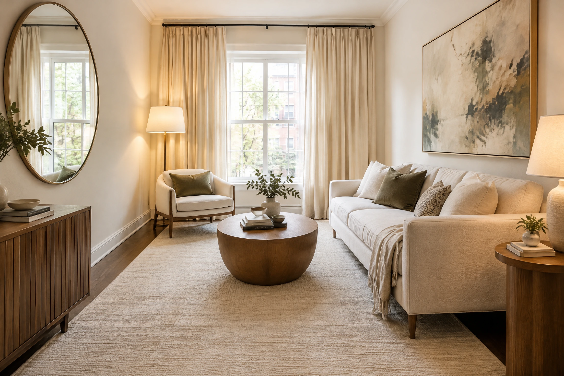
The advice for making a small living room look bigger is everywhere and almost always the same: use mirrors, go light, declutter, choose small furniture. The tips are not wrong. They are just applied incorrectly by most people, because nobody explains the visual mechanics behind them. A mirror in the wrong place does nothing. Light paint in the wrong undertone can make a room look smaller. Small-scale furniture in a small room reads as a doll’s house rather than a spacious one. These ideas go beyond the standard list and explain exactly why each change works so you can apply it correctly and stop wondering why the tips did not help as much as you expected. Most small living room advice fails at the application stage, not the principle stage.
THE FLOOR PLANE: WHAT THE GROUND IS DOING TO YOUR ROOM
1. Size the Rug Up, Not Down
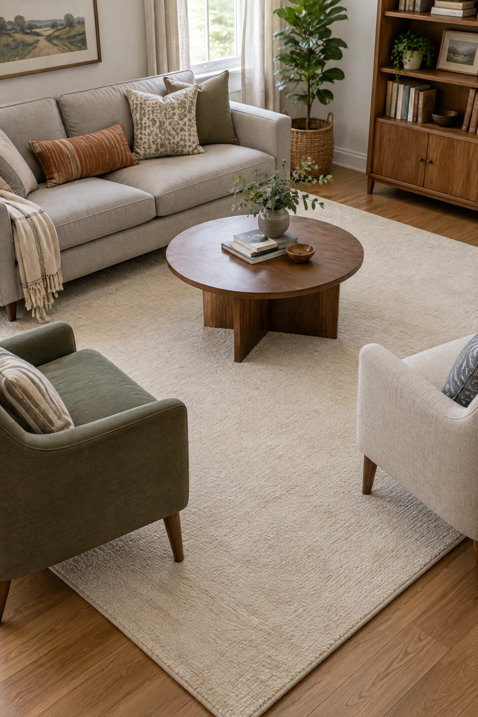
The instinct in a small living room is to buy a smaller rug to match the smaller room. This is the single most common small-room decorating mistake, and it consistently makes the room look smaller rather than larger. A small rug creates an island of color in the center of the floor, which makes the floor around it visible, which emphasizes how limited the floor area actually is. A large rug that extends under the front legs of every seating piece creates a visual boundary for the seating zone and makes the room feel like it was designed to be exactly this size. For most small living rooms, a rug no smaller than 6 by 9 feet is the minimum, and 8 by 10 is almost always better.
Pro Move: If the rug you want is too expensive at the correct size, layer a smaller version of it over a cheap natural fiber rug in the right dimensions. The layered approach reads as intentional and gives you the correct floor scale at a lower cost.
2. Choose a Rug in a Tone Close to the Floor
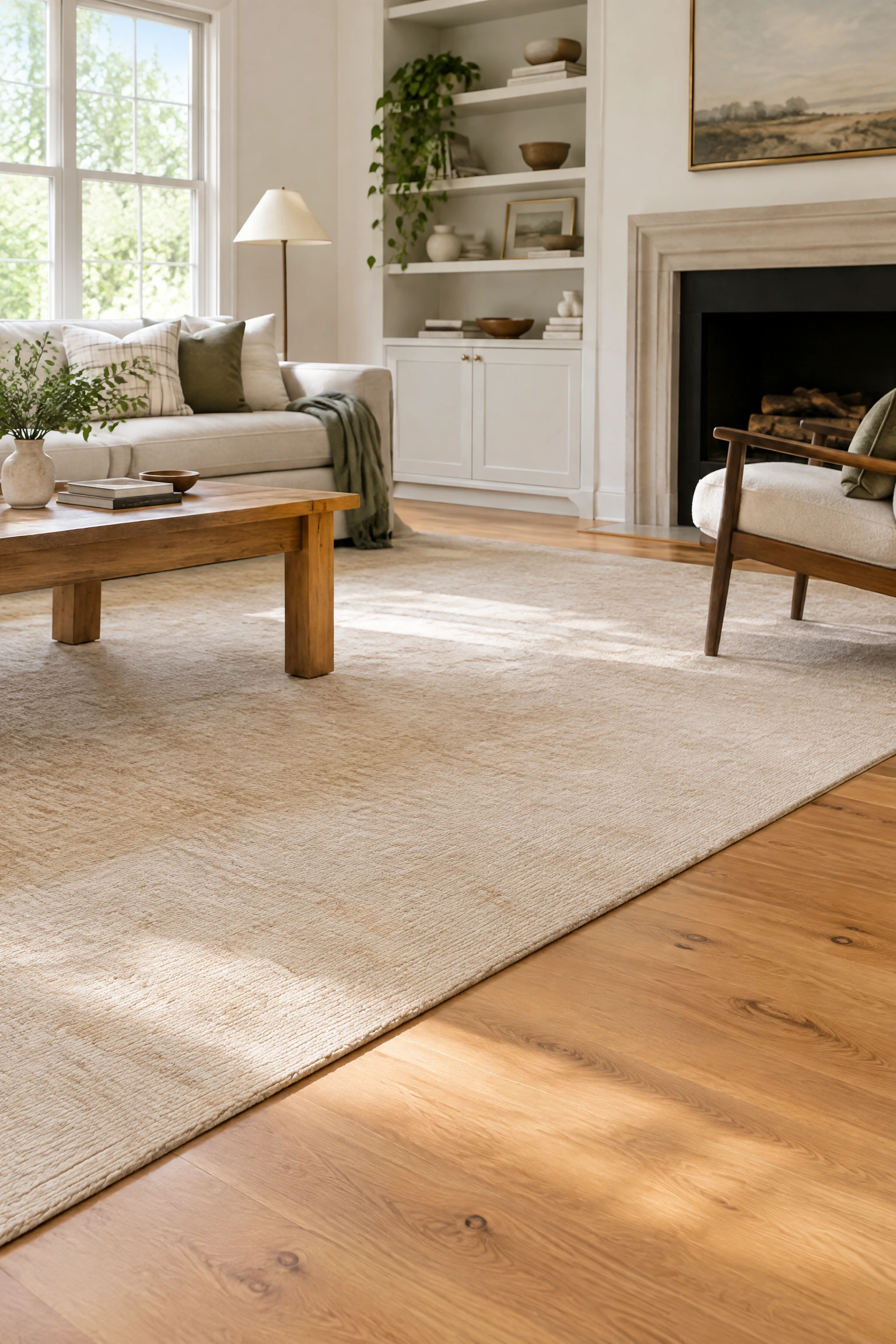
A rug that is dramatically different in color from the floor beneath it creates a visual boundary that fragments the floor plane into two separate zones, which makes the room feel smaller. A rug in a tone that sits close to the floor color, a warm cream rug on a warm wood floor, a warm grey rug on a light stone tile, creates a continuous floor plane where the rug blends into the floor rather than cutting it into sections. The eye reads this as more floor area, not less. A dark rug on a light floor, or a bright rug on a neutral floor, signals a visual stop that the eye interprets as the edge of the usable space.
Designer Advice: This does not mean the rug needs to match the floor exactly. It needs to be in the same temperature family. A warm cream rug on a warm honey-toned wood reads as a continuous warm ground. A cool grey rug on the same warm wood floor creates a contrast that fragments the space.
3. Choose Furniture With Visible Legs
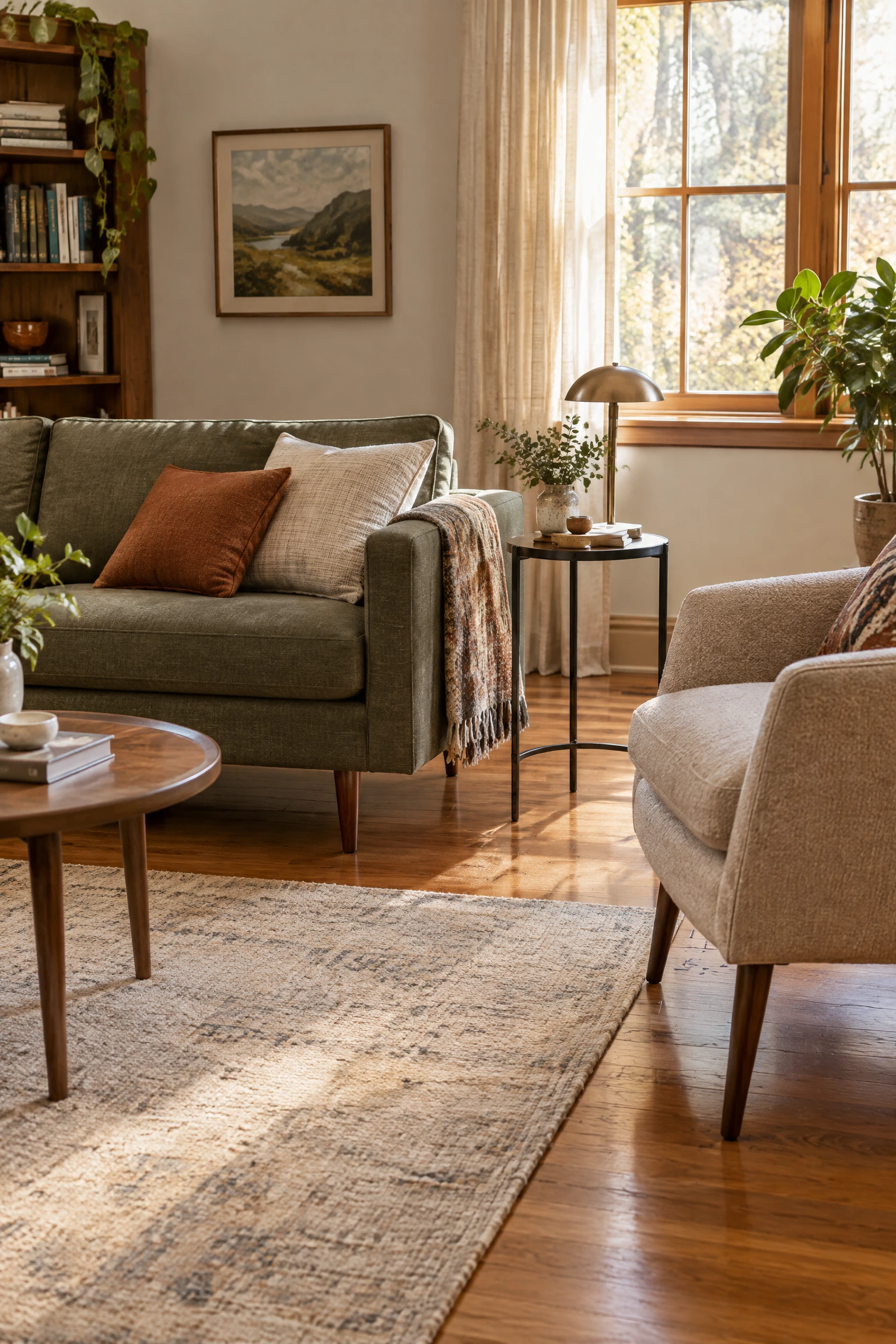
Furniture that sits directly on the floor with no visible gap between the base and the floor plane makes a small room feel heavier and more enclosed, because it blocks the floor from view and signals a visual endpoint where the furniture meets the ground. Furniture on legs reveals a continuous strip of floor beneath every piece, which extends the apparent floor area and makes the room feel open. The difference in perceived floor space between a sofa on legs and the same sofa with a floor-length skirt, with no floor visible beneath it, is significant and immediately felt in a compact room. Legs on every major piece, sofa, armchairs, side tables, and media units, cumulatively open the floor plane in a way that is greater than the sum of the individual changes.
Quick Tip: The higher the leg on a piece of furniture, the more floor is visible beneath it, and the more open the room feels. A sofa on 8-inch tapered legs reveals more floor than the same sofa on 4-inch block legs. In a very small room, every inch of visible floor helps.
4. Keep the Central Floor Area Completely Clear
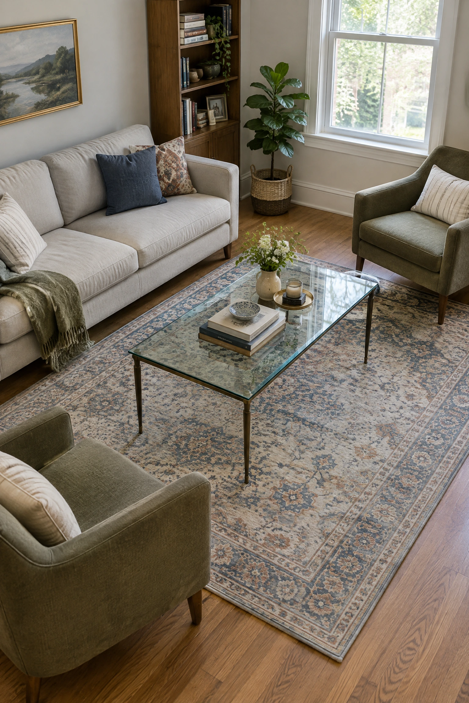
The floor at the center of a small living room is its most valuable visual real estate, and filling it with a coffee table, poufs, footstools, extra chairs, or decorative objects makes the room look smaller even if the individual pieces are small in scale. A clear central floor area, even just a few square feet of unobstructed rug or floor, gives the room visual breathing room that makes the entire space feel more generous. The easiest way to free up the center is to replace a large solid coffee table with a smaller, lighter alternative: a glass-topped table, a nest of two small tables that can be separated and pushed aside, or a single small side table beside each seating piece instead of a central table altogether.
Reality Check: A glass or acrylic coffee table is not a compromise in a small living room. It is the better choice. A transparent surface allows the eye to continue across the floor plane rather than stopping at a solid obstacle, which makes the room feel physically larger.
[THE CEILING: MAKING IT FEEL FURTHER AWAY THAN IT IS
5. Hang Curtains From the Ceiling, Not the Window
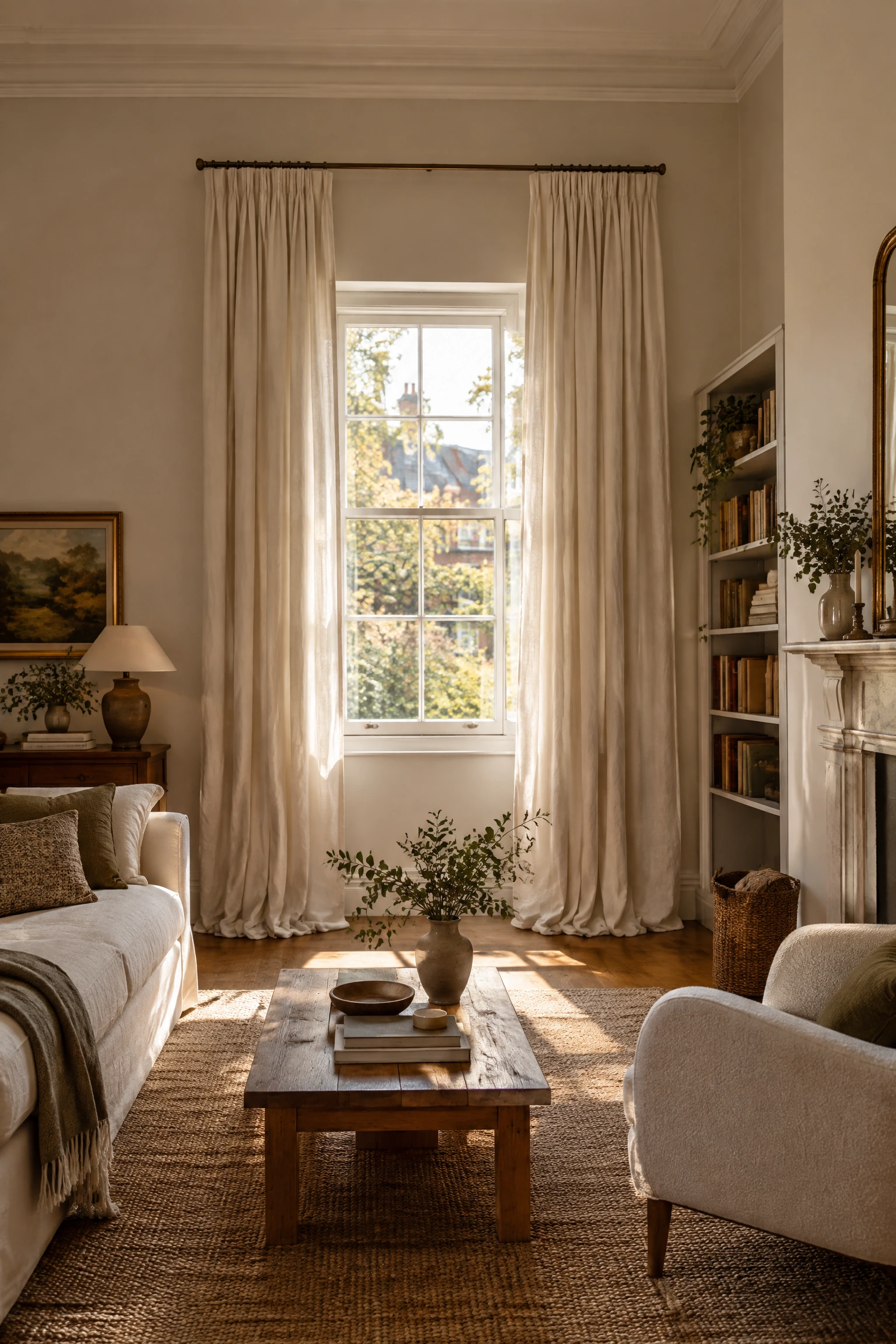
A curtain rod hung just above the window frame tells the eye exactly where the wall stops and the ceiling begins, which emphasizes the room’s limited height. A curtain rod hung as close to the ceiling as possible, even touching the ceiling cornice, tells the eye that the wall extends from floor to ceiling without interruption, which makes the room feel taller by the entire distance between where the rod was and where it now is. This is one of the most consistently impactful changes available in a small living room and one of the cheapest to implement. The curtains themselves need to be floor-length to complete the vertical illusion: curtains that stop at the window sill or hover above the floor interrupt the line and cancel the effect.
Designer Advice: Hang the curtain rod as close to the ceiling as possible AND extend it 8 to 12 inches beyond the window frame on each side. The extended rod allows the curtain to stack beyond the window when open, which keeps the glass fully uncovered and maximizes the natural light entering the room.
6. Avoid Anything That Cuts the Wall Horizontally
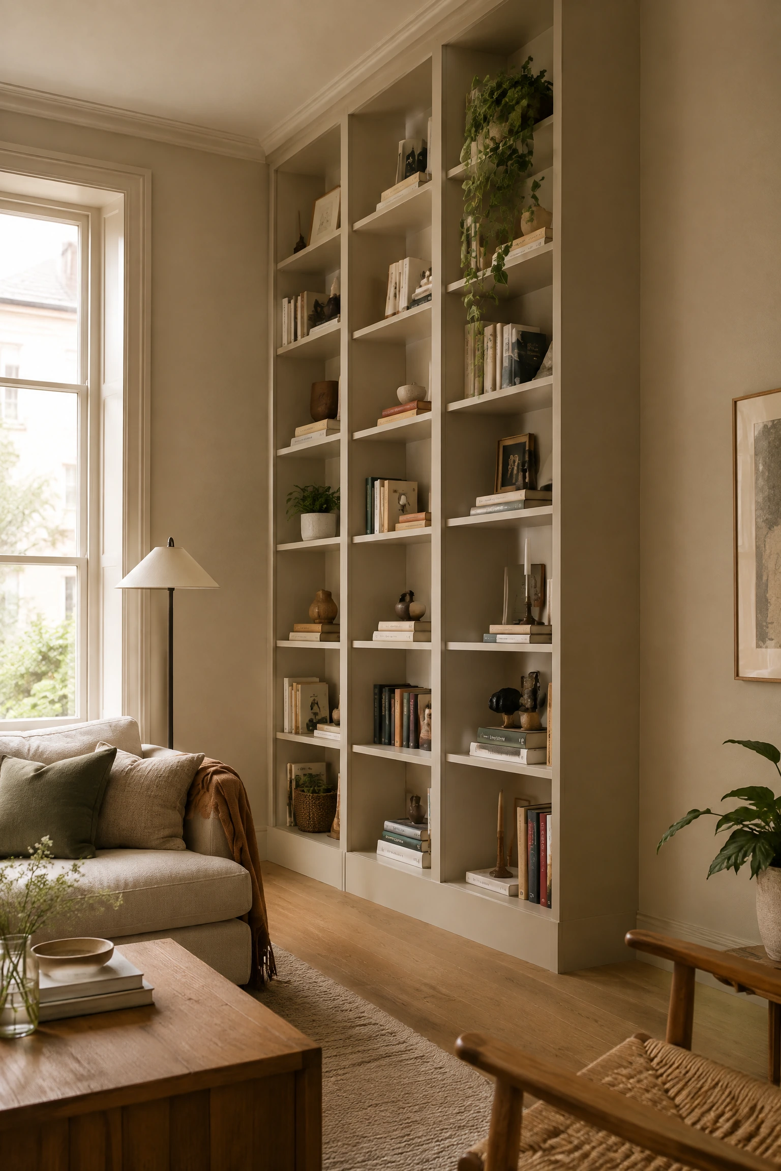
Horizontal lines in a small room at mid-wall height, a dado rail, a shelf that runs the length of the wall, a large piece of art that creates a strong horizontal emphasis, or curtains that end at mid-wall level all visually lower the ceiling by drawing the eye across the room rather than up toward the ceiling. The visual principle is simple: vertical lines make rooms taller, horizontal lines make rooms wider but also lower. In a small living room where ceiling height is one of the primary spatial constraints, anything that creates a strong horizontal line below the ceiling is working against the room’s perceived height. Replace mid-wall shelves with floor-to-ceiling shelving, hang art in a vertical stack or at ceiling height, and choose curtains that run all the way to the floor.
Heads Up: This applies to furniture too. A very long, low sofa against a short wall creates a horizontal emphasis that lowers the perceived ceiling height of that wall. A sofa with a higher back or a slightly shorter footprint on the same wall reads as less horizontally dominant and lets the wall height do more work.
7. Take Shelving All the Way to the Ceiling
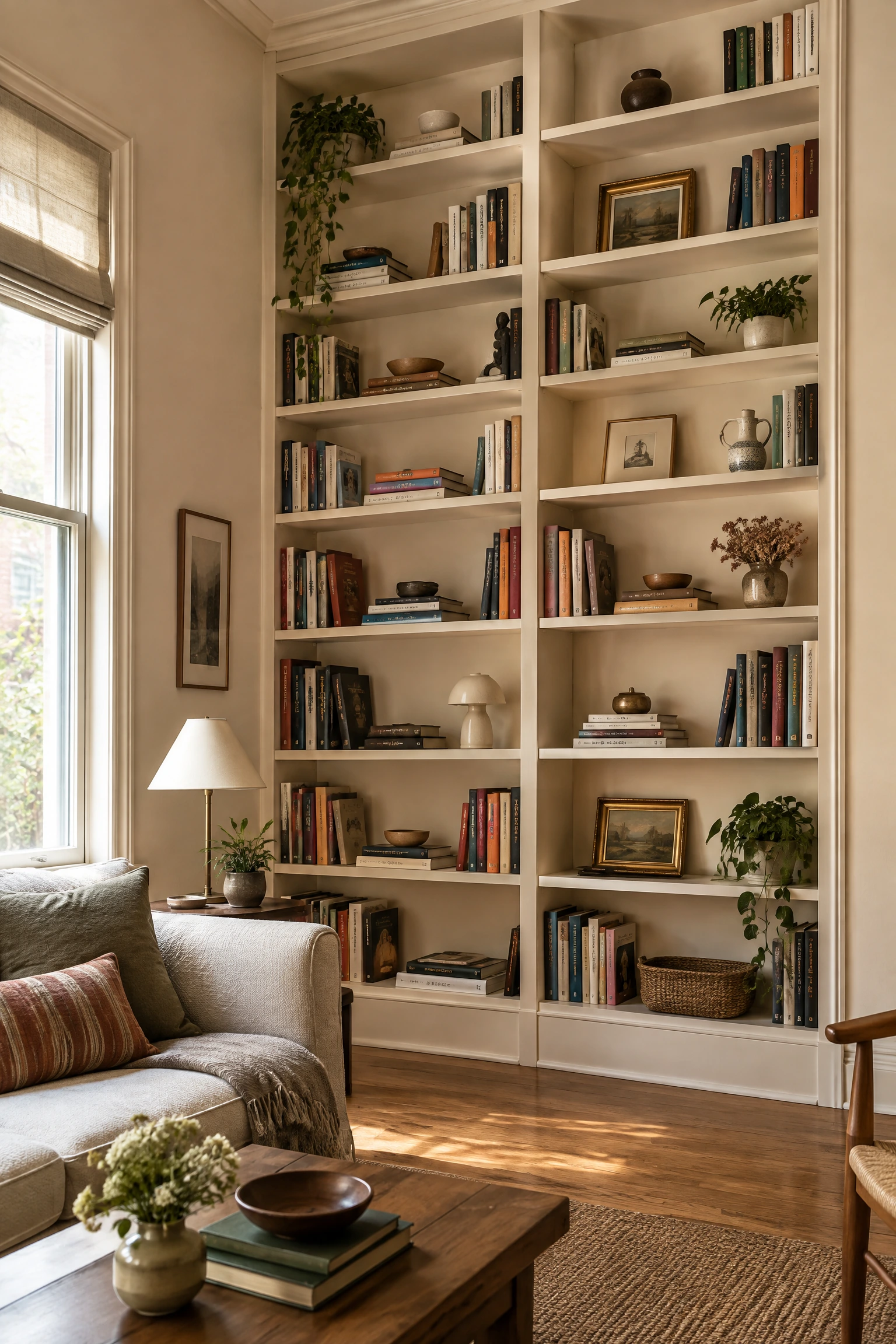
Floor-to-ceiling shelving does two things for a small living room simultaneously: it draws the eye upward in a way that makes the room feel taller, and it provides a volume of storage that keeps the floor and other surfaces clear. A bookshelf that stops at 6 feet on an 8-foot wall wastes the top 2 feet of wall height and leaves a zone that neither contributes storage nor draws the eye upward. Full-height shelving that meets the ceiling cornice removes that wasted band, makes the room feel architecturally intentional, and creates the impression that the room was designed to be this way from the start rather than furnished within an existing constraint.
Pro Move: Paint the back panel of a floor-to-ceiling shelving unit in the same color as the wall behind it, or in a slightly deeper tone. This visually recedes the shelving into the wall and makes the room feel deeper rather than adding a prominent block of dark wood color at the most visible vertical surface.
8. Use a Statement Pendant or Chandelier
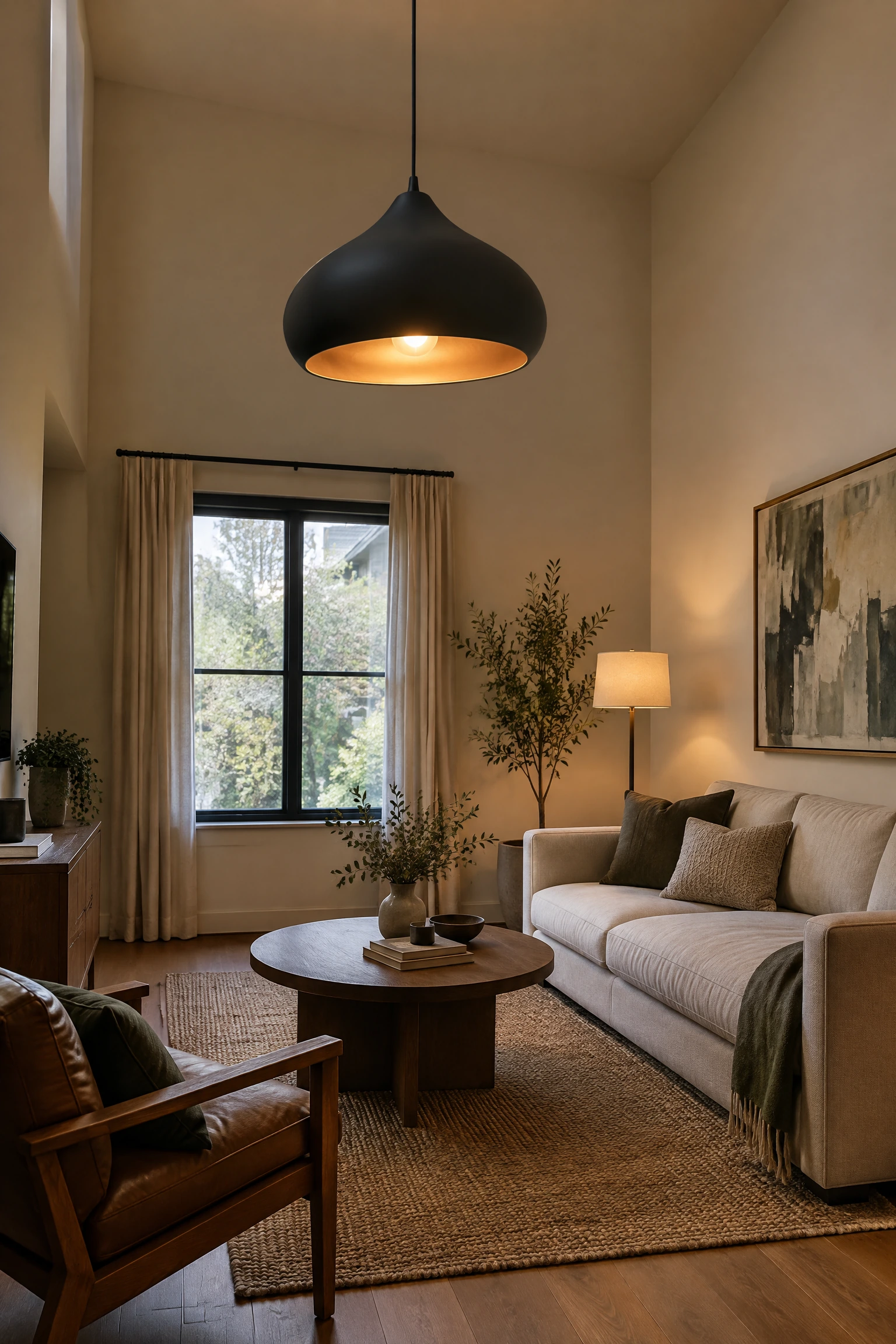
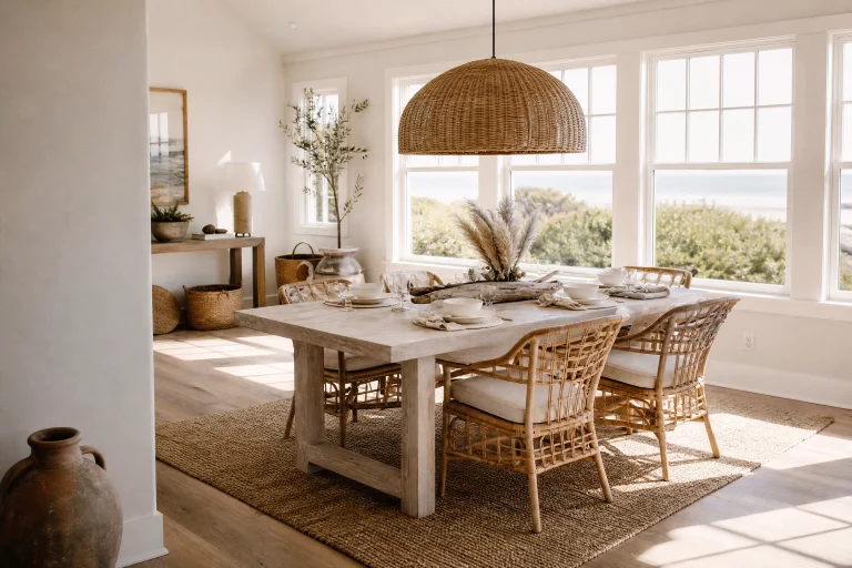
A ceiling light that hangs low enough to engage the eye, rather than a flat ceiling-mounted fixture that disappears into the overhead, creates a vertical focal point that draws the eye upward and makes the room feel taller. The common fear is that a pendant in a small room will be overwhelming, but the opposite is usually true: a flat flush-mounted ceiling fixture makes a small room feel lower because it brings the light source down to ceiling level with no visual space between. A pendant that hangs into the room creates a clear sense of ceiling height above it and visual space below it, which together produce the impression of more vertical room than actually exists. Scale the pendant to the room: one large statement pendant above the seating zone is almost always more effective than multiple small pendants.
Quick Tip: The bottom of a pendant light above a seating zone should sit at around 6.5 to 7 feet from the floor so it is above standing eye level but visually engaging rather than disappearing into the ceiling. Lower than this and it feels intrusive. Higher and the vertical effect is lost.
THE WALLS: WHAT MAKES A ROOM FEEL WIDER AND DEEPER
9. Choose the Right Paint Color, Not Just Any Light Color
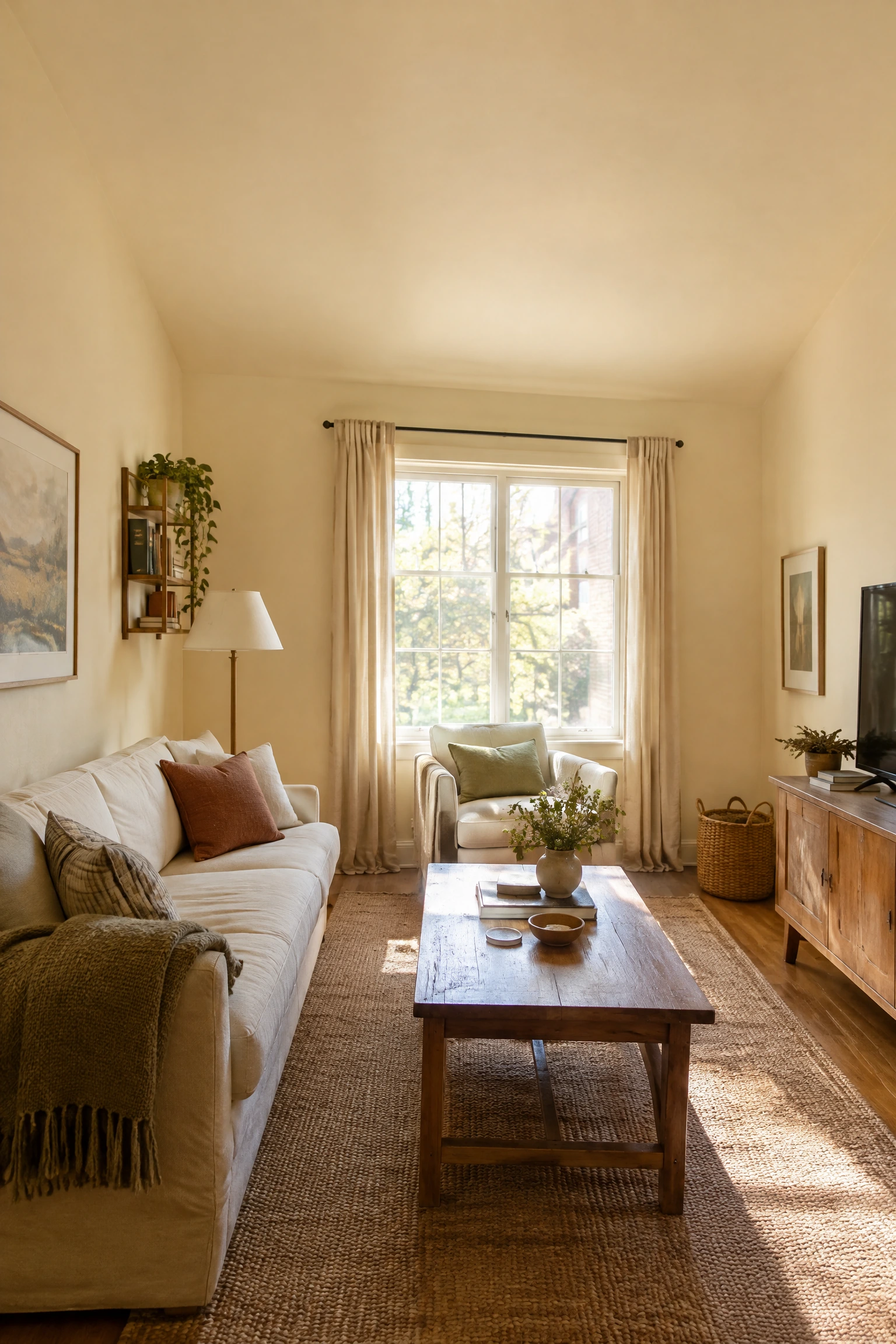
Light paint makes a small room feel larger is true, but only when the light color has the right undertone for the specific room. A light paint in a cool undertone, any grey-white, blue-tinted white, or cool off-white, in a north-facing or low-light room makes the room feel cold and flat, which reads as smaller rather than larger. Warm light colors, a creamy white with a yellow or pink base, a soft warm grey with a brown undertone, or a pale warm greige, reflect the limited natural light back into the room as warm ambient light, which makes the room feel brighter, more generous, and more expansive. The question is not just “is this light?” but “is this the right warmth for the light conditions in this room?”.
Designer Advice: Paint the ceiling in the same color as the walls or in a very slightly lighter version of the same tone. Walls and ceiling painted in the same color remove the visual boundary between them, which makes the ceiling feel higher by blurring the point at which the wall ends.
10. Place a Large Mirror Opposite the Room’s Best Feature
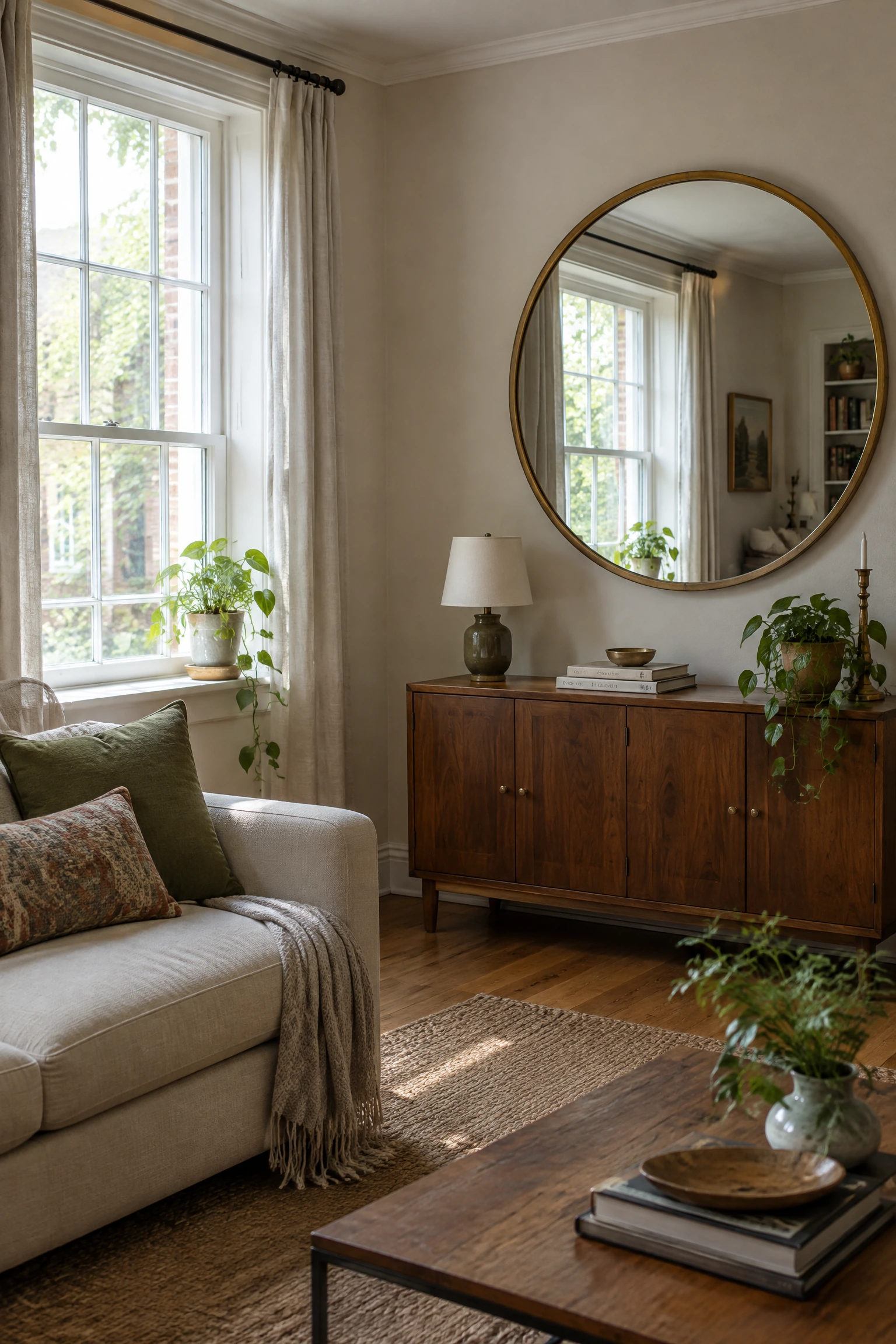
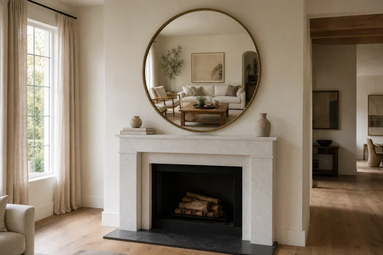
A mirror makes a small room feel larger through two mechanisms: it reflects light, which makes the room feel brighter, and it reflects the room itself, which creates the visual impression of a second room beyond the mirror. The position of the mirror determines which of these effects dominates. Opposite a window, the mirror reflects natural light and the view beyond the glass, which is the most effective single placement. Opposite a particularly well-styled zone, a beautiful shelving arrangement, a fireplace, or a gallery wall, the mirror reflects that specific feature and creates the impression of a larger, more symmetrical room. What to avoid is placing a mirror opposite a visually cluttered or unattractive surface, because the mirror will double whatever it reflects, including the problem.
Reality Check: A small mirror does very little for a small room. The reflective surface needs to be substantial, at least 24 by 36 inches for a wall mirror, or a full-length floor mirror that captures the room from floor to eye level, to produce a meaningful visual expansion. Small decorative mirrors add style but not perceived space.
11. Create One Focal Wall Rather Than Decorating All Four Equally
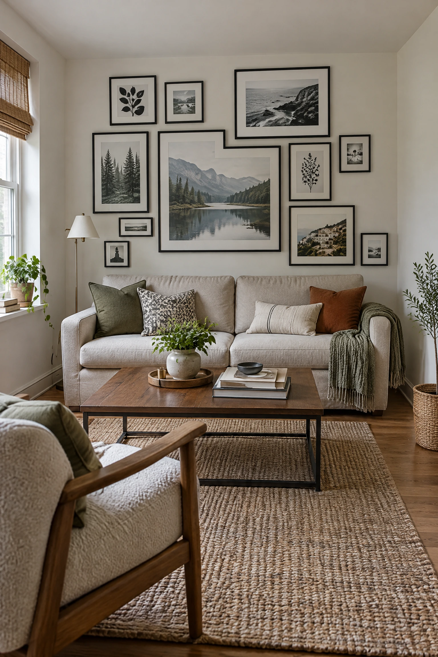
A small room with art, objects, and visual interest on all four walls gives the eye nowhere to rest, which makes the space feel busy and enclosed. A single focal wall with deliberate decoration, a gallery arrangement, a large mirror, a piece of significant art, or a painted or wallpapered accent, while the other three walls remain relatively quiet, gives the eye a specific place to land and makes the room feel organized around a point of view rather than cluttered in every direction. The focal wall in a small living room is almost always the wall the sofa faces or the wall behind the sofa, and concentrating the room’s visual interest there draws the eye through the room rather than stopping it at the nearest surface.
Quick Tip: A wallpaper accent on a single wall in a small room introduces pattern and depth without making the room feel enclosed. A full-room wallpaper in a small space almost always feels overwhelming. One wall gives the character and depth without the claustrophobic effect.
12. Use Vertical Stripes or Vertical Lines in Art and Fabric
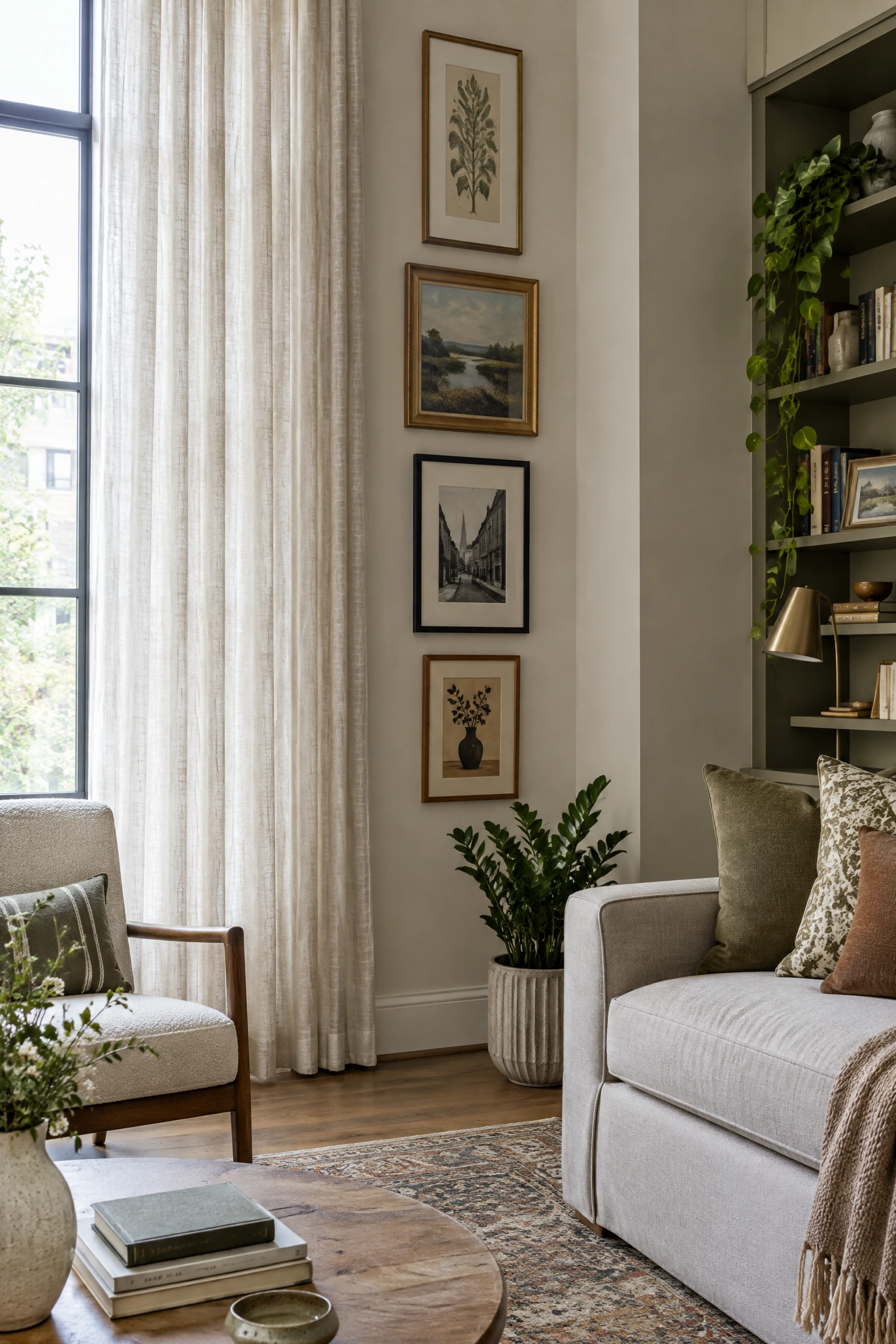
Vertical lines in a small room, whether in wallpaper, curtain fabric, tile layout, or the dominant direction of art hung in a vertical stack, draw the eye upward along the line of the pattern and create the impression of a taller room. This is the same optical principle that makes a vertically striped shirt read as lengthening: the eye follows the line in the direction it travels, which in a vertical pattern means upward toward the ceiling. Sheer linen curtains with a subtle vertical weave, a gallery wall of frames hung in a tall vertical column rather than a horizontal row, or a tile laid in a running vertical bond rather than a horizontal stack all apply this principle at different scales within the room.
Heads Up: Horizontal stripes do the opposite. They draw the eye across the room, which can make a narrow room feel wider but will also make it feel lower. In a small room where ceiling height is already limited, avoid strong horizontal patterns at mid-wall height or in large fabric areas like curtains and rugs.
THE FURNITURE LAYER: SCALE, PROPORTION, AND WHAT ACTUALLY FITS
13. Choose One Large Piece Rather Than Multiple Small Ones
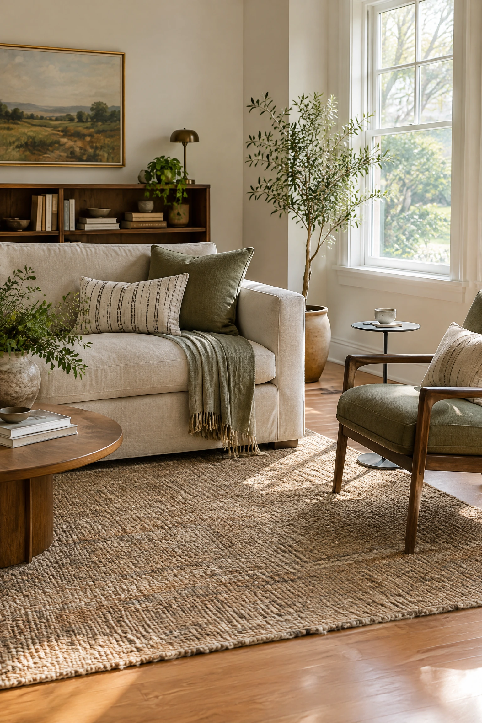
The instinct in a small room is to choose smaller furniture to leave more floor space, but a room filled with many small pieces reads as cluttered and cramped. The more effective approach is to choose one well-proportioned sofa at the correct scale for the room and fewer additional pieces, rather than a smaller sofa plus more chairs plus more side tables plus more storage that together fill more floor space than one good sofa would. A single large well-chosen piece reads as confident and considered. Multiple small pieces read as accumulated and tentative. The principle applies to art, mirrors, and accessories too: one large piece on a wall does more for a small room than three small ones in the same location.
Designer Advice: The sofa is almost always the right place to spend the most in a small living room. A well-proportioned sofa in a good fabric that fits the room correctly is the foundation of everything else. Compromising on the sofa and spending on accessories is a consistently less effective approach.
14. Float the Furniture Away From the Walls
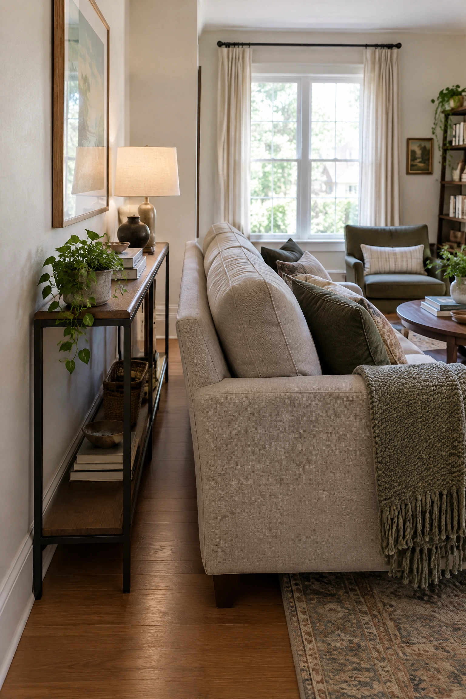
Pushing every piece of furniture against the wall to free up the center of the room feels logical but consistently produces a room that reads as a waiting area rather than a living space. A sofa pulled 12 to 18 inches away from the wall creates visual depth between the sofa back and the wall, which makes the room feel like it has more space rather than less. The seating zone reads as a considered arrangement rather than a perimeter installation, and the visible space between the furniture and the wall actually reads as generous floor area even though it is the back of a sofa. Floating the furniture is the layout change that most consistently transforms a small room from feeling cramped to feeling intimate and considered.
Reality Check: Floating a sofa in a small room feels counterintuitive and often frightening the first time you try it. Do it anyway. The improvement in how the room reads and feels is almost universal, and the few inches of floor between the sofa back and the wall make no practical difference to the room’s usability.
15. Use a Sofa With Narrow Arms or an Armless Design
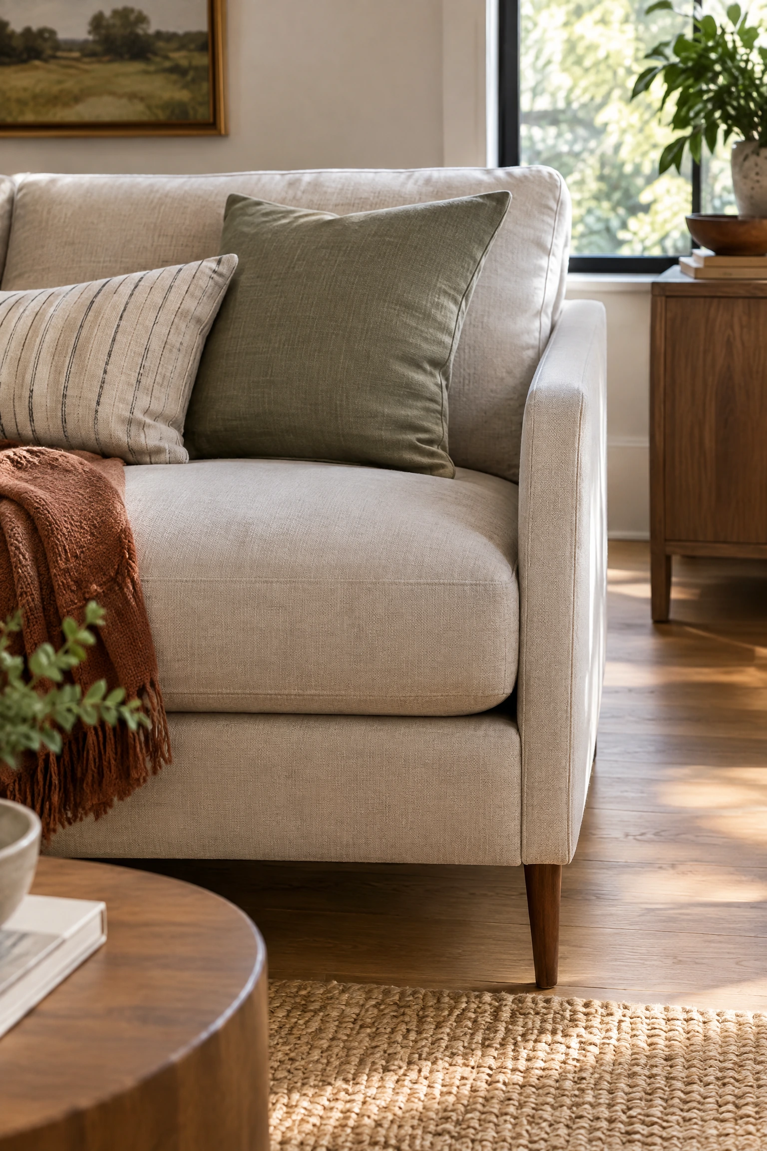
The width of a sofa’s arms is responsible for a significant portion of its overall footprint that contributes nothing to seating capacity. A sofa with wide, roll-top or cushioned arms may be 90 inches long but offer only 60 inches of actual sitting width, because 15 inches of arm on each side is occupied by upholstery that cannot be sat on. A sofa with narrow track arms or a fully armless design of the same 90-inch width offers significantly more sitting surface and often looks more slender and less heavy in the room despite having the same dimensions. In a small living room where every inch of visual weight matters, a track-arm or armless sofa is almost always the more effective choice.
Pro Move: A loveseat plus two armchairs often provides more seating and a more open floor plan than a standard three-seat sofa plus one armchair in a small living room. The loveseat-and-chairs arrangement can be angled inward to face each other, which creates a conversation zone that feels larger than the perimeter arrangement a full sofa tends to encourage.
16. Choose Multi-Functional Furniture for Every Major Piece
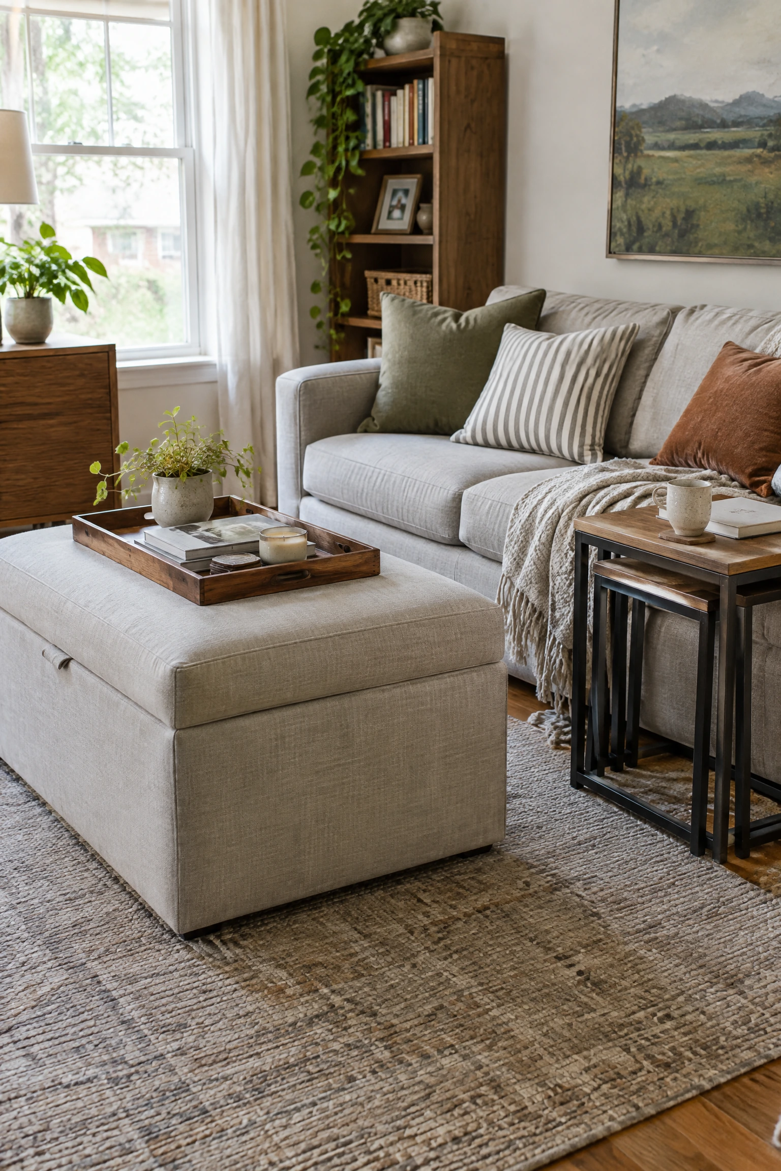
In a small living room, furniture that performs only one function is a luxury the room cannot afford. A storage ottoman serves as coffee table, footrest, extra seating, and hidden storage simultaneously. A console table behind the sofa serves as a display surface, a lamp platform, and a room divider. A bench at the end of the sofa serves as extra seating and a surface for objects without occupying additional floor space. A nesting table set beside the sofa provides surface area for drinks and objects when needed and disappears beneath itself when not. Each of these multi-functional choices does the work of two or three single-purpose pieces in the same floor footprint, which multiplies the perceived generosity of the room without multiplying the actual square footage.
Heads Up: Multi-functional furniture is worth spending more on than single-purpose decorative pieces, because it is used daily rather than occasionally. A storage ottoman that falls apart under regular use, or nesting tables that wobble, become practical frustrations that undermine the room’s functionality.
THE LIGHTING LAYER: WHAT LIGHT DOES TO PERCEIVED SPACE
17. Layer Light From Multiple Sources at Different Heights
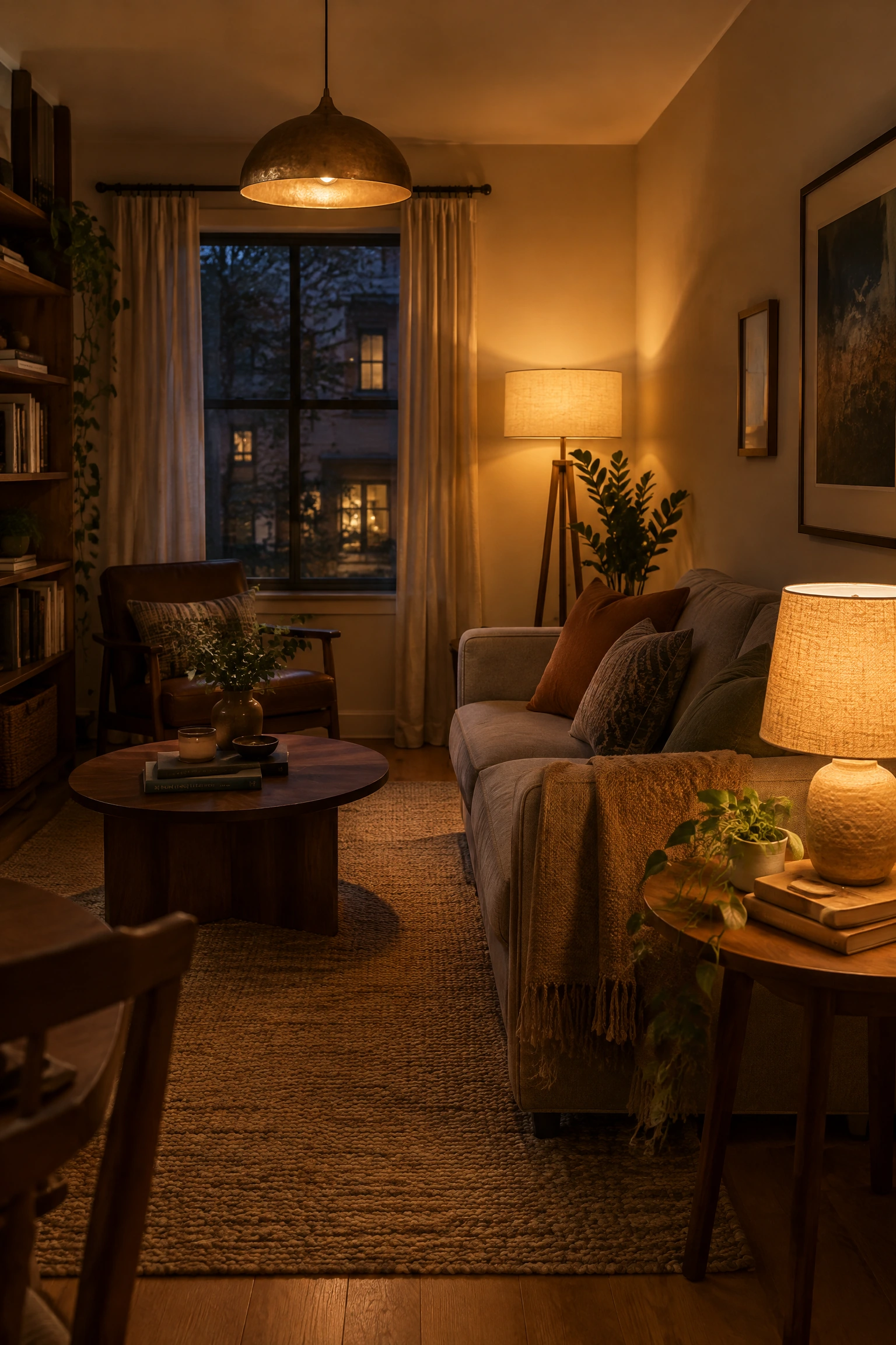
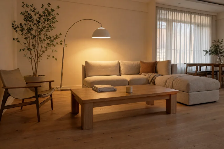
A single overhead light source in a small living room illuminates the room from above at a uniform intensity, which flattens the surfaces and makes the room read as a fixed, bounded box. Multiple light sources at different heights, a floor lamp in a corner, a table lamp on a side surface, a pendant above, and candlelight or a picture light at low level, create pools of warm light that make the room feel textured and larger by creating zones of emphasis and shadow. The shadow between light sources is not a problem: it is the space that makes the room feel like it has depth. A room that is uniformly lit at the same intensity in every corner has no depth because there is nothing to create the visual impression of distance.
Quick Tip: Position at least one light source in a corner. A floor lamp or table lamp in a corner that would otherwise be dark makes that corner feel inhabited rather than empty, which expands the perceived boundary of the room to include the corner rather than stopping at the nearest lit surface.
18. Maximize Natural Light at Every Window
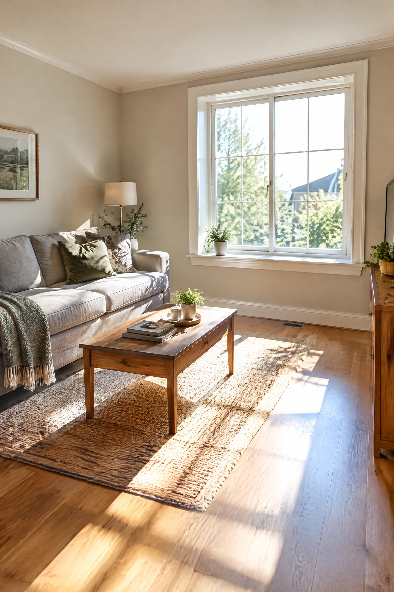
Natural light makes a small room feel larger than artificial light does at any intensity, because daylight is directional: it comes from a specific source and creates variation in brightness across the room that reads as depth. Anything that reduces natural light, heavy curtains pulled closed during the day, furniture blocking the window, dark objects placed on the windowsill, makes the room feel measurably smaller. Keep windows completely unobstructed during daylight hours, choose curtains that stack neatly outside the window frame when open, keep the windowsill clear or use it for a single translucent object like a glass vase or a trailing plant that does not block the glass, and clean the windows regularly. Clean glass transmits significantly more light than dirty glass, which sounds obvious but is consistently overlooked.
Designer Advice: A mirror placed on the wall adjacent to a window, rather than opposite it, catches and reflects the directional quality of the natural light into the darker side of the room. Opposite the window, the mirror reflects the window itself. Adjacent, it reflects the light’s quality and direction, which adds warmth and depth differently.
19. Use Warm White Bulbs Throughout
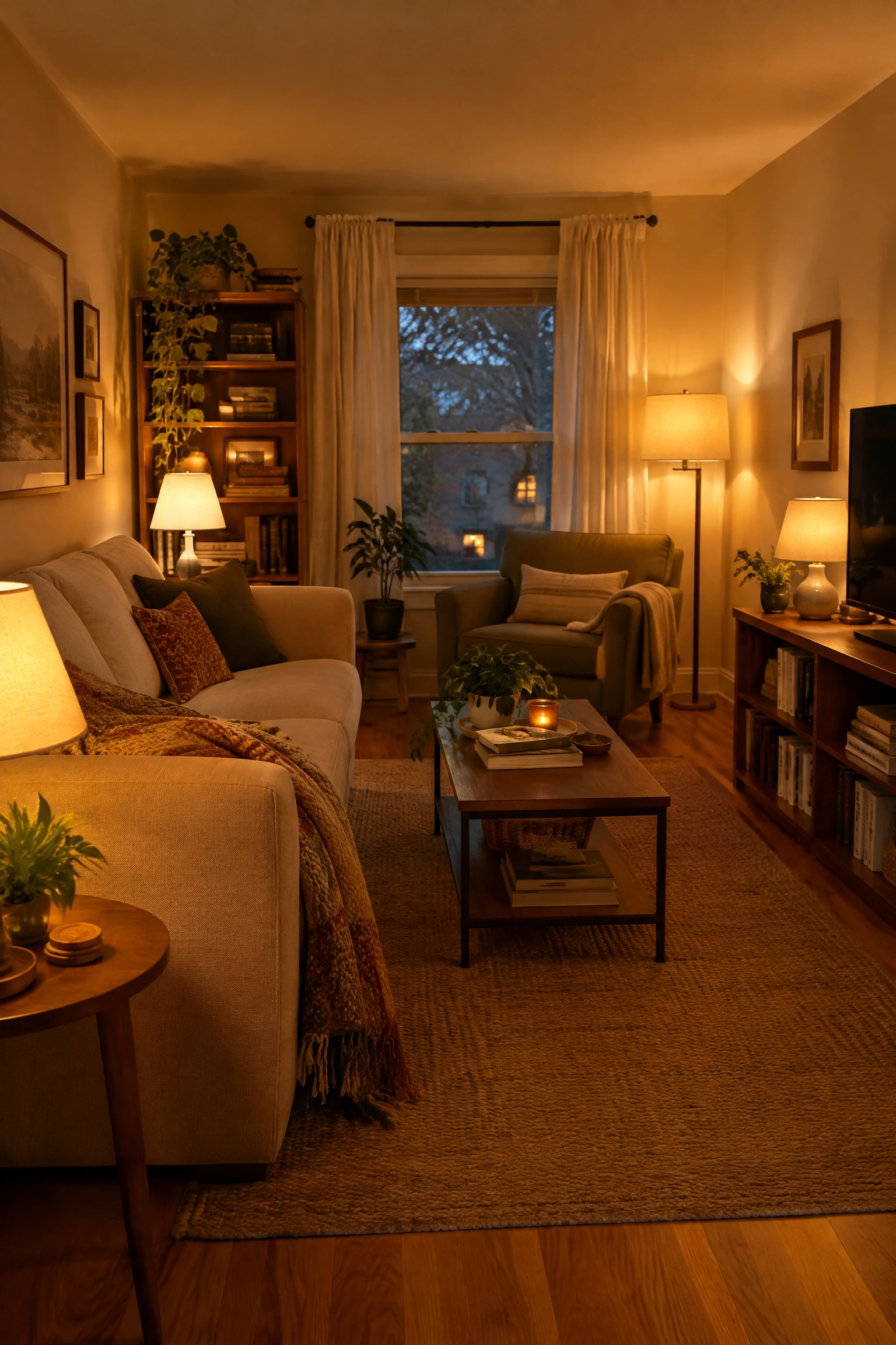
Cool white or daylight bulbs make a small room feel clinical and boxed-in, because the blue-white light quality is associated with fluorescent environments that are large and impersonal rather than residential and warm. Warm white LEDs in the 2700K to 3000K range produce a light quality that is associated with warmth, intimacy, and generous space, which is why every well-designed hotel room and high-end residential interior uses warm white exclusively. In a small living room, the difference between 4000K bulbs and 2700K bulbs is not subtle. It is the difference between a room that feels cramped and bright and a room that feels intimate and generous, even when the actual dimensions are identical.
Reality Check: Replacing every bulb in a small living room with 2700K warm white LEDs is a thirty-minute, under-twenty-dollar change that is one of the highest-impact improvements available. Do this before anything else.
THE VISUAL EDITING LAYER: WHAT TO REMOVE AS MUCH AS WHAT TO ADD
20. Edit Every Surface to Half Its Current Objects
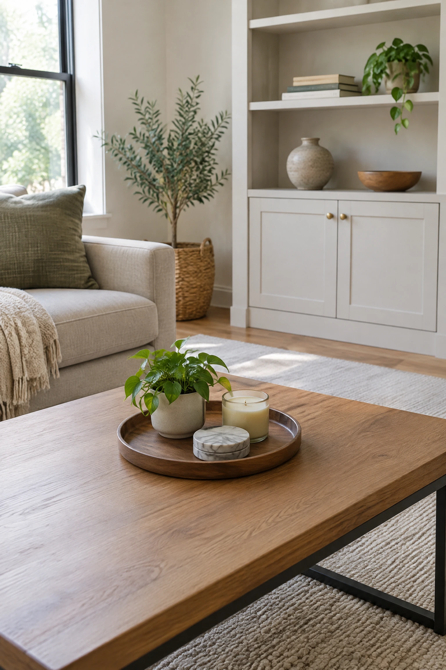
A small room reads as cramped when every surface is occupied, because the eye has no place to rest and the visual complexity reads as density rather than richness. The fastest improvement available to most small living rooms is removing half the objects from every surface, grouping what remains with deliberate spacing, and leaving visible empty surface between groupings. The empty surface is not wasted space: it is what makes the remaining objects readable and the room feel generous. An edited coffee table with three well-chosen objects reads as styled. The same coffee table with eight objects reads as cluttered, regardless of how individually attractive each piece is.
Pro Move: Box up everything removed and leave it in another room for two weeks. If you do not reach for something in that time, it does not belong in a small living room. What stays in the room should earn its place through beauty, function, or both.
21. Choose a Consistent Color Palette Across All Textiles
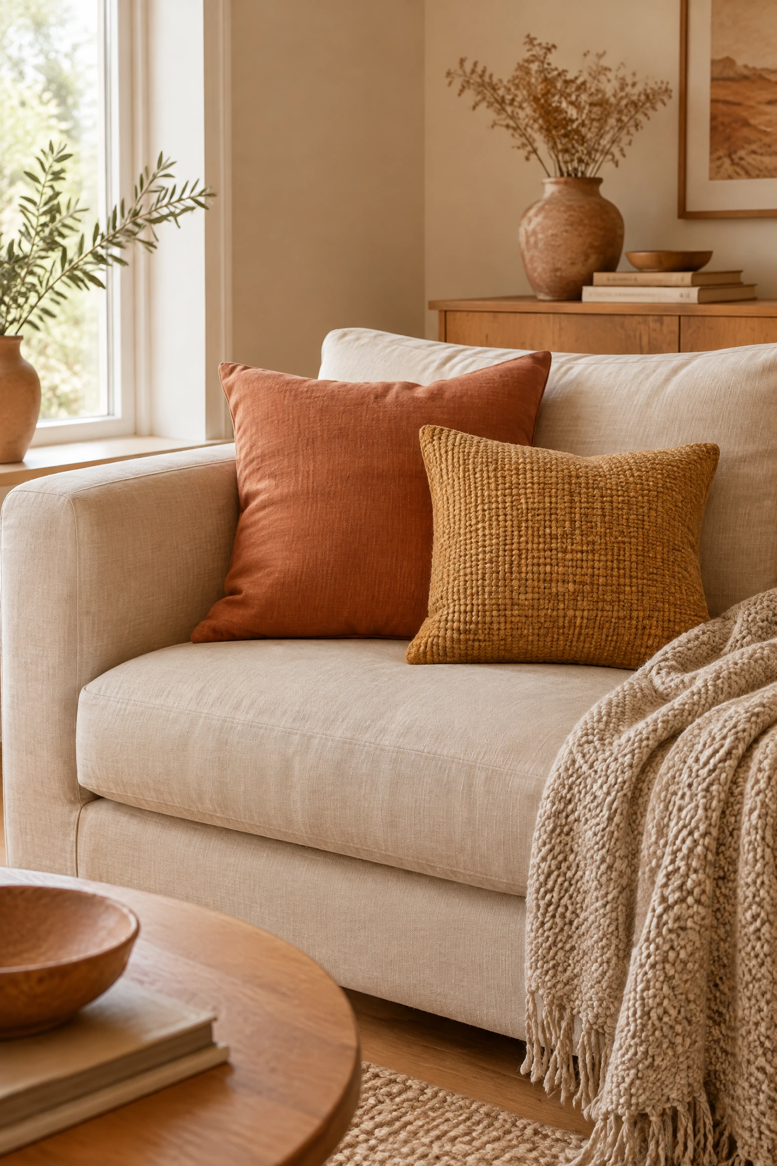
A small room with textiles in five or six different colors, a red cushion, a blue throw, a green plant pot, an orange rug, and a yellow lamp shade, reads as chaotic rather than rich, because the many competing colors fragment the room’s visual field and make the eye jump between them without rest. A consistent palette of two or three related tones across all the soft furnishings, even if the individual pieces vary in texture and pattern, gives the eye a coherent surface to read across the room, which makes the space feel more unified and more spacious. The palette does not need to be monotone. It needs to be related: warm neutrals together, or a warm neutral with two consistent accent tones, with no rogue colors from outside the family.
Designer Advice: Start the color edit with the largest textile in the room, the rug or the sofa. Every other textile in the room should sit within the same temperature family as this anchor piece. Warm against warm, cool against cool. A single textile in the wrong temperature disrupts the cohesion of everything around it.
22. Hide All Visible Cables and Technology
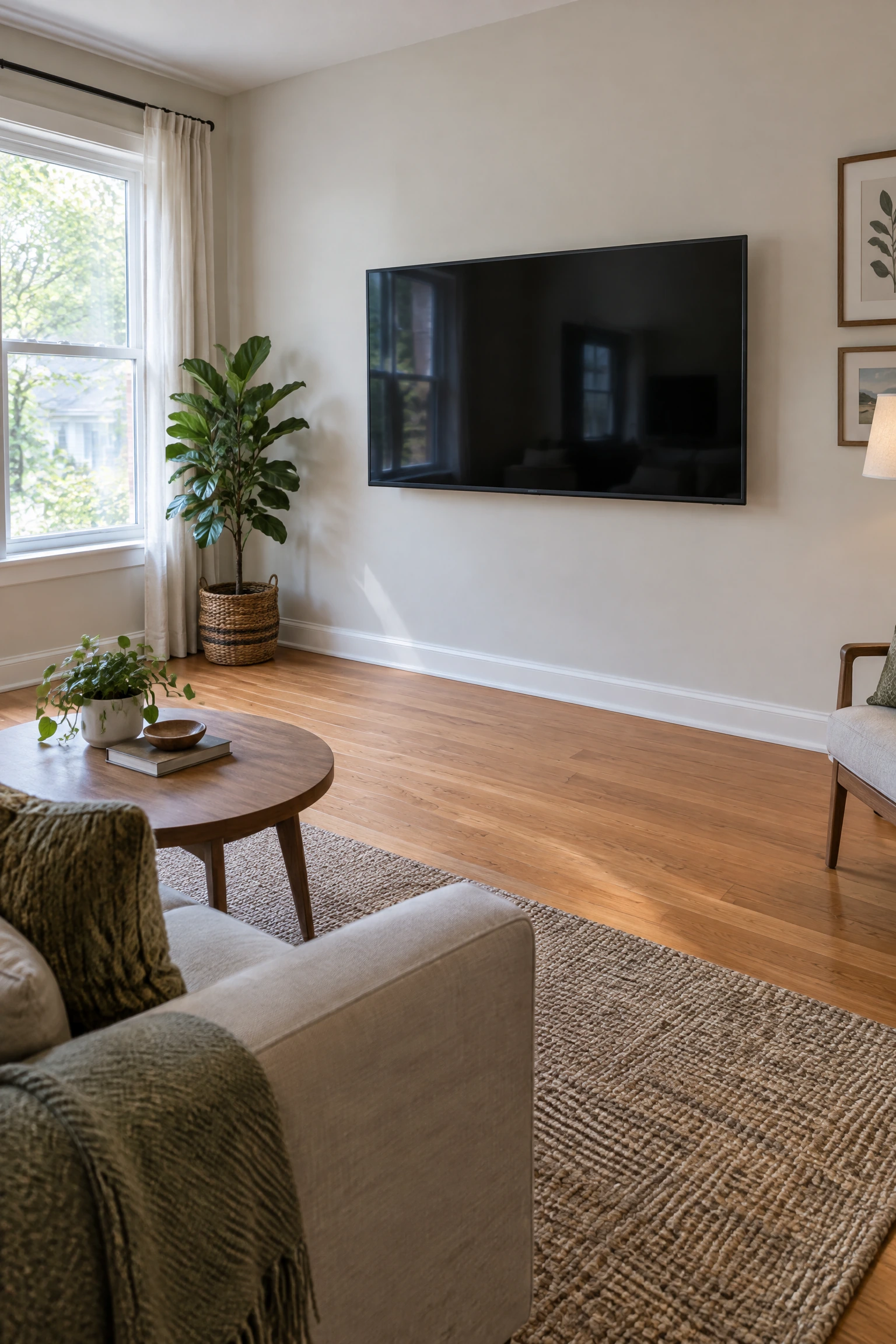
Visible cables, chargers, power strips, television cables running down the wall, and multiple device remotes scattered on surfaces each add a layer of visual noise to a small room that reads as density and disorder rather than as specific objects. In a large room, a visible cable is a minor distraction. In a small room, where the eye has less space to travel before hitting the next surface, visible cables actively make the room feel more cluttered than it is. A cable management box on the media unit, cord clips routing cables behind furniture along the wall, and a designated tray or drawer for remote controls and chargers eliminate this noise at a cost of under twenty dollars and thirty minutes of installation.
Quick Tip: Mount the television on the wall rather than placing it on a media unit where possible. A wall-mounted television removes the media unit from the floor plan, eliminates a substantial piece of furniture from the room, and frees up significant floor area and visual space in a small living room.
23. Keep the Color of Large Surfaces Consistent
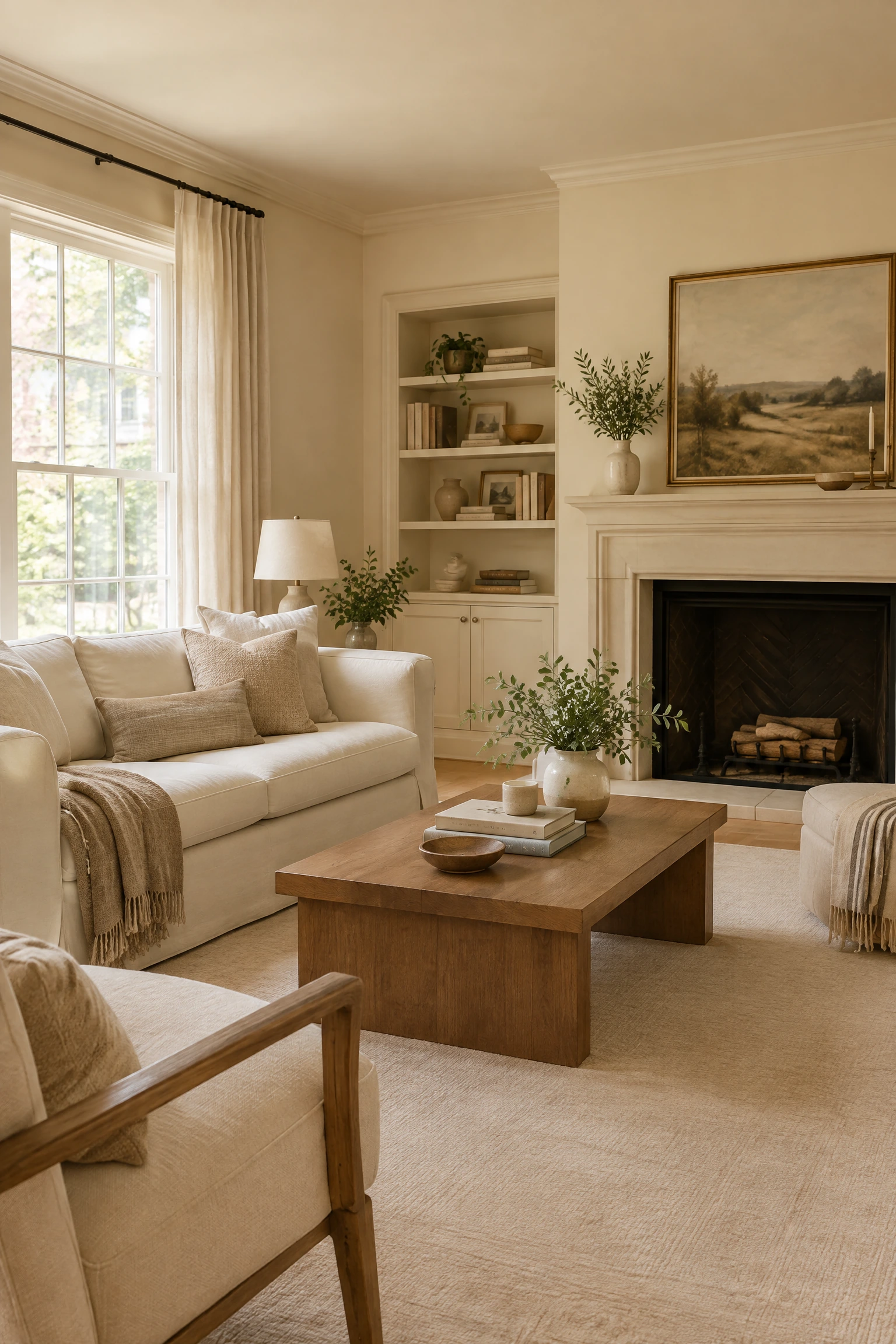
A small living room with different colors on different large surfaces, cream walls, a dark brown floor, a bright white ceiling, and a patterned rug in a third set of colors, reads as a collection of competing zones rather than a unified space. When large surfaces, walls, ceiling, floor, and the main rug, are close in tone to each other, the room reads as continuous and expansive. The principle is tonal continuity across the ground, the surrounding surfaces, and the ceiling, which prevents the eye from hitting a color boundary and reading it as the room’s edge. A light warm wall color, a warm neutral rug, and the same warm white on the ceiling creates a wrap of related tones that makes the room feel like a complete, generous space rather than a series of separate surfaces in close proximity.
Reality Check: This does not mean the room needs to be monochrome. It means the largest surfaces should be tonally related. All the variation and personality in the room can live in the smaller pieces: cushions, accessories, art, and plants, where the color contrast reads as deliberate accent rather than fragmented ground.
24. Use One Large Piece of Art Rather Than Many Small Ones
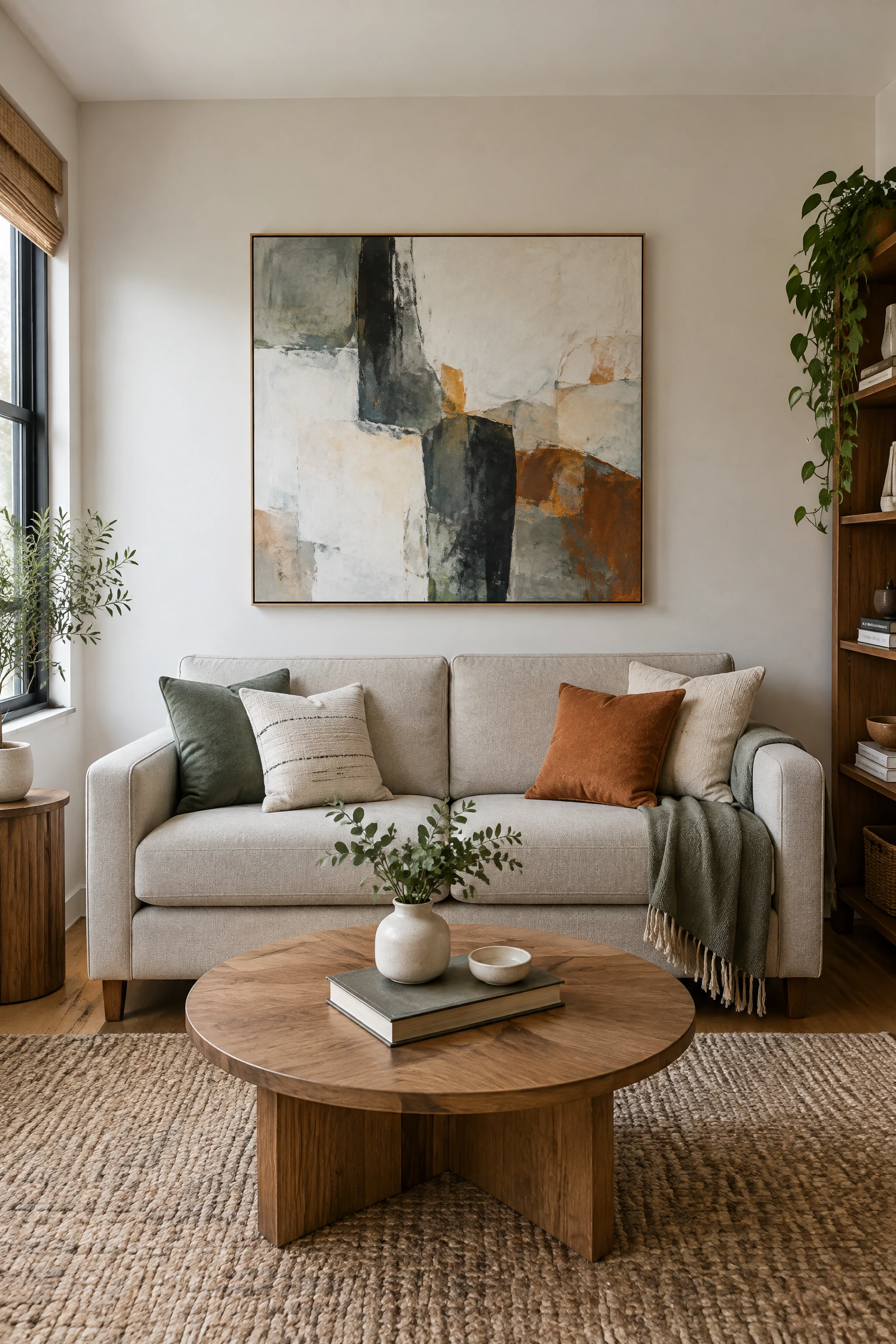
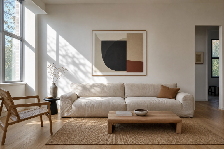
A small room with six or eight small pieces of art distributed across multiple walls reads as scattered and visually busy, which makes the room feel more cramped. A single large piece of art on the focal wall, large enough to command attention from across the room, provides a clear visual anchor that makes the room feel organized around one deliberate point of view. The scale of the art relative to the wall matters: a piece that is at least half the width of the sofa or the wall section it hangs on is the minimum for a small room. Smaller than that and the wall reads as mostly empty with a small object in the middle, which emphasizes the limited dimensions rather than transcending them.
Heads Up: Large-format art does not need to be expensive. A large canvas stretched with a simple abstract painted in the room’s palette tones, a large-format print in a good frame, or a single oversized botanical print from a free digital archive are all effective at the right scale. The size is what does the work, not the price.
Small Living Room: The Visual Mechanics Reference
| Spatial Challenge | The Mistake | The Fix | Why It Works |
| Floor feels small | Rug too small for the room | Size up: 8×10 minimum for most rooms | A large rug creates a unified floor plane; a small rug emphasizes the empty floor around it |
| Ceiling feels low | Curtain rod just above window | Rod at or near ceiling, floor-length panels | Vertical drop from ceiling to floor reads as full room height |
| Room feels boxed-in | Furniture against every wall | Float sofa 12-18 inches from wall | Space behind sofa reads as depth; perimeter layout reads as a waiting room |
| Room feels cluttered | Multiple small art pieces on all walls | One large focal piece on one wall | Single anchor gives the eye a resting point; scattered small pieces fragment the space |
| Room feels heavy | Solid-base furniture, no legs visible | Furniture with visible legs throughout | Visible floor beneath furniture extends perceived floor area |
| Room feels dark and small | Single overhead light, cool bulbs | Multiple lamp sources, 2700K warm bulbs | Layered warm light creates depth; uniform cool light flattens and boxes the room |
| Walls feel close | Art hung at standard height | Art hung high, vertical stacks preferred | High placement draws the eye upward; vertical groupings emphasize ceiling height |
| Room has no depth | Mirror placed anywhere with space | Large mirror opposite window or best feature | Mirror creates the impression of a second room; reflects the room’s best asset |
The One Thing Most People Skip
Almost every piece of advice for making a small living room feel larger focuses on adding things: a mirror here, a rug there, floor-length curtains, more lamps. The step that is consistently skipped is the editing that should come first. A small room that has been properly edited, surfaces halved, furniture reduced to what the room genuinely needs, cables hidden, and all textiles brought into a consistent palette, will feel significantly more spacious before a single new purchase is made. The additions work best when they are added to a room that has already been clarified. Add to a cluttered room and the additions simply become part of the clutter. Edit first, then add with intention, and the room will respond to every new change more clearly and more immediately than it ever did before.