Moon Phase Wall Art Ideas That Look Like Design, Not Decoration
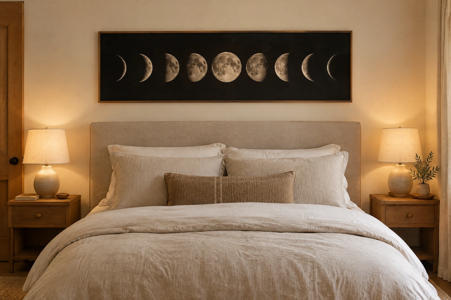
Moon phase wall art is one of the most versatile and most consistently misused decorating choices available. Done well, it brings a quiet celestial quality to a room that works across bohemian, minimalist, modern, and even traditional interiors. Done poorly, it turns the room into a themed space that reads as a single decorating interest rather than a considered home. The difference is almost always in how the art is integrated with the room rather than in the art itself. Scale, material, placement, and the objects that surround it determine whether moon phase art reads as a genuine design choice or as a novelty purchase. These 24 ideas cover all of it, from the practical choices of size and material through to room-specific applications and the styling decisions that make the art feel at home in the space around it. Moon phase pieces are one of the rare wall art formats where the framing and spacing choices matter as much as the art itself.
CATEGORY ONE: SCALE AND PLACEMENT
1. Hang a Full Lunar Cycle Piece Above the Bed as the Room’s Anchor
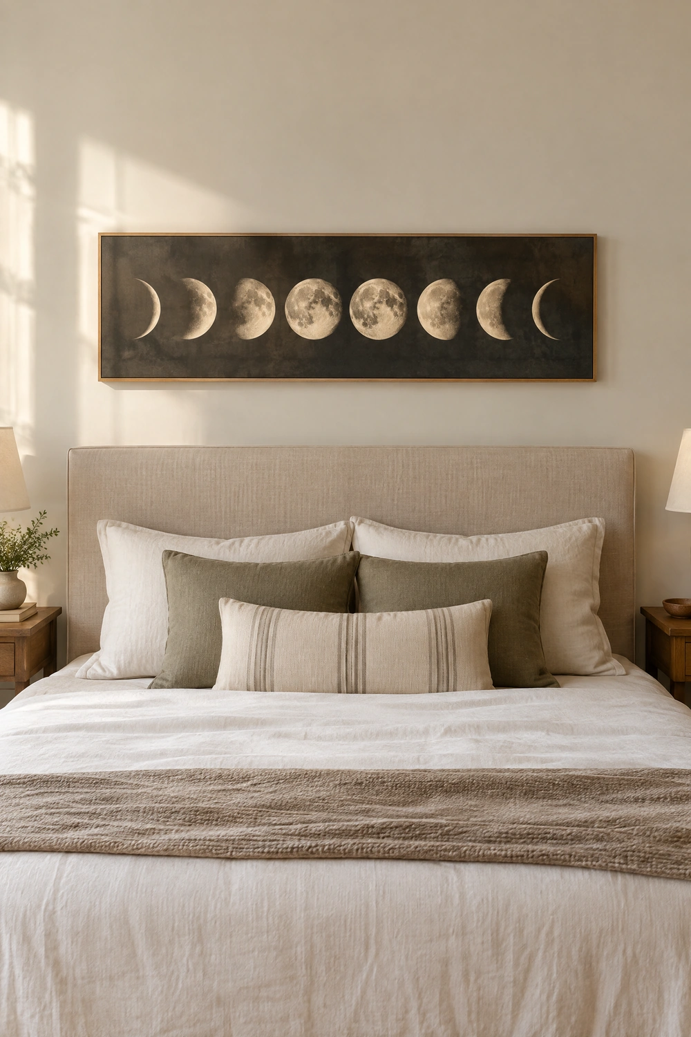
A single piece showing all eight phases of the moon in a horizontal sequence, hung above the headboard with the center of the piece at approximately 57 to 60 inches from the floor and the bottom of the frame sitting 6 to 8 inches above the top of the headboard, is the most classic and most effective placement for moon phase wall art. The horizontal sequence of phases mirrors the linear quality of the headboard beneath it and grounds the art in a clear relationship with the furniture below. Scale matters enormously here: a piece that is at least two-thirds the width of the bed reads as an anchor. A narrower piece floats disconnected from the headboard and makes both the art and the furniture look smaller than they are.
Designer Advice: For a king or queen bed, aim for a moon phase piece at least 40 to 48 inches wide. For a full or twin, 30 to 36 inches is the minimum. A piece smaller than this above a bed reads as decorative accessory rather than the room’s primary art element.
2. Use a Single Oversized Full Moon Print as a Statement Piece
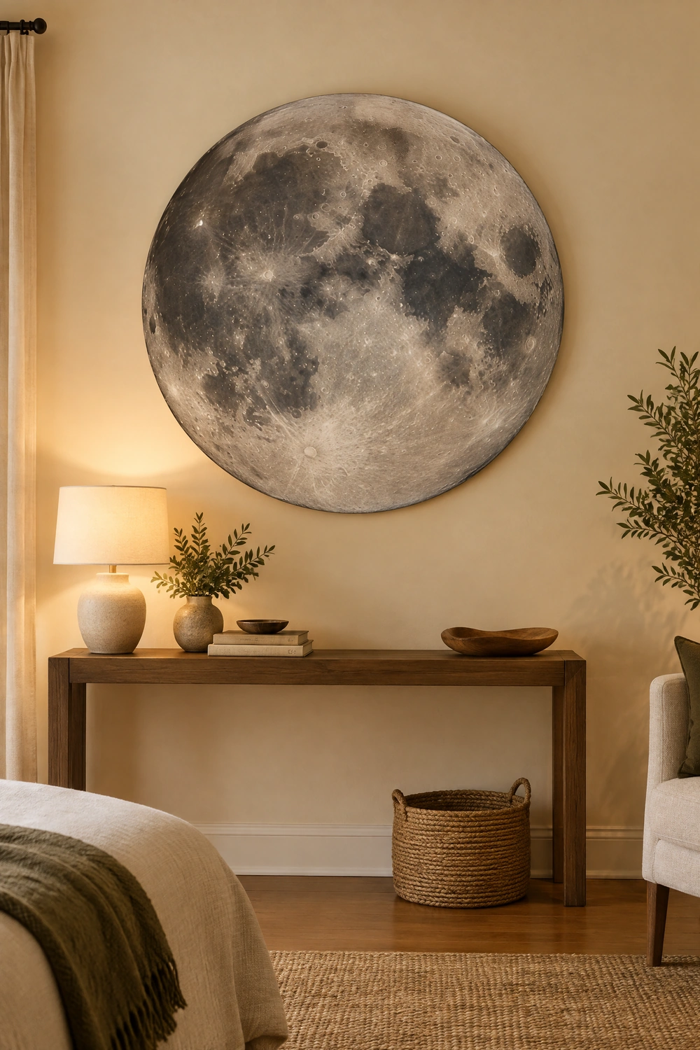
Rather than displaying all eight phases, a single large-format full moon print, a photographic or painterly rendering of the complete moon in high detail, functions as a statement artwork in the same way an abstract or botanical print would. At a scale of 24 by 24 inches or larger, a full moon print commands a wall without requiring the horizontal expanse that a full phase sequence needs, which makes it more versatile for rooms with limited wall width. The detail in a high-quality full moon print, the visible craters and shadow gradients, gives it a presence and depth that smaller decorative moon pieces lack, and it reads as art photography or fine art rather than celestial merchandise.
Quick Tip: A circular format for a full moon print reads as more intentional and more graphic than a rectangular format. A large round canvas or a circular framed print gives the piece a shape that references the moon itself rather than simply depicting it inside a conventional rectangle.
3. Create a Vertical Stack of Moon Phase Prints in a Narrow Space
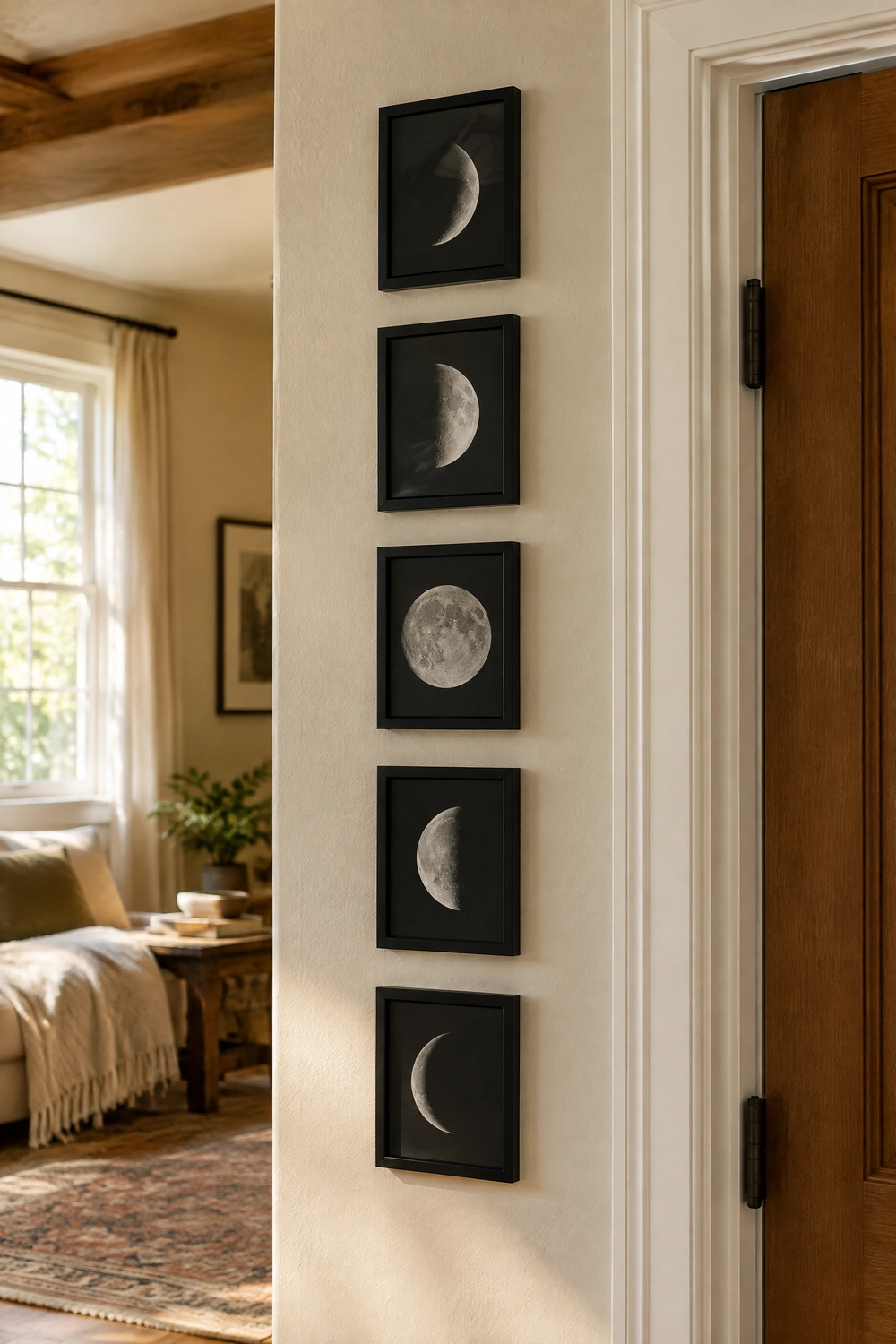
In a room with limited wall width but good ceiling height, a vertical arrangement of three or five individual moon phase prints, each in its own matching frame, stacked in a column from eye level upward, makes effective use of vertical space while introducing the lunar theme in a format that draws the eye upward and adds perceived height to the room. The prints should be identically sized and framed for cohesion, and the spacing between them should be consistent, 2 to 3 inches of gap between frames. This arrangement works particularly well in a hallway, in the space beside a doorframe, or in the narrow wall section between a window and a corner.
Pro Move: A vertical column of moon prints beside the bed, where a nightstand-to-ceiling vertical zone is often unused, creates a floor-to-near-ceiling moment that makes the bedside wall feel intentionally designed rather than partially decorated.
4. Lean a Large Moon Phase Piece Against the Wall Rather Than Hanging It
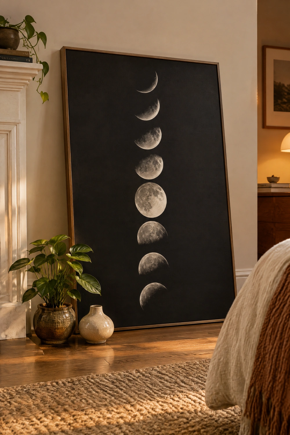
Leaning a large moon phase canvas or framed print against the wall on a mantel, on a shelf, or directly on the floor beside the bed or sofa is the approach that most immediately reads as contemporary rather than conventional. The casual lean communicates confidence in the piece and removes the permanence of a hung work, which suits the moon phase theme’s associations with flux and change. On the floor, the piece should be substantial, at least 24 by 36 inches, for the lean to read as intentional rather than as a picture waiting to be hung. On a mantel or shelf, even a smaller piece reads well leaning because the furniture beneath it provides the grounding that the wall provides in a hung piece.
Heads Up: A leaned piece on the floor needs a wall or piece of furniture to lean against for stability and visual connection. A piece leaning against a bare wall in the middle of a room reads as forgotten rather than styled. The context around the lean is what makes it a design choice.
CATEGORY TWO: MATERIALS AND FORMATS
5. Choose Wood-Cut Moon Phase Panels for a Warm, Organic Feel
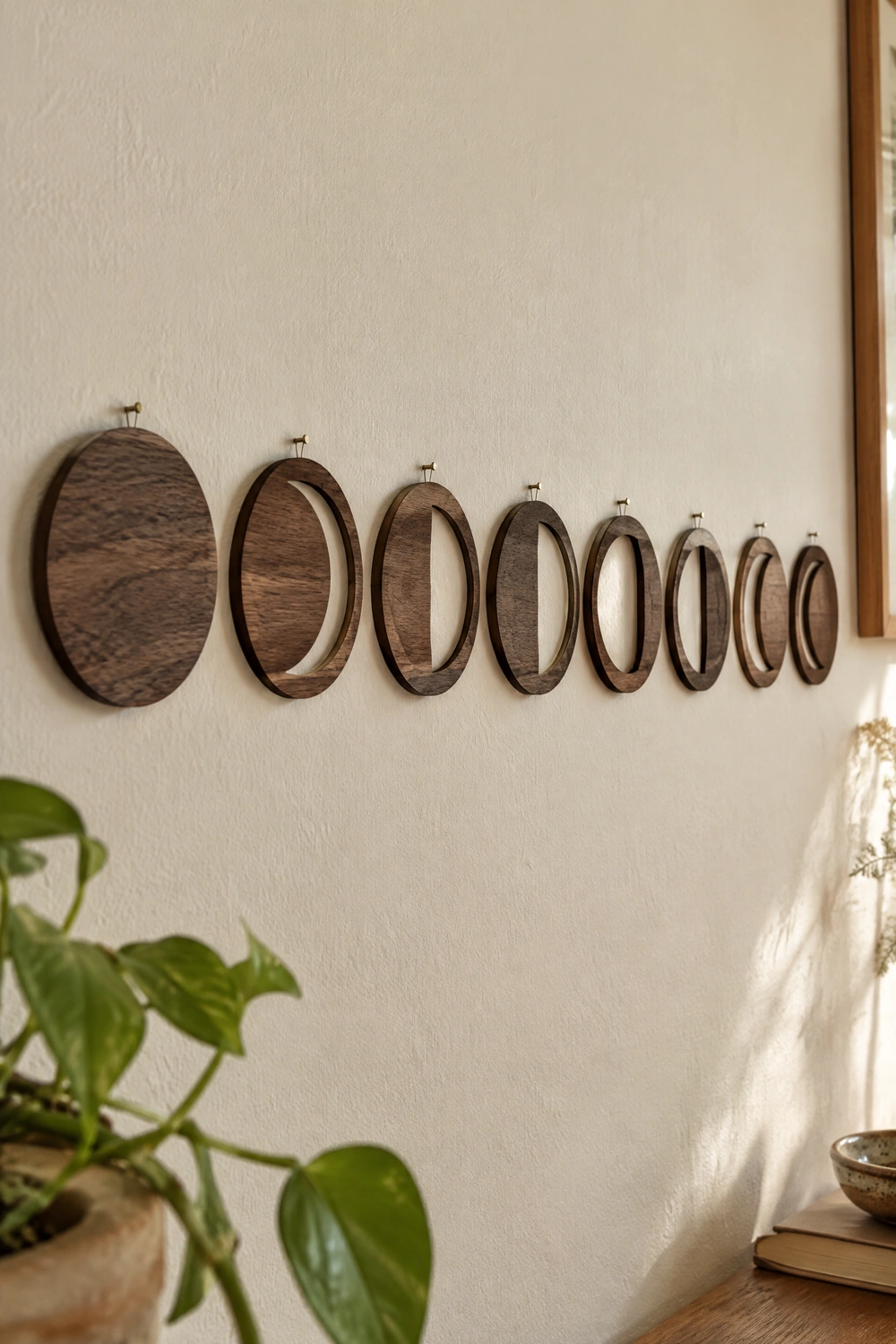
Laser-cut or hand-carved wooden moon phase panels bring a warmth and organic material quality to the lunar theme that printed canvas or metal cannot replicate. The grain of the wood visible behind or through the cut shapes, whether left natural, stained in a warm walnut or dark ebony tone, or painted in a matte neutral, adds texture to the wall at a scale that a flat print does not have. A set of eight individual wooden discs in the eight major phases, hung in a horizontal sequence with small nails, reads as handcrafted and specific in a way that a single framed print does not. The slight imperfection in hand-carved pieces, the visible tool marks, the slight variation in disc size, adds authenticity that laser-cut precision pieces lack.
Designer Advice: Choose the wood tone to suit the room’s existing material palette. Natural light wood reads as Scandinavian and clean. Dark walnut stain reads as mid-century and warm. Matte black painted wood reads as contemporary and graphic. The material choice positions the piece within the room’s existing aesthetic rather than against it.
6. Use Brass or Gold Metal Moon Phase Pieces for a Luxe Finish
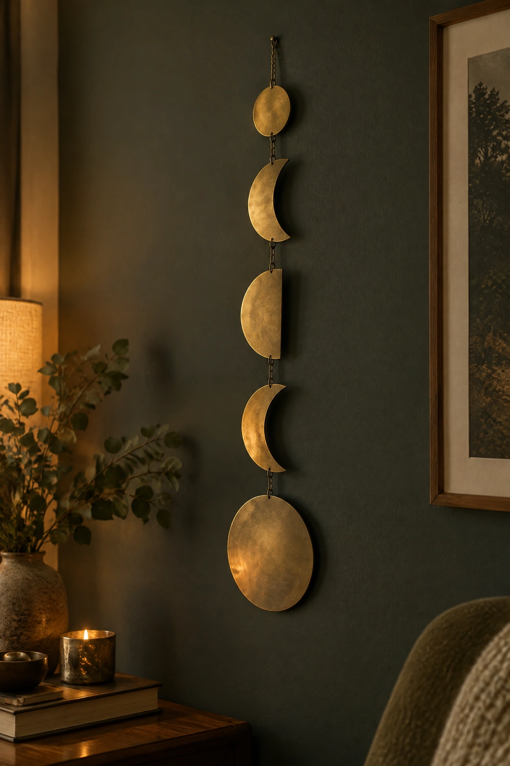
Brass or gold metal moon phase wall art, whether cast in a matte antique brass, a bright polished gold, or an aged warm bronze, bridges the celestial theme and the warm metallic accents that appear in many living rooms and bedrooms. A set of metal moon discs in graduated sizes, each in a different phase, hung against a deep-toned wall, creates one of the most visually striking expressions of the moon phase theme available because the metal catches and reflects ambient light at different times of day, making the piece appear to shift and glow. Matte brass reads as more contemporary and considered than high-polish gold, which can tip into ornate territory in rooms with understated furnishings.
Reality Check: Ensure the metal finish of moon phase wall art aligns with the other metals in the room. Brass moon phases beside chrome lamp bases and silver frames introduce competing metal tones that make the celestial piece feel out of context. Consistent metal tones across art hardware, lamp bases, and accessories keep the room cohesive.
7. Hang a Macrame Moon Phase Wall Hanging as a Textile Statement
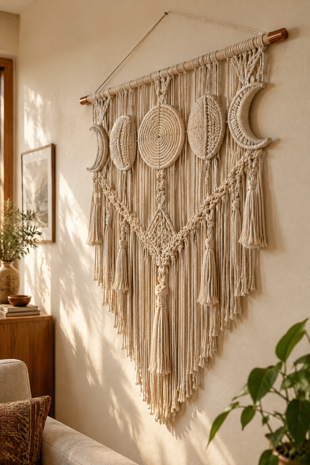
A macrame wall hanging in the shape of a crescent or incorporating a series of circular moon phase forms in natural cotton or jute cord brings the bohemian textile quality of macrame together with the celestial reference of the moon phase theme. These pieces add three-dimensional tactile texture to the wall at a scale that no flat print can achieve, and the organic, slightly imperfect quality of hand-knotted cord suits the naturalistic associations of the lunar theme far better than a mass-produced metal or canvas piece. A large macrame moon phase hanging, at least 18 to 24 inches wide, reads as the room’s primary wall textile and works in a similar way to a mix: it brings warmth, texture, and a handmade quality to a vertical surface.
Quick Tip: Hang a macrame moon piece from a wooden dowel or a simple copper or brass curtain rod with decorative end caps. The hanging method is part of the visual composition at this close range, and a wooden dowel adds an organic, natural element that suits the piece better than a plain nail or wire.
8. Choose a Framed Fine Art Print for a More Elevated Look
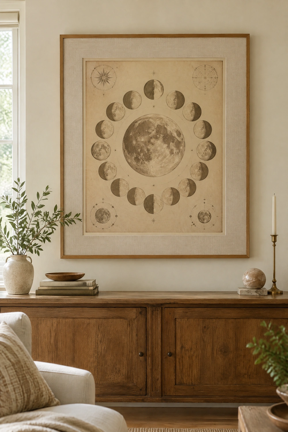
A museum-quality fine art print, whether a vintage astronomical illustration of the lunar cycle, a hand-rendered watercolor of moon phases in soft indigo and gold, or a contemporary photographic study of the full moon in black and white, positioned in a well-chosen frame, elevates the moon phase theme from decorative trend to considered art collection. The frame is doing significant work here: a thin black metal frame reads as modern and graphic, a wide linen-matted natural wood frame reads as gallery and considered, and a slim brass frame reads as warm and considered. The key difference between a fine art print and a decorative moon phase piece is the quality of the image and the intentionality of the framing rather than the subject matter.
Pro Move: Source vintage astronomical illustrations of the moon from public domain archives like the Rijksmuseum collection or NASA’s image archives. Printed at large scale and framed with quality materials, these images look more considered and more specific than mass-produced moon phase prints, at a fraction of the cost.
9. Try a Moon Phase Mirror for Reflection and Celestial Reference Together
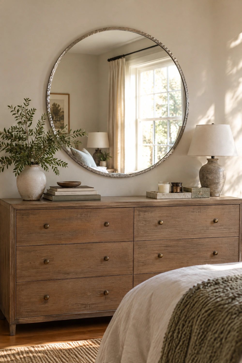
A circular mirror styled as a full or crescent moon, with a frame referencing the moon’s texture or coloring in aged silver, hammered metal, or a dusty pale grey, performs double duty: it opens the room visually through reflection and introduces the celestial theme simultaneously. A large circular moon mirror above a dresser or console, positioned opposite a window to maximize its reflective effect, becomes one of the most functional and most aesthetically specific pieces in the room. The circular format references the moon’s shape without being literal about it, which allows the piece to read as design-forward rather than themed.
Reality Check: A mirror styled too literally as a moon, with craters sculpted into the frame or surrounded by decorative stars, crosses from celestial-themed design into novelty territory. The most effective moon-referencing mirrors are those that suggest the theme through shape and material rather than spelling it out.
CATEGORY THREE: STYLE PAIRINGS BY INTERIOR AESTHETIC
10. Moon Phase Art in a Bohemian Room
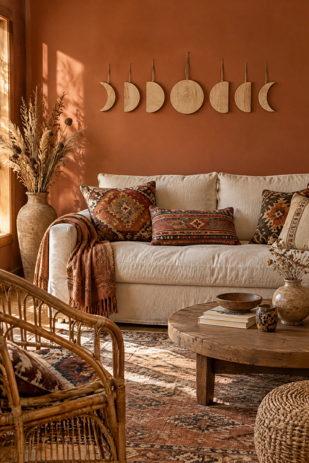
The bohemian interior is the most natural home for moon phase wall art because the style’s emphasis on global materials, organic textures, and personal spiritual expression aligns naturally with the celestial theme. In a bohemian room, moon phase art works best in natural materials, wood, macrame, woven textile, or hand-painted ceramic, rather than in mass-produced metal or printed canvas, which read as decorative products rather than collected objects. Layer moon phase art with a kilim rug, dried botanicals, rattan furniture, and crystal groupings for a cohesive celestial-earth aesthetic that reads as deliberate and personally meaningful rather than assembled from a trend.
Designer Advice: In a bohemian room, the moon phase piece should be the room’s most visually considered element, not one of many competing celestial objects. A single high-quality wood-carved or macrame moon phase piece surrounded by botanical and textile elements reads as a focal point. A room filled with moon prints, moon cushions, moon candles, and moon rugs reads as a theme rather than an aesthetic.
11. Moon Phase Art in a Minimalist Room
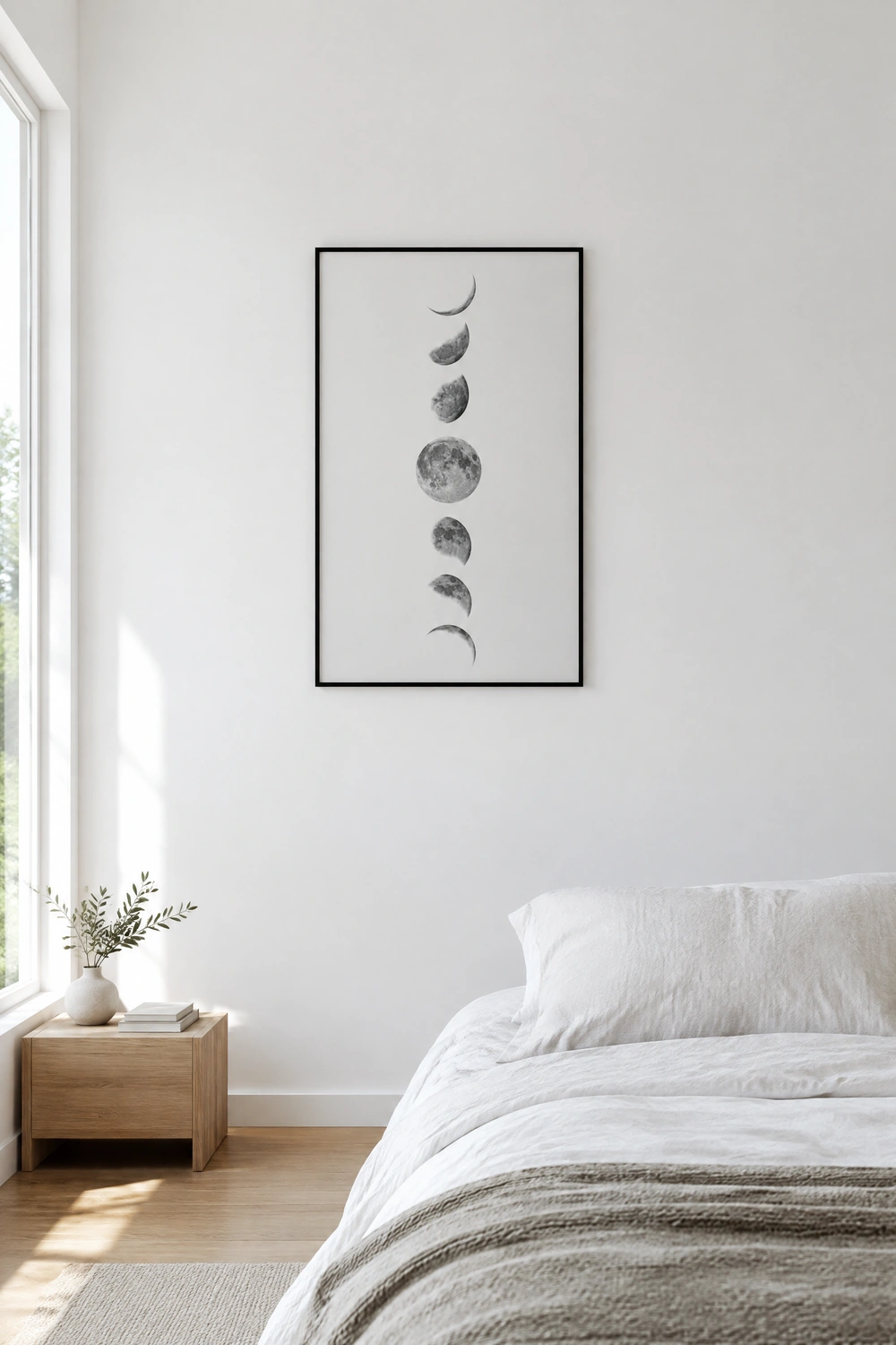
In a minimalist interior, moon phase art earns its place through restraint: a single, high-quality, large-format piece in a format that aligns with the room’s existing aesthetic, a clean framed fine art print in a thin black or white frame, a set of matte white or pale grey ceramic moon discs, or a single circular mirror with a slim frame. The piece should be the room’s only celestial reference: no supporting moon accessories, no star-scattered cushions, no lunar candle holders. The theme is carried by a single strong piece, and the room’s overall restraint gives that piece the space to read clearly without competing noise. In a minimalist context, the celestial reference reads as considered and specific rather than decorative.
Quick Tip: In a minimalist room, hang moon phase art against the most deliberately empty wall. The negative space around the piece is part of the composition. A moon phase print surrounded by a generous margin of empty wall reads as a considered installation. The same print surrounded by other objects reads as part of a collection.
12. Moon Phase Art in a Modern or Contemporary Room
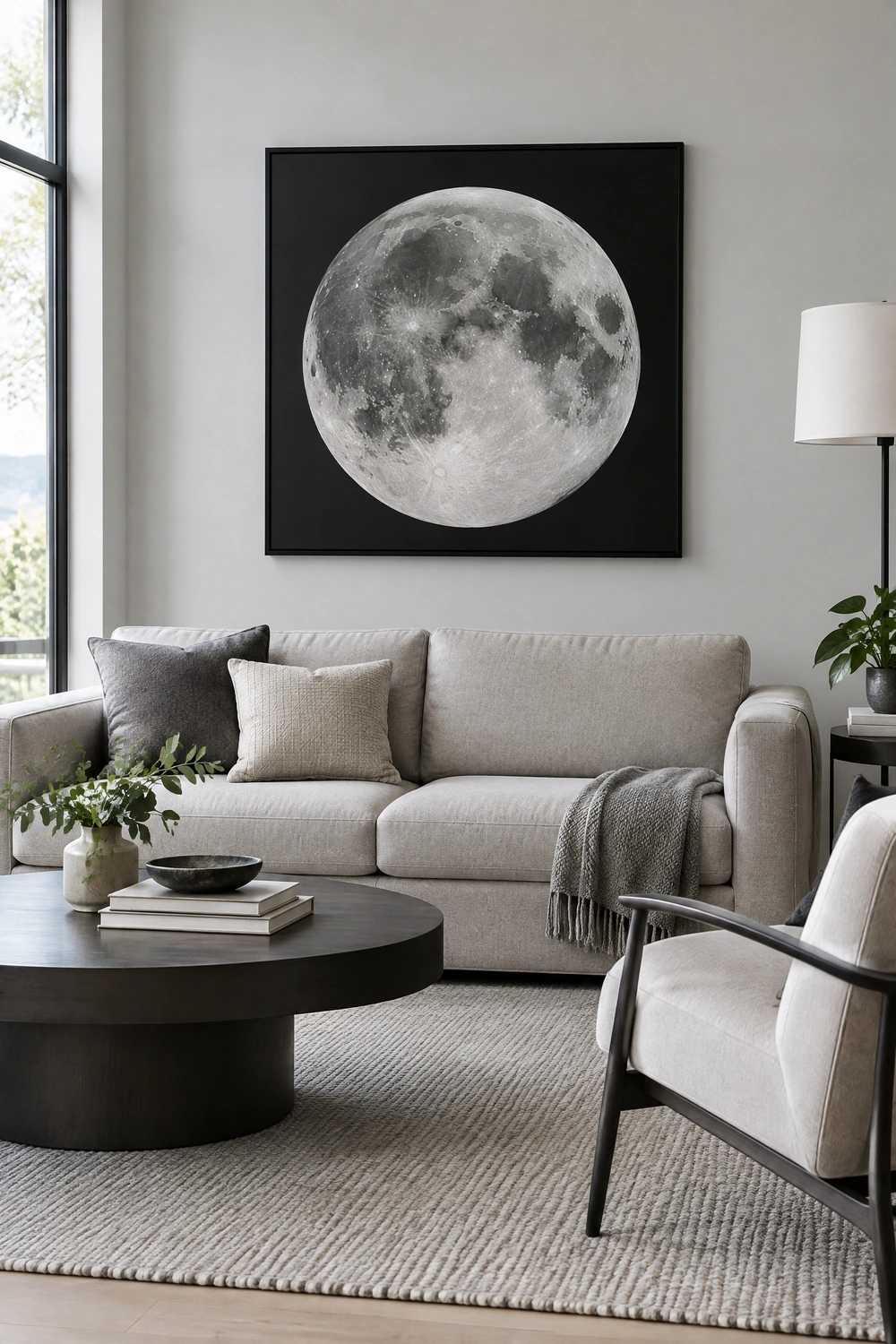
A contemporary interior can incorporate moon phase art through the most graphic and material-specific expressions of the theme: a large-scale high-contrast black and white photographic moon print in an oversized format, a set of matte black metal phase discs against a white or grey wall, or a single circular metal piece in a brushed finish. The key in a contemporary room is to approach the moon phase as an abstract graphic element rather than a celestial symbol, choosing pieces that read as art first and theme second. A large photographic print of the moon’s surface at extreme close range reads as fine art photography in any context. The same subject matter in a cursive “follow the moon” print reads as merchandise.
Reality Check: The quality of the printing or fabrication is the primary determinant of whether moon phase art reads as design-forward or trend-driven. A high-resolution fine art print or a precisely crafted metal piece reads as contemporary art. A low-resolution print on thin canvas or a cheap die-cut metal piece reads as a trend purchase regardless of how it is styled.
13. Moon Phase Art in a Celestial or Mystical Room
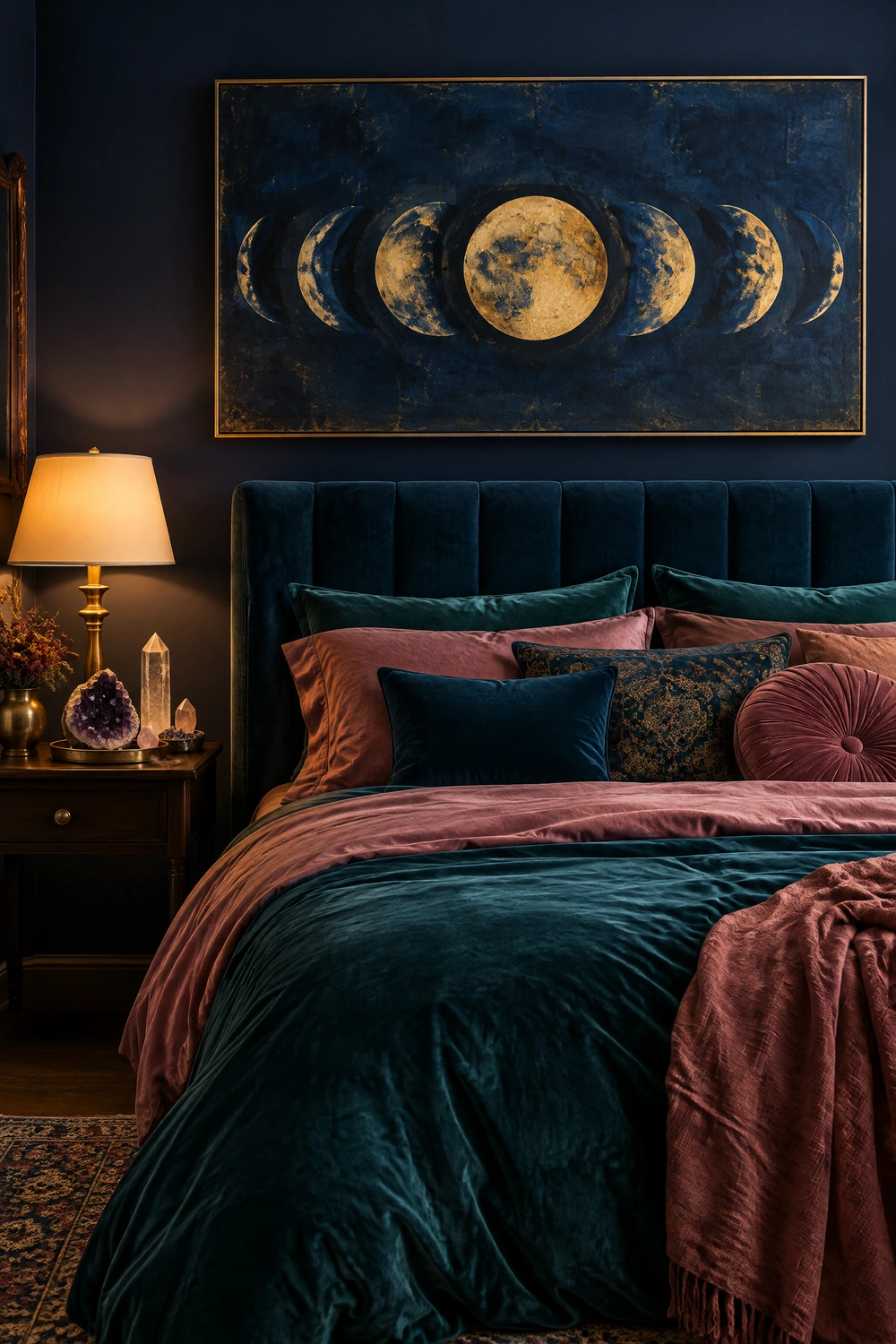
A room with a fully committed celestial aesthetic, deep indigo or near-black walls, rich velvet upholstery, crystal displays, candles, and layered jewel tones, is the context in which the most elaborate and most literal moon phase art works most effectively. Here, a large framed map of the night sky, a hand-painted depiction of the moon’s phases in gold on a dark ground, or a mixed-material piece combining metal, crystal, and printed elements reads as the room’s defining focal point rather than one element among many. The surrounding celestial objects create the context that legitimizes the most statement-making moon phase art, which would overwhelm a more restrained room.
Pro Move: In a celestial-aesthetic room, position the moon phase art so it is the first thing visible on entering. The room should build around the art’s scale and palette, with the surrounding colors and objects referring back to the tones and shapes in the piece rather than competing with it.
14. Moon Phase Art in a Scandinavian or Nordic Room
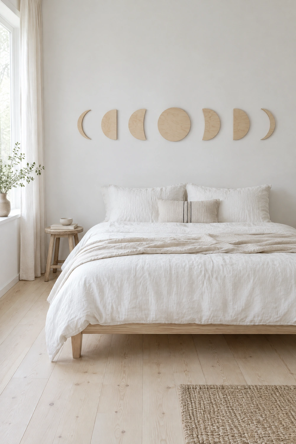
The Scandinavian interior, with its emphasis on natural materials, pale tones, clean lines, and the relationship between the interior and the natural world beyond it, is a less obvious but highly effective context for moon phase art. A simple set of unfinished birch wood moon phase discs, a linen print of the lunar cycle in muted grey tones, or a hand-printed textile banner showing the moon’s phases in natural ink on undyed cotton all carry the natural material and restrained palette associations of Nordic design while bringing a celestial reference that relates to the long dark winters central to the Nordic lived experience. In this context, the moon phase theme reads as culturally resonant rather than decorative.
Designer Advice: In a Scandinavian-inspired room, keep the moon phase piece in natural, undyed, or pale tones: natural birch, undyed linen, pale grey, or soft cream. Bright gold or high-contrast black moon phase art introduces the wrong material and color register for the aesthetic.
CATEGORY FOUR: ROOM-SPECIFIC APPLICATIONS
15. Above the Bed: The Most Impactful Position in a Bedroom
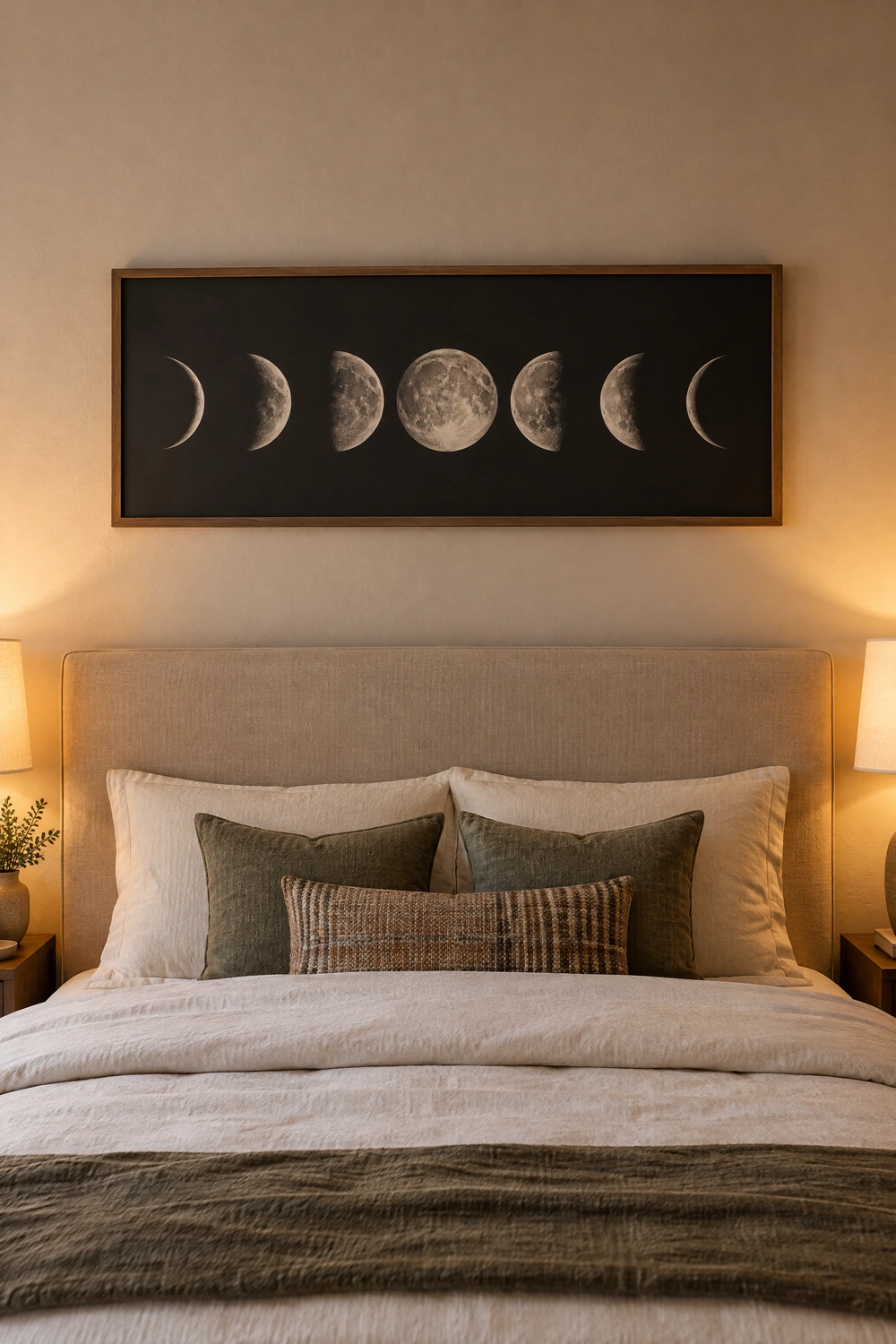
The wall above the bed is the bedroom’s primary focal point and the most naturally suited position for moon phase wall art, both aesthetically and thematically. The moon’s associations with night, sleep, dreams, and the cyclical nature of rest make the bedroom context for moon phase art the most conceptually coherent placement available. A horizontal phase sequence centered above the headboard, a single large full moon print, or a circular metal or wood arrangement centered above the bed each create the kind of visual anchor that makes a bedroom feel considered and complete. The ceiling above the bed and the wall immediately surrounding the art should be kept clear to allow the piece the visual space it needs to function as the room’s defining moment.
Quick Tip: If the bedroom wall has limited height above the headboard, consider a wide, narrow format for the moon phase piece: a horizontal canvas at 48 by 12 inches presents all eight phases across a compact height that works in rooms where a taller piece would crowd the ceiling.
16. In the Living Room: Making Moon Phase Art Work as Serious Decor
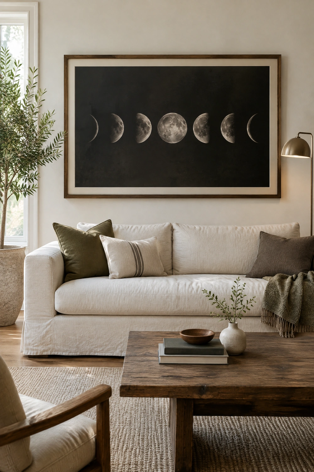
Moon phase wall art in a living room needs to do more work to justify itself than in a bedroom, because the living room is a more socially visible space where celestial references can read as whimsical rather than considered if not handled carefully. The approach that works most consistently is to treat the moon phase piece as a piece of abstract or fine art rather than as themed decoration: a large-format photographic print, a significant framed illustration, or a substantial sculptural set of discs in a quality material, hung as the room’s primary artwork rather than as one element in a larger celestial display. The piece should be the room’s focal point, with the surrounding objects providing context rather than competition.
Reality Check: A moon phase print surrounded by moon candles, moon cushions, and a moon phase rug in a living room reads as a single-interest collection rather than a designed room. Let the art carry the theme and let the rest of the room exist in a broader aesthetic that the art sits within.
17. In a Nursery or Child’s Room: Soft and Whimsical
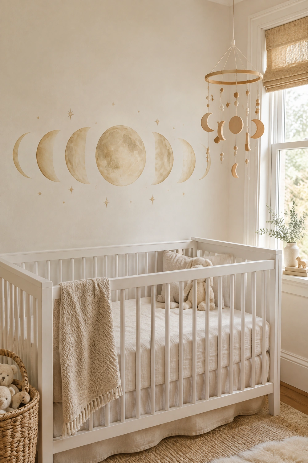
Moon phase wall art in a nursery or young child’s room is one of the most appropriate and most charming applications of the theme, because the moon’s associations with bedtime, lullabies, and the gentle mystery of the night sky are culturally embedded in childhood in a way that makes the theme feel natural rather than decorative. Soft watercolor depictions of the moon phases in muted pastels, a wooden mobile showing the phases in natural wood shapes, or a gentle linen banner with embroidered moon forms suit a nursery context without the more dramatic treatments that suit an adult bedroom. The palette should stay soft: pale gold, dusty rose, soft grey, or cream rather than the high-contrast black and gold that reads best in adult spaces.
Designer Advice: Choose materials that are safe and durable for a child’s room. Framed prints behind glass should be hung at a height the child cannot reach. Wooden pieces should be sanded smooth with no sharp edges. Macrame or textile pieces should be hung securely with no loose cords accessible to small hands.
18. In a Home Office or Study: Inspiration and Intentionality
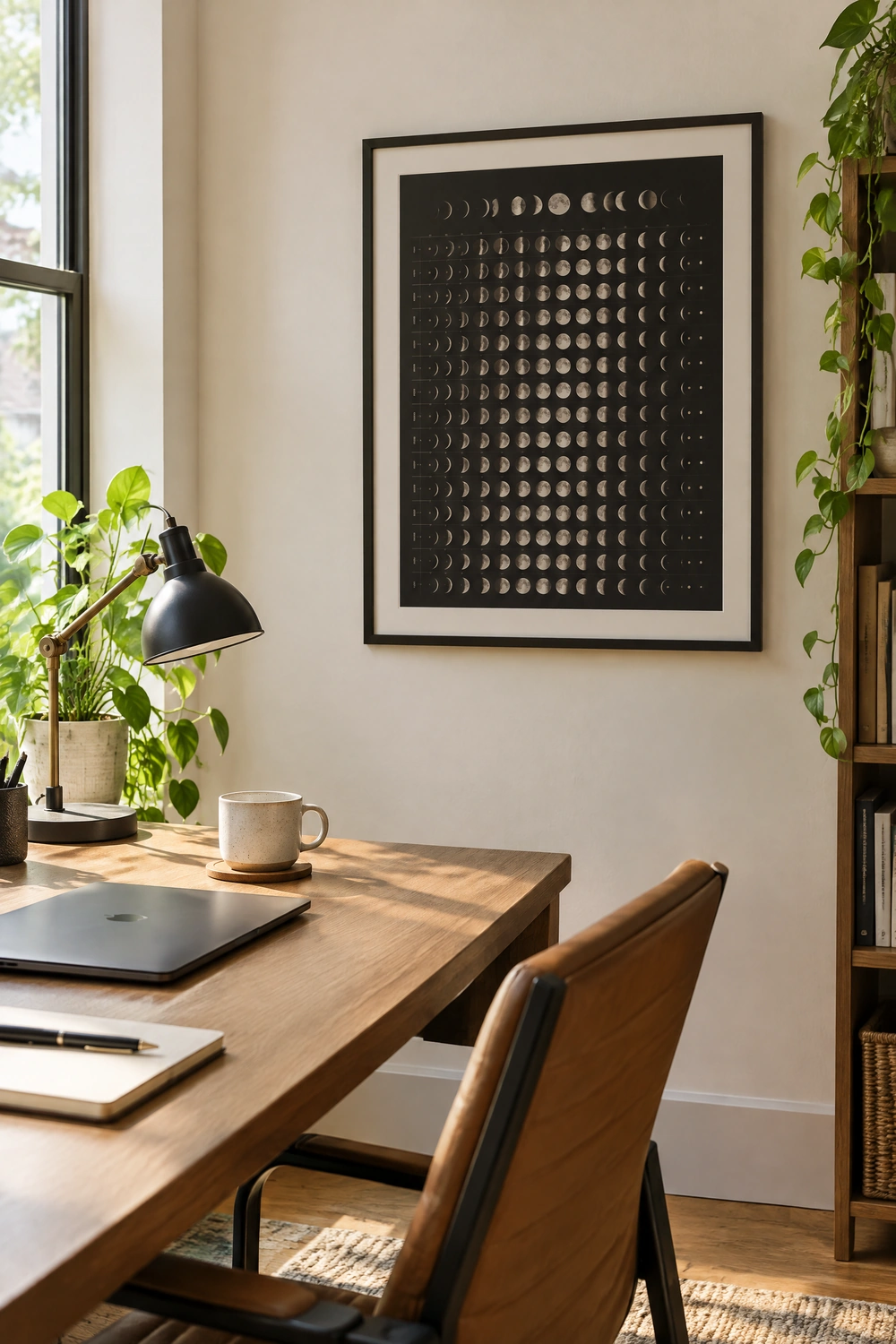
A home office or study is a less conventionally considered location for moon phase art but one where the theme can work effectively as a symbol of intentional cycles, planning, and the broader rhythms of time. A moon phase calendar art piece, showing the full lunar cycle for the current year with specific dates marked, functions simultaneously as a decorative art piece and a practical reference that adds purpose and meaning to the workspace. A simple framed print of the moon phases in muted black and cream tones against a light wall in a clean contemporary frame reads as considered and specific in a home office context, contributing to the sense of a considered, thoughtful working environment without the decorative excess that moon phase art can slide toward in other rooms.
Pro Move: A moon phase art print in a home office works best when it relates thematically to the nature of the work done in the space. For a writer, a designer, or a creative professional, the cyclical nature of the moon phases references the rhythm of creative work in a way that reads as meaningful rather than arbitrary.
19. In a Bathroom: Small-Scale Celestial Detail
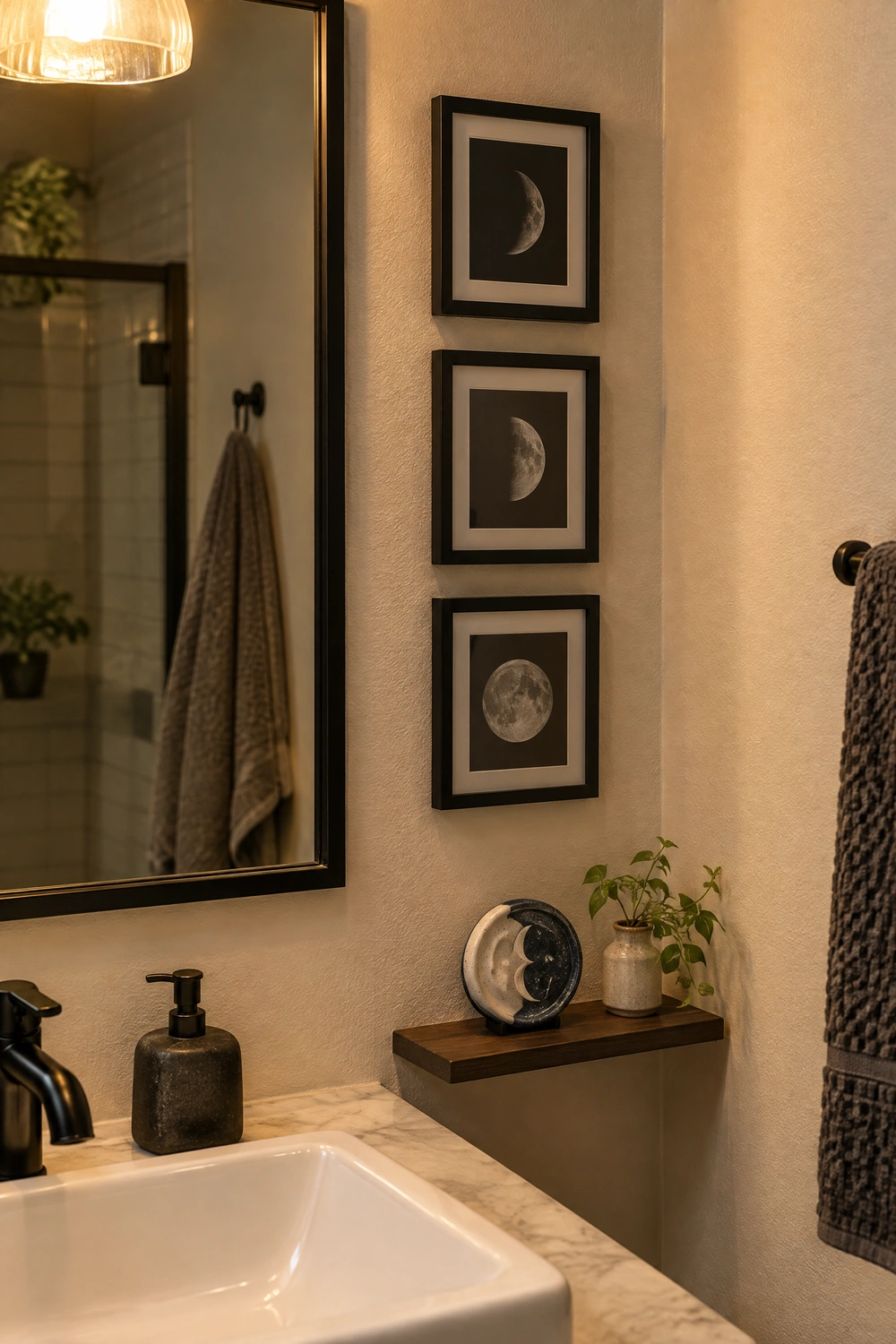
A bathroom is an ideal location for a smaller, more intimate expression of the moon phase theme because the private, personal quality of the bathroom context aligns with the lunar theme’s associations with reflection, cycles, and inner experience. A small set of three framed moon phase prints in matching frames hung in a column beside the mirror, a single circular moon phase ceramic piece on a shelf beside the basin, or a simple linen art print in a narrow frame on the wall beside the bath each add celestial character to the bathroom at a small scale that suits the room’s typical wall area without overwhelming it. Materials in a bathroom should be chosen for their resistance to humidity: framed prints behind glass, ceramic pieces, and metal wall art are more durable in a humid environment than unprotected canvas or raw wood.
Heads Up: Avoid unprotected canvas, raw or unsealed wood, and untreated paper art in a bathroom where steam and humidity are regular. A canvas print in a sealed frame behind glass, a glazed ceramic moon piece, or a sealed metal moon wall piece will last significantly longer in a humid environment than an unprotected piece.
CATEGORY FIVE: STYLING AND INTEGRATION
20. Pair Moon Phase Art With Natural Crystals and Geodes
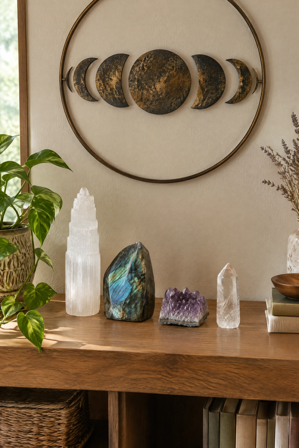
Moon phase wall art and crystals or geodes share the same natural, mineral, celestial aesthetic and work together in a room without either element feeling redundant. A moon phase piece hung above a shelf or console displaying a selenite tower, a piece of labradorite, a clear quartz cluster, and an amethyst point creates a cohesive celestial-mineral vignette that reads as a deliberate collection rather than a series of separate purchases. The crystals add organic three-dimensional form to the display zone beneath the art, and the art provides the vertical, wall-level element that grounds the arrangement on the surface below it. Together they create the kind of layered, considered display that makes a small shelf or console feel like a considered installation.
Quick Tip: Keep the crystal display beneath moon phase art to a small number of well-chosen, significant pieces: three to five crystals of varying heights and forms. A large number of small crystals scattered across the surface looks like a collection rather than a display and competes with the art above rather than supporting it.
21. Use Warm Lighting to Enhance the Moon Phase Piece
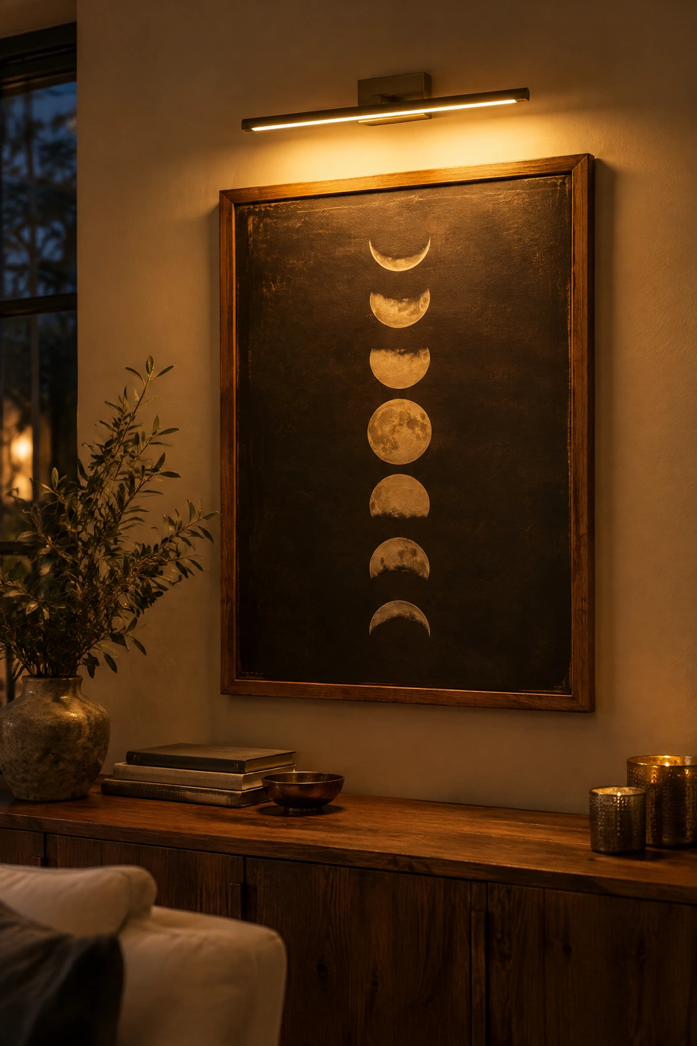
The way a moon phase art piece is lit is as important as where it is hung, particularly for pieces in wood, metal, or three-dimensional sculptural formats where light reveals surface texture. A warm-toned picture light mounted above or beside a significant moon phase piece, a floor lamp positioned to cast upward light toward a large moon print, or a warm-toned LED strip running along the back of a shelf below a ceramic moon installation each use light to enhance the material qualities of the piece and make it the room’s visual focus in the evening hours. Warm 2700K light enriches the gold, brass, and warm wood tones in most moon phase art and prevents the cooler celestial palette of blues and grays from reading as cold and unwelcoming.
Designer Advice: A battery-powered picture light is one of the most effective and least invasive ways to highlight a significant piece of wall art without rewiring. Many are designed specifically for art lighting and can be installed in minutes with adhesive strips, making them ideal for renters or anyone unwilling to drill near their artwork.
22. Build a Gallery Wall That Includes Moon Phase Art Without Centering It
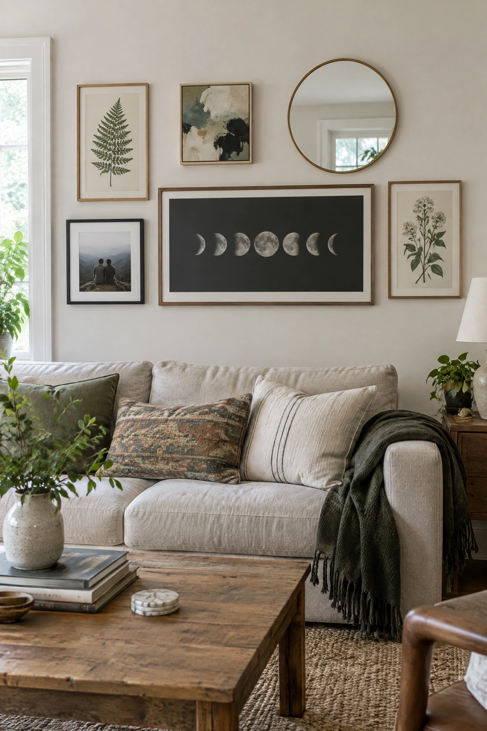
Rather than treating moon phase art as the room’s single celestial statement, incorporating a moon phase piece within a broader gallery wall, where it sits beside botanical prints, abstract art, mirrors, and personal photographs, integrates the theme into the room’s overall art collection rather than making it the room’s defining aesthetic. The moon phase piece should be one of the larger pieces in the gallery wall so that it reads as a featured element rather than a minor addition, but it should be surrounded by art in other subjects that reflect the broader interests and personality of the space. This approach prevents the room from reading as celestially-themed and positions the moon phase piece as part of a considered, eclectic art collection.
Reality Check: A gallery wall that includes moon phase art alongside multiple other celestial references, star charts, sun prints, constellation maps, and moon calendars all in the same arrangement, tips back into themed territory. The moon phase piece works best in a gallery wall when it is the only explicitly celestial element.
23. Complement Moon Phase Art With a Consistent Palette
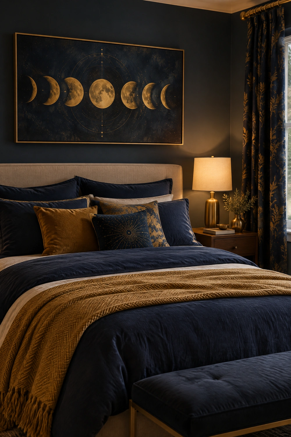
Moon phase art comes in a wide range of palettes, from deep navy and gold to monochrome black and cream, to soft watercolor in muted pastels, to natural wood tones and warm neutrals. The palette of the art piece should be chosen in relation to the existing room palette rather than in isolation. A deep navy and gold moon phase piece in a room dominated by warm neutrals and terracotta introduces a color that does not belong. The same piece in a room with deep blue or indigo tones, or paired with navy cushions and a warm gold lamp base, reads as intentionally placed. The art’s palette should either match the room’s dominant tones or echo the room’s accent colors, and it should never introduce a new color that exists nowhere else in the room.
Pro Move: Before buying any moon phase piece, take a photograph of the room’s existing palette and hold it beside the piece you are considering, either in person or using a phone photo beside an online product image. The question is not whether the art is beautiful in isolation but whether its tones relate to the room it will live in.
24. Let the Moon Phase Piece Stand Alone Rather Than Adding Supporting Objects
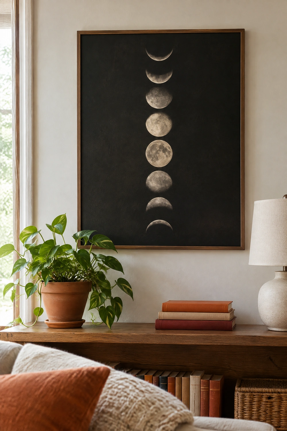
The most common styling mistake with moon phase wall art is surrounding it with supporting celestial accessories, moon-shaped candle holders, star cushions, planet mobiles, and lunar-themed books, in the belief that this creates cohesion. What it actually creates is a themed zone that reads as a single decorating interest rather than a designed room. The most effective and most considered way to display moon phase art is to let it stand as a significant piece surrounded by objects that are not celestial, a plant, a lamp, a well-chosen book stack, a ceramic vase, so that the art reads as one considered element within a broader aesthetic rather than the anchor of a celestial collection. A single strong piece in a room that does not otherwise reinforce the theme reads as confident and specific. The same piece surrounded by thematic support reads as a hobby rather than a home.
Designer Advice: If a room contains one high-quality moon phase art piece and nothing else celestial, the piece reads as art. If the room contains three or more celestial references, the room reads as a celestial-themed space. One is almost always better than three.
Moon Phase Wall Art: Style and Material Quick Guide
| Interior Style | Best Format | Best Material | Palette | Avoid |
| Bohemian | Macrame hanging or wooden discs | Natural cotton, jute, unfinished wood | Natural cream, warm ochre, dark wood | Mass-produced metal or printed canvas |
| Minimalist | Single large-format print or one set of discs | Matte ceramic, thin-framed print, pale wood | White, cream, pale grey, soft black | Multiple pieces or supporting celestial objects |
| Contemporary/Modern | Large-scale photographic print or graphic metal set | Brushed or matte black metal, fine art canvas | Black and white, charcoal, matte black | Illustrative or decorative-style prints |
| Celestial/Mystical | Large hand-painted or mixed-media statement piece | Gold metal, hand-painted canvas, crystal accents | Deep navy, indigo, gold, dark jewel tones | Understated pieces that do not match the room’s intensity |
| Scandinavian/Nordic | Linen banner or pale wood disc set | Natural birch, undyed linen, pale grey paint | Natural, pale grey, cream, soft gold | High-contrast black and bright gold |
| Traditional/Classic | Framed fine art print or vintage lunar illustration | Wide-matted frame, aged brass, museum-quality paper | Sepia, cream, dusty gold, warm brown | Modern graphic formats or raw industrial materials |
The Test of Whether It Works
The simplest test for whether moon phase wall art is working in a room is to ask what the room reads as to someone who did not choose the pieces. If the answer is “a room with an interesting piece of art,” the art is integrated. If the answer is “someone who likes the moon,” the theme is too prominent. Moon phase art earns its place in a designed room when it is the only celestial reference, when its palette relates to the surrounding room, when its scale is confident enough to anchor the wall it occupies, and when the objects around it belong to a broader aesthetic rather than to the same theme. At that point, it reads as a genuinely considered design choice rather than a decorating trend.