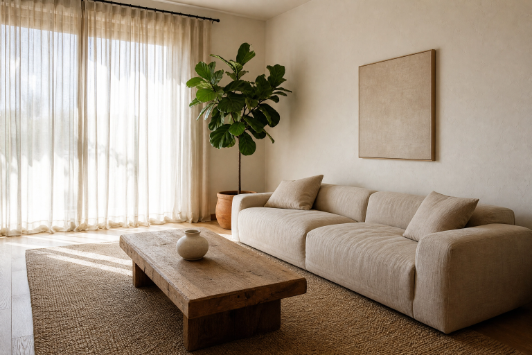
Minimalist Kitchen Decor Ideas Worth Stealing Right Now
There is something genuinely satisfying about walking into a kitchen where everything has a place and nothing is fighting for your attention. Minimalist kitchen design has moved well past the cold, sterile aesthetic it once had. Today it is warm, considered, and packed with personality, even if that personality expresses itself through restraint rather than excess. Whether you are starting a full renovation or just looking to refresh what you already have, the ideas below will give you a real, practical roadmap for getting there.
What makes a minimalist kitchen work in real life is not just removing things. It is about choosing the right things, placing them with intention, and letting the materials and proportions do the heavy lifting. The 23 ideas here are organized by design approach so you can find what fits your space, your budget, and your personal style. Some ideas are investment-level, others cost almost nothing. All of them are built around how people actually cook and live.
Category 1: Color and Surface Strategy
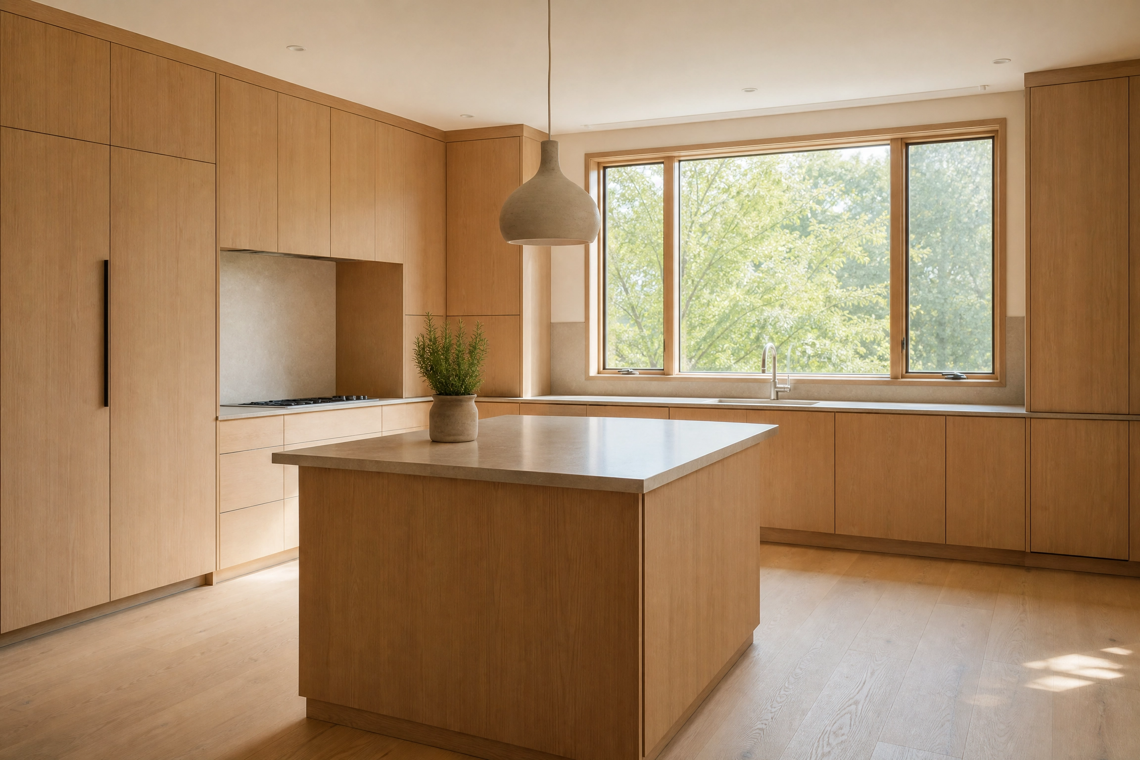
1. Warm White with Visible Wood Grain
Pure brilliant white kitchens are fading, and for good reason. They read flat under artificial light and show every fingerprint. A warmer off-white, think linen, antique white, or cream, paired with flat-front cabinets in natural white oak gives you the same clean visual line without the clinical feel. The wood grain provides just enough texture to keep the eye interested without adding visual clutter. For the countertop, a honed Calacatta marble or a matte quartz in soft greige works well here because the low sheen keeps the surface from overpowering the wood. Under-cabinet LED strip lighting in a warm 2700K color temperature pulls the whole palette together at night. This combination works best in kitchens with at least moderate natural light, because in a very dark room the warmth can tip into feeling dingy rather than cozy.
Designer Note: Run a sample of your chosen off-white alongside your wood cabinet door in natural daylight before committing. Colors shift dramatically between morning and afternoon light.
2. Tonal Greige from Floor to Ceiling
One of the most effective minimalist moves you can make is reducing the number of distinct colors in the room to one or two closely related tones. A tonal greige kitchen, where walls, cabinets, and countertops all live within the same warm grey-beige family at slightly different values, creates a quiet, cohesive space that feels bigger than it is. The trick is introducing variation through finish rather than color. Matte cabinets, a slightly glossier countertop, and a satin wall paint all read as the same family but give the eye just enough difference to stay engaged. Pair with brushed brass or matte black hardware to introduce a single contrasting note. This approach is particularly effective in smaller kitchens where too many colors make the space feel choppy. On the budget side, this can be achieved with a paint refresh and new hardware without touching the cabinetry at all.
Designer Note: Choose your countertop tone first, then match the cabinets and walls to it. Countertops are the hardest to change later, so they should anchor the palette.

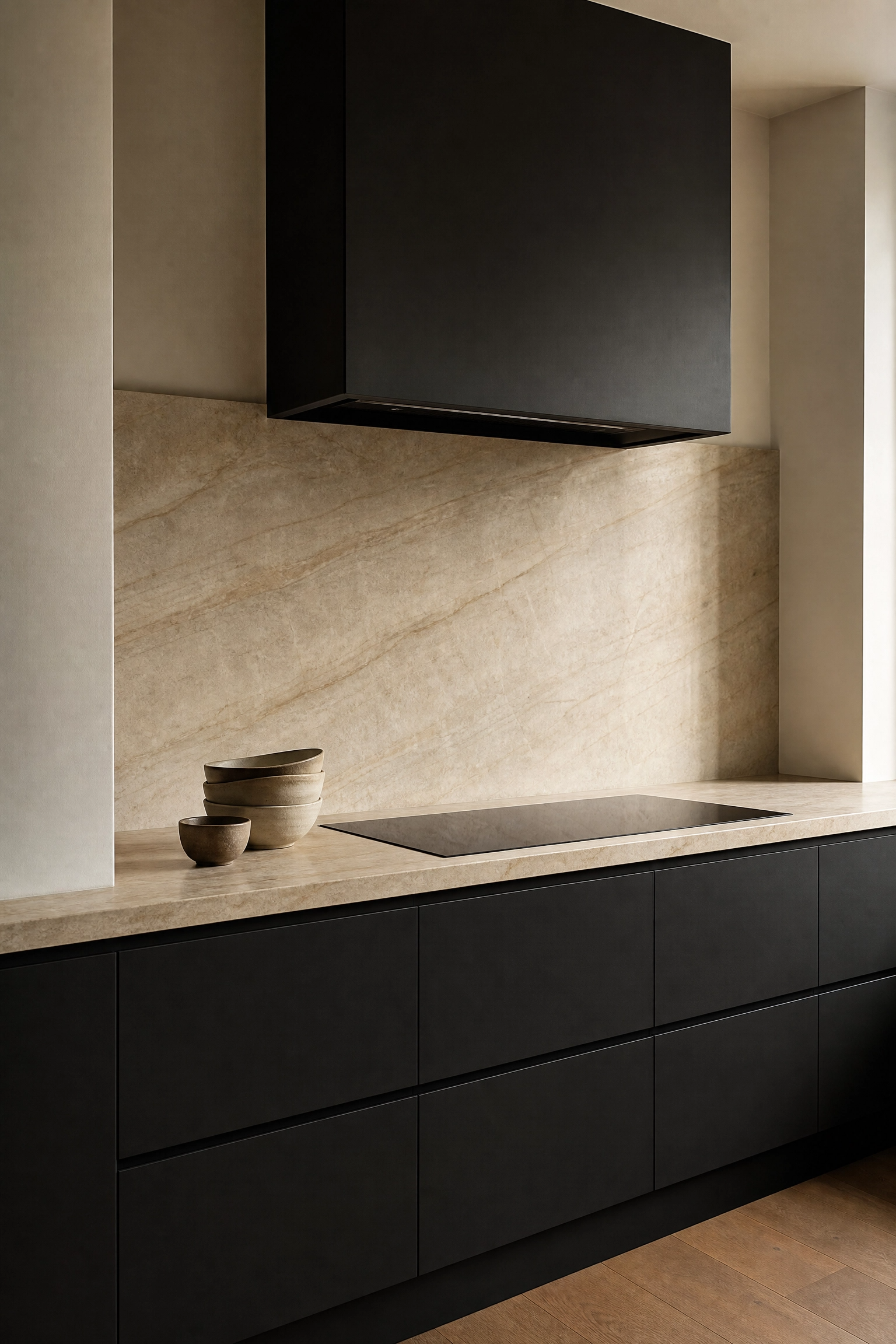
3. Matte Black Cabinets with Natural Stone
Matte black kitchen cabinetry has been championed by professional designers for several years now, and it continues to hold up because it behaves like a neutral rather than a bold statement. It absorbs light rather than reflecting it, which paradoxically makes the room feel calmer. Paired with a slab of natural stone in soft grey or warm cream, the combination is rich without feeling heavy. The key is keeping everything else simple. White walls or a plaster finish, simple integrated handles or push-to-open mechanisms, and a single material for the backsplash, ideally a continuation of the countertop stone, prevent the dark cabinetry from overwhelming the space. Matte black is also practical in a high-use kitchen because it hides smudges and water spots better than gloss finishes. Be honest about maintenance: natural stone requires sealing annually and is vulnerable to acidic liquids.
Designer Note: If full matte black feels too bold for your space, try it on the island only and keep perimeter cabinets in a complementary warm neutral.
4. Sage Green Lower Cabinets, White Uppers
This two-tone approach has become popular among designers working in the Japandi and soft Scandinavian traditions because it grounds the kitchen without darkening it. Sage green, particularly in a dusty, desaturated tone rather than a bright botanical green, reads almost like a neutral in the context of a kitchen. The white upper cabinets keep the eye moving upward and make the ceiling feel higher, while the sage lowers give the room a sense of weight and solidity. A butcher block or warm oak countertop bridges the two tones naturally. For hardware, aged brass in a simple bar pull works better than chrome or brushed nickel here because it connects to the organic, slightly earthy quality of the sage. This is an accessible budget option too, since lower cabinets are easier and cheaper to paint or reface than a full kitchen overhaul.
Designer Note: Avoid shiny or bright sage. Look for paint names that include words like dusty, muted, grey-green, or mineral for the right tone.

Category 2: Storage and Clutter Control
5. Full-Height Integrated Cabinetry
Floor-to-ceiling cabinetry is one of the most impactful structural changes you can make in a minimalist kitchen because it eliminates the visual gap between the top of the cabinets and the ceiling, which is where kitchens tend to collect visual noise, awkward dead space, and dust. When the cabinet doors run all the way to the ceiling and the appliances are integrated behind matching panels, the kitchen reads as a single, calm surface rather than a collection of separate objects. This works particularly well in open-concept living areas where the kitchen is visible from the living room. In practice, the upper portion of tall cabinetry is best used for items accessed less frequently, seasonal cookware, or backup pantry supplies, since reaching it daily requires a step stool. This is an investment-level upgrade, but even partial implementation, such as adding upper cabinet extensions to existing cabinetry, makes a significant difference.
Designer Note: Pull-out drawers inside lower cabinets are worth prioritizing over fixed shelves. They give full access to everything at the back without having to remove items in front.

6. Appliance Garage with a Tambour Door
One of the most honest criticisms of minimalist kitchens is that they look perfect in photographs but fall apart the moment you put a toaster, a coffee maker, and a blender on the counter. An appliance garage, a dedicated cabinet section built into the countertop with a tambour or roller door, solves this without forcing you to give up the appliances you use daily. The door rolls up or slides out of the way when you need access and disappears completely when you do not. It is a genuinely clever piece of kitchen design that prioritizes real use over aesthetics while still delivering both. For a cohesive look, finish the interior of the garage in the same material as your countertop or use a painted interior that matches the cabinet color. This is a mid-range investment and works best when planned during a renovation rather than retrofitted.
Designer Note: Make sure your appliance garage has its own outlet inside it. Running a toaster cord out from under a tambour door defeats the entire purpose.

7. Handle-Free Push-to-Open Cabinets
Hardware is one of the most underappreciated contributors to visual noise in a kitchen. Knobs, pulls, and bar handles each catch light, create shadow lines, and fragment the surface of the cabinetry. Removing hardware entirely through push-to-open mechanisms or integrated finger pulls at the top edge of doors gives the kitchen a cleaner, more unified look with minimal cost. This works especially well with flat-front slab doors in a light wood or matte paint finish. In practical terms, push-to-open mechanisms require consistent pressure to operate reliably, so cabinet alignment becomes more important. If the cabinets are slightly warped or the frame is uneven, the mechanism can be frustrating to use daily. For heavy pantry doors or drawers with significant weight, integrated recessed pulls are a more reliable option than push-to-open.
Designer Note: Test push-to-open mechanisms in a showroom before specifying them throughout an entire kitchen. Some brands are significantly more reliable than others.

8. Floating Shelves in Place of Upper Cabinets
Replacing some or all upper cabinets with open floating shelves is a structural change that immediately makes a kitchen feel more open and airy because it removes visual mass from the upper half of the room. In a minimalist kitchen, this works best when the shelves are used intentionally: a curated set of matching vessels, a row of decanted pantry staples in glass jars, a few simple ceramic bowls. The mistake most people make is treating open shelves like closed cabinets and filling them with whatever fits. In practice, open shelving requires more discipline about what you own and how it is organized. White oak or walnut floating shelves in a simple rectangular profile with concealed wall brackets look clean and current. This is a budget-friendly option if you are replacing existing upper cabinets, since shelves cost significantly less than cabinetry.
Designer Note: Limit open shelves to one or two sections of the kitchen rather than replacing all upper storage. This gives you the airy look without forcing you to hide everything you reach for daily.

Category 3: Countertop and Work Surface Choices
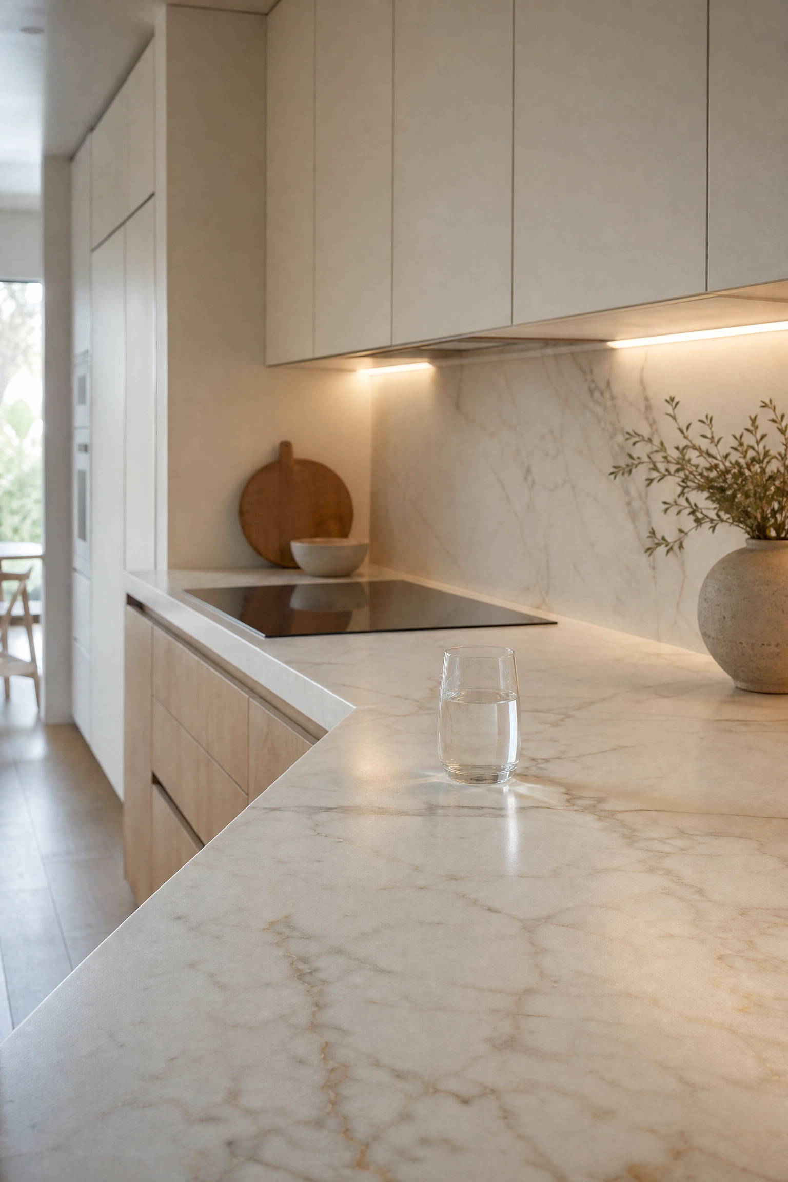
9. Slab Backsplash Continuing the Countertop
Running the countertop material up the wall as a full slab backsplash rather than using tile or a separate material is one of the clearest visual moves in minimalist kitchen design. It eliminates the grout lines, the material transition, and the visual break between horizontal and vertical surfaces, creating a single continuous plane that makes the kitchen feel more refined and spacious. This works beautifully with quartz, marble, quartzite, and even sintered stone like Dekton. In practice, the slab backsplash does require more upfront investment because you need a larger piece of stone and more precise cutting around outlets and switches. It also shows water splashes more easily near the sink than tile would, so a honed or leathered finish is more forgiving than a polished one in that area. For budget-conscious projects, limiting the slab backsplash to behind the hob or range only and using a simple painted wall elsewhere still delivers much of the same effect at a lower cost.
Designer Note: A leathered or honed stone finish is more forgiving around the hob and sink than polished. It hides water marks and small scratches far better in everyday use.

10. Waterfall Island in a Single Material
A waterfall island, where the countertop material wraps down the sides of the island to the floor in a continuous sheet, is one of those design elements that reads as expensive even when executed in mid-range materials like a solid quartz or a good laminate. It creates a strong geometric focal point and makes the island look like a piece of furniture rather than a built-in counter. In a minimalist kitchen, the waterfall edge works best when the island is simple in form, a clean rectangle with no curves, minimal hardware, and seating along one side only. The visual weight of the material falling to the floor grounds the island and gives the whole kitchen a sense of considered proportion. Bar stools in a complementary material, raw oak, matte black metal, or simple white polypropylene, keep the look from becoming too formal. This is an investment-level detail but one of the highest-impact upgrades available.
Designer Note: Match the grain direction of the waterfall panel to the countertop top if using a veined stone. Book-matching the veining at the corner looks intentional rather than accidental.

11. Thin-Profile Countertop Edge
Countertop thickness is one of those details that most people never consciously notice but that contributes significantly to whether a kitchen feels heavy or light. A standard countertop edge in laminate or basic stone is typically 30 to 40 millimeters thick. Reducing this to a slim 12 to 20 millimeter edge profile, which is very achievable in quartz, sintered stone, or solid surface materials, immediately makes the kitchen feel more architectural and precise. It is a detail that professional designers in high-end residential projects have been using for years and that is now accessible at mid-range price points through quartz suppliers. The slim edge looks particularly good on an island because you see it from multiple angles. It does not work as well with soft or porous materials like unlacquered wood, which need more thickness for structural integrity.
Designer Note: A mitred edge, where two thin pieces are joined at a 45-degree angle to appear solid, gives you the look of a thick slab with the visual lightness of a thin profile.

Category 4: Lighting Design
12. Recessed Ceiling Lighting on a Dimmer
Lighting is where minimalist kitchens most often fall short, not because the fixtures are wrong, but because the control is missing. A grid of recessed downlights run at full brightness makes any kitchen feel like a supermarket. The same lights on a dimmer, brought down to 50 or 60 percent for everyday meal prep and dropped further for evenings, creates warmth and atmosphere that completely changes how the room feels. In terms of fixture choice, slim-profile LED downlights with a color temperature around 2700K to 3000K and a CRI of 90 or above are the current standard for quality residential kitchens. They disappear into the ceiling and put all the attention on the room itself rather than the fittings. This is a low-cost upgrade if you are doing any electrical work and makes more difference than almost any other single lighting change.
Designer Note: Zone your kitchen lighting into at least two circuits: one for work surface lighting and one for ambient. Being able to control them independently is worth the extra electrical cost.

13. Integrated Under-Cabinet LED Strips
Under-cabinet lighting is one of those practical additions that also happens to be one of the best aesthetic upgrades in a minimalist kitchen, because it adds a layer of light that makes the countertop and backsplash glow rather than sit in shadow. In practice, most kitchen work happens at counter level, and overhead lighting casts the cook’s own shadow onto the work surface. Under-cabinet LED strips eliminate this completely. For a clean installation, the strip should be recessed into a slim aluminum channel mounted flush with the underside of the cabinet, rather than surface-mounted with visible tape and wires. Warm white LEDs in the 2700K to 3000K range work best in most kitchen palettes. This is a genuinely budget-friendly upgrade that can be done without a full renovation and makes the kitchen look significantly more polished.
Designer Note: Always hide the power supply and the wire run. A visible cable hanging down the backsplash undoes the whole effect. Plan the cable route before cutting anything.

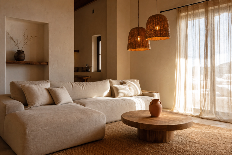
14. A Single Statement Pendant Over the Island
In a kitchen that is deliberately quiet in its finishes and forms, one well-chosen pendant over the island can act as the single expressive element that gives the room personality without disrupting its calm. The key word is single, either one pendant or a pair hung close together, not a row of three or five. In terms of scale, the pendant should feel proportionate to the island length, typically spanning about a third of the island length for a single fixture. Simple glass globe pendants, paper or washi shades, linear concrete forms, and hand-thrown ceramic shades all work well in minimalist kitchens because they bring material warmth and craft without visual complexity. Avoid fixtures with multiple arms, decorative metalwork, or overly industrial profiles in a kitchen that is otherwise clean and spare.
Designer Note: Hang the pendant so the bottom of the shade sits around 70 to 75 centimeters above the countertop surface. Too high and it loses its intimacy; too low and it becomes a head hazard.

Category 5: Material and Texture Choices
15. Raw Concrete or Microcement Walls
Microcement and polished concrete wall finishes have become the go-to texture play in minimalist kitchens because they add material depth and warmth without adding pattern, color, or visual complexity. Applied in a single continuous coat over existing walls, microcement eliminates grout lines and paint boundaries and gives the kitchen a monolithic, architectural quality that photographs beautifully and ages well. In a warm neutral tone, it sits comfortably alongside wood, stone, and ceramic finishes. It is also highly practical: sealed microcement is waterproof, stain-resistant, and easy to clean, which makes it a realistic choice for a kitchen environment rather than just a showroom aesthetic. The main honest caveat is that application quality varies enormously between contractors. A poorly applied microcement finish will crack or peel within a year, so this is absolutely not a DIY project and requires a specialist.
Designer Note: Ask your microcement contractor for photos of projects completed at least two years ago. This tells you far more about the durability of their work than a fresh installation ever will.

16. Fluted Glass Cabinet Inserts
Fluted or reeded glass cabinet inserts sit in a satisfying middle ground between the full exposure of open shelving and the complete concealment of solid doors. They let light pass through and give a soft hint of what is inside without putting everything on full display, which means your kitchen storage does not have to be styled to magazine standards at all times. The ribbed texture of the glass adds a gentle geometric detail that is interesting without being loud. In a minimalist kitchen, this works best as an accent rather than a wholesale approach, perhaps on two or three upper doors on either side of a range hood, or on a single display cabinet at the end of a run. Pair with internal cabinet lighting for a genuinely beautiful effect in the evening. The glass inserts themselves are a mid-range cost addition that can often be retrofitted into existing cabinet door frames.
Designer Note: Fluted glass reads lighter and more delicate than frosted glass. If you want the contents to be genuinely obscured, use ribbed glass with a tighter pattern.

17. Limewash Paint on One Accent Wall
Limewash paint has had a significant moment in interior design over the past few years, and in a minimalist kitchen it earns its place because it adds organic texture and depth without pattern or strong color. Applied over a plaster or smooth drywall surface, limewash creates a layered, slightly mottled finish that shifts subtly with light throughout the day. In a kitchen context, it works best on a single wall, typically the one behind the dining area or the wall opposite the main window, rather than on all surfaces, where it can start to feel overwhelming. A warm white or pale clay limewash on one wall with flat-painted surfaces everywhere else is a sophisticated and achievable choice. It is also a surprisingly budget-friendly option since limewash paint is available from a growing number of mainstream paint brands and can be applied by a confident DIYer.
Designer Note: Limewash requires a smooth base. Apply over primed, skimmed plaster rather than textured walls. The finish amplifies whatever is underneath it.

18. Integrated Sink in the Same Material as the Countertop
An undermount or fully integrated sink in the same stone or solid surface material as the countertop is a detail that most people only notice when it is done well. It eliminates the rim line between sink and counter, making the work zone look like a single sculpted surface rather than two separate components joined together. In practical terms, it is also easier to clean because there is no gap for food debris to collect. Composite stone sinks in a quartz or Silestone material are the most durable and heat-resistant option. Ceramic undermount sinks work beautifully in a white or cream kitchen. Stainless steel undermount is the most budget-friendly and the most forgiving in a busy kitchen. What makes this detail feel minimalist is not the material choice but the consistency, matching the sink material to the countertop or keeping the contrast very deliberate and intentional.
Designer Note: Avoid drop-in sinks in a minimalist kitchen. The visible rim around the edge is exactly the kind of detail that breaks the clean line of the counter.

Category 6: Furniture and Layout Details
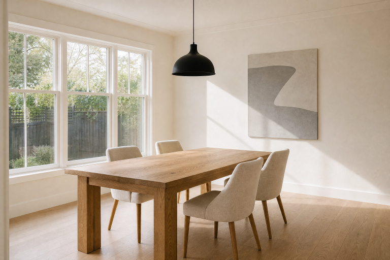
19. A Clean-Lined Dining Table Inside the Kitchen
In an open-plan or large kitchen, incorporating a simple dining table rather than a breakfast bar changes the character of the space considerably. A breakfast bar signals quick meals and high stools; a proper table suggests something more relaxed and social. For a minimalist kitchen, the best table choices are those with a single pedestal base or four straight-tapered legs in solid oak, walnut, or painted steel, a rectangular or oval top in a natural material, and no ornamentation. Keep the chairs consistent with each other, either all matching or all from a very closely related family. Four matching chairs in a simple Shaker or mid-century profile in raw oak or painted white read as calm and collected rather than matchy. This works in kitchens with enough floor area to pull chairs out comfortably, which typically means at least 90 centimeters of clearance around the table on all sides.
Designer Note: Oval tables are often a better choice than rectangular in minimalist spaces. The absence of corners makes the room feel less segmented and easier to move around.

20. Bar Stools with Negative Space in the Design
Bar stools are one of the most overlooked elements in kitchen design, partly because they tend to be chosen last, after the big decisions have been made, and partly because the wrong stool can introduce exactly the visual clutter a minimalist kitchen is trying to avoid. The principle for choosing a minimalist-friendly bar stool is to look for negative space in the design, meaning stools where the back, legs, or seat frame are open rather than solid, which allows the eye to see through them rather than being blocked by them. Wire stools, ladder-back designs, and simple round-seat stools with four straight legs all follow this principle. Avoid upholstered bar stools with thick foam seats and fabric backs in a very clean kitchen, they tend to look heavy and domestic in a space that is trying to feel considered and precise.
Designer Note: Counter-height stools, for island surfaces around 90 centimeters tall, need a seat height of 58 to 65 centimeters. Bar-height stools for 105-centimeter surfaces need 73 to 80 centimeters. Measure before buying.

21. A Slim Console or Trolley as Secondary Storage
Not every kitchen has the luxury of abundant cabinetry, and for those that do not, a slim console table or a simple kitchen trolley used as secondary storage is a much better solution than adding free-standing shelving units, which tend to look provisional and create visual noise. A well-chosen piece with a clean profile and a natural material top, oak, walnut, or marble, reads as furniture rather than storage, which is a meaningful distinction in a kitchen that is trying to feel curated. A slim console along one wall can hold a cutting board, a fruit bowl, and a single lamp. A trolley with a drawer and a lower shelf can hold oils, spices, and a few key utensils that would otherwise crowd the counter. This approach also has the advantage of being movable and budget-friendly.
Designer Note: Choose a console or trolley with legs rather than a base that sits on the floor. Legs create visual breathing room and make the piece look lighter in the space.

Category 7: Decorative Accents Done Right
22. Decanted Pantry Staples in Matching Containers
This is one of the simplest and most budget-friendly ways to bring a minimalist kitchen to life, and it is also one that most people who have tried it say genuinely changes how the kitchen feels day to day. Decanting dry staples such as pasta, rice, lentils, oats, flour, and sugar into a matching set of glass or ceramic canisters instantly transforms a visually busy pantry shelf or open storage unit into something that feels organized and intentional. The matching element is important. Mixed containers in different shapes, heights, and materials create noise even when the contents are tidy. A set of square or cylindrical glass jars with matching lids, or a series of simple stoneware canisters in the same glaze, reads as a deliberate design choice. Label them simply with a chalk marker or a small adhesive label for functionality. This is an investment measured in tens rather than hundreds.
Designer Note: Buy one or two jars first and live with them for a week before committing to a full set. Some people find the decanting process annoying to maintain; honesty with yourself here will save money.

23. A Single Potted Plant or Herb in a Simple Ceramic
In a kitchen that is intentionally restrained, a single well-chosen plant does more decorative work than an entire shelf of accessories. The principle is the same as with everything else in a minimalist space: one thing, chosen carefully and placed with intention, rather than several things scattered around. A small potted olive tree, a trailing pothos in a hanging wall planter, or a simple row of three herb pots in matching ceramic vessels along the windowsill all bring organic life and softness to a space that might otherwise read as cold. The container matters as much as the plant. A simple matte white or terracotta ceramic pot without decoration is almost always a better choice than a decorative or patterned one in a kitchen that is otherwise quiet. Keep the scale honest. One medium plant or a trio of small matching pots is plenty.
Designer Note: Avoid plants that drop leaves or shed frequently near food prep surfaces. Trailing pothos, compact fig trees, and hardy herbs like rosemary and thyme are low-maintenance and kitchen-friendly.

Bringing It All Together
A minimalist kitchen is not finished when you have removed everything unnecessary. It is finished when everything that remains feels exactly right, chosen for a specific reason and placed with care. The ideas in this article are not rules to follow in order. They are a set of principles and specific moves that you can mix and match depending on what your kitchen already has, what your budget allows, and how you actually use the space.
Start with the elements that will have the biggest visual impact for the least disruption. Often that means lighting, hardware, and countertop clarity before anything structural. If a full renovation is on the table, prioritize integrated storage, a cohesive material palette, and quality in the things you touch every day, the handles, the faucet, the sink. In practice, the kitchens that feel genuinely minimalist are not the ones that had the most things removed. They are the ones where every remaining choice was made with confidence and honesty about how the space is actually lived in. That is entirely achievable at any budget level, and these 23 ideas are a solid starting point for getting there.
Frequently Asked Questions
What is the most important first step in creating a minimalist kitchen?
Decluttering the countertops is almost always the most impactful first move, because visual clarity at counter level changes how the entire room feels before you spend a single dollar on renovation. Remove everything that does not get used at least three times a week and find it a home inside a cabinet or drawer. What remains on the counter should be things you genuinely use daily and items that are worth looking at.
Can a minimalist kitchen work in a small space?
Minimalist principles are actually more effective in small kitchens than in large ones. The reduction of visual noise, the use of integrated storage, and the consistent use of a limited color palette all make small spaces feel larger and calmer. The key is investing in storage quality over storage quantity and being ruthless about what actually needs to be in the kitchen versus what has just accumulated there over time.
Do minimalist kitchens have to be white or grey?
Not at all. Minimalism is a design principle about form, proportion, and restraint, not a color rule. Warm terracotta, deep sage green, soft navy, and rich charcoal can all be used in a minimalist kitchen when they are applied consistently and the other elements of the space are kept simple. The key is using a limited palette, typically two to three tones, rather than mixing many competing colors.
How do I keep a minimalist kitchen looking tidy in real life?
The honest answer is that it requires both good storage design and a daily habit of putting things away. Good storage design means having enough space inside cabinets for everything that needs to live in the kitchen, so nothing is left out by default. The habit side means taking two minutes at the end of cooking to clear the counter back to its baseline. Minimalist kitchens do require slightly more maintenance than kitchens where clutter is hidden among more visual noise, but most people find that the calm it creates is worth the effort.
Is a minimalist kitchen expensive to achieve?
It does not have to be. Several of the most effective minimalist upgrades cost very little: decluttering the counters, decanting pantry staples into matching containers, replacing hardware with a simpler set, and adding a dimmer to existing lighting are all low-cost moves with significant visual impact. Investment-level changes like integrated appliances, slab backsplashes, and full-height cabinetry make a bigger structural difference but are not required for a kitchen to feel genuinely minimalist.
What materials work best in a minimalist kitchen?
Materials that age gracefully and have a quiet visual quality tend to work best. White oak, walnut, honed marble, quartz, microcement, matte ceramic tile, and simple stainless steel are all strong choices because they reward close inspection without demanding attention from across the room. Avoid high-gloss finishes on large surfaces, heavily veined stone used everywhere at once, and mixed metals, these tend to add visual complexity that works against the minimalist goal.