Light Blue Living Rooms That Actually Feel Warm
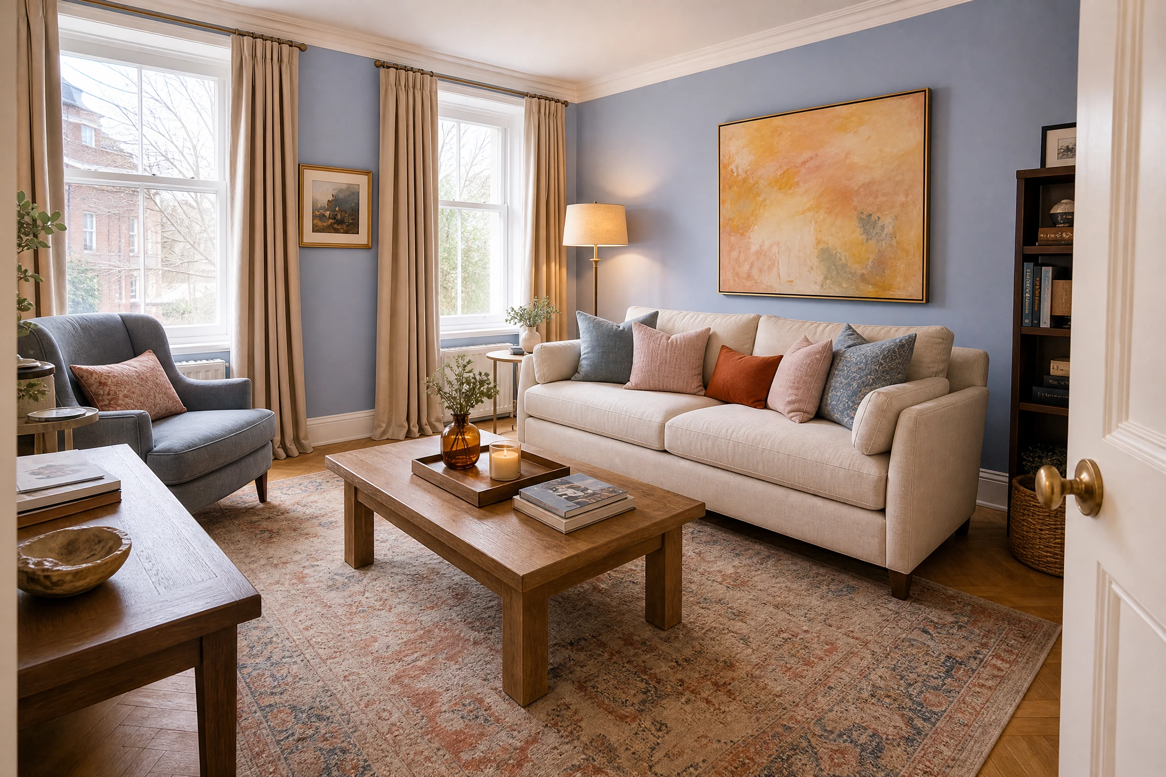
The number one thing people get wrong with a light blue living room is stopping at the paint and wondering why it feels like a waiting room. Light blue is one of the most versatile and genuinely beautiful colors you can put in a living space, but it needs the right partners to come alive. Get those pairings right and you end up with a room that is calm, fresh, and full of personality all at once. Getting them wrong produces something that looks like an underdecorated hospital corridor, which is the fear most people start with.
1. Pick a Blue With a Warm Undertone, Not a Cool One
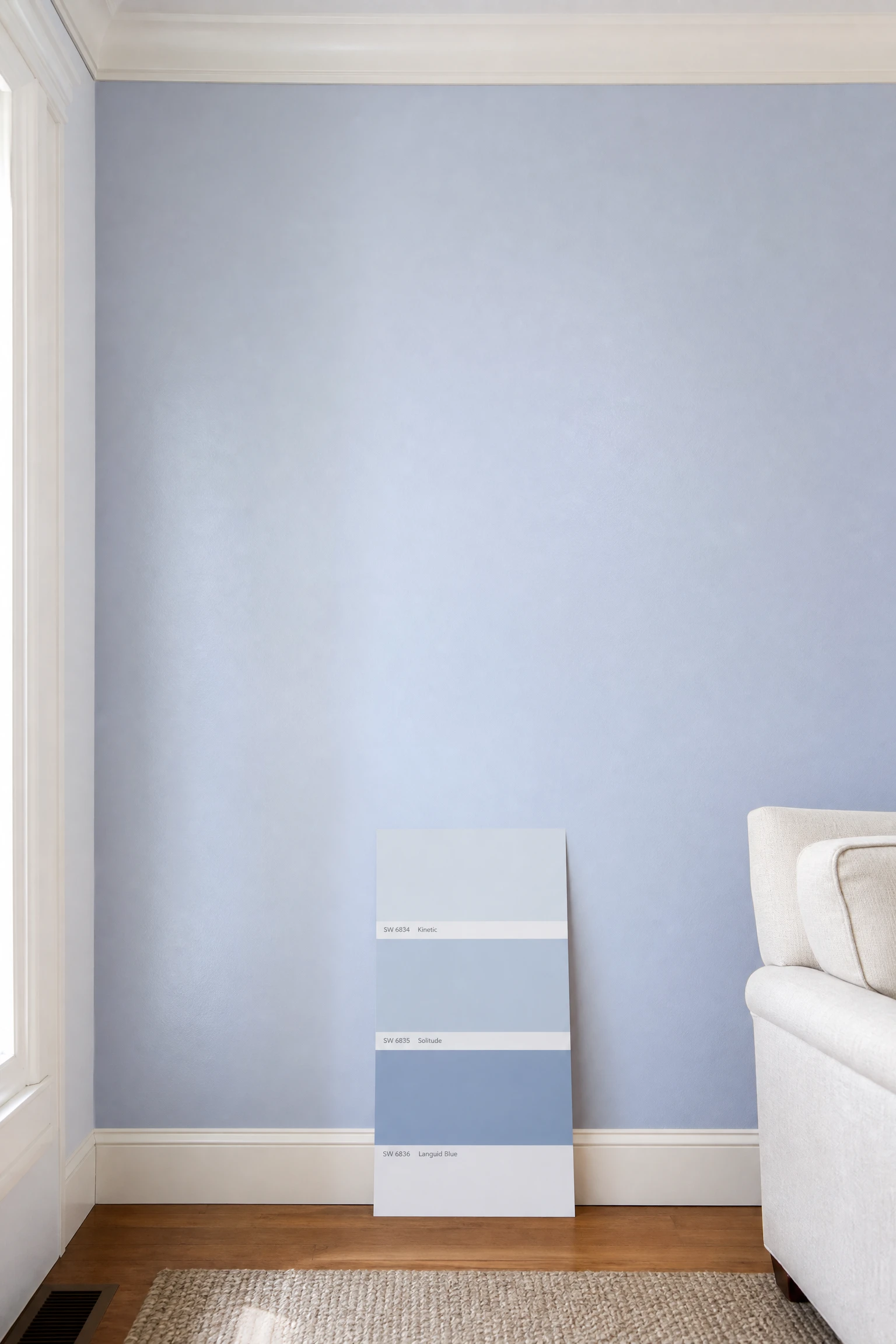
Not all light blues are created equal, and choosing a shade with a cold, steely, or grey-green undertone is the fastest way to end up with a living room that feels clinical rather than calming. In practice, light blues with a slight red, violet, or warm grey undertone, think powder blue, dusty periwinkle, or pale French blue, read as soft and livable where icy or cyan-leaning blues read as stark. Farrow and Ball Lulworth Blue, Benjamin Moore Blue Hydrangea, and Sherwin-Williams Celestial are reliable warm-leaning options with broad natural light compatibility.
Pro Move: Always test paint swatches in A4 or larger patches and observe them at three times of day: morning, midday, and evening with lamps on. Light blue shifts more dramatically with changing light than almost any other color.
2. Use Warm White on Trim and Ceiling, Never Bright White
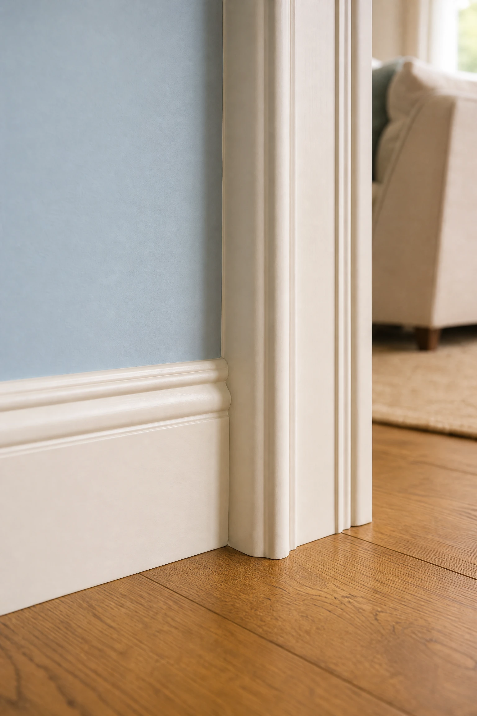
Pairing light blue walls with a good or cool bright white on trim and ceiling creates a harsh contrast that amplifies the coldness of both colors, making the blue feel colder and the white feel sterile. A warm white, one with a cream, ivory, or warm grey undertone, softens the boundary between wall and trim, lets the blue breathe, and keeps the whole room in a unified warm register. Benjamin Moore White Dove, Dulux Jasmine White, and Sherwin-Williams Alabaster are classic warm whites that sit beautifully next to most light blues.
Reality Check: If your light blue walls already feel cold and you painted the trim bright white, changing the trim to a warm white first is often enough to fix the whole room without repainting the walls.
3. Bring in Natural Wood to Anchor the Room
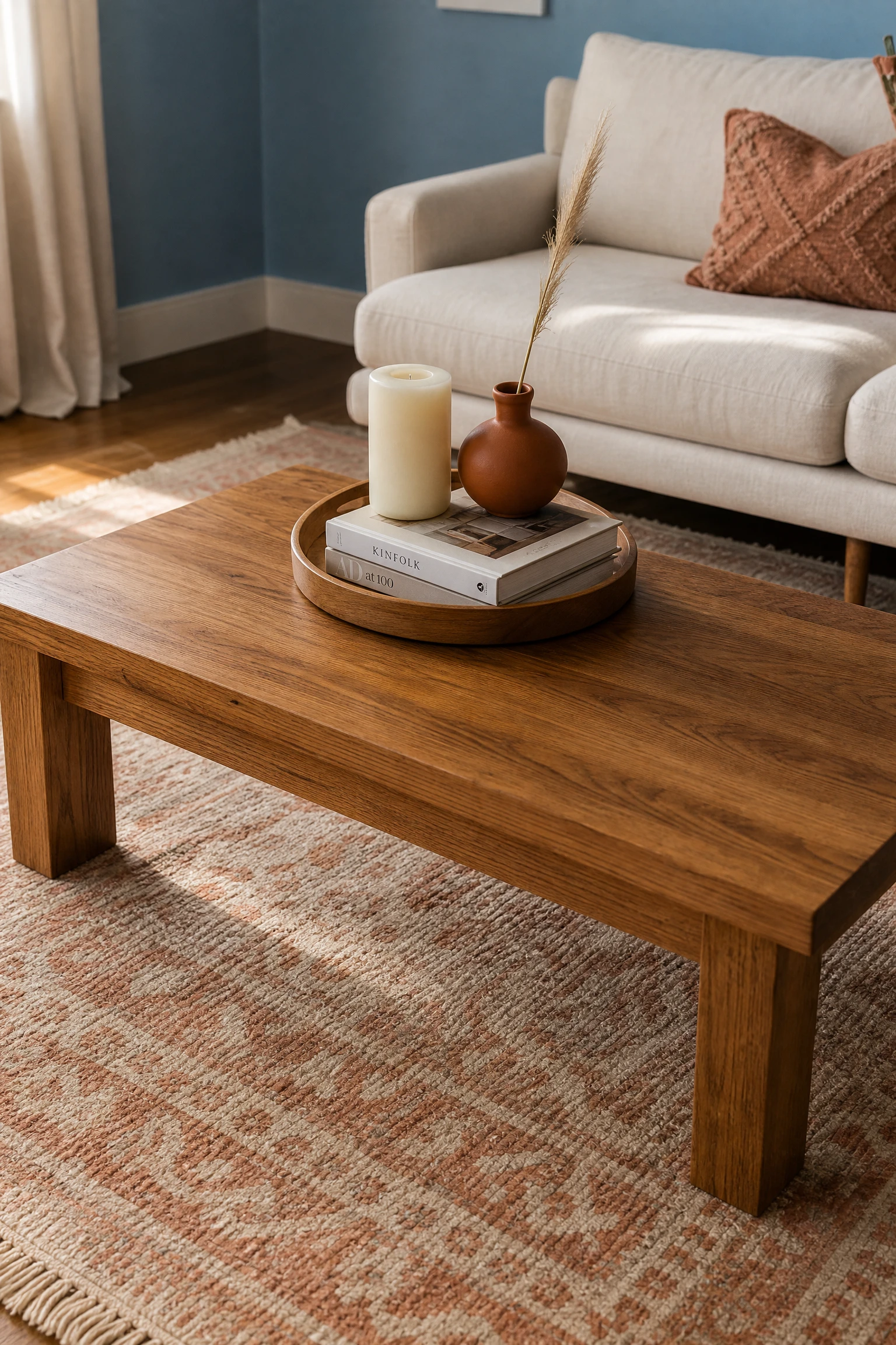
Natural wood is the single most reliable antidote to a light blue living room that reads as too cold, because warm wood tones, amber oak, honey pine, walnut, sit on the opposite side of the color temperature spectrum from cool blue and create an immediate sense of natural balance. A wood coffee table, side tables, or a media unit in a natural or lightly oiled finish introduces enough warmth to make the blue walls feel intentional and grounded rather than chilly.
Quick Tip: Medium-toned oak is the most versatile wood for a light blue living room. Very dark woods can feel heavy against pale blue, and very light or blonde woods can feel washed out alongside it.
| Wood Tone | Effect With Light Blue | Best Used As | Overall Mood |
| Medium oak (amber) | Warm, grounding, inviting | Coffee table, side tables, shelving | Scandi, coastal, relaxed modern |
| Walnut (dark brown) | Rich contrast, well-considered | TV unit, accent chair legs | Refined modern, mid-century |
| Pine (honey) | Warm, casual, airy | Shelving, small tables | Farmhouse, cottage, boho |
| Bleached or whitewashed | Soft, beachy, light | Flooring, accent furniture | Coastal, Hamptons, minimal |
4. Choose Cream or Linen Sofa Upholstery, Not Bright White
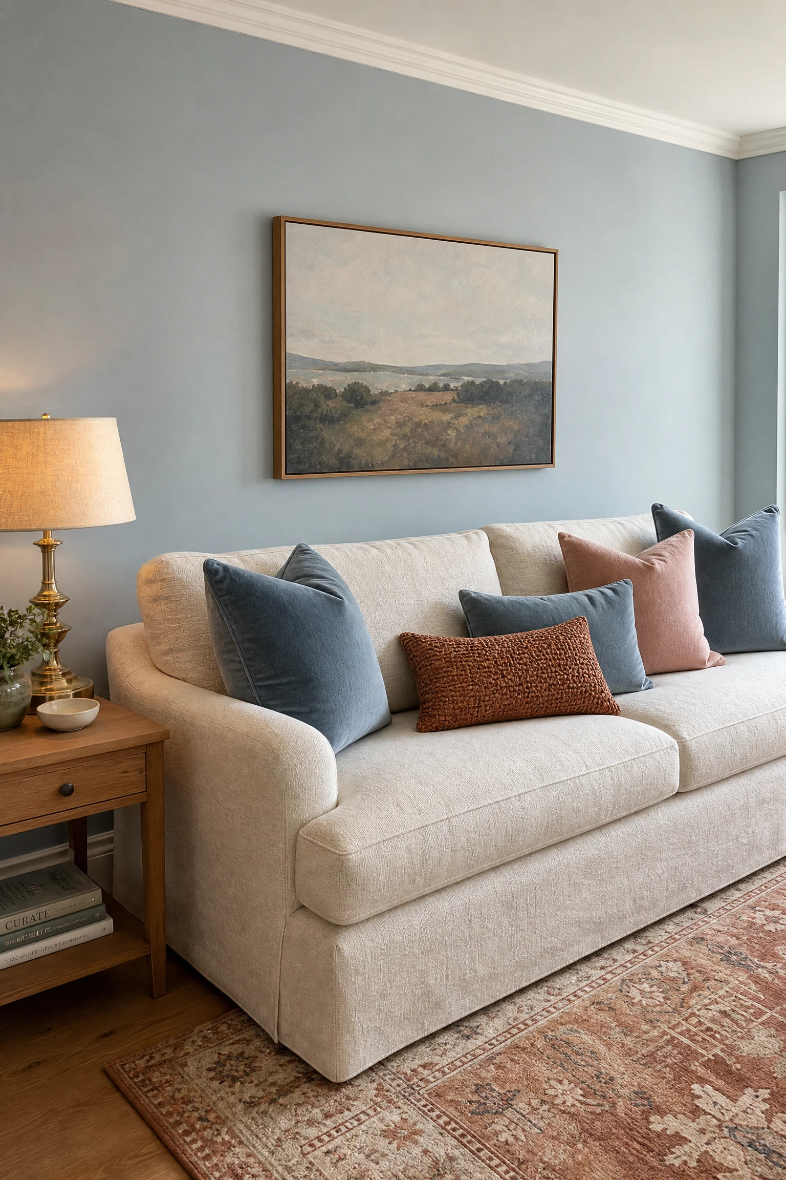
A bright white sofa against light blue walls doubles down on the cool palette and makes the room feel like a design hotel rather than a home. A cream, linen, warm ivory, or oatmeal-toned sofa creates the same visual lightness without the coldness, and the slight warmth in the fabric acts as a tonal bridge between the blue walls and any warmer accent pieces in the room. Fabric texture matters here too: a nubby linen or textured boucle reads as warm even in a pale cream color, where a smooth cotton or polyester in the same tone feels flat.
Designer Advice: If you love the idea of a blue sofa in a blue room, keep the sofa a few shades darker than the walls, such as a dusty French blue or a muted denim tone, so the two blues create depth rather than dissolving into each other.
5. Layer a Warm-Toned Area Rug as the Room’s Anchor
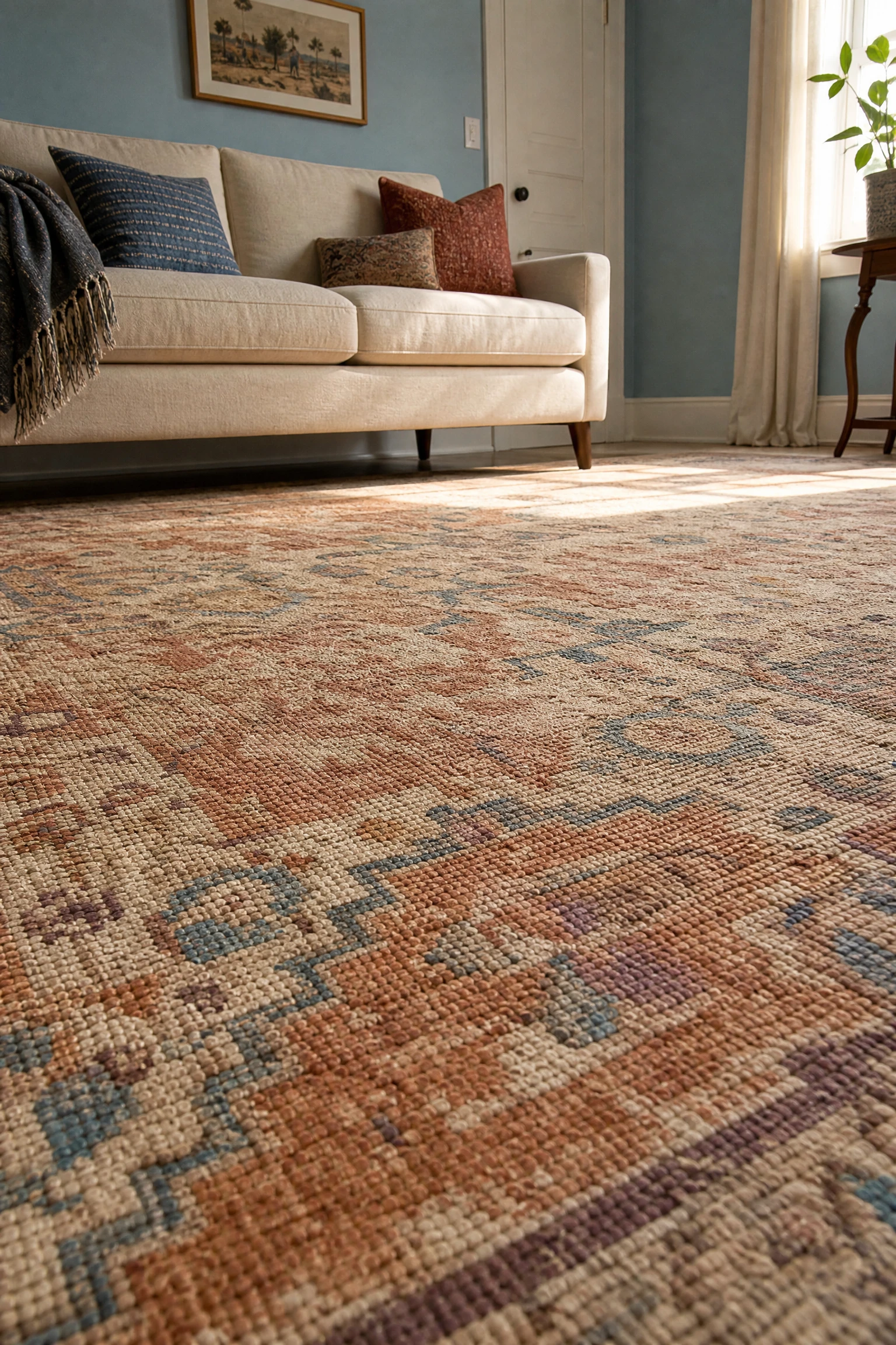
In a light blue living room, the floor is your biggest opportunity to introduce warmth, and a large area rug in a cream, warm sand, terracotta, rust, or warm grey tone grounds the whole room and prevents the cool walls from making the space feel as though it is floating. The rug should be large enough that all main furniture legs sit on it, because a rug that is too small in a blue room looks like an afterthought rather than a design decision.
Heads Up: Avoid rugs with a strong cool grey or blue as the dominant tone in a light blue room; they pull the palette in only one temperature direction and remove the warmth the rug should be providing.
6. Add Brass or Gold Accent Hardware and Lighting
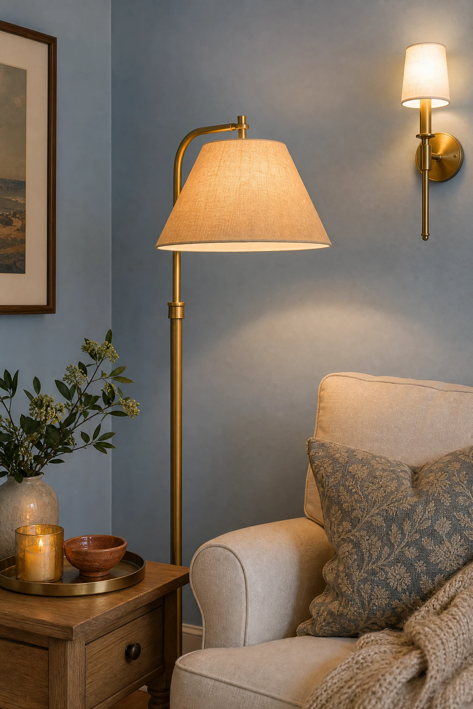
Brass, gold, and warm antique bronze are the metal finishes that work most naturally in a light blue living room because their warm yellow tones sit opposite cool blue on the color wheel and create an immediate visual balance. A brass floor lamp, gold picture frames, bronze side table legs, or brushed gold cabinet hardware bring just enough warmth and light-catching quality to a blue room to make it feel deliberate and alive rather than flat.
Pro Move: You do not need a lot of brass to make a difference. Even three or four pieces, a lamp, a small tray, a mirror frame, a curtain rod finial, are enough to shift the warmth reading of an entire room.
7. Paint Just One Wall in a Deeper Blue for Depth
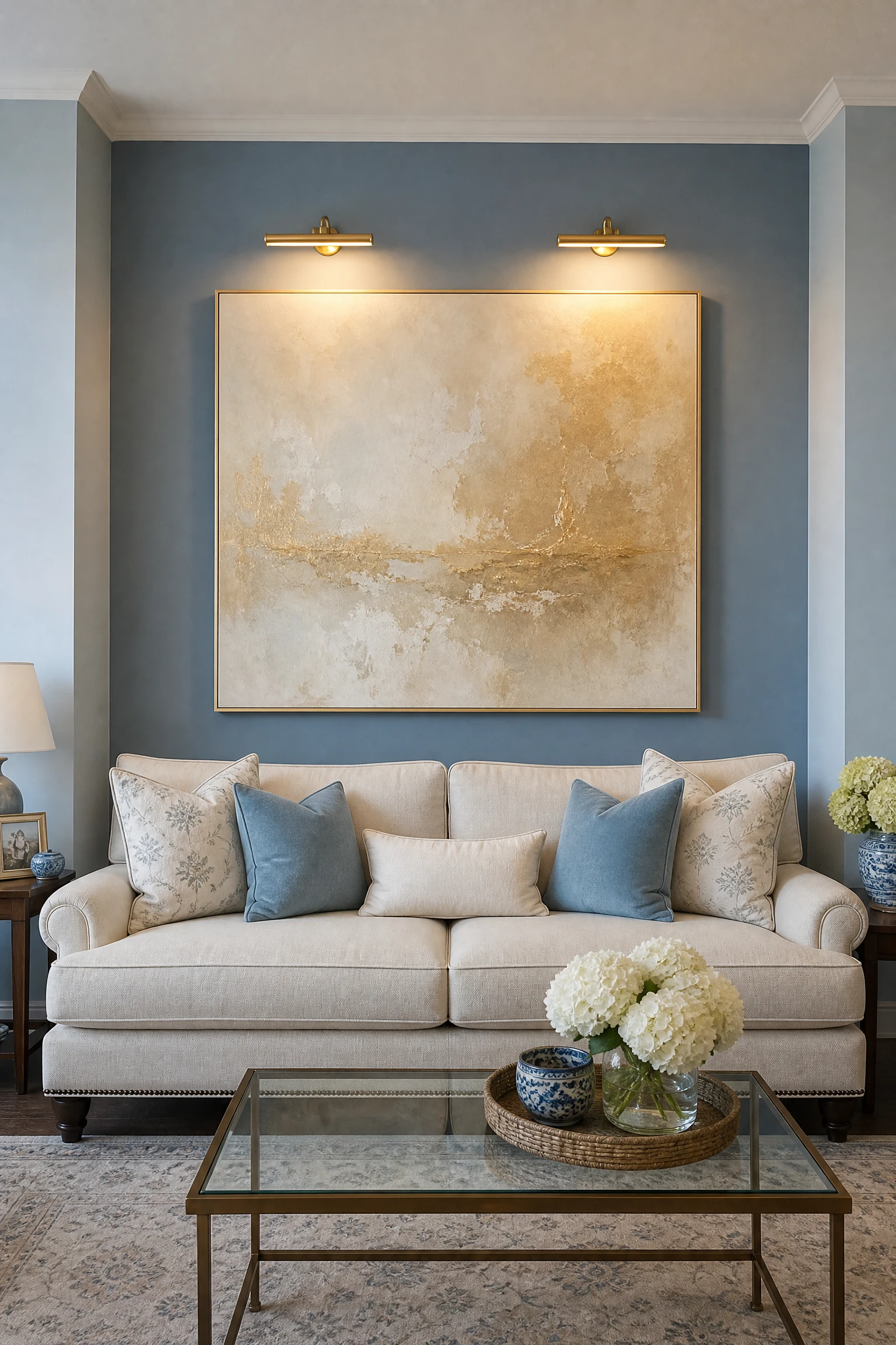
If an all-blue room feels like too much of a commitment or is making the space feel flat and one-note, painting just the wall behind the sofa or the fireplace wall in a tone one or two shades deeper than the other walls creates depth and dimension while keeping the overall palette cohesive. This technique, known as tone-on-tone accent walling, works especially well with light blue because the depth difference between a pale sky blue and a mid-blue reads as architectural rather than decorative.
Quick Tip: Stay within the same paint family and just go two steps deeper on the color strip rather than choosing a different shade entirely; this keeps the transition seamless rather than jarring.
8. Try Light Blue on the Ceiling as a Color Drench
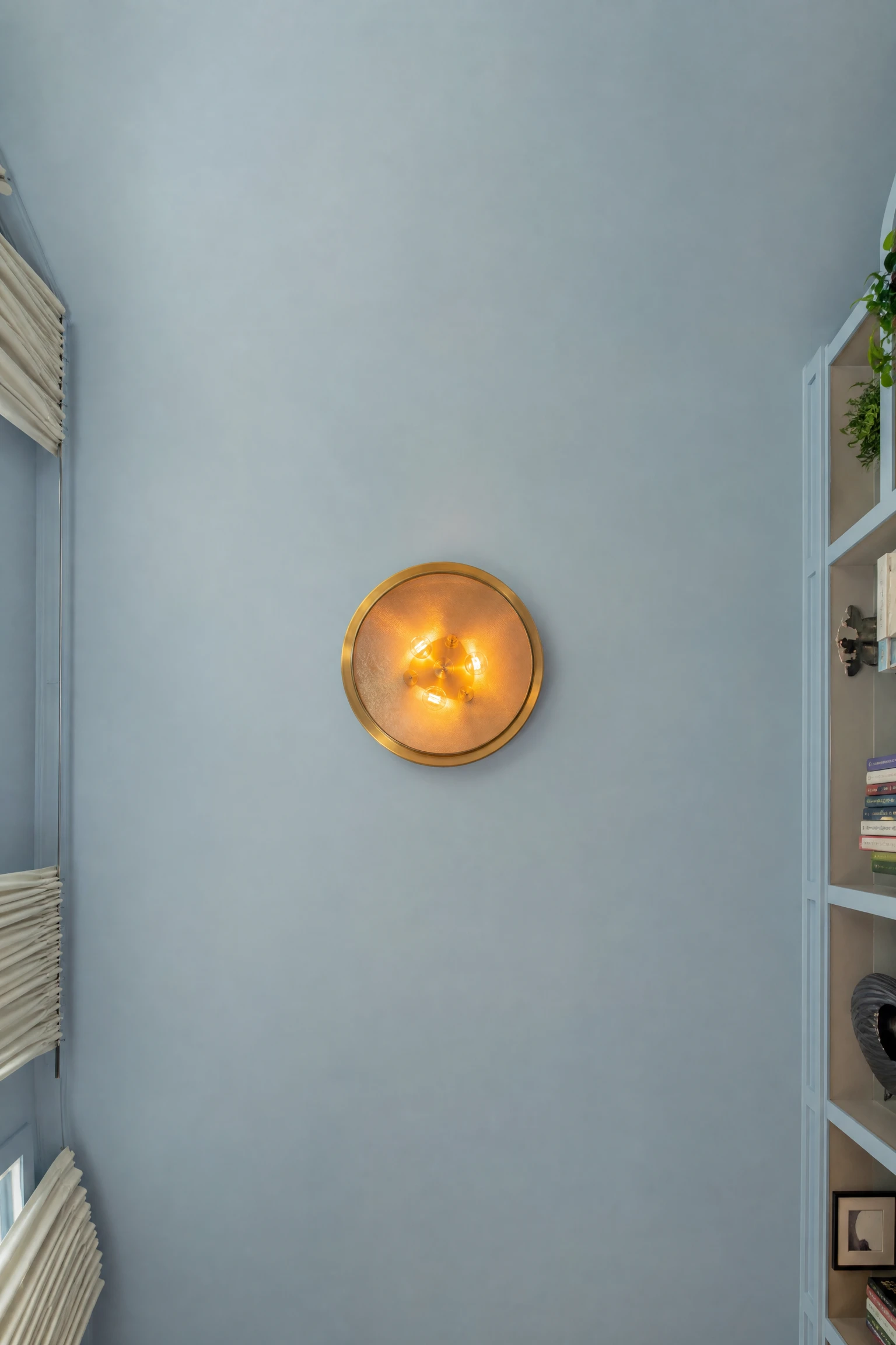
Painting the ceiling the same light blue as the walls, a technique called color drenching, completely changes how the room reads: it feels enveloping, intentional, and almost architectural rather than just “painted.” Interior designers frequently use it in smaller rooms where they want the space to feel cocoon-like rather than boxy, and in a light blue scheme it creates a sky-like effect that is particularly beautiful in rooms with good natural light.
Reality Check: Color drenching works best in rooms with clean white or off-white furniture and trim as the contrasting element; if the room has a lot of competing colors already, drenching the ceiling can make everything feel busy.
| Application | Effect Achieved | Best Room Type | Pairs Best With |
| Walls only, white ceiling | Classic, open, traditional feel | Large or formal living rooms | Statement art and warm trim |
| Walls + ceiling drench | Cocoon-like, enveloping, architectural | Smaller or cozy living rooms | White or cream furniture |
| One accent wall, rest neutral | Fresh, layered, less committed | Any size room | Natural wood and warm textiles |
| Ceiling only, white walls | Unexpected, sky-like, airy | Rooms with high ceilings | Bright artwork and bold furniture |
9. Use Terracotta or Rust as a Warming Accent Color
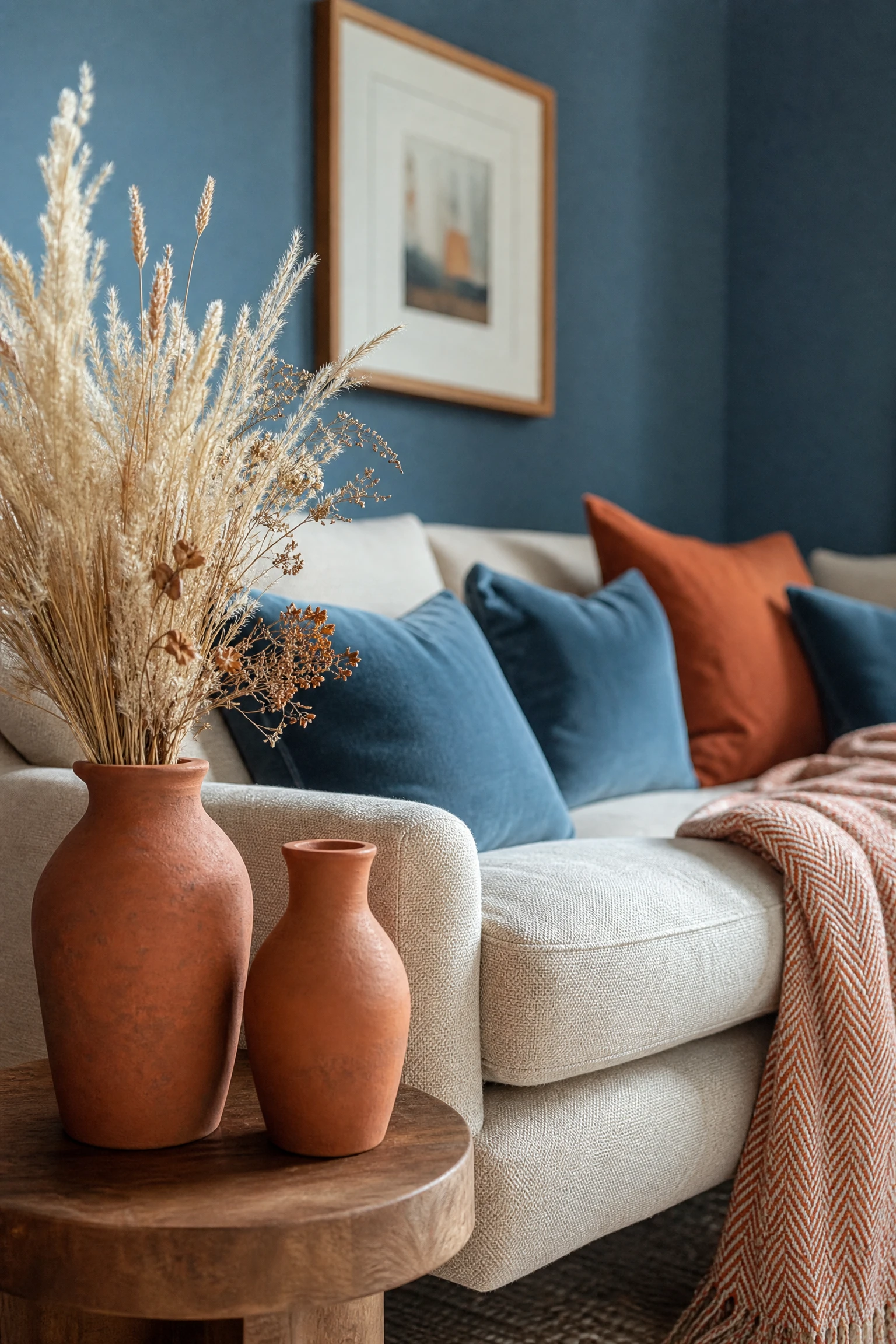
Terracotta, warm rust, and burnt orange are the accent colors that do the most work in a light blue living room because they sit nearly opposite blue on the color wheel and create a natural visual tension that reads as dynamic and warm without being jarring. Even a small dose, two rust-toned cushions, a terracotta vase, or a single warm-toned throw, is enough to shift the entire temperature of a blue room from cool to balanced.
Designer Advice: Go for muted, earthy rust and terracotta rather than bright orange; the softer versions of these colors feel well-considered in a blue room where bright orange would feel like an accent you were trying too hard with.
10. Introduce Warm Lighting at Multiple Levels
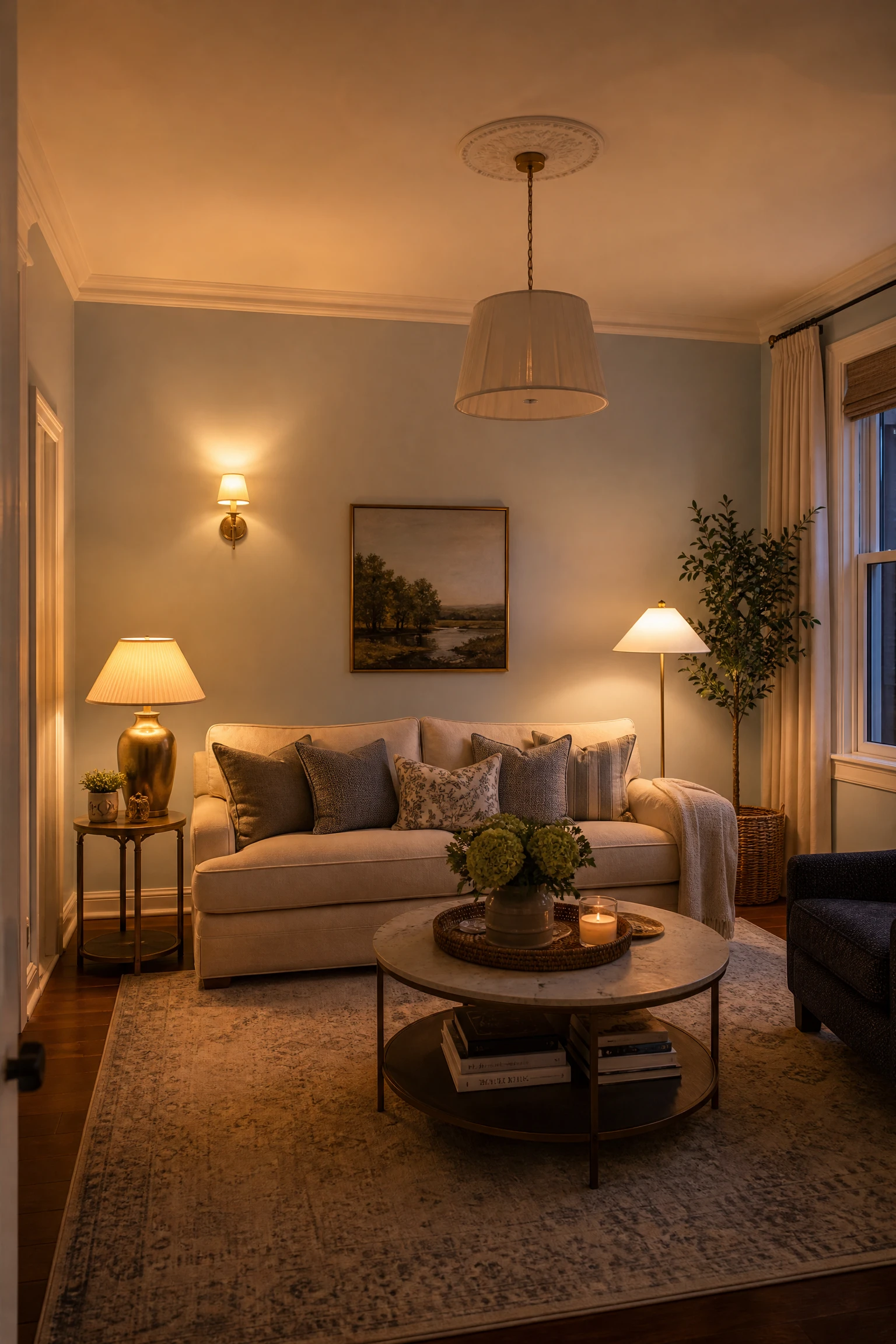
Overhead lighting alone in a light blue room is a reliable way to make it feel cold, because a single ceiling fixture throws flat, even light that removes shadows and flattens the color. Layering with floor lamps, table lamps, and wall sconces at different heights creates a warm amber glow that wraps around the blue walls and makes them read as cozy rather than clinical. Always use bulbs rated at 2700 to 2900 Kelvin in a light blue room; anything cooler pushes the blue toward sterile territory.
Heads Up: Smart bulbs that let you adjust color temperature are worth the investment in a light blue room specifically; you can push the warmth up in the evening when the natural light drops and the room would otherwise start to feel cold.
11. Hang Linen or Velvet Curtains in a Warm Neutral
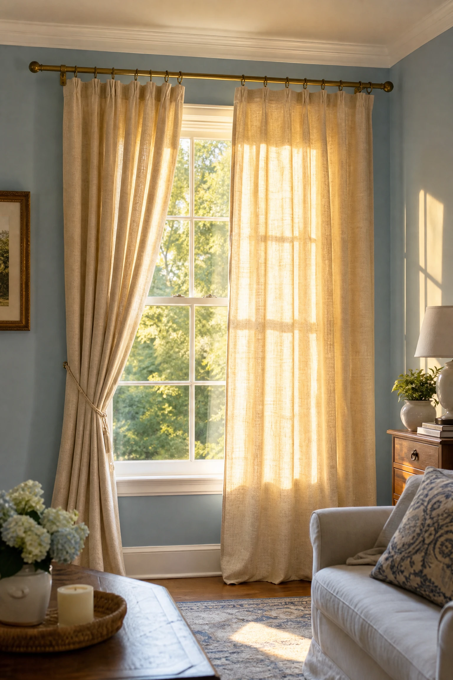
Curtains in a warm sand, aged linen, warm ivory, or blush tone add softness and warmth to the perimeter of a light blue living room and frame the windows in a way that transitions the eye naturally from the blue walls to the outside world. Full-length curtains hung high and wide above the window make the ceilings feel taller and the room feel more generous, and in a light blue room this vertical element of soft warm fabric does a significant amount of visual warming work.
Quick Tip: Avoid cool grey or white curtains in a light blue room; they reinforce the cool palette where you need contrast. Even a barely-there warm blush or the palest sand makes a noticeable difference in person.
12. Mix Textures Aggressively Throughout the Room
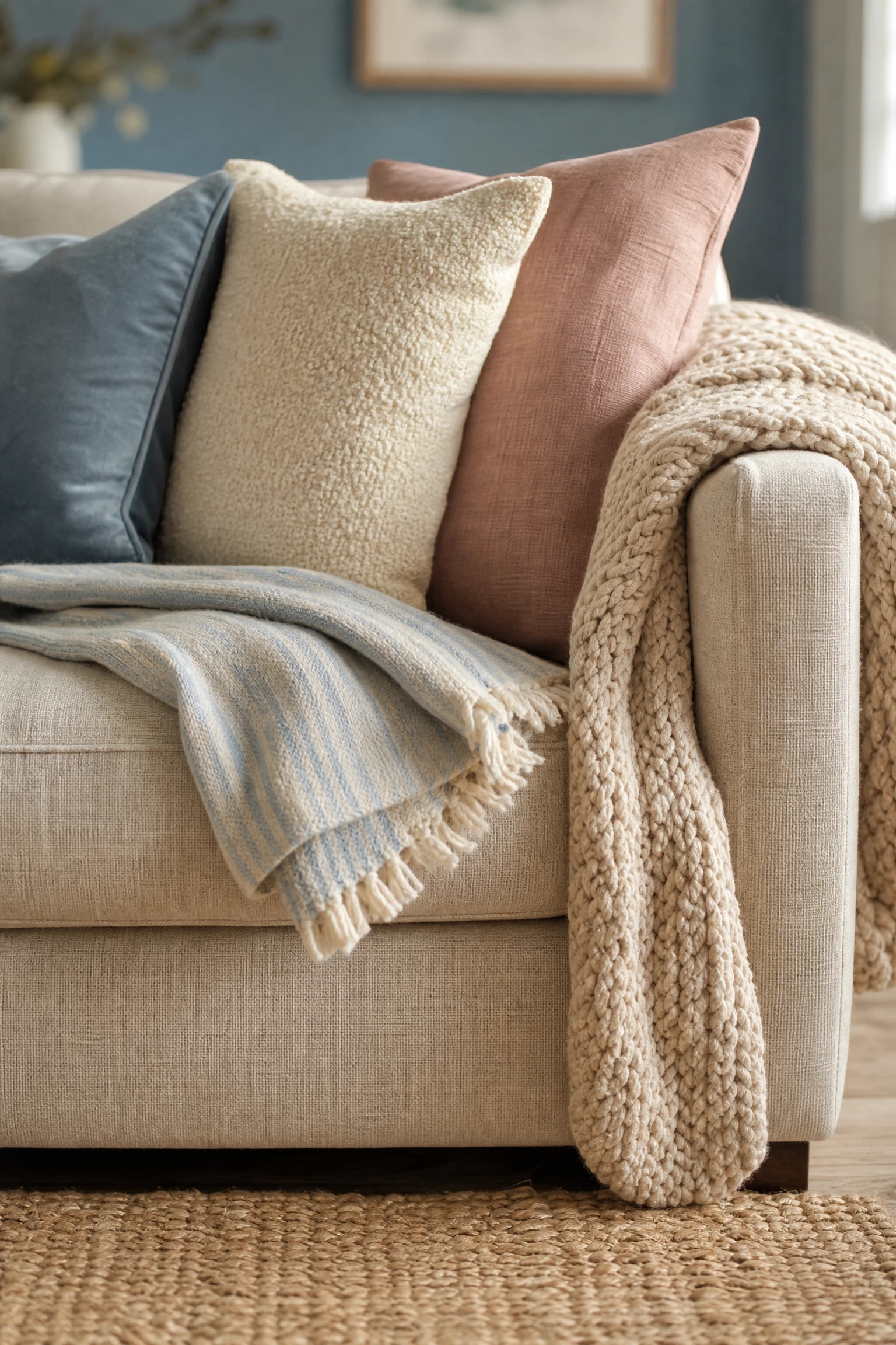
One of the main reasons a light blue living room reads as cold is that the palette tends toward smooth, even surfaces, and smooth surfaces feel cool to the eye regardless of color. Deliberately mixing textures, a chunky knit throw, a woven jute rug, a boucle cushion, a rough ceramic vase, a linen sofa against a velvet armchair, introduces tactile warmth that the eye registers as cosiness even before anyone physically touches anything.
Pro Move: In a blue room, aim for at least four different textures visible from the sofa: the rug, the cushions, the window treatment, and one surface material. More than that and the room starts to feel busy; fewer than that and it starts to feel sparse.
13. Add a Blush or Dusty Rose Accent Alongside the Blue
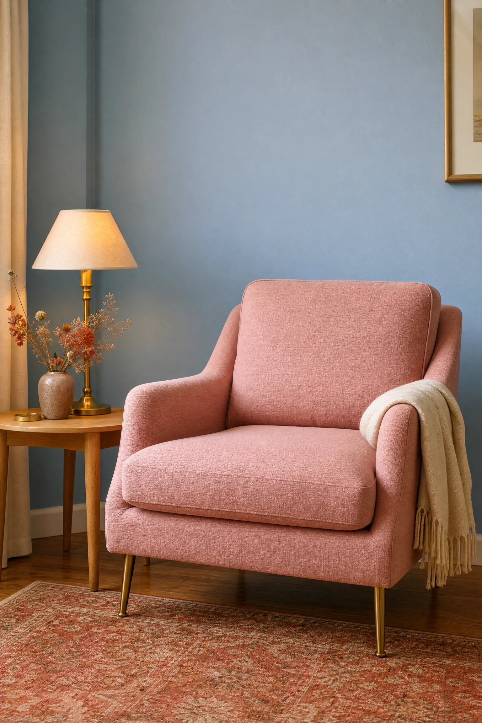
Blush pink and dusty rose are underrated partners for light blue because they share a similar softness and low saturation while sitting on the warm side of the color wheel. A single blush armchair, two dusty rose cushions, or a soft pink abstract art print in a light blue room creates an unexpected warmth that most people describe as feeling vintage, romantic, or just quietly beautiful. This pairing is popular in Scandinavian and French country interiors for exactly this reason.
Reality Check: Stick to muted, dusty blush rather than hot pink or bubblegum; the desaturated version harmonizes with light blue where brighter pinks fight it.
14. Use a Cream or Off-White Bookcase as a Display Backdrop
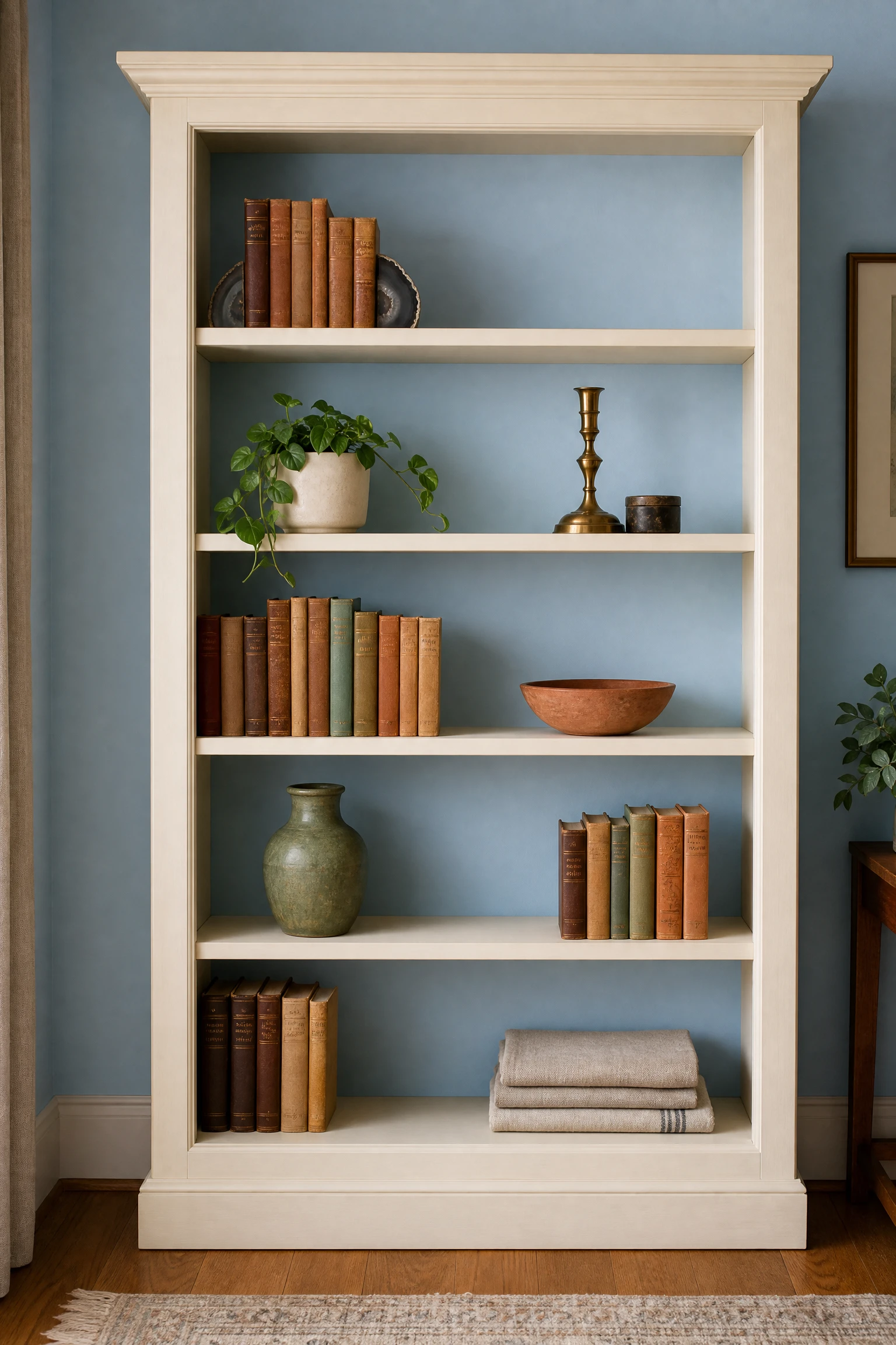
A built-in or freestanding bookcase in cream, antique white, or warm off-white placed against a light blue wall creates a layered composition where the shelving acts as a warm neutral band between the wall color and the objects displayed on it. Styled with a mix of books, plants, ceramics, and small art objects in warm tones, the bookcase becomes the most characterful and collected-looking element in the room without requiring a single structural change.
Designer Advice: Paint the back panel of the bookcase the same light blue as the walls so objects displayed against it appear to float in front of the wall color rather than against a white box.
15. Bring in Sage Green as a Natural Color Companion
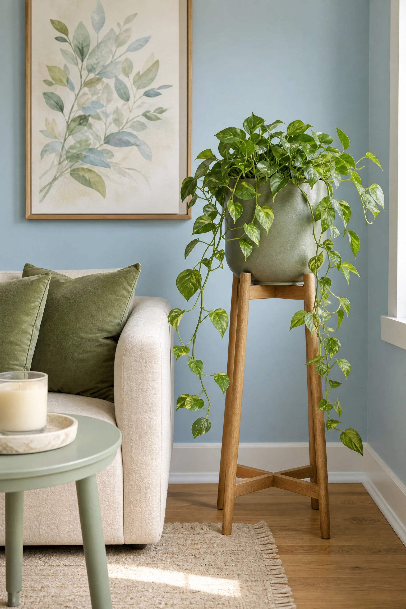
Sage green and light blue are analogous colors, sitting adjacent on the color wheel, and their combination has become one of the most requested pairings in contemporary living room design precisely because it feels naturally harmonious without being matchy. Sage green works in a light blue room as a plant color, a cushion tone, a painted side table, or a large art print and consistently reads as organic, calm, and slightly earthy in a way that warms the palette without introducing contrast.
Quick Tip: Keep the sage on the greyer, more muted side rather than going bright or lime-tinted; dusty sage complements light blue where fresh green can clash with it.
| Accent Color | Relationship to Light Blue | Works Best As | Overall Mood Created |
| Terracotta / Rust | Complementary, warm contrast | Cushions, vase, throw | Warm, grounded, Mediterranean |
| Brass / Gold | Warm metallic contrast | Lamps, frames, hardware | Elevated, classic, slightly glamorous |
| Blush / Dusty Rose | Warm tonal softness | Armchair, cushions, art | Romantic, Scandi, vintage |
| Sage Green | Analogous, natural harmony | Plants, cushions, side table | Organic, calm, biophilic |
| Warm Cream / Sand | Neutral warm base | Sofa, rug, curtains | Classic, airy, timeless |
| Navy (deeper blue) | Tonal depth | Throw pillows, artwork | Coastal, well-considered, layered |
16. Hang Warm-Toned Artwork on the Blue Walls
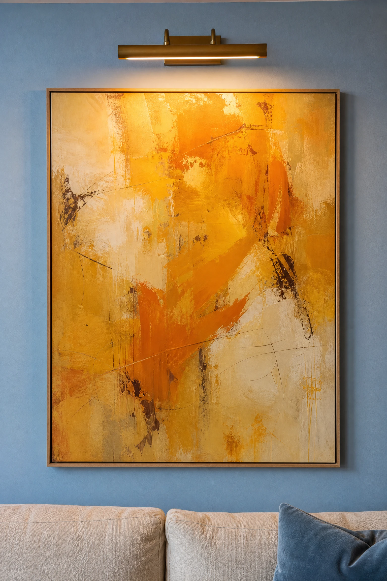
Artwork with warm dominant tones, golden yellows, burnt oranges, warm reds, earthy greens, or sun-lit landscape photography, placed on light blue walls creates the most effective and instantaneous warmth boost available to you short of repainting. The contrast between the cool blue wall and the warm-toned image creates a visual dynamic that makes both elements more alive, and in practical terms it gives the eye somewhere to rest and the room a sense of narrative.
Pro Move: Large single works, anything 24 inches or bigger, do more warming work than the same number of square inches spread across a gallery wall. One bold warm canvas on a light blue wall makes a statement that twelve smaller prints in a grid cannot match.
17. Consider Tongue-and-Groove Panelling Below a Chair Rail
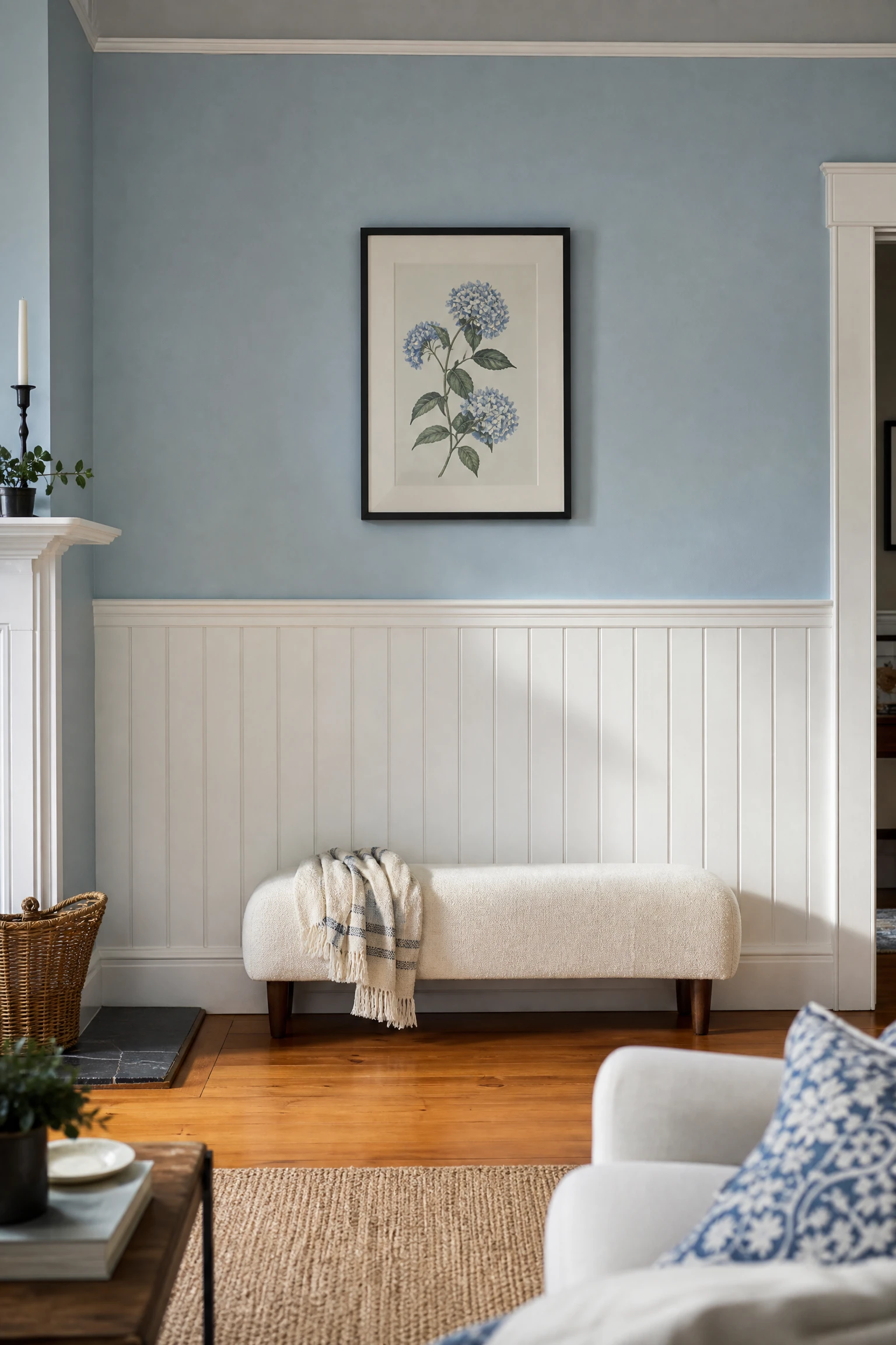
Painting tongue-and-groove or shiplap panelling on the lower half of the wall in a warm white or cream, with the light blue above the chair rail, breaks the blue into a smaller visual portion and introduces an architectural warmth that makes the room feel considered and layered. This approach, known as a two-tone wall treatment, also gives smaller living rooms a sense of height by drawing the eye upward toward the blue, and it suits both traditional and coastal room styles.
Heads Up: If you go with this approach, the chair rail and panelling should be in a warm white, not the same blue. The contrast between the blue above and the warm white below is the whole point of the technique.
18. Layer Blue Cushions in Multiple Tones and Textures
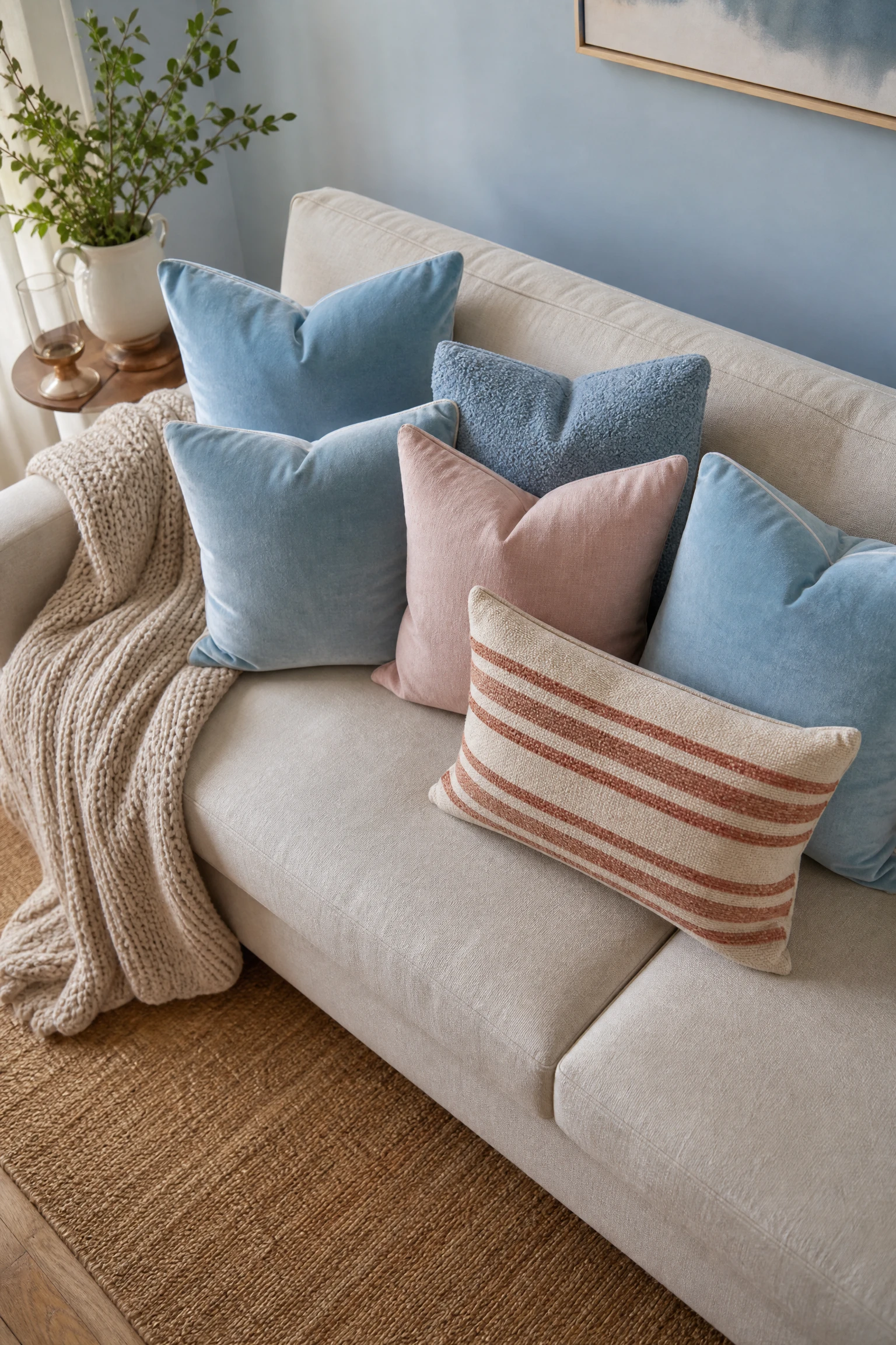
A common mistake in a light blue living room is using only one shade of blue in the soft furnishings, which makes the room feel flat and single-dimensional. Layering cushions in two or three blues, a pale sky, a deeper dusty blue, and a washed denim tone, on a cream sofa creates the tonal depth that makes a blue room feel genuinely designed. Add one or two cushions in a contrasting warm tone, rust, blush, or warm gold, and the layered arrangement reads as complete.
Designer Advice: Use the 60-30-10 rule for cushion arrangement: 60 percent in a neutral base (cream or natural linen), 30 percent in the main blue tone, and 10 percent in a warm accent color. This ratio always reads as balanced.
19. Install a Natural Stone or Marble Fireplace Surround
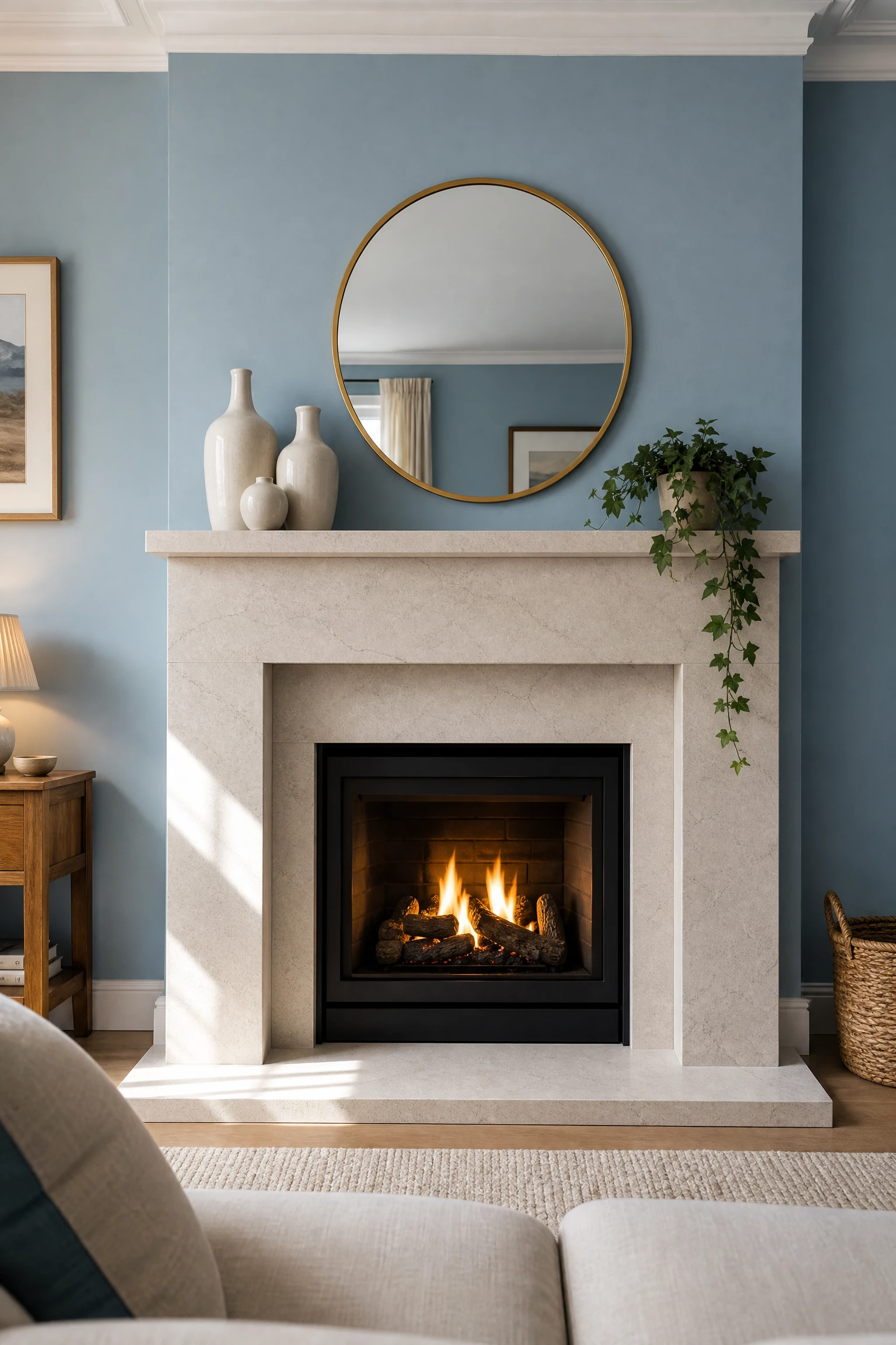
A fireplace with a natural stone, limestone, or marble surround in a warm white, cream, or pale grey tone introduces a material richness that a light blue living room genuinely benefits from, because the natural variation in stone texture and veining adds visual complexity that softens the uniformity of a blue wall. Even a simple white-painted wood surround with a tiled hearth in a warm neutral achieves a version of this effect and makes the fireplace read as the natural focal point of the room.
Quick Tip: A light blue living room with a fireplace almost never needs a TV on the same wall; let the fireplace be the focal point and position the seating to face it rather than dividing attention between the two.
20. Add Indoor Plants With Large Structural Leaves
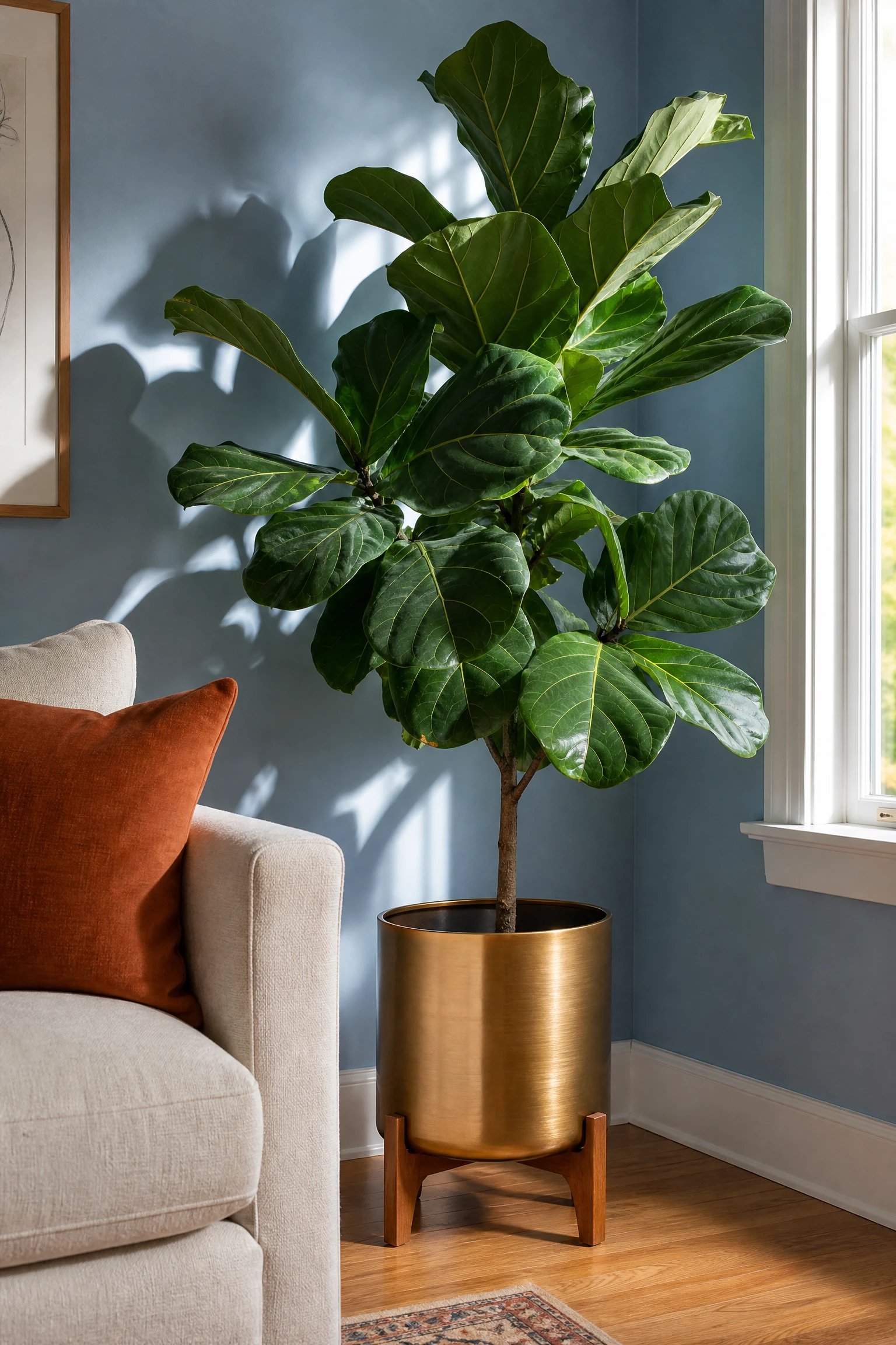
Large-leafed indoor plants, a fiddle leaf fig, a monstera deliciosa, a rubber plant, or a large peace lily, add living green to a light blue room that simultaneously warms and softens the palette in a way that no other single object achieves. Green and blue are naturally harmonious, and the organic irregularity of a large plant introduces biophilic warmth, which is the subconscious warmth we feel from natural living things, that manufactured objects simply cannot replicate.
Reality Check: A light blue room with good natural light is actually an excellent environment for most houseplants since it typically means the room faces a favorable direction. Match the plant size to the room: a small succulent disappears in a full-sized living room; go large and let it make a statement.
21. Use Wallpaper on One Wall for Pattern and Texture
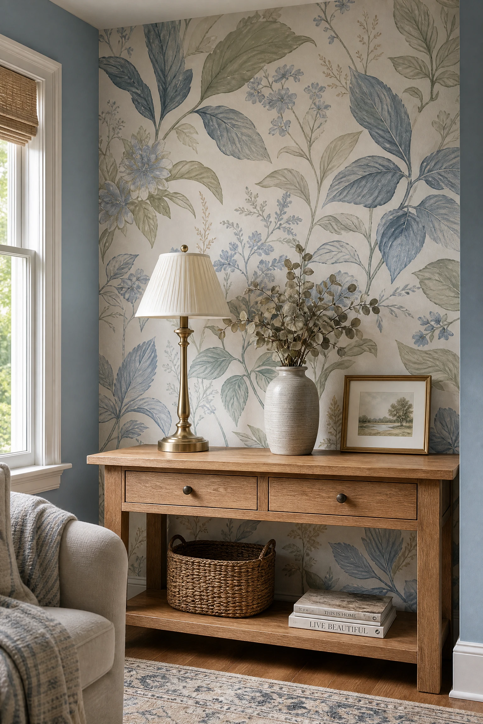
A wallpapered accent wall in a botanical, geometric, or classic stripe pattern that incorporates the light blue as one of its colors ties the architecture to the decor in a way that makes the whole scheme feel more deliberate. Wallpaper also introduces texture that paint cannot, and texture is warmth: a grasscloth wallpaper, a linen-look texture, or an embossed botanical print all read warmer than the same color in flat paint.
Pro Move: Choose a wallpaper where the blue in the pattern is slightly different in tone to your wall color, either slightly deeper or slightly greener, so the two blues create interest rather than competing.
22. Create a Reading Nook With Built-In Blue Shelving
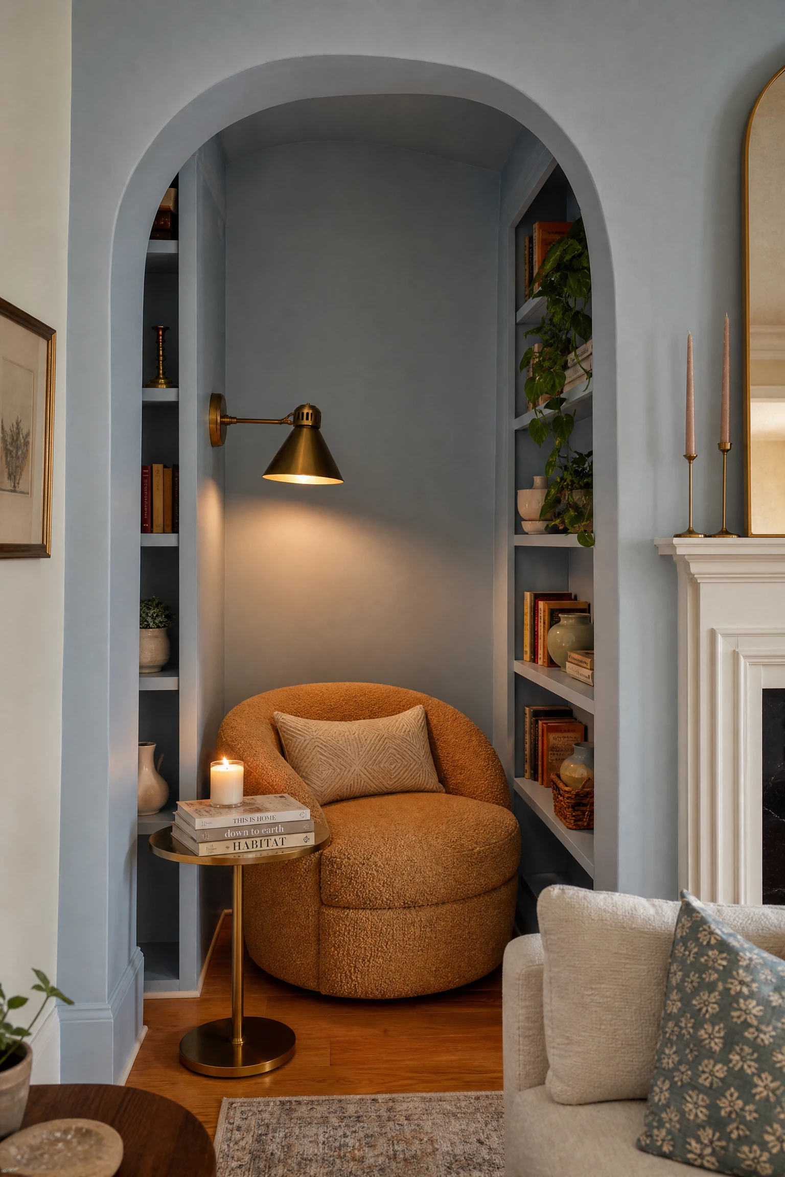
Painting built-in shelving or an alcove in the same light blue as the walls, then styling the space with a comfortable armchair, a floor lamp, and curated books, turns a potentially dead corner of a light blue living room into its most intimate and characterful feature. The built-in shelving in the same color as the walls creates an architectural continuity that looks intentional and expensive even when the shelving itself is basic.
Quick Tip: Add a seat cushion in a warm-toned fabric, a terracotta linen or a camel boucle, to the reading nook chair so it anchors the corner with warmth against all that blue.
23. Hang a Large Round Mirror to Bounce Light
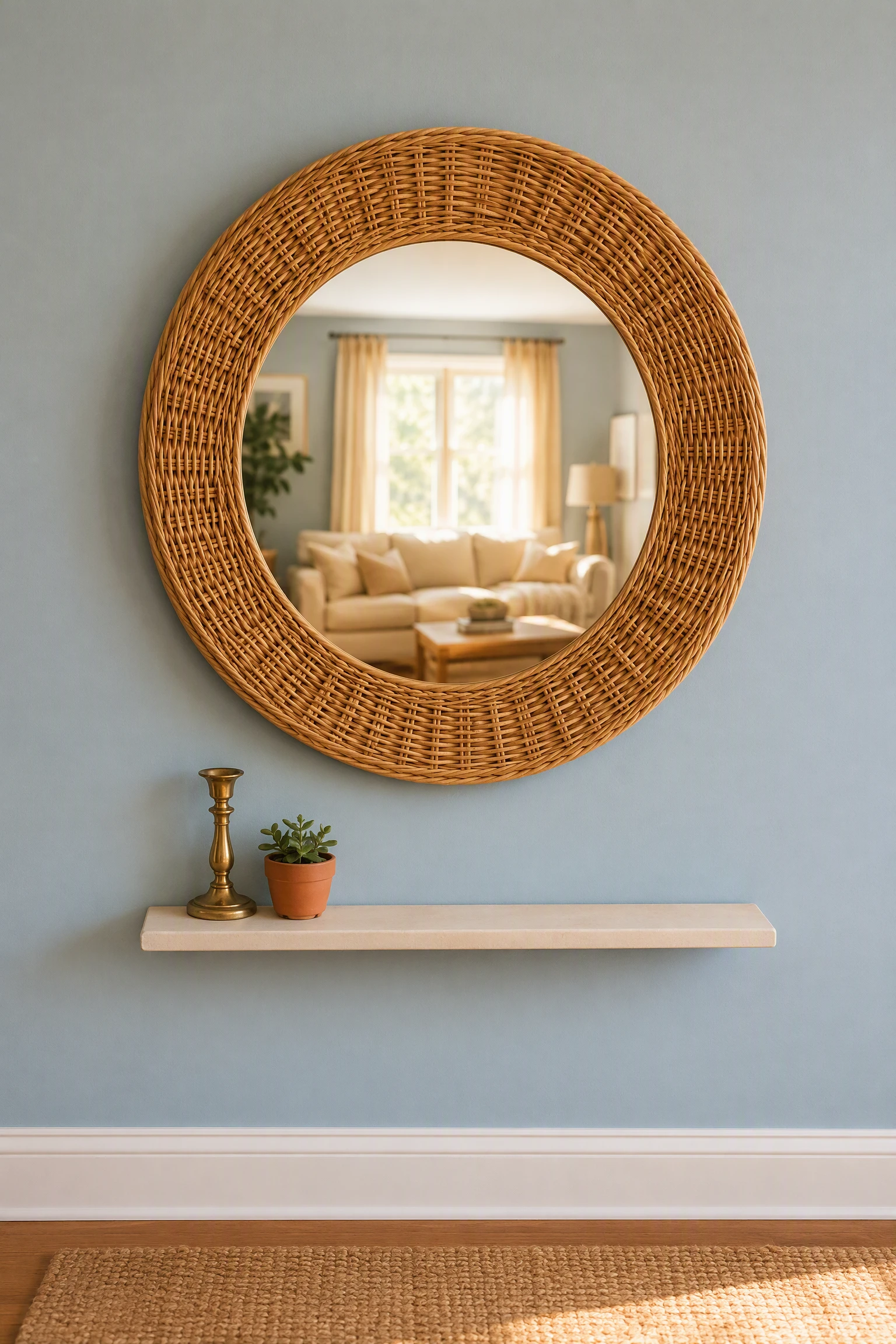
A large round mirror in a warm frame, gold, brass, warm wood, or an organic rattan weave, hung on a light blue wall acts as a light-multiplying tool and a warmth anchor at the same time. The reflected light it bounces around the room softens the coolness of blue walls dramatically, and the warm frame material signals heat even within a cool palette. Round mirrors in particular suit light blue rooms because their soft organic shape offsets the straight lines of walls and furniture.
Heads Up: Position the mirror to reflect the most light-filled part of the room, ideally a window, rather than reflecting another wall; a mirror that reflects a window doubles natural light while a mirror that reflects a wall just reflects more blue.
24. Style a Coffee Table Tray With Warm Finishing Objects
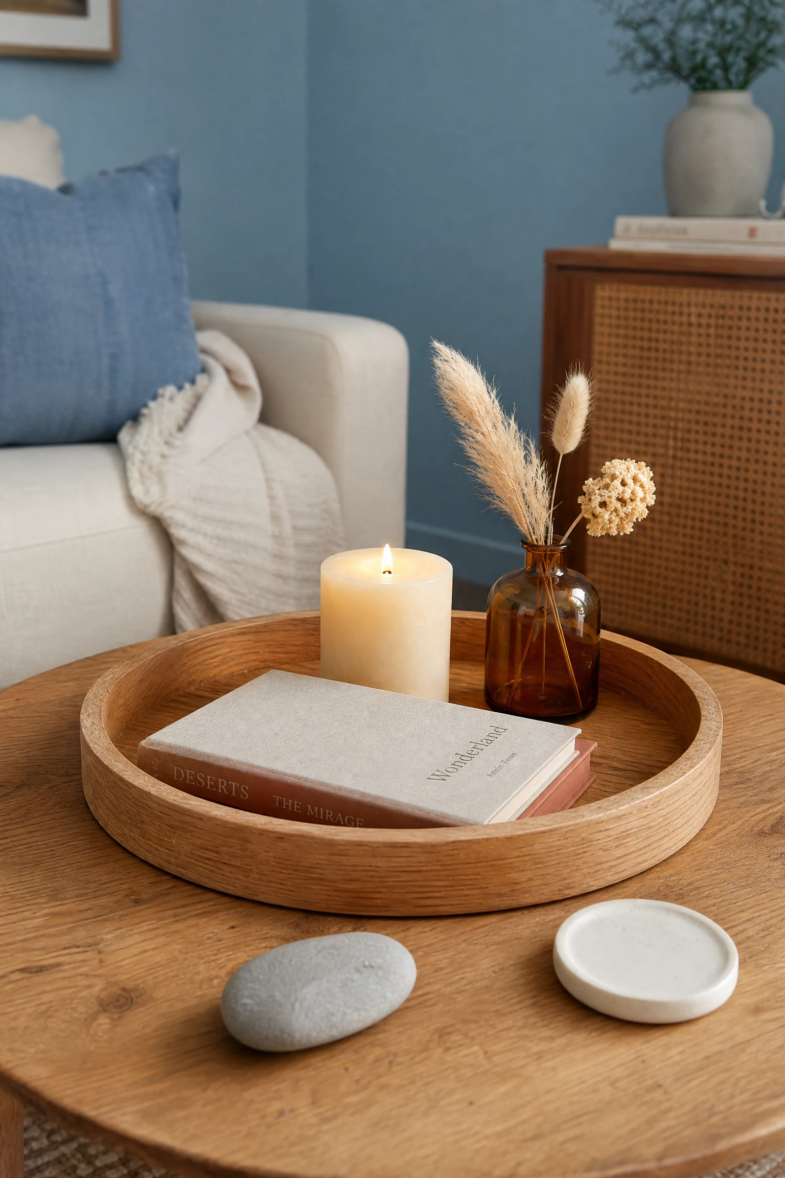
The coffee table in a light blue living room is the closest surface to eye level when seated, making it the highest-visibility styling surface in the space. A wooden or brass tray holding a cluster of warm-toned objects, a cream pillar candle, a small terracotta or amber glass vase, a couple of books with warm-toned covers, and a small ceramic object, concentrates warmth exactly where people look and creates a deliberate, styled focal point at the center of the room.
Designer Advice: The tray is non-negotiable; without it, individual objects on a coffee table just look like things placed there. The tray is what groups them into a composition.
25. Introduce Navy Blue as a Grounding Depth Layer
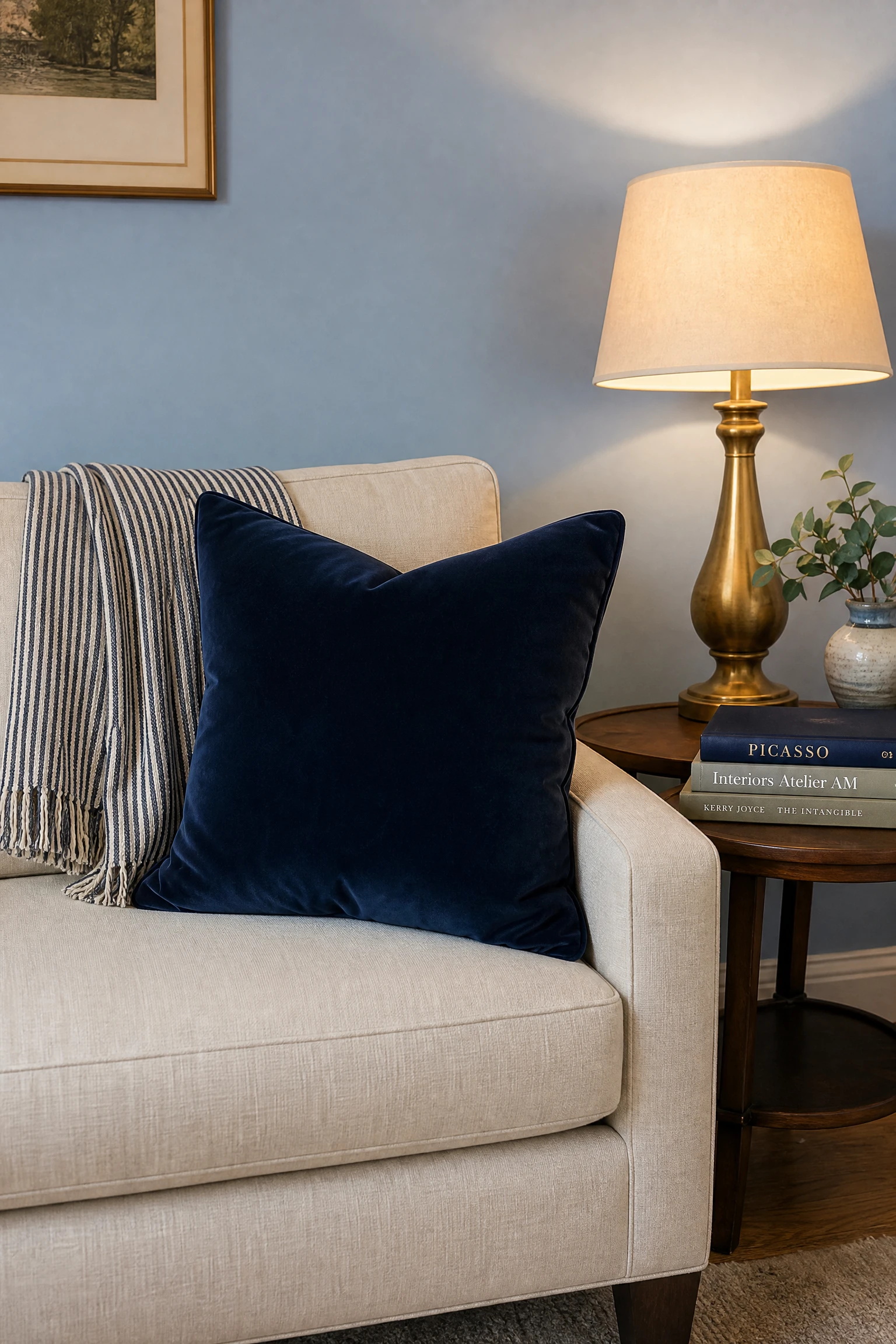
Bringing in a deeper navy or indigo as an accent within a light blue living room, through a throw, a cushion, a small side chair, or a piece of art, creates tonal depth that prevents the room from reading as flat or washed out. The relationship between pale blue and deeper navy is one of the most considered and naturally cohesive color combinations in interior design, and the contrast between them gives the light blue something to play against.
Reality Check: Navy works as an accent in a light blue room but should not dominate; keep the total navy presence to under 15 percent of the room’s visual field or it starts to pull the room toward a nautical or overly dark feeling.
26. Choose a Patterned Rug With Warm and Blue Tones Together
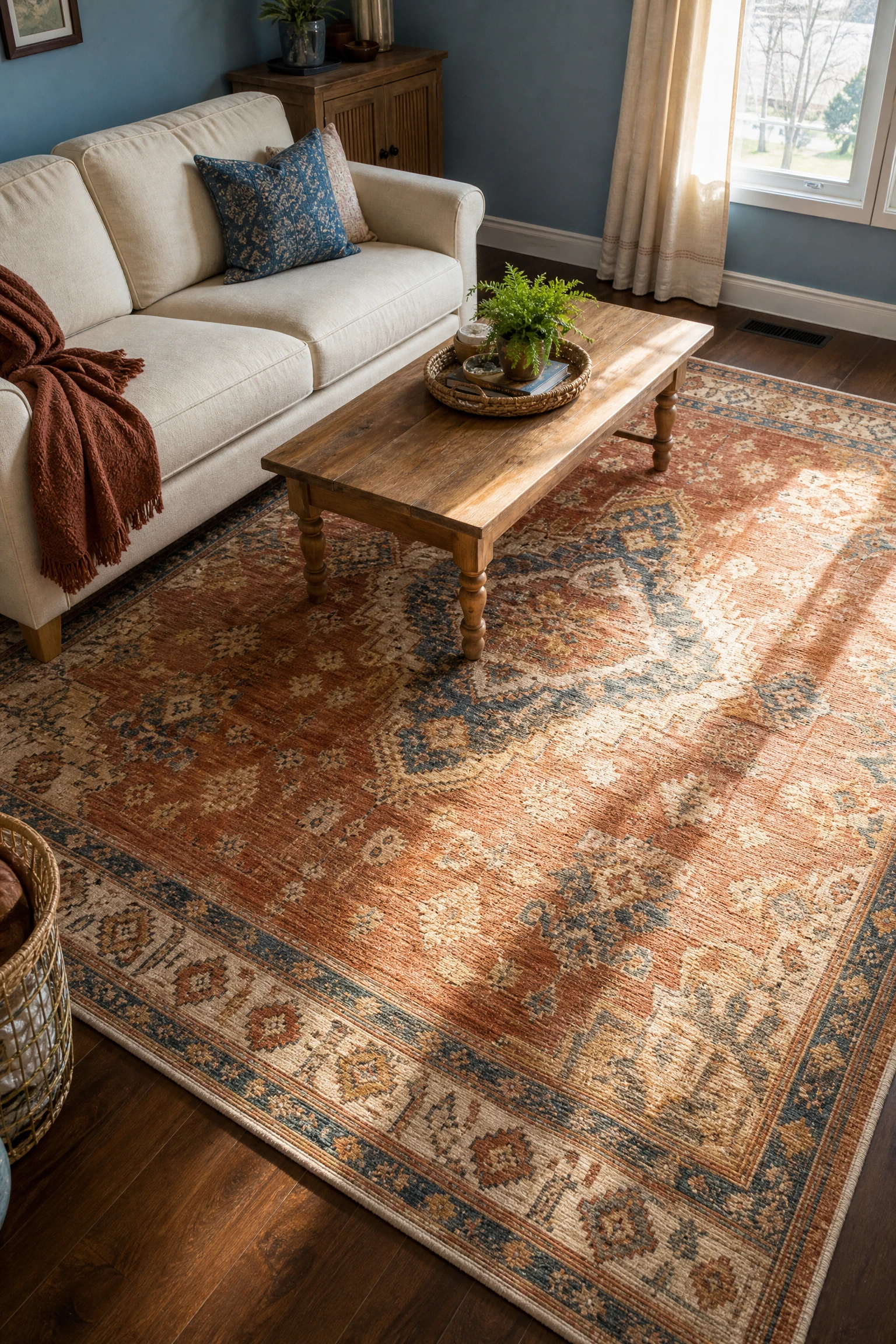
A patterned rug that weaves together the light blue of the walls with one or two warm accent tones, cream, rust, gold, or warm grey, does something a single-color rug cannot: it visually connects the floor to the walls while simultaneously introducing the warmth the floor layer needs to provide. Persian, Moroccan, or vintage-look flatweave rugs that incorporate blue as a secondary rather than dominant color tend to work best in this context.
Quick Tip: If you find a rug you love that has too much blue in it, balance it by choosing warmer tones for every other textile in the room: cream cushions, sand curtains, a warm throw.
27. Style Open Shelves With a Warm and Cool Object Mix
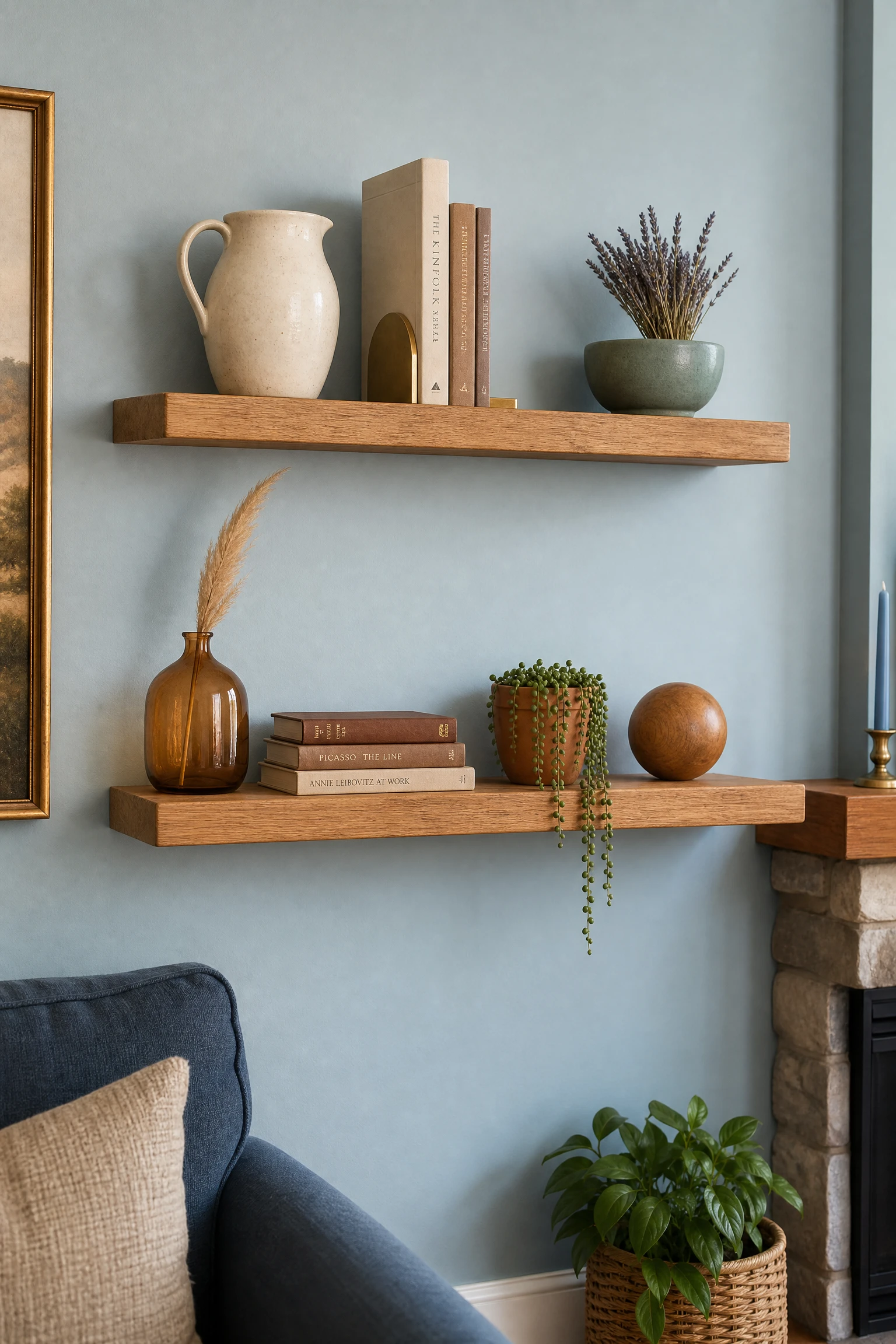
Open shelving in a light blue living room is one of the best opportunities to demonstrate color confidence, alternating warm objects, wooden bowls, amber glass vases, terracotta pots, brass bookends, with cool blue and white objects across the shelves. This warm-to-cool rhythm across the shelving creates the same visual balance the whole room needs at a micro scale, and it makes the shelves look styled by someone who genuinely knows what they are doing.
Pro Move: Do not group all warm objects together and all cool objects together on the shelves; alternate them shelf by shelf or even within each shelf so the visual temperature feels evenly distributed.
28. Finish With Candles and Warm Scent for Sensory Warmth
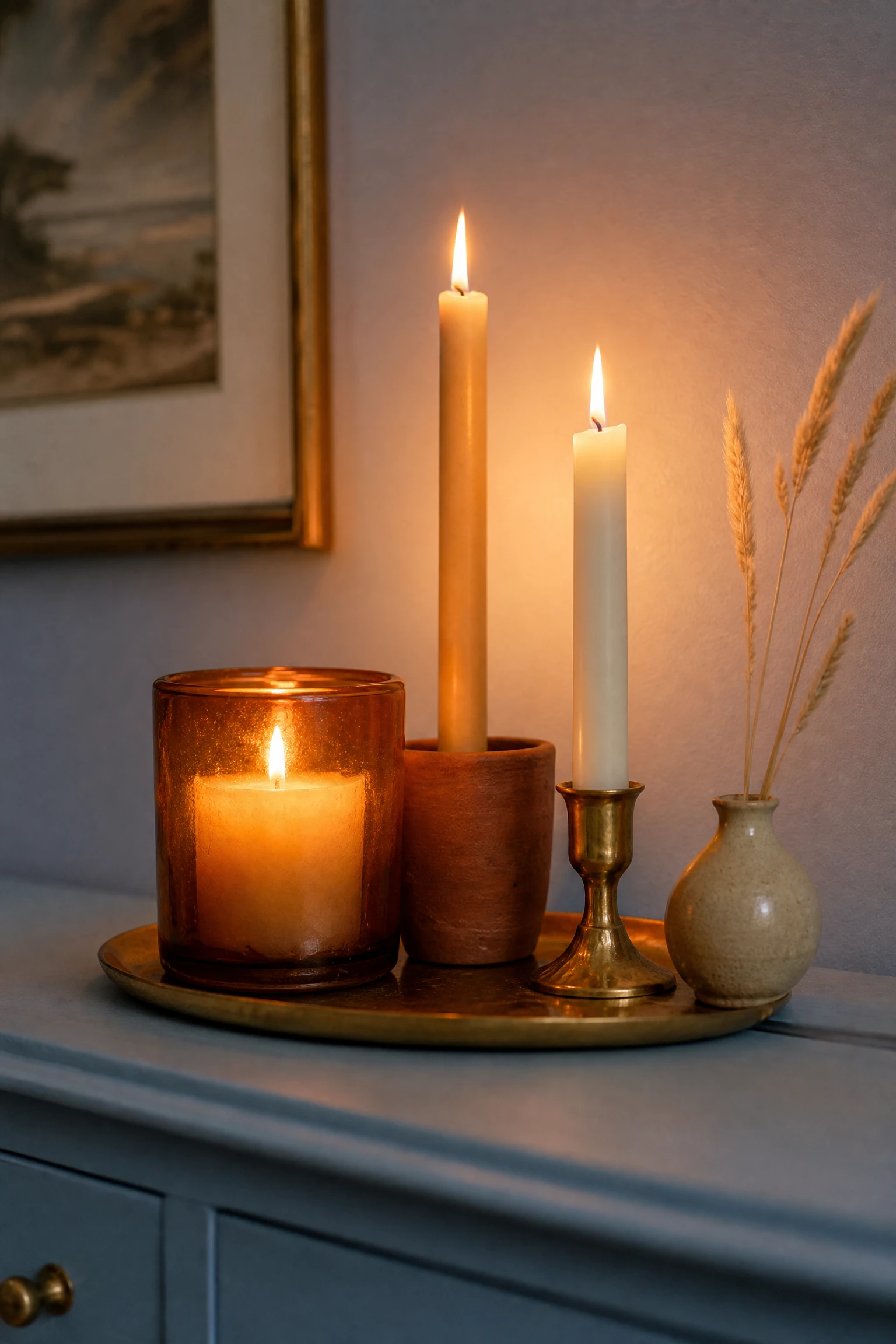
A light blue living room that looks warm in photographs can still feel cool in person if it has no sensory warmth to back up the visual palette, and candles are the quickest fix for both. The warm glow of lit candles changes the color temperature of a room in real time and the right scent, amber, sandalwood, warm vanilla, cedar, communicates warmth through a completely different sensory channel that no paint chip or cushion can match. Two or three quality candles grouped on the coffee table or sideboard are the final layer that makes a light blue room feel genuinely lived in and welcoming.
Quick Tip: For maximum effect in a light blue room, choose candles in amber glass, terracotta, or gold vessels rather than white or clear; the container itself contributes a warm visual note before the candle is even lit.