Minimalist Living Room Looks That Actually Feel Like Home
There is a version of minimalism that feels cold and a version that feels like the best kind of exhale after a long day. The difference usually comes down to a few deliberate choices: the right materials, a considered color palette, and enough personality in the details to make the space feel like yours. When it works well, a minimalist living room does not read as empty. It reads as calm, and that is a very different thing. If you have been drawn to this style but are not sure where to start, or if past attempts left your room feeling bare rather than beautiful, these ideas are for you.
The 19 ideas here are grouped by mood and approach, from warm and textural to clean and architectural. Each one covers the colors, furniture, lighting, and materials that make the look work in a real home, not just in a styled photo. Some are easy, budget-friendly wins. Others are more of an investment, but worth understanding either way. Whatever your space and budget, the goal is the same: a living room that feels genuinely good to be in.
Warm Minimalism
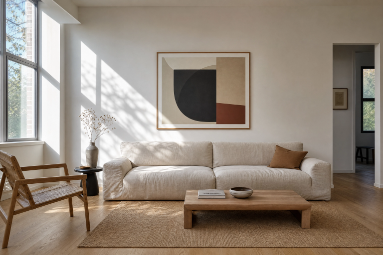
1. Sand and Linen with Low-Profile Seating
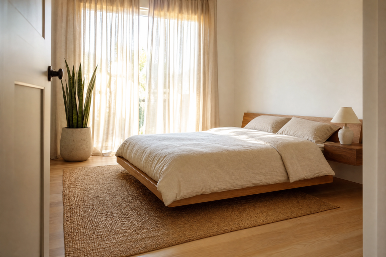
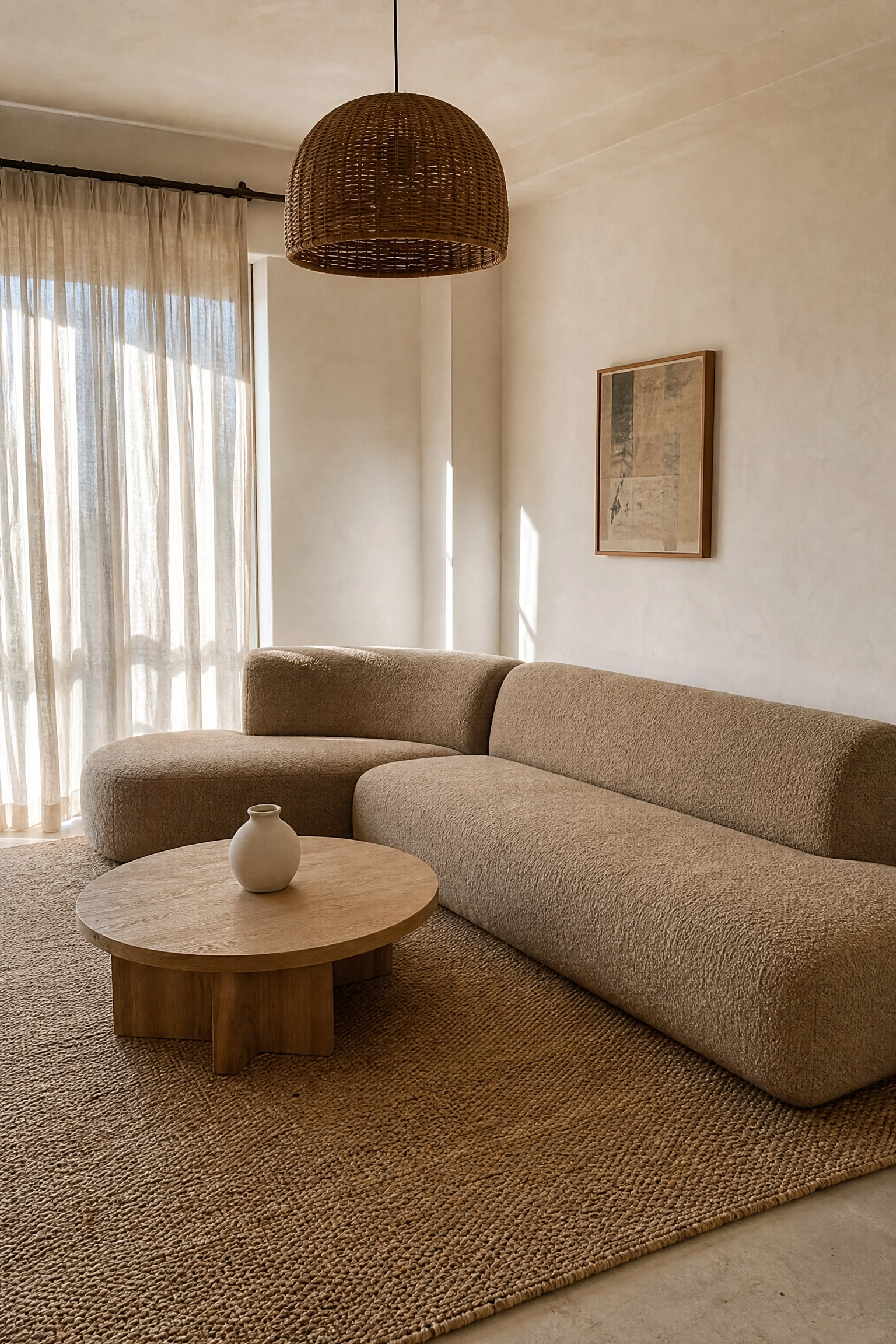
Warm minimalism is the version of this style that has been winning over the most people lately, and for good reason. It takes the clean lines of traditional minimalism and adds in materials that feel genuinely touchable. Start with walls in a warm sand or pale greige, something in the space between white and beige that picks up golden-hour light beautifully. A low-profile sofa in natural linen or a textured boucle becomes the anchor, and because it sits close to the floor, it actually makes the ceiling feel taller. Layer in a jute or flatweave wool rug in a tone that is only slightly darker than the floor, and you create depth without visual noise. Warm-white pendant lighting, ideally in rattan or a matte ceramic shade, keeps the overhead light soft rather than clinical. The one honest trade-off: linen upholstery marks and creases easily, so it works best in homes without young children or pets, or you can opt for a performance linen-look fabric that handles wear much better.
Designer Advice: Stick to a three-tone palette within the sand-and-linen family by varying the finish rather than the color. Matte walls, a sheen-free sofa, and a slightly reflective ceramic lamp base create quiet contrast that reads as sophisticated without breaking the minimal feel.
2. Warm White Walls with Natural Wood Accents
Warm white is not the same as cool white, and that distinction matters more than most people realize before they have painted a room and stood in it at noon. Warm white walls have a faint undertone of cream or stone that makes them feel lived-in and welcoming rather than sterile. Pair them with furniture that has honest, visible wood grain, a solid oak coffee table, a walnut media console, or a simple bench near the entrance. The wood does not need to match exactly. In fact, slight variation in tone between pieces looks more considered than a perfect set. Lighting is crucial here: a floor lamp with a fabric shade placed in the corner behind the sofa creates the layered lighting that professional designers always talk about and that most people forget to plan. On the walls, one or two framed line drawings or simple abstract prints in natural wood frames keep the aesthetic consistent. This is a genuinely budget-friendly approach, and pieces from secondhand shops or online marketplaces often work better here than new flat-pack furniture.
Designer Advice: When mixing wood tones, keep the undertone consistent. Mixing a warm honey oak with a cool grey walnut reads as mismatched. Mixing warm oak with warm walnut reads as intentional.

3. Terracotta Accents in an Otherwise Neutral Room
A fully neutral minimalist room can tip into being a bit lifeless if there is no color anchor anywhere, and terracotta is one of the most reliable ways to fix that without breaking the minimal brief. The idea is not to paint a wall terracotta, but to bring it in through one or two well-chosen objects. A pair of terracotta ceramic vases on the coffee table, a single woven throw in a burnt-orange tone folded over the arm of a sofa, or a small terracotta planter holding a fiddle-leaf fig or snake plant, any of these will warm the room considerably. The walls and main furniture should stay in soft white, warm stone, or pale grey so the terracotta reads as an accent rather than a theme. Flooring in pale timber or a light concrete effect is ideal. For lighting, stick with bulbs in the 2700K range, which have a slightly amber tone that makes terracotta accents look genuinely rich rather than orange. This is a very affordable approach since the accent pieces are the stars, and they do not need to be expensive.
Designer Advice: Limit terracotta to a maximum of three objects in the room. Beyond that, the color starts to feel like a theme rather than an accent, which is a different look entirely.

Japandi-Inspired Minimalism
4. Low Furniture and Negative Space as a Design Tool
Japandi is the design shorthand for the marriage of Japanese and Scandinavian aesthetics, and it is still one of the most relevant approaches to minimalism in 2025 because it solves the personality problem. Pure minimalism can feel cold; Japandi adds in the concept of wabi-sabi, the Japanese philosophy that finds beauty in imperfect, natural things, which gives rooms warmth and character without adding clutter. The key furniture principle here is to go low. A platform sofa sitting close to the floor, a low rectangular coffee table in a dark walnut or smoked oak finish, and open shelving rather than tall cabinetry all reduce visual weight and keep the sightlines clear. Walls work best in a deep warm off-white or a muted sage green. Lighting should be architectural, a minimal track light system or a simple paper pendant from a well-regarded Japanese brand like Noguchi-style designs give the right feel without being heavy. Be honest: this style requires good discipline about keeping surfaces clear, because low furniture shows every object in a way that a bulkier room does not.
Designer Advice: The magic of Japandi is restraint in the furniture and personality in the materials. One beautifully grained wood piece, one imperfect ceramic bowl on the coffee table, one handwoven cushion cover. Quiet choices, but they do a lot.

5. A Tonal Dark Palette Done the Minimalist Way
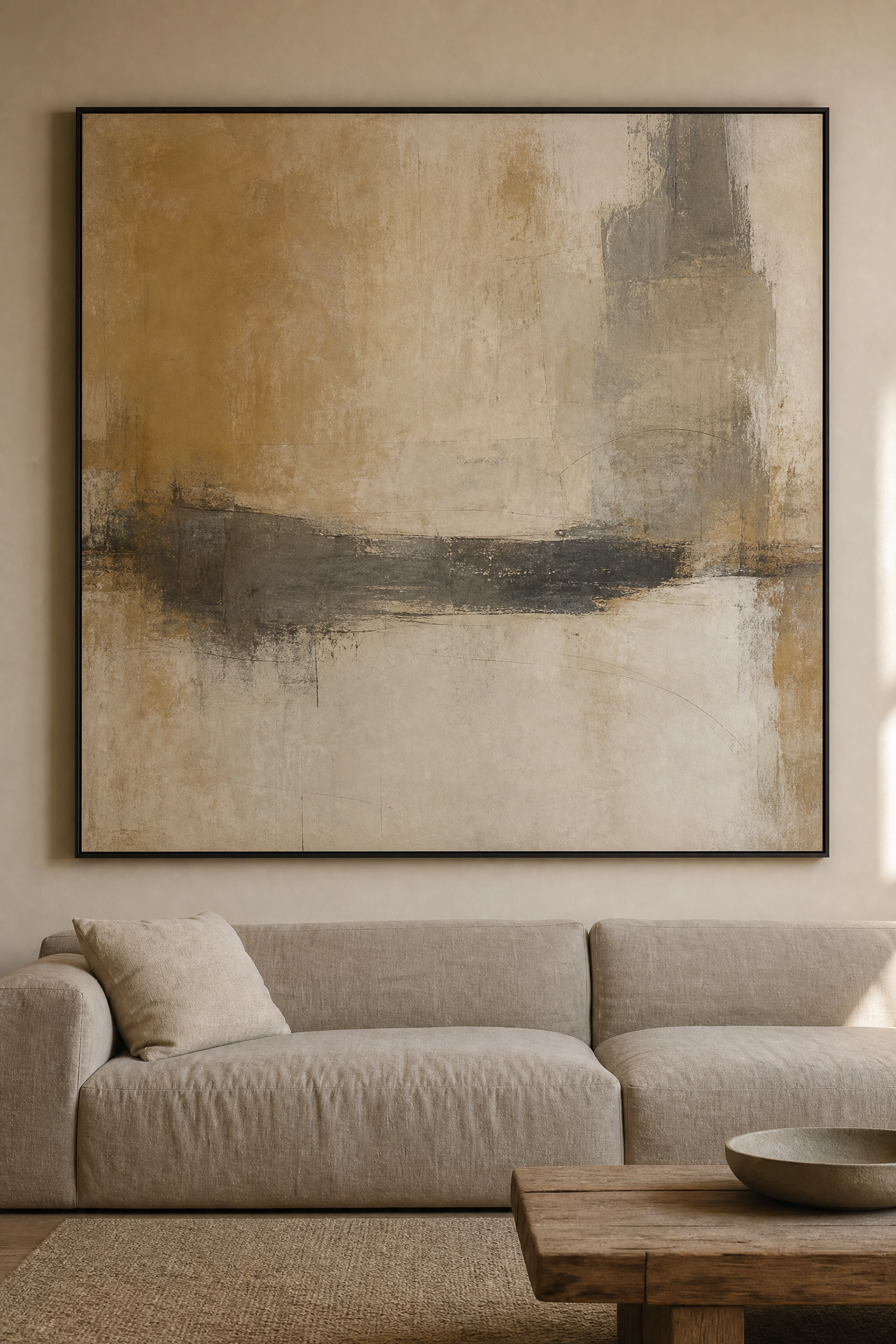
Dark minimalism is one of those looks that photographs brilliantly but requires some real consideration in practice, especially in rooms with limited natural light. When it works, it creates a moody, enveloping quality that makes a living room feel genuinely special. Deep charcoal or near-black walls (try Farrow and Ball’s Railings or a similar deep blue-black) work best in rooms that get afternoon or evening sun, or in rooms where you are happy to rely on well-planned artificial light. Furniture in a mid-grey or dark forest green velvet adds depth without making the room feel smaller, and the velvet texture is important because it catches light and creates movement in what could otherwise be a flat, uniform space. A single large-format abstract painting in muted tones provides a focal point. Lighting here is everything: a brass or aged bronze floor lamp, a dimmer on the overhead light, and candles in the evenings make this look incredible. Without good lighting, a dark minimalist room just looks dim, so plan the lighting before you commit to the palette.
Designer Advice: In a dark minimalist room, the visual weight is carried by the walls rather than the furniture. This means you can get away with simpler, less expensive furniture pieces because they read as part of the backdrop.

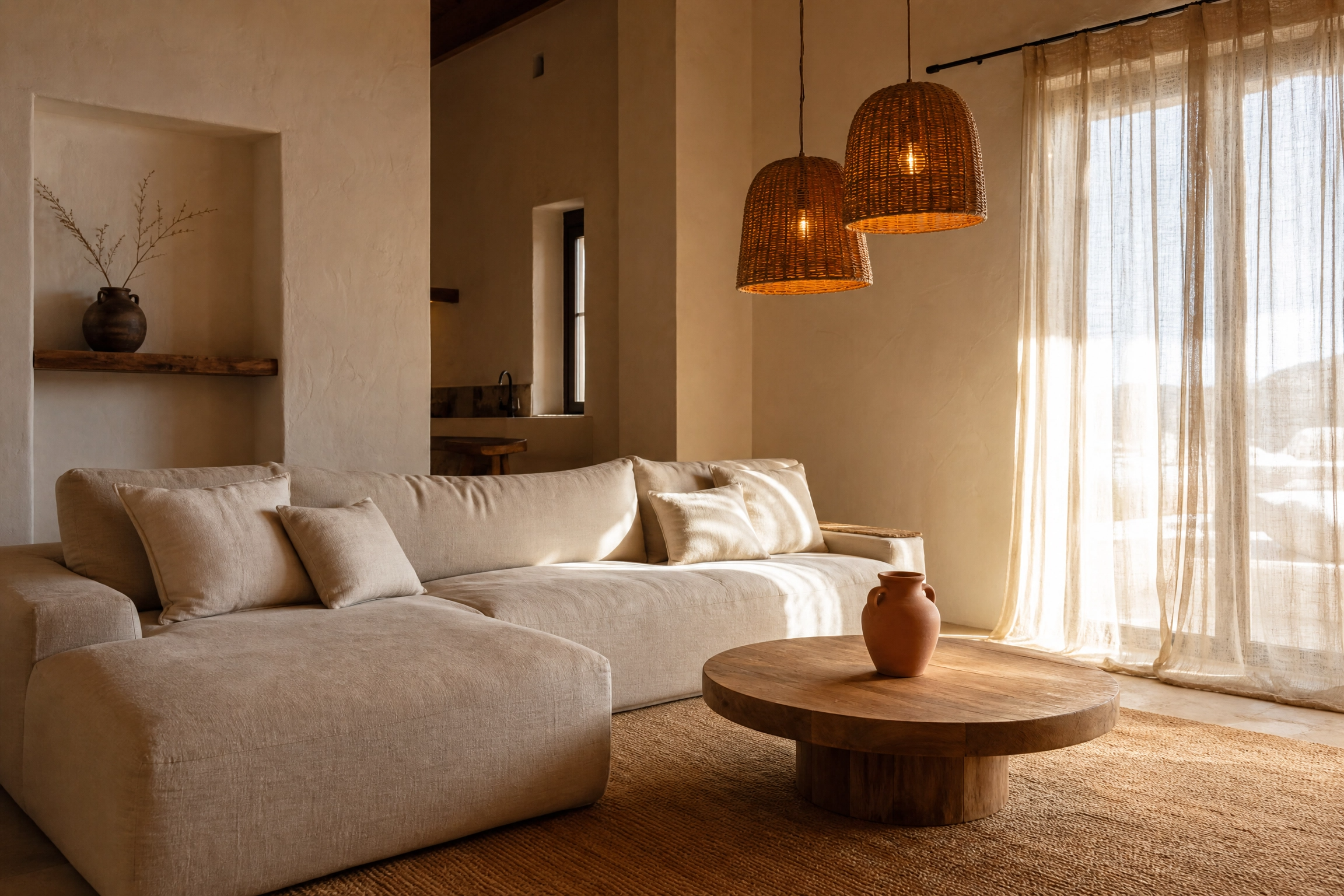
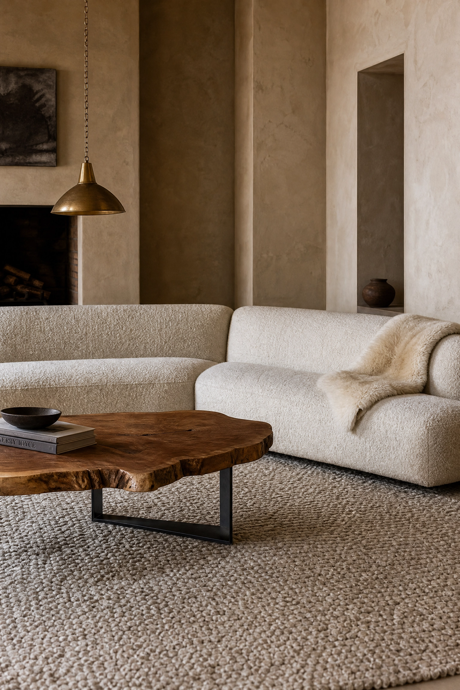
6. Natural Materials as the Main Event
One approach that feels very current and works beautifully in a minimalist framework is building the whole room around material quality rather than color or pattern. The idea is simple: a limited palette of two or three colors, but each surface has genuine material interest. A sofa upholstered in slightly nubby bouclé, a coffee table with a live-edge timber slab top on a simple steel frame, a rug in hand-knotted wool with visible texture variation, plaster walls with a slightly imperfect finish. None of these things are loud, but together they create a room that feels rich and considered. Color stays quiet, soft white or warm stone throughout, maybe a single piece of furniture in dark charcoal for contrast. This approach does lean toward the investment end of the budget because quality natural materials are not cheap. That said, one hero piece, a genuinely good rug or a solid timber coffee table, can anchor a room of more budget-friendly pieces and still make the whole thing feel elevated.
Designer Advice: When working with natural materials, odd numbers work better. Three textures, three material types. The brain reads even numbers as a list and odd numbers as a composition.
Clean and Architectural Minimalism
7. The One Sofa, One Rug, One Light Formula
Sometimes the most effective minimalist approach is also the most literal one. If your living room feels cluttered or disconnected, start by stripping it back to three anchor pieces: one sofa, one rug, one pendant or floor lamp, then build very carefully from there. The sofa should be a simple, well-made piece with clean lines and no unnecessary ornamentation. A loose-cushion sofa in a solid neutral is almost always the right call. The rug should be large enough to sit properly under the front legs of the sofa at minimum, ideally under all the legs, in a tone that complements rather than matches the sofa. The light should be a single, considered piece, a paper pendant for softness, a concrete or ceramic floor lamp for an architectural feel. From this base, you can add a coffee table and one or two small side tables, but the discipline of starting with just three items forces you to make each one a strong choice. This approach works very well in rental apartments where you cannot change the walls or floors.
Designer Advice: The biggest mistake in minimalist living rooms is a rug that is too small. A rug that floats in the middle of the room with the furniture around it rather than on it makes the whole space look accidental rather than designed.

8. A Gallery Wall Done the Minimalist Way
Most gallery walls lean maximalist by nature, but there is a version that fits perfectly within a minimalist living room. The key is consistency in the frames and restraint in the number of pieces. Five to seven pieces maximum, all in the same frame color (black, natural wood, or white depending on your palette), hung with equal spacing on a single wall. The art itself can have variety in terms of subject, but keeping it to a consistent tonal range, say all cool-toned or all warm-toned, makes the collection read as a single composition rather than a collection of different things. Black-and-white photography works particularly well in this context because it keeps the visual temperature neutral. Avoid mixing frame styles, and avoid hanging pieces that vary wildly in size. A consistent medium-large format across all pieces is the most architectural approach. This is a genuinely affordable idea because you can print your own images, use secondhand frames, and build the collection over time.
Designer Advice: Lay your gallery wall arrangement out on the floor first and photograph it. It is much easier to adjust spacing and composition on the floor than on the wall, and you avoid extra nail holes in the process.

9. Built-in Storage That Disappears into the Wall
Nothing serves minimalist living rooms better than storage that does not look like storage. Built-in shelving or cabinetry that is flush with the wall and painted the same color as the surrounding plaster is one of the cleanest approaches in contemporary interior design, and it is a principle that professional designers use in almost every high-end minimal project. The cabinet fronts become part of the wall plane, and only the objects placed on any open shelves are visible. In practice, you do not need a full renovation to achieve this effect. Flat-front IKEA PAX units painted to match the wall come very close when the skirting boards and coving are handled properly. Keep the shelves genuinely edited: a few books turned spine-in or stacked horizontally, one or two objects with real visual quality, nothing else. This approach requires ongoing discipline about what goes in the storage, but it genuinely changes the feel of a room.
Designer Advice: Paint built-in storage the exact same sheen level as the walls, not just the same color. A matte cabinet against an eggshell wall will show up even if the color matches perfectly.

10. Architectural Lighting as the Only Decoration
There is a kind of minimalist room where the furniture is almost brutally simple and the lighting does absolutely all of the decorative work, and when it is done well, it is genuinely one of the most striking approaches in contemporary interior design. The idea is to invest in one or two genuinely interesting light fittings and let everything else be quiet. A sculptural pendant in hand-blown glass or woven rattan over the coffee table, a pharmacy floor lamp with an unexpected curve or material finish, or a wall sconce that casts a geometric shadow pattern, any of these become the visual focal point of the room. The rest of the room stays almost aggressively simple: a linen sofa, a plain coffee table, smooth walls with no art. The lighting is the art. This approach works particularly well in rooms with good ceiling height and it suits people who genuinely dislike having many objects in a space but still want the room to feel special.
Designer Advice: Layer at least three light sources at different heights in a minimalist room, overhead, mid-level (table or floor lamp), and low (candles or a low side lamp). Single overhead lighting is the number-one thing that makes a minimal room feel flat.

Earthy and Nature-Inspired Minimalism
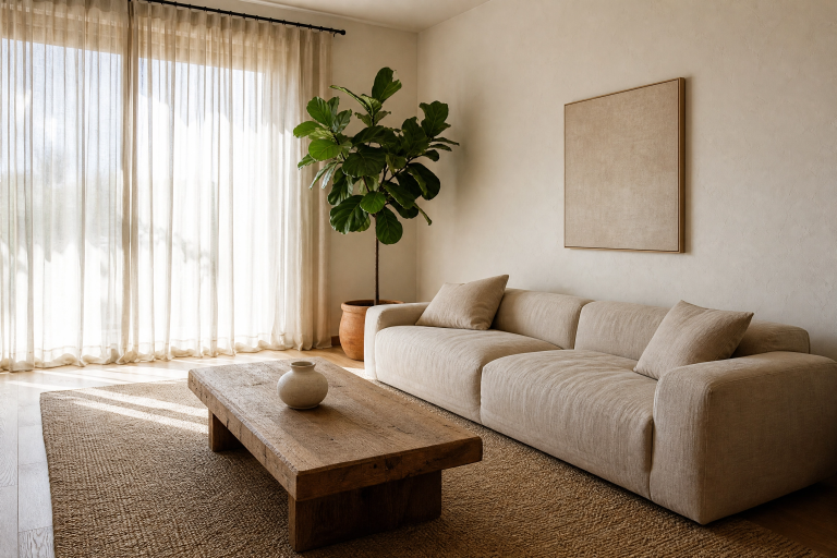
11. A Single Statement Plant as a Room Anchor
A well-chosen plant can do the work of several decorative objects in a minimalist living room, adding color, organic shape, and a sense of life without introducing clutter. The key word is single, or at most two plants, chosen for their sculptural quality rather than collected the way plant enthusiasts tend to do. A large fiddle-leaf fig in a simple matte planter, a dramatic monstera in a concrete pot, or a tall snake plant in a cylindrical black ceramic container all have enough visual presence to serve as a genuine room anchor. The planter matters as much as the plant: plain geometric shapes in matte concrete, ceramic, or stone keep the botanical element feeling intentional rather than incidental. Place it where it gets appropriate light, ideally near a window, which also keeps it framed against natural light for the best visual effect. Worth being honest: fiddle-leaf figs in particular can be fussy, dropping leaves in response to drafts or inconsistent watering. If you want the look without the maintenance anxiety, a large monstera or ZZ plant is far more forgiving.
Designer Advice: Choose a planter that is slightly larger than you think you need. A plant that looks like it belongs in the space is almost always in a pot that is one size bigger than the default option.

12. Stone and Concrete Textures as Focal Points
Raw stone and concrete have become some of the most desirable surface finishes in contemporary minimalist interiors, and the reason comes down to visual weight. Both materials carry a sense of permanence and honesty, two qualities that minimalism as a design philosophy genuinely values. A concrete coffee table with a smooth polished finish, a stone side table, or a fireplace surround in unfaced limestone can anchor a minimalist room in a way that timber and upholstery simply cannot. The palette around these elements should stay in the cool-neutral range, pale grey walls, a sofa in warm charcoal or smoke-grey fabric, and simple white or smoked-glass pendant lighting. Accessories should be kept to an absolute minimum, a small ceramic dish, a single candle, a book. The material does the talking. The honest note here: genuine stone furniture is heavy, expensive, and hard to move if you change your mind about placement, so make sure you are committed before investing. Concrete-effect porcelain tiles or resin finishes can give a similar look at a fraction of the cost and weight.
Designer Advice: Balance the visual coldness of stone and concrete with at least one genuinely warm element, a sheepskin throw, a lamp with a warm-toned bulb, or a cushion in a natural wool. Without it, the room tips from minimal into austere.

13. A Neutral Room with One Bold Organic Shape
One of the most effective ways to bring personality to a minimalist room without adding more objects is to let one piece of furniture or decor make a genuinely bold shape statement. This could be a kidney-shaped coffee table in solid marble, an asymmetric sculptural vase on a shelf, a sofa with a dramatically curved arm, or a pendant light in an irregular organic form. Everything else in the room stays simple and rectilinear so the single curved or organic piece reads clearly against the quiet background. Color stays fully neutral throughout, which means the drama is entirely in the shape, not the palette. This is a very considered approach that requires patience because it does not work if there is too much else competing for attention. In practice, one organic statement piece in an otherwise very restrained room tends to stop people in their tracks, which is exactly the point.
Designer Advice: Organic and curved shapes read best in rooms that have strong horizontal and vertical lines elsewhere. The contrast is what makes the curve interesting. In a room that is already soft and round, it just gets lost.

Functional and Smart Minimalism
14. Multi-Purpose Furniture That Hides in Plain Sight
Functional minimalism is the approach that makes the most sense for people who genuinely live in their living rooms rather than just looking at them, and the central idea is that every piece of furniture should do at least two things. An ottoman that doubles as a coffee table and hidden storage, a sofa with a pull-out bed for guests, a media console that also houses the router, printer, and any other equipment that would otherwise sit on display, a nest of side tables that tuck away when not in use. The visual result is the same quiet, uncluttered aesthetic, but the room actually works harder. The materials and colors should still follow the core minimalist principles: clean lines, neutral tones, quality over quantity. The difference is that the simplicity is engineered rather than just aesthetic. This approach works especially well in smaller living rooms and apartments where every square foot needs to justify itself. Budget note: multi-purpose furniture tends to cost more upfront than single-use pieces, but the longer-term value is usually justified.
Designer Advice: When choosing a storage ottoman as a coffee table, measure carefully. The ideal coffee table height is roughly the same as or slightly lower than the seat height of your sofa. Most ottomans hit this perfectly, but check before buying.

15. A Curated Bookshelf That Reads as Art
A bookshelf in a minimalist living room requires a completely different approach to how most people style shelves, and when it is done well, it becomes one of the most personal and interesting elements in the space. The principle is to treat each shelf as a small composition rather than a storage solution. Books are organized by color grouping or all turned spine-in for a uniform look, leaving deliberate breathing room between groups. One or two objects per shelf, chosen for their shape and material quality rather than their sentimental weight, sit alongside the books. A small ceramic, a smooth stone, a single dried stem in a slim vase. The shelf itself should be simple, a wall-mounted floating shelf in white or pale oak rather than a large standalone bookcase, which tends to dominate a minimal room. The result looks more like a gallery installation than a bookshelf, which is exactly what a minimal room needs: quiet interest rather than loud decoration.
Designer Advice: Edit your bookshelf down to books you actually want visible. Remove anything with a cover that fights with your palette. The books that remain should look like they were chosen, not like they were there by default.

16. A Monochromatic Room With Texture as the Variable
A fully monochromatic living room, where walls, furniture, rug, and accessories all sit within the same color family, is one of the most sophisticated approaches to minimalist decorating and also one of the most commonly attempted incorrectly. The mistake is making everything the same tone and finish, which just reads as dull. The correct approach keeps everything within one color family but varies the shade, material, and finish at every level. Soft white walls in matte plaster, a sofa in a slightly deeper cream boucle, a rug in a warm ivory with visible hand-knotting texture, cushions in a cool linen white, side tables in bleached timber. The monochrome palette unifies the room while the material variation creates depth and genuine visual interest. This approach is very forgiving of mixing pieces from different sources because the color consistency pulls everything together. It is also a very good background for hosting because the room adapts to different kinds of lighting and seasons well.
Designer Advice: The success of a monochromatic room lives or dies on the quality of the textiles. This is where to spend the budget. A genuinely well-made rug and cushion covers make a cheap sofa look expensive. The reverse is rarely true.

17. Handleless Cabinetry and a Floating Media Wall
The floating media wall is one of those features that looks complex and expensive but can be approached at a range of budget levels, and it does more for a minimalist living room than almost any other single change. The concept is a wall-mounted television with all the cable management handled behind the wall or through a slim trunking system, flanked by handleless cabinetry or floating shelves at the same height. The television blends into the composition rather than sitting on a stand and dominating the room. When the cabinetry is painted the same color as the wall, the whole arrangement recedes and the room gains a calm, architectural quality. Color throughout should stay in a quiet neutral, warm white or pale greige for a softer look, cooler grey for a more contemporary one. A single pendant or a pair of wall sconces at either side of the media wall create symmetry and add the layered lighting the room needs. Be honest: hiding cables properly requires either routing them through the wall cavity, which needs a professional, or accepting a slim cable trunking channel, which is a more budget-friendly compromise.
Designer Advice: If your budget does not allow for built-in cabinetry around the television, a single wide, low media console in a quality timber or lacquer finish with the television wall-mounted directly above it achieves a very similar minimal effect at a fraction of the cost.

18. Minimal Art With Maximum Impact
The relationship between art and minimalism is interesting because minimalism does not mean no art. It means art that has been chosen with real intention. A single large-format piece, a canvas that takes up most of a wall, or a framed artwork at least 100cm in the longest dimension, has far more presence and far less visual noise than six smaller pieces scattered around the room. Scale is the key variable that most people get wrong with art in minimal spaces. The subject can vary: abstract works in muted or earthy tones work well, as do large-scale black-and-white photographs or simple gestural drawings. The frame, if there is one at all, should be as thin as possible, a slim black metal float frame or a simple gallery wrap with painted edges. Hang the piece slightly lower than traditional rules suggest, so that the center of the work is roughly at eye level when seated rather than when standing. This grounds the artwork in the room and makes the whole composition feel more relaxed.
Designer Advice: When buying art for a minimal room, go bigger than feels comfortable. A piece that feels almost too large when you buy it almost always looks exactly right on the wall. A piece that feels comfortably sized usually looks too small once it is hung.
19. A Reading Nook That Earns Its Place
A dedicated reading nook within a minimalist living room is one of those additions that adds genuine function and warmth without introducing clutter, provided it is considered rather than casual. The formula is straightforward: one good armchair in a quality upholstery, a slim side table at the right height for a cup of tea, a floor lamp positioned directly behind and to the side of the chair for task lighting, and a small basket or open-front box on the floor for the current book and a folded throw. Nothing else belongs in this corner. The armchair should complement the sofa without matching it exactly, slightly different in tone or silhouette but harmonious in material or color family. A mid-century modern accent chair in a warm tweed or boucle works particularly well alongside a simple linen sofa. The floor lamp should have a directed light source, an adjustable arm or a shade that focuses the light downward, because reading in ambient light is hard on the eyes and a directed reading lamp is one of the most practical investments in a well-used living room.
Designer Advice: The reading nook corner benefits from a small rug underneath it, distinct from the main living area rug. Even a simple sheepskin or a small jute circle creates a defined zone that makes the nook feel intentional rather than incidental.

Final Thoughts
Minimalist living rooms work best when the simplicity is a reflection of actual decisions rather than a result of not knowing what to add. Every one of these 19 ideas comes back to the same principle: choose a few things that genuinely work, and let them do the job properly. Whether that means investing in one quality material, getting the lighting right, or committing to a single art piece with real scale, the impact comes from clarity rather than abundance. You do not need to implement all of these ideas at once. In fact, most successful minimalist rooms are built slowly, one considered choice at a time. Start with the foundation: color, lighting, and one anchor furniture piece. Build carefully from there, and resist the pull to fill every surface. The rooms that feel most genuinely calm are the ones where someone said no quite a few times before they were finished.
Frequently Asked Questions
How do I make a minimalist living room feel warm and not cold?
The shift from cold to warm in a minimalist room usually comes down to material choice and lighting color temperature. Natural materials like linen, wool, timber, and rattan all add warmth without visual noise. Swap cool-white bulbs for warm-white ones in the 2700K range, and rely more on floor lamps and table lamps than overhead lighting. A few terracotta or earthy accents, even just a couple of ceramic objects, will shift the room’s temperature considerably.
What colors work best for a minimalist living room?
Warm whites, soft greiges, sandy beiges, and muted stone tones are the most reliable choices because they reflect light well and work with a wide range of furniture finishes. If you want more depth, a deep charcoal or navy can work beautifully as a full-room color in a minimalist space, provided the lighting is planned carefully. The rule of thumb is to stay within a three-color palette where two of the three are neutrals.
How do I add personality to a minimalist living room without making it look cluttered?
Personality in a minimal room comes through in the materials and the quality of individual pieces rather than in the number of objects. A genuinely interesting lamp, one well-chosen piece of art, a rug with real texture, a plant with a sculptural silhouette. Pick a few things that mean something or that are genuinely beautiful, and give them the space to be seen. A single interesting object in a quiet room always reads better than ten objects competing for attention.
What furniture should I avoid in a minimalist living room?
Anything with heavy ornamentation, thick scrolled legs, or busy patterns tends to fight with the clean lines that minimalism relies on. Oversized sectionals in small rooms, glass-top coffee tables that feel visually fragile, and matching furniture sets that look like they came out of a showroom all tend to work against the style. The goal is furniture that has a clear purpose, a clean silhouette, and material quality that holds up to close inspection.
Is minimalism a good approach for small living rooms?
Minimalism is actually one of the most practical approaches for small living rooms because it prioritizes negative space, which directly affects how large a room feels. Low-profile furniture keeps sightlines clear, a limited number of pieces prevents the room from feeling cramped, and multi-purpose furniture means you get full functionality from a smaller footprint. The one caveat is that small minimalist rooms require good storage solutions to function, because clutter is more visible when there is less competing with it.
How much does it cost to decorate a minimalist living room?
The range is genuinely wide. A minimal living room can be achieved on a tight budget by focusing on decluttering, painting the walls, and making a few key purchases from secondhand markets or affordable retailers. At the other end, a high-end minimalist room with quality natural materials, custom built-ins, and investment-level furniture can cost significantly more than a busier room with the same footprint. The principle that helps here is to spend well on the things that get the most visual and physical use (the sofa, the rug, the main light fitting) and be more budget-conscious with everything else.