Living Room Color Schemes That Actually Come Together
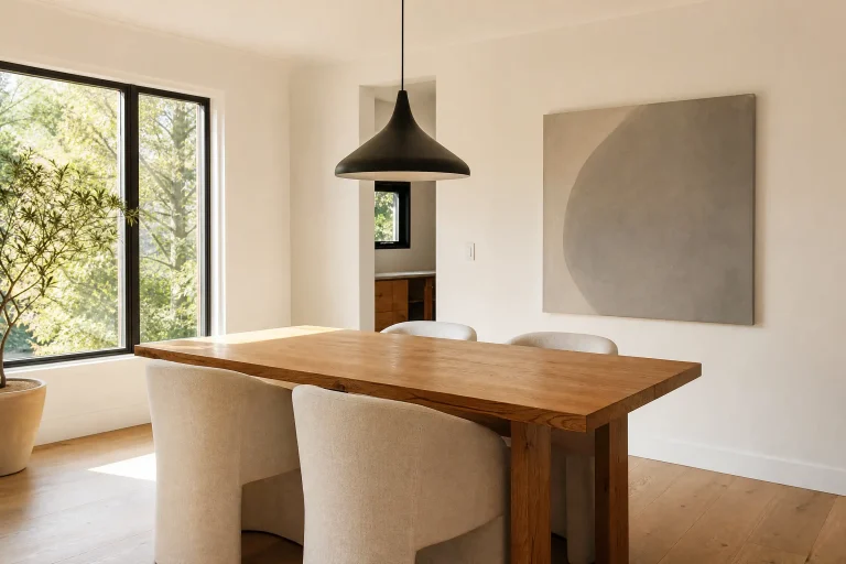
Choosing a living room color scheme sounds simple until you are standing in the paint aisle wondering why the combination that looked perfect on your phone looks wrong in your actual room. The color is rarely the problem. The proportions, the materials, and the light are. Understanding those three factors makes the paint aisle considerably less stressful.
These 28 schemes go beyond naming a color. Each one shows you exactly how to distribute it, what to put alongside it, and what to avoid so the whole room comes together the way you pictured it.
1. Warm White and Natural Wood with One Green Accent
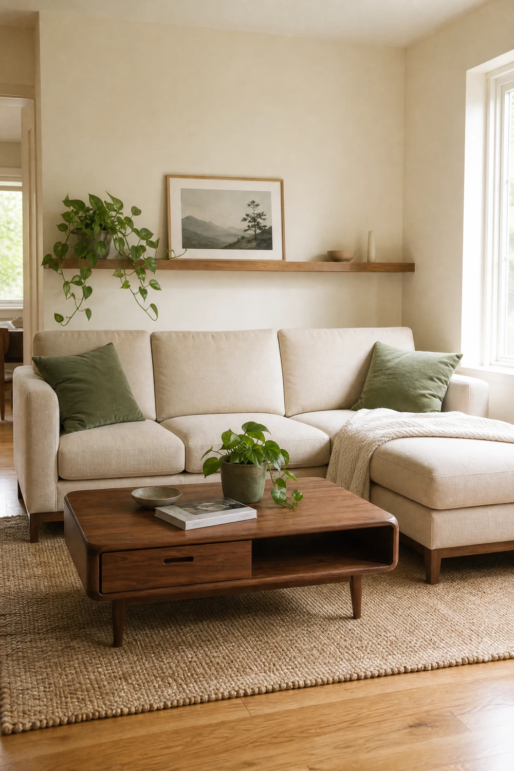
This is the most reliably successful living room color scheme of the current decade because it works in almost every light condition, suits every furniture style, and never reads as dated. Warm white on 60 percent of the visual space, natural oak or walnut wood on the floor and one key furniture piece for 30 percent, and sage or olive green in cushions, a throw, and one plant for the final 10 percent.
Reality Check: The white must be warm. Bright white or cool white walls make this scheme cold and sterile rather than calm. Look for whites with a yellow or pink undertone, such as Farrow and Ball All White, Benjamin Moore White Dove, or Sherwin-Williams Alabaster. Test a paint sample on the actual wall before committing.
2. Sage Green and Cream with Brass and Warm Wood
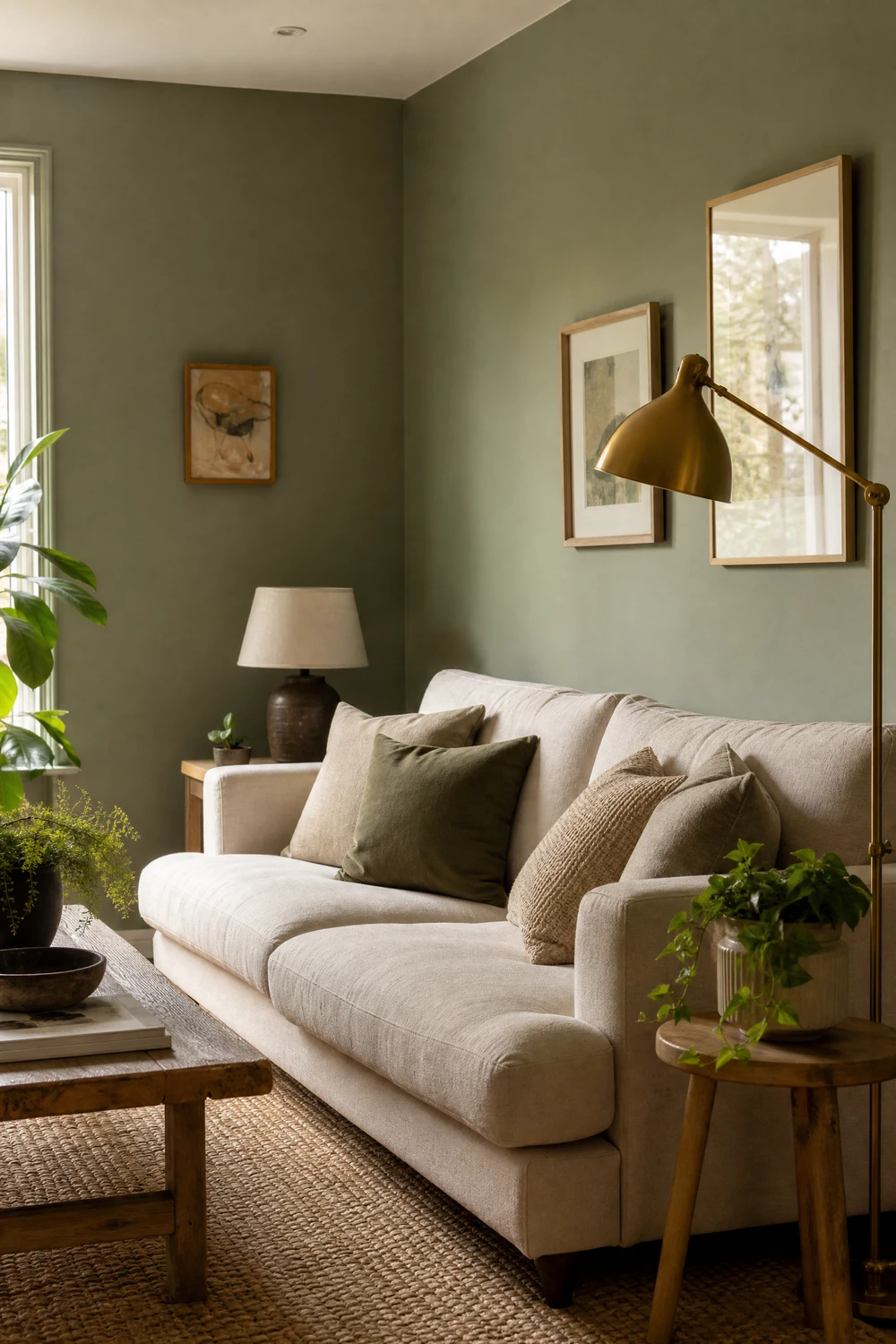
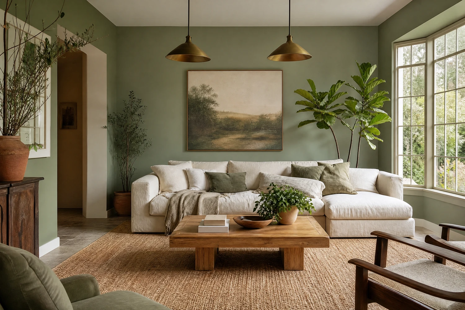
Sage green on the walls at 60 percent, cream or warm ivory on the sofa and soft furnishings at 30 percent, and warm brass in lamp bases, picture frames, and cabinet hardware at 10 percent creates one of the most widely loved living room schemes of 2025 and 2026. The brass pulls warmth out of the sage and stops it from reading as cool or clinical, while the cream sofa keeps the room from feeling heavy.
Pro Move: Sage green absorbs light, so a room that faces north or gets limited natural light needs a sage with a higher LRV than 35. Clary Sage by Sherwin-Williams at LRV 41 and Muted Sage by Benjamin Moore are good options for lower-light rooms. Save the deeper, moodier sages for south-facing rooms with plenty of natural light.
3. Navy Blue and Warm White with Natural Brass
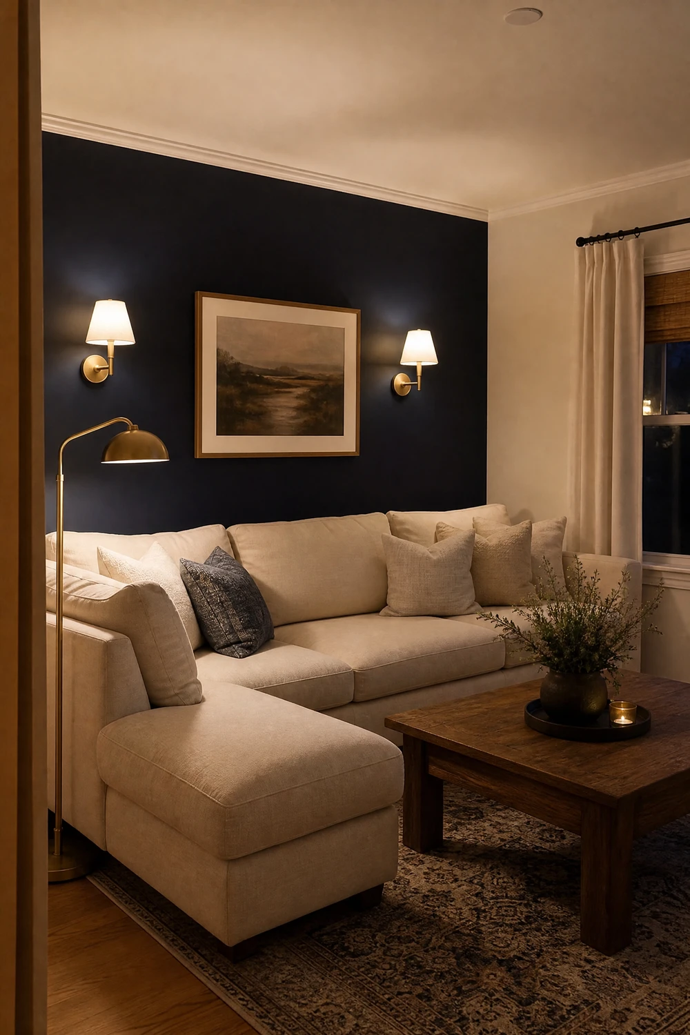
Navy on one accent wall or as the dominant color on the sofa, warm white on the walls and ceiling, and natural unlacquered or brushed brass in fixtures, lamps, and hardware creates a scheme that reads as classic, confident, and endlessly adaptable. The brass is the key element that prevents navy from reading as cold or corporate and gives the whole room warmth and richness.
Designer Advice: If using navy on the walls rather than as an accent, go all in and use it on all four walls and the ceiling in the same shade. A room where navy is on three walls and the fourth is white looks unfinished. Full commitment to navy creates an enveloping, cocooning effect that reads as designed rather than uncertain.
4. Terracotta and Cream with Olive Green and Natural Materials
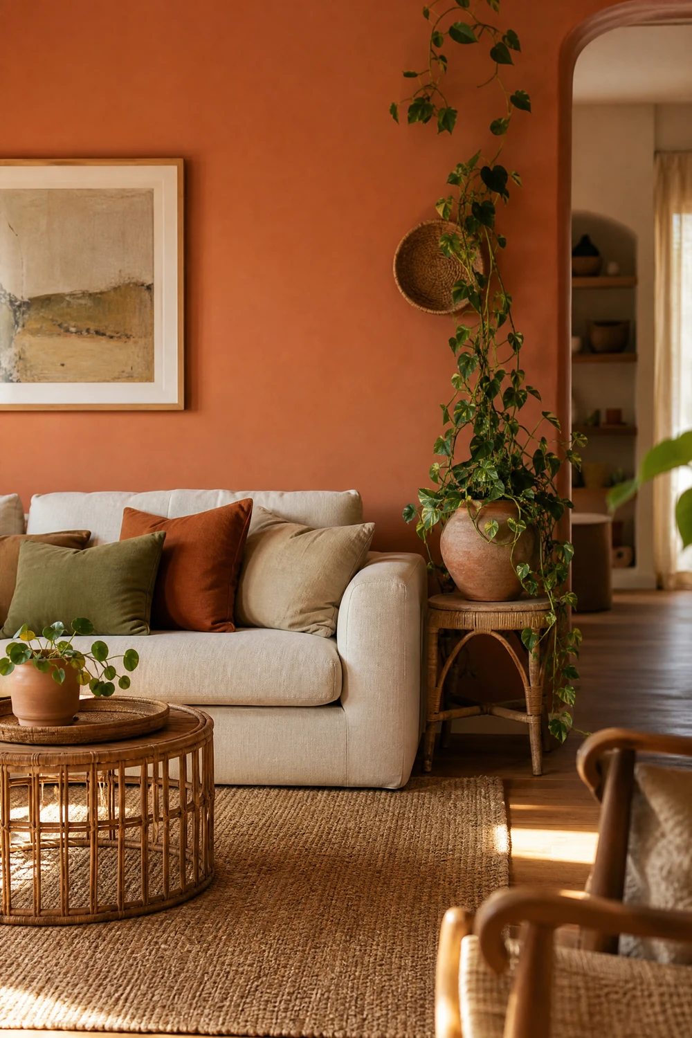
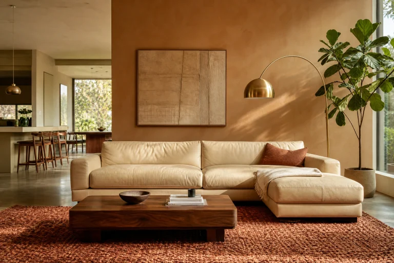
Terracotta at 60 percent, whether on the walls, a statement sofa, or large-scale ceramics and planters, paired with cream textiles at 30 percent and olive green in cushions, throws, and plants at 10 percent creates a scheme that feels warm, grounded, and Tuscan without being kitschy. The natural materials that complete it, jute rugs, rattan accessories, and raw linen, tie the earthy tones together and keep the room from looking like a themed space.
Quick Tip: Terracotta works best in rooms with warm afternoon light. In a north-facing or cool-lit room, terracotta can read as muddy rather than warm. If your room gets limited sun, shift the terracotta toward a pinker clay tone rather than an orange-red one to keep it looking alive.
| Color Scheme | Dominant (60%) | Secondary (30%) | Accent (10%) |
| Warm white and wood | Warm white walls | Natural wood floor and furniture | Sage green in textiles |
| Sage and cream | Sage green walls | Cream sofa and soft furnishings | Warm brass hardware and lamps |
| Navy and white | Navy accent wall or sofa | Warm white walls and ceiling | Brass fixtures and frames |
| Terracotta and cream | Terracotta walls or key pieces | Cream linen textiles | Olive green in plants and cushions |
| Moody charcoal | Deep charcoal walls | Warm white trim and ceiling | Cognac leather and amber glass |
5. Warm Charcoal and Cognac Leather with Amber and Brass
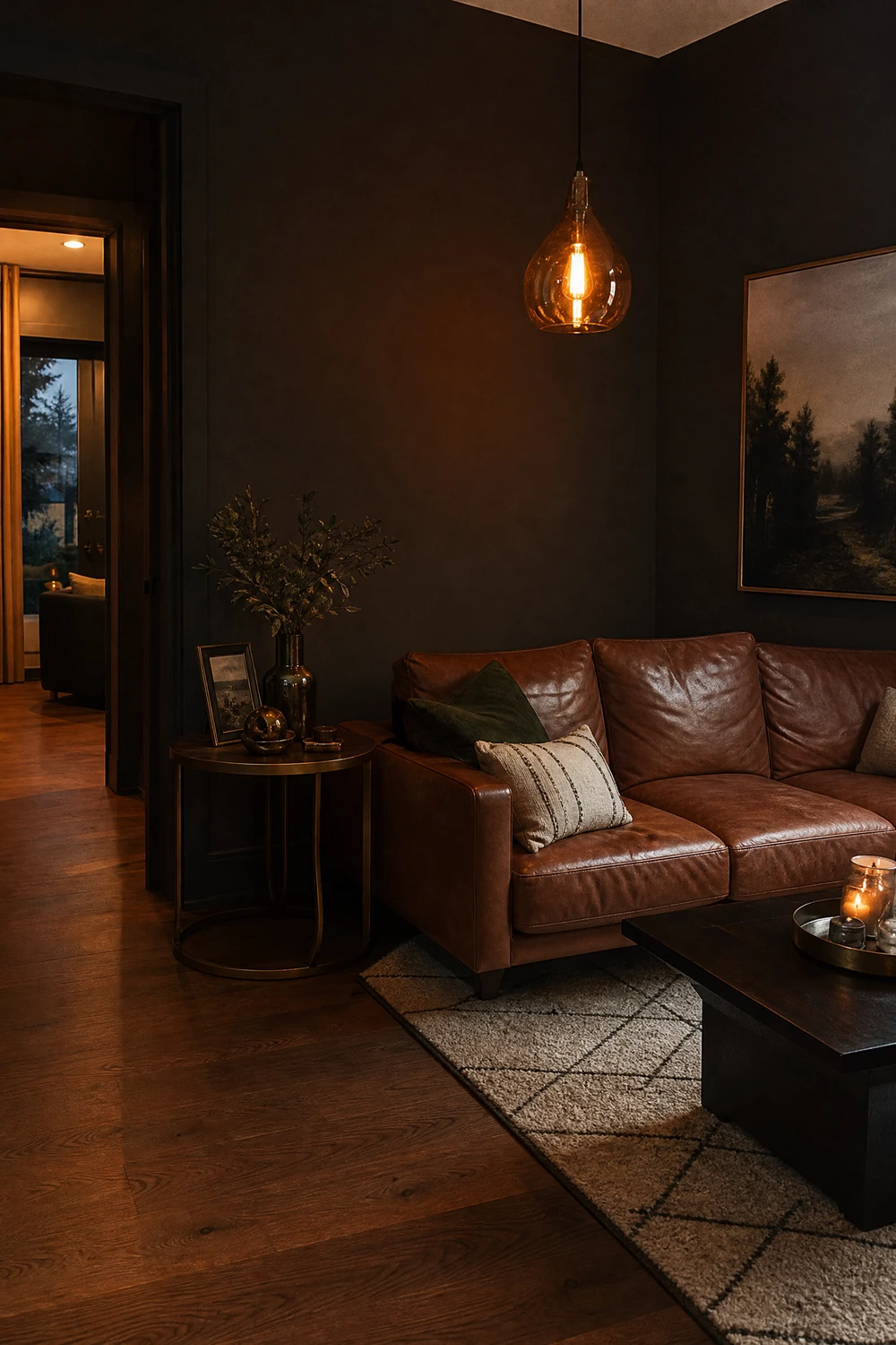
Deep charcoal or dark slate gray on all four walls, a cognac or caramel leather sofa as the anchor, and amber glass lighting, brass hardware, and warm wood floors as the supporting elements creates one of the most enveloping living room schemes available. The warmth of the leather and amber prevents the dark walls from feeling oppressive, and the whole room takes on a quality like a considered whisky bar at golden hour.
Heads Up: Dark wall schemes require significantly more lighting than light-colored rooms because the walls absorb rather than reflect light. Plan for at least three light sources at different heights: floor lamp, table lamp, and either wall sconces or pendant lighting. A dark room with one overhead light feels like a cave.
6. Dusty Blue and Warm White with Terracotta Accents
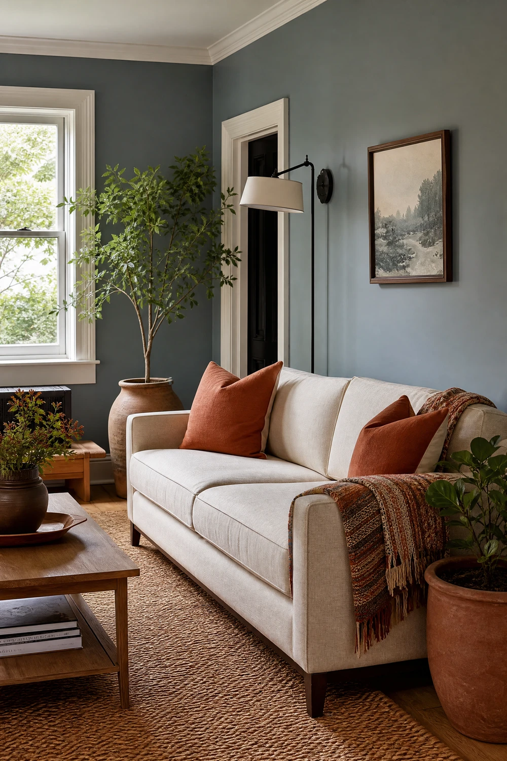
A muted, dusty blue at LRV 40 to 55 on the walls, warm white on trim and ceiling, and terracotta introduced through cushions, a ceramic lamp, a woven rug with warm tones, and clay pots for plants creates a scheme that balances cool and warm in a way that feels genuinely well-resolved. The terracotta is the critical piece: without it, dusty blue and white reads as a bathroom; with it, the room has warmth, depth, and personality.
Designer Advice: The terracotta in this scheme should never be a wall color. Keep it entirely in moveable objects: cushions, ceramics, throws, and plants. This way the scheme reads as a considered dusty blue room with warm accents, rather than two competing wall colors fighting for dominance.
7. Warm Beige and Chocolate Brown with Cream and Caramel
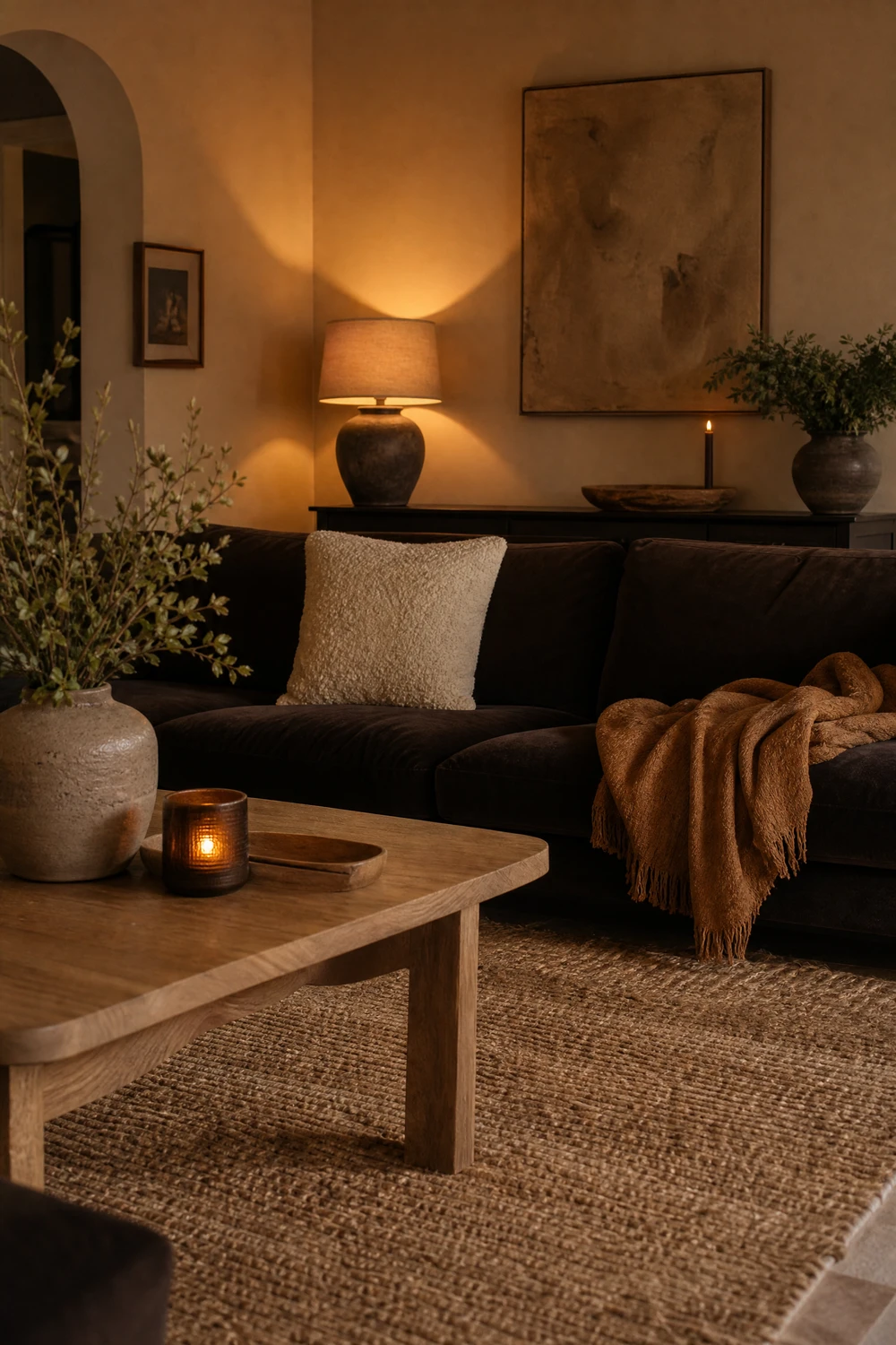
A tonal scheme built entirely within the warm brown family, with beige or greige at 60 percent, chocolate brown in a velvet sofa or coffee table at 30 percent, and lighter caramel and cream tones in cushions, throws, and rugs at 10 percent, delivers the cocooning, rich earthiness that professional designers have been forecasting as the defining palette of 2026. The key is ensuring enough contrast between the tones so the room reads as layered rather than muddy.
Reality Check: Monochromatic brown schemes fail when all the tones are too similar in lightness and darkness. You need at least three clearly distinguishable values: a light (cream or pale beige), a mid (warm beige or tan), and a dark (chocolate or espresso). Without a genuine dark anchor, the room reads as washed out.
8. Forest Green and Off-White with Dark Wood and Brass
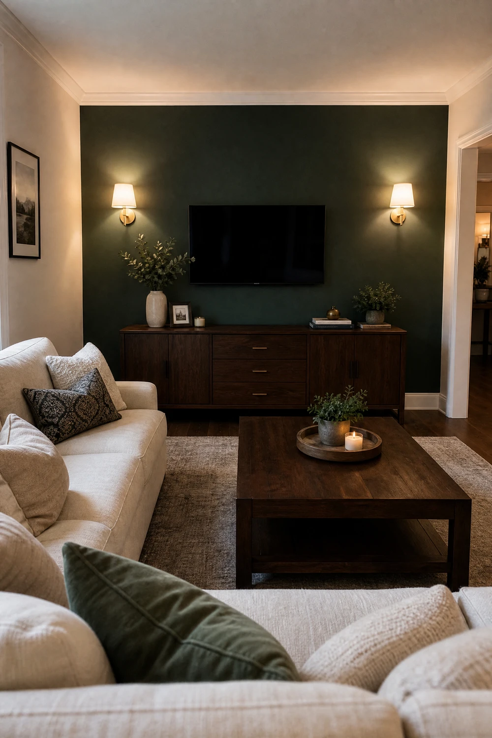
Deep forest green on one feature wall, a fireplace surround, or large built-in shelving, paired with off-white walls on the remaining surfaces, dark walnut or ebonized wood furniture at 30 percent, and warm brass in lighting and hardware creates a scheme that feels simultaneously traditional and contemporary. The green grounds the room, the dark wood gives it depth, and the brass keeps the whole palette from reading as too serious or cold.
Pro Move: Forest green on a single wall works best when it is the wall the sofa faces, not the wall behind the sofa. The feature wall should be what you look at from your main seating position, not what sits behind your head, where it loses all its impact.
9. Warm Gray and Blush with Matte Black Accents
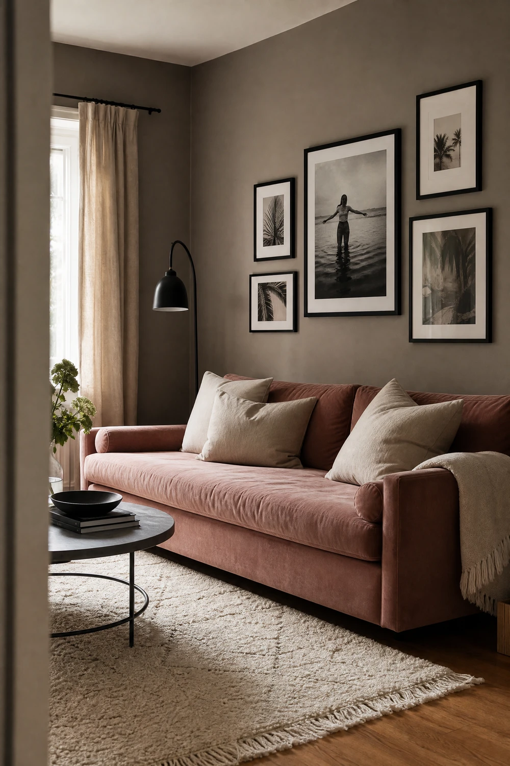
A warm gray at 60 percent on the walls, blush pink introduced through a velvet sofa, cushions, or a large abstract artwork at 30 percent, and matte black in a floor lamp, picture frames, coffee table legs, and plant stands at 10 percent gives the room a contemporary editorial quality that sits comfortably between feminine and modern. The matte black is the element that prevents this scheme from tipping into overly soft or saccharine territory.
Quick Tip: Choose a gray with a clear warm or pink undertone for this scheme, not a cool blue-gray. Cool grays next to blush pink create an uncomfortable visual clash because the gray pulls blue while the blush pulls pink-red. Agreeable Gray by Sherwin-Williams and Pale Oak by Benjamin Moore both have the right warmth.
10. All-Cream Monochromatic with Textured Layers
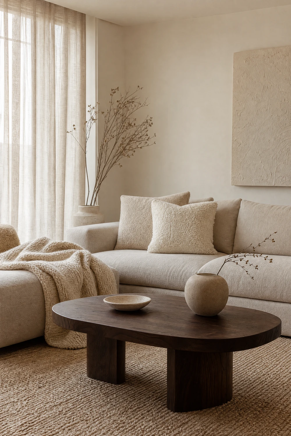
A monochromatic cream scheme uses a single warm cream family across walls, sofa, curtains, and rug, but succeeds through radical variation in texture rather than color. Smooth plaster walls, bouclé cushions, a chunky knit throw, a flat-woven linen sofa, a jute rug, and a stone or concrete coffee table all exist in the same cream-to-oatmeal range but create visual richness through the way each surface catches and holds light differently.
Designer Advice: A monochromatic cream scheme needs one dark anchor to prevent it from reading as a blank canvas. A single dark walnut coffee table, a set of dark picture frames, or a matte black floor lamp gives the eye something to land on and makes everything else look more intentional by contrast.
| Scheme Type | Key Risk | How to Avoid It |
| Monochromatic cream | Reads flat and formless | Vary texture aggressively, add one dark anchor |
| Terracotta dominant | Feels orange and muddy in poor light | Use clay-pink tone in north-facing rooms |
| Navy all-over | Feels oppressive without enough light | Plan for 3+ layered light sources |
| Warm gray and blush | Gray pulls too cool next to pink | Choose gray with warm or pink undertone |
| Forest green feature wall | Wall behind sofa loses all impact | Put feature wall where you look, not sit |
| Dark charcoal all-over | Room feels like a cave | Add ambient, task, and accent lighting |
11. Teal and Warm White with Natural Wood and Rattan
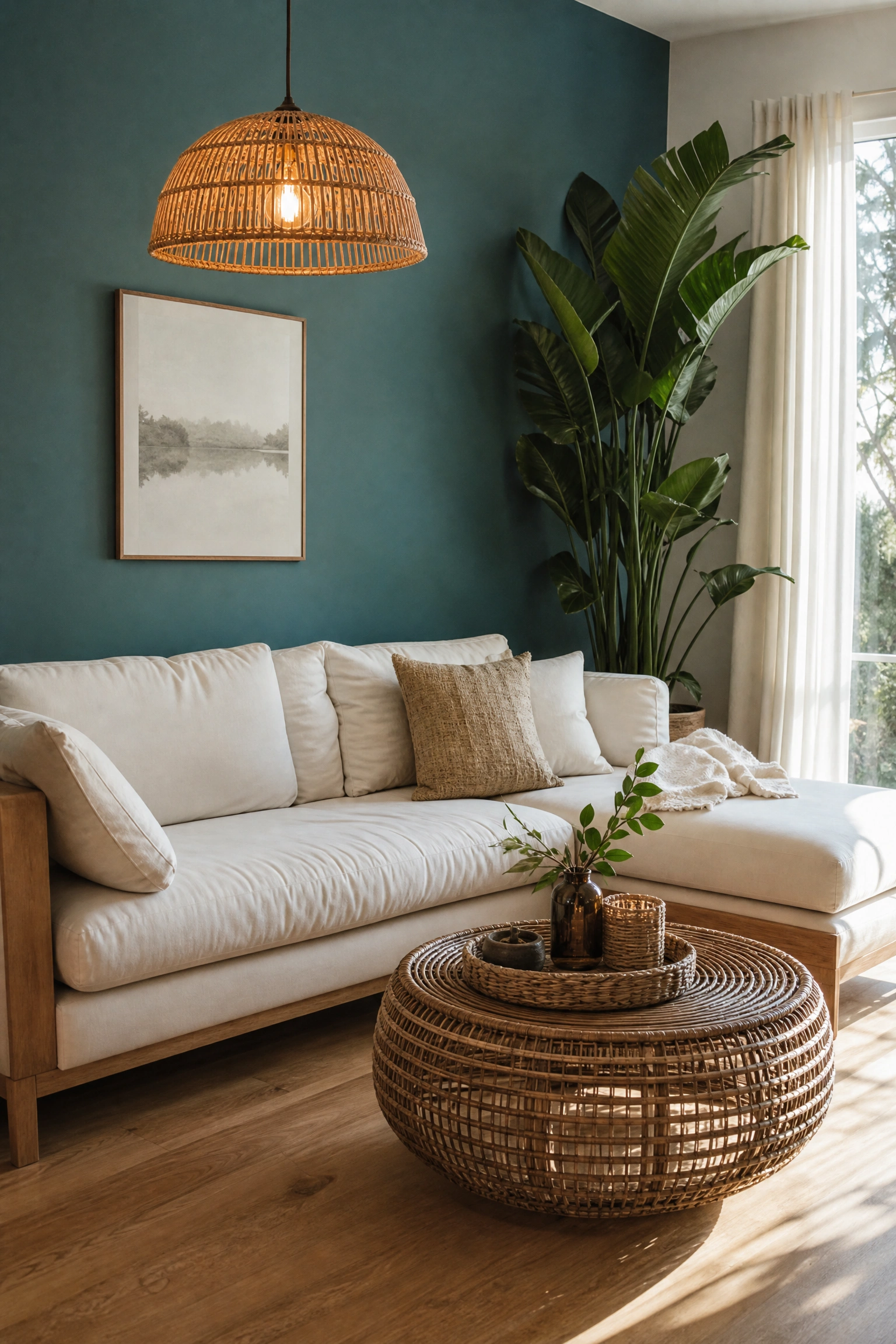
Teal, the blue-green hybrid that sits confidently between both color families, works as a wall color or sofa color at 60 percent against warm white walls or ceiling at 30 percent, with natural wood, rattan, and woven accessories at 10 percent to ground it in organic warmth. Teal is one of the few colors that reads as both calming and bold simultaneously, which makes it a strong choice for living rooms where you want personality without drama.
Heads Up: Teal shifts dramatically under different light temperatures. Under warm yellow-toned bulbs it pulls green; under cool daylight-balanced bulbs it pulls blue. Before painting a wall or choosing a teal sofa, check the color in your room at different times of day and under your actual light bulbs, not in the store.
12. Plaster Pink and Raw Linen with Soft Bronze
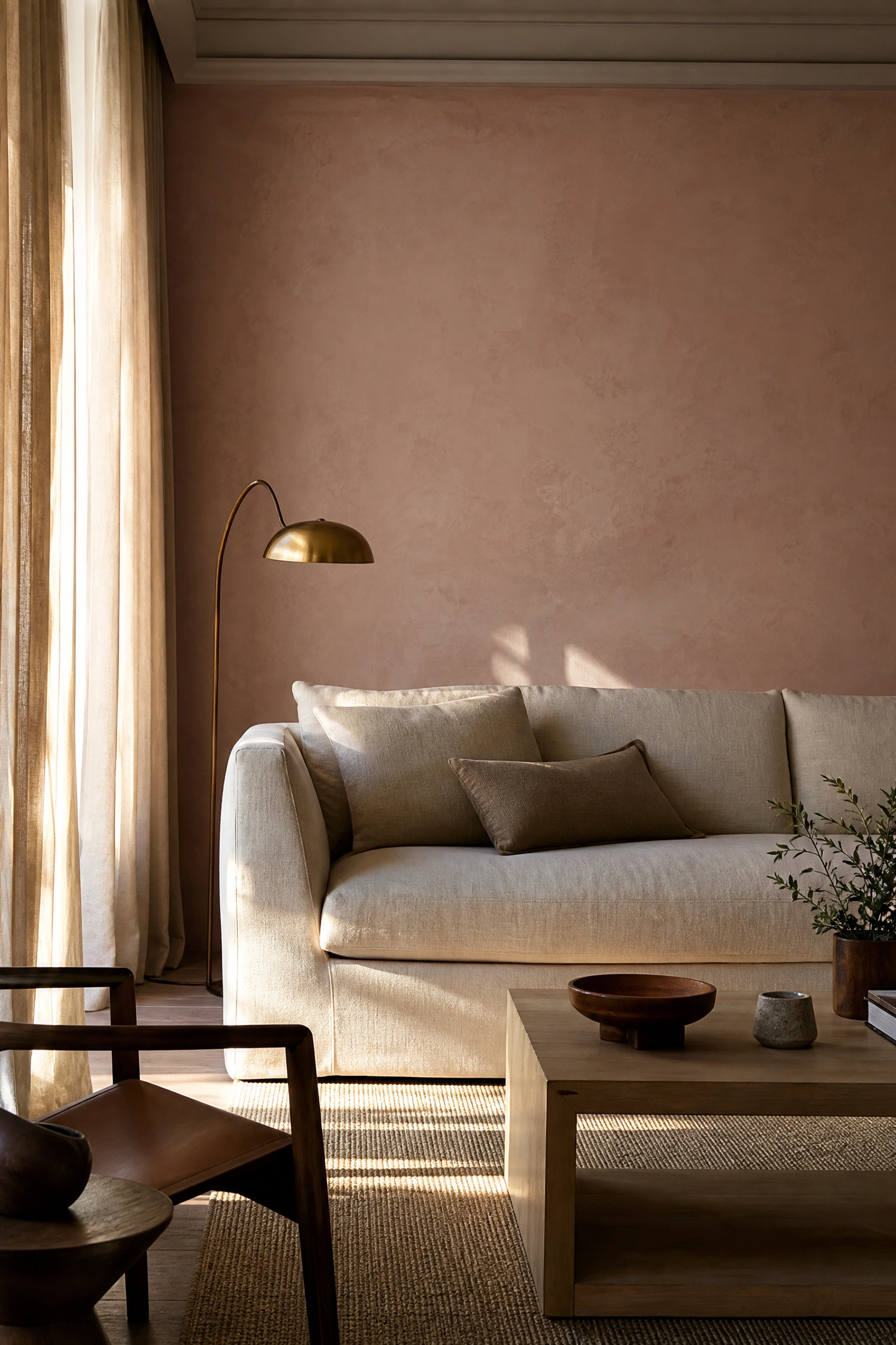
A plaster or dusty rose pink, something muddied with gray undertones rather than a true bubble-gum pink, at 60 percent on the walls, raw undyed linen in the sofa and curtains at 30 percent, and soft bronze or antique gold in lamp bases, vases, and picture frames at 10 percent creates a scheme that designers describe as contained warmth. Farrow and Ball Dead Salmon and Setting Plaster are often cited as the benchmark colors for this approach.
Reality Check: Plaster pink reads very differently at different times of day. In morning light it tends to look pale and gray; in afternoon light it glows warm and pink; in evening lamplight it deepens to an almost terracotta tone. This is actually a feature of the color, not a problem, but it means you should live with a sample for several days before committing.
13. Cobalt Blue and Warm White with Yellow and Brass Accents
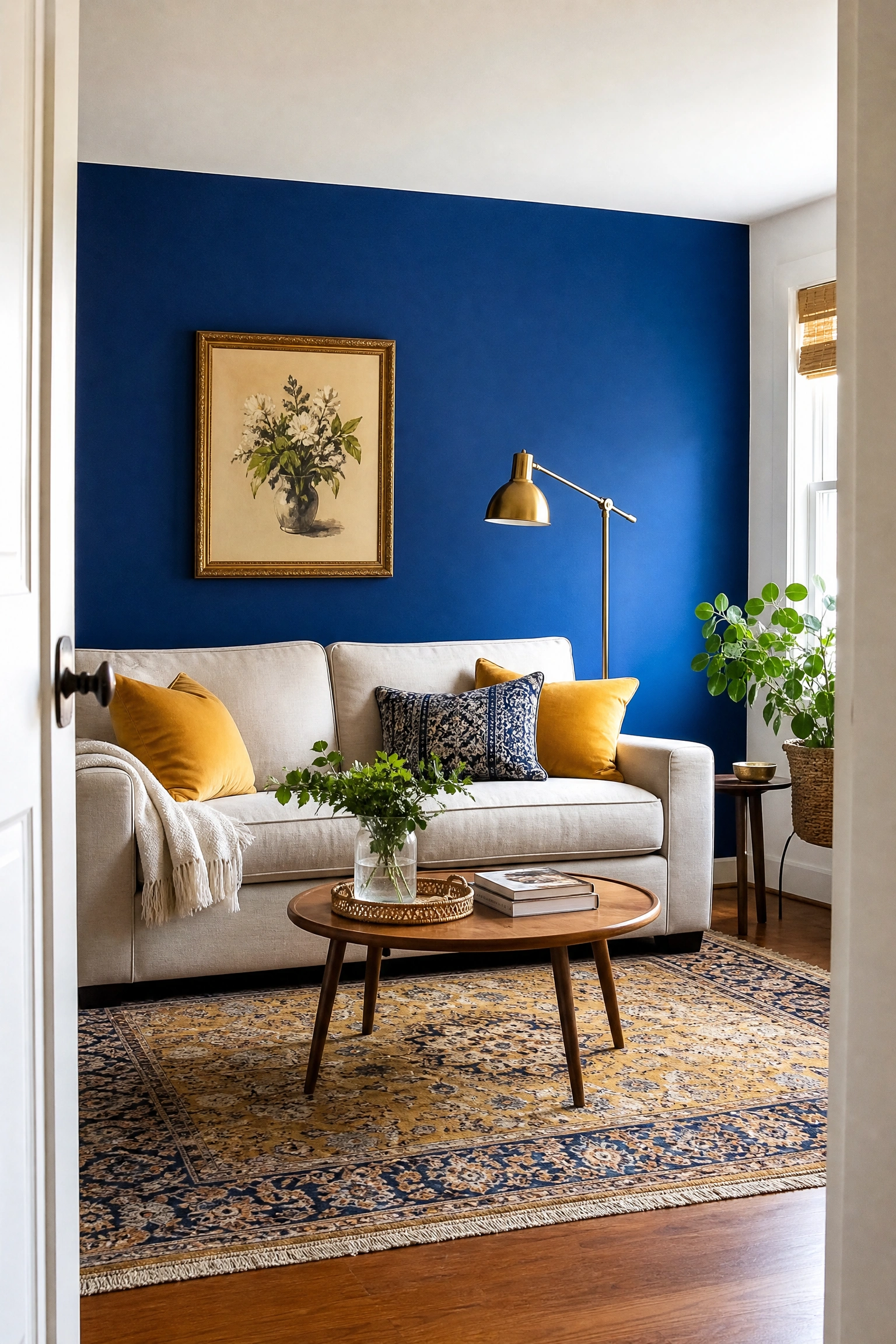
A saturated cobalt or French blue at 60 percent used on an accent wall or as a bold sofa color, against warm white walls at 30 percent, and warm yellow in cushions, a ceramic lamp, or a vintage rug at 10 percent, with brass hardware throughout, creates a scheme that feels deliberately joyful, optimistic, and globally influenced. This is the scheme that most reads as personal and particular rather than trend-driven.
Pro Move: Cobalt is a high-saturation color that needs to breathe. Pair it with only warm white, not pure bright white, on the surrounding surfaces. Bright white next to cobalt creates a harsh contrast that reads as graphic and commercial. Warm white softens the cobalt and makes the whole scheme feel more residential and livable.
14. Olive Green and Brown Leather with Warm Cream
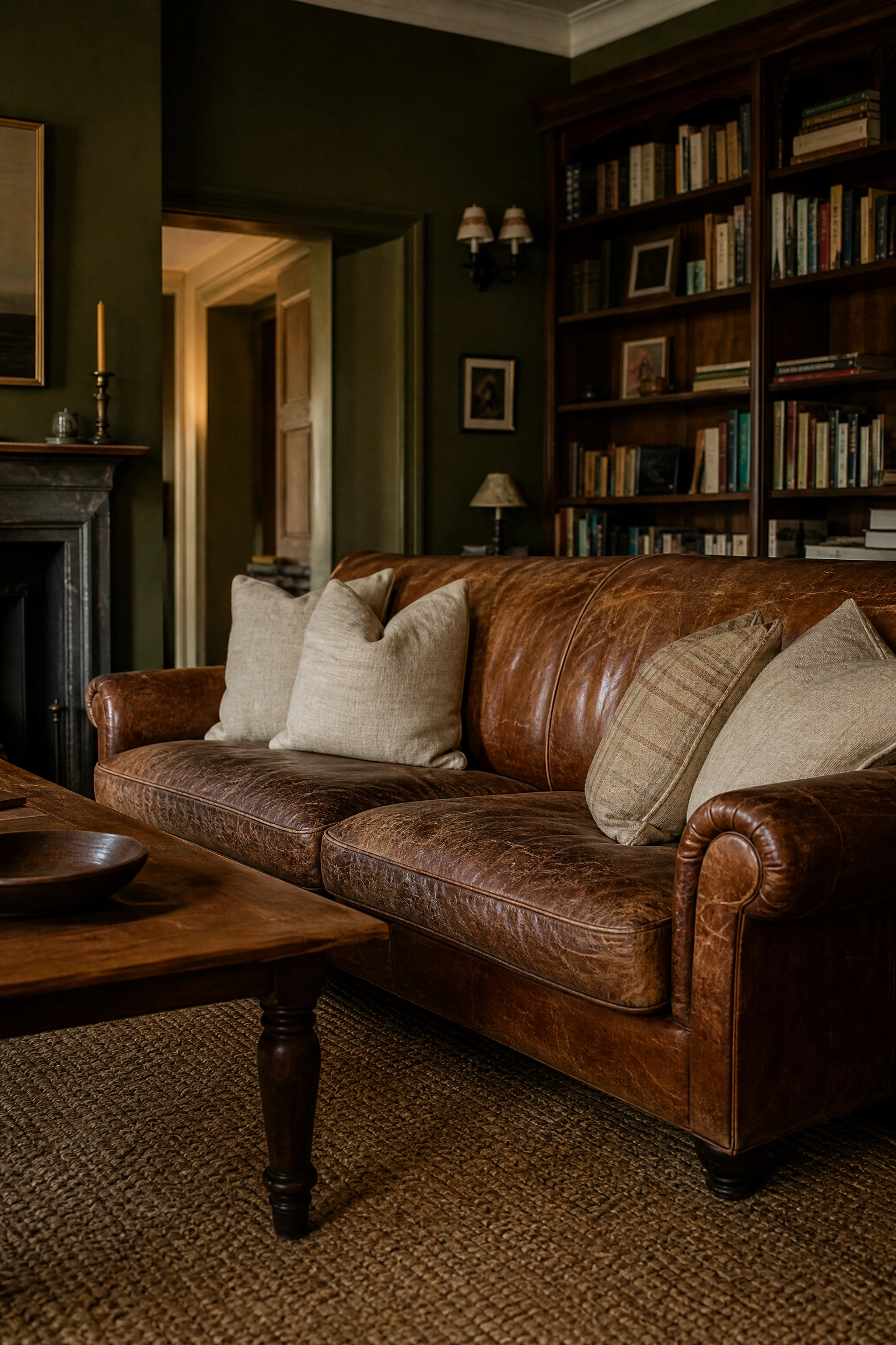
Olive green on the walls at 60 percent, a brown or cognac leather sofa as the dominant furniture piece at 30 percent, and warm cream in soft furnishings, a jute rug, and sheer curtains at 10 percent creates a scheme that feels genuinely vintage and considered. It is particularly associated with the quiet luxury and old-money aesthetics that have been dominant in interior design since 2024 and are continuing strongly into 2026.
Designer Advice: The leather in this scheme should be allowed to develop its patina over time rather than being treated to stay looking new. An olive green room with a worn, character-rich leather sofa reads as collected and lived-in; the same room with a pristine, factory-fresh leather sofa reads as assembled rather than grown.
15. Warm White and Limewash Plaster with Terracotta and Ochre
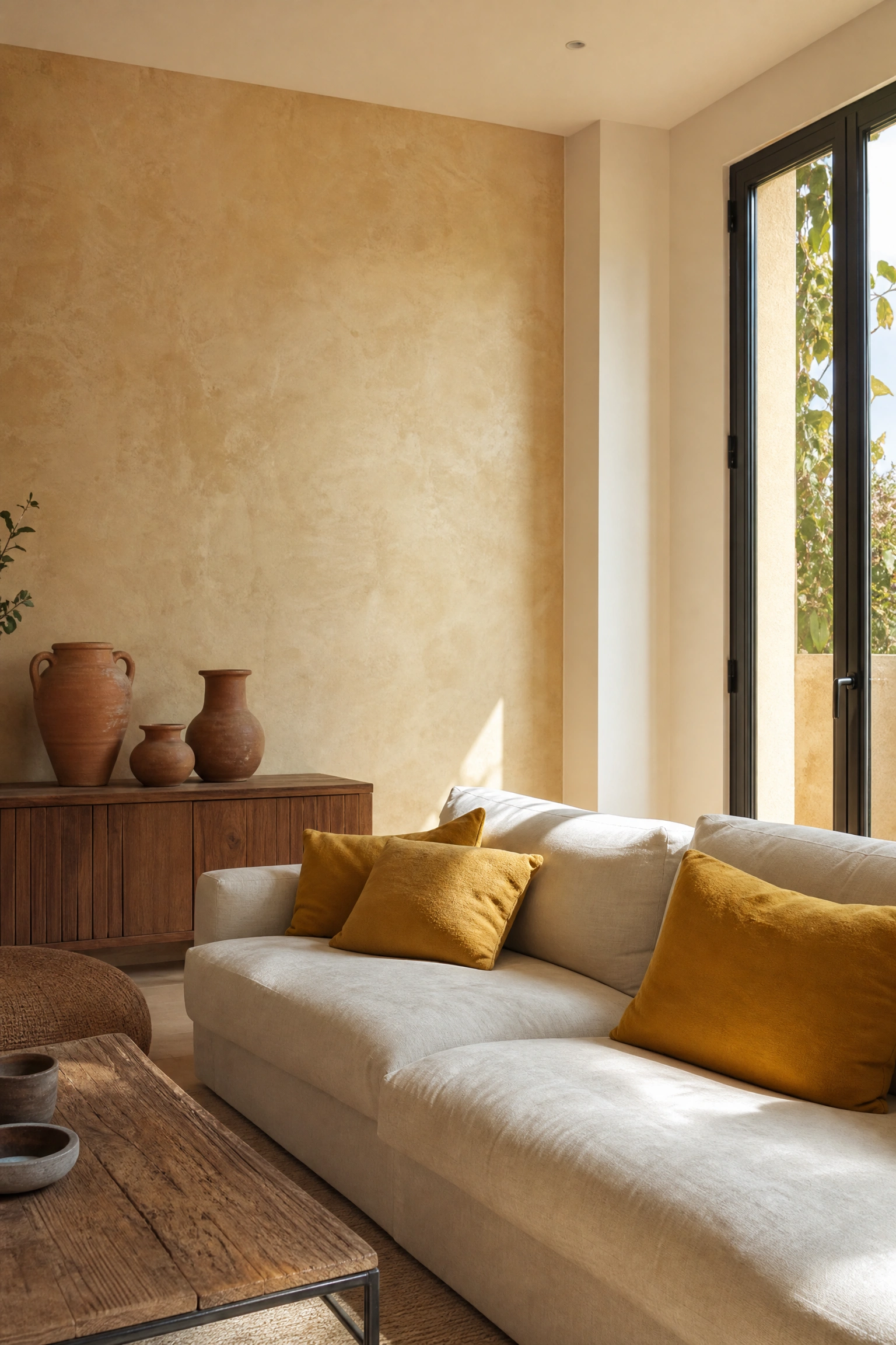
A warm white base at 60 percent, with one wall treated in a limewash plaster finish in warm white or pale sand at 30 percent, and terracotta and ochre yellow introduced through ceramics, woven textiles, and art at 10 percent creates a scheme that reads as artisanal, handmade, and genuinely Mediterranean. The limewash wall is the design decision that elevates the whole scheme from ordinary warm-neutral to something distinctive.
Quick Tip: Limewash paint is available from several widely stocked brands including Portola Paints, Backdrop, and Roman Clay. It is fully DIY-applicable and costs $50 to $80 per gallon. One gallon covers approximately 200 square feet in two coats and the variation in tone that develops during application is the intended effect, not a mistake.
16. Black and Warm White with Natural Wood and Greenery
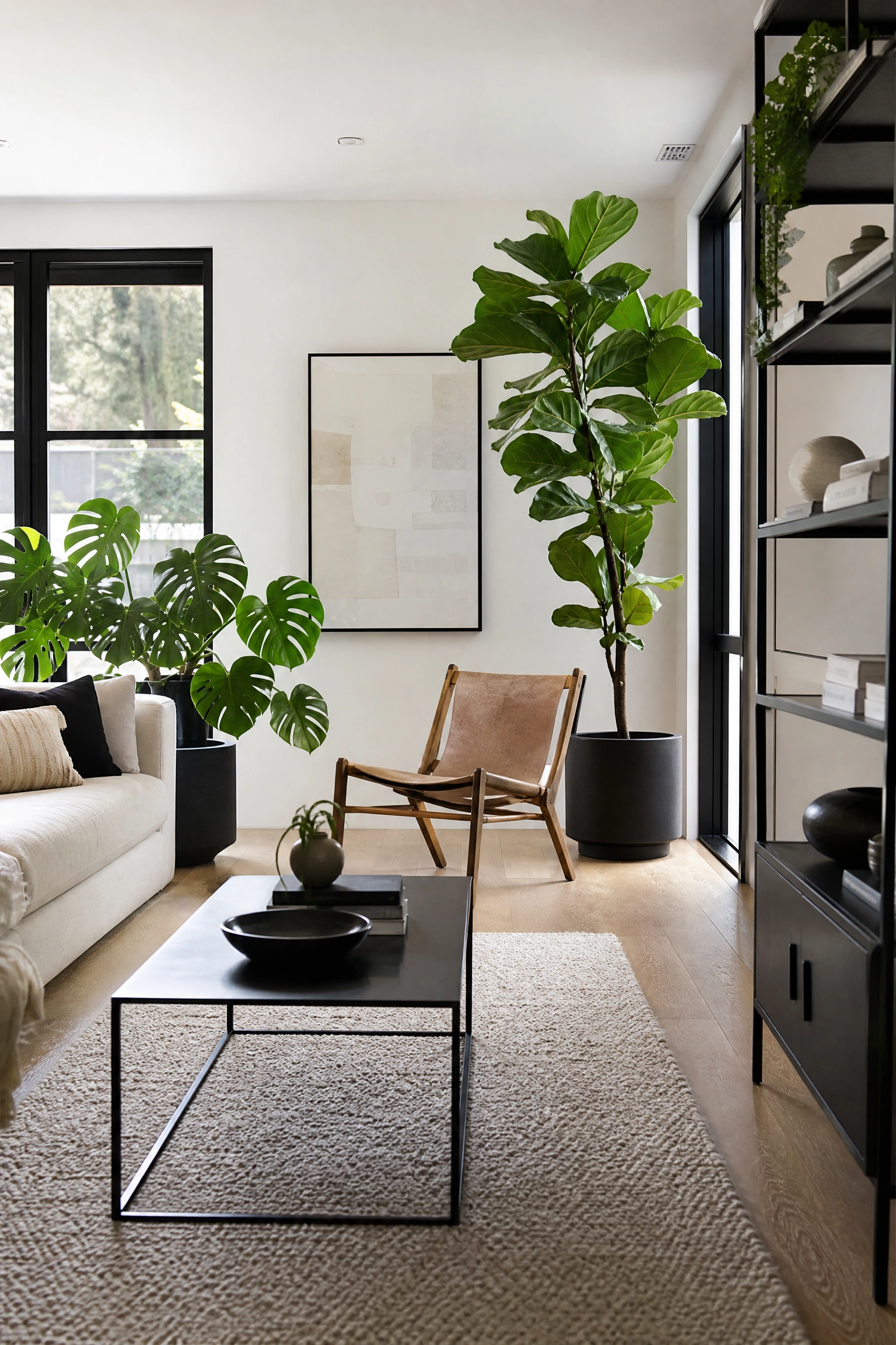
A graphic black and warm white scheme uses matte black on one architectural element, such as window frames, shelving, or a fireplace surround, warm white on all remaining walls at 60 percent, and natural wood floors and plant life as the softening elements that prevent the scheme from reading as stark or harsh. This scheme suits contemporary, industrial, and loft-style living rooms where bold contrast is part of the intended character.
Heads Up: Black works in a living room only when it is used as a structural accent rather than a wall color. Black accent elements, such as frames, legs, and fixtures, read as intentional. Black walls in a living room typically feel oppressive rather than dramatic, unless the room has exceptional natural light and very high ceilings.
| Color | Works Best As | Avoid Using It As | Best Companion Color |
| Black | Frames, legs, fixtures, trims | All-over wall color in small rooms | Warm white and natural wood |
| Cobalt blue | Accent wall or statement sofa | All four walls in dark room | Warm white and brass |
| Terracotta | Textiles, ceramics, planters | North-facing wall color | Cream and olive green |
| Blush pink | Sofa, cushions, artwork | Small room wall color | Warm gray and matte black |
| Forest green | Single feature wall or built-ins | Multiple walls in dark room | Off-white and dark walnut |
| Ochre yellow | Cushions, ceramics, artwork | Primary wall color in large room | Warm white and terracotta |
17. Warm Mustard and Charcoal Gray with Cream
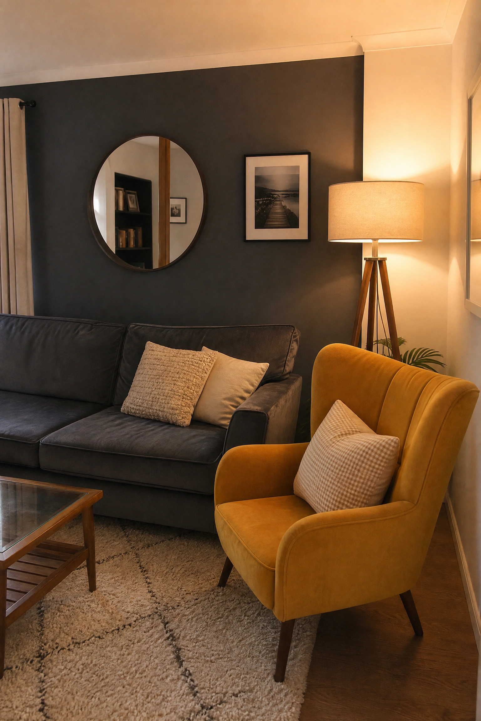
Warm mustard yellow used as an accent color at 10 percent in cushions, a statement armchair, and ceramic accessories, against a dominant charcoal gray on one wall or a gray velvet sofa at 60 percent, and cream on the remaining walls and soft furnishings at 30 percent, creates a living room scheme with serious color confidence and a mid-century modern feel. Mustard and charcoal is a combination that should feel bold but in practice sits surprisingly easily on the eye.
Reality Check: Mustard yellow is one of the most misunderstood colors in interior design because most people buy it too bright and too clean. The mustard that works is dirty, golden, and slightly brown-toned: think golden ochre rather than school-bus yellow. If the fabric swatch looks too cheerful and clean, it will not work with charcoal.
18. Deep Burgundy and Warm Cream with Dark Wood and Antique Brass
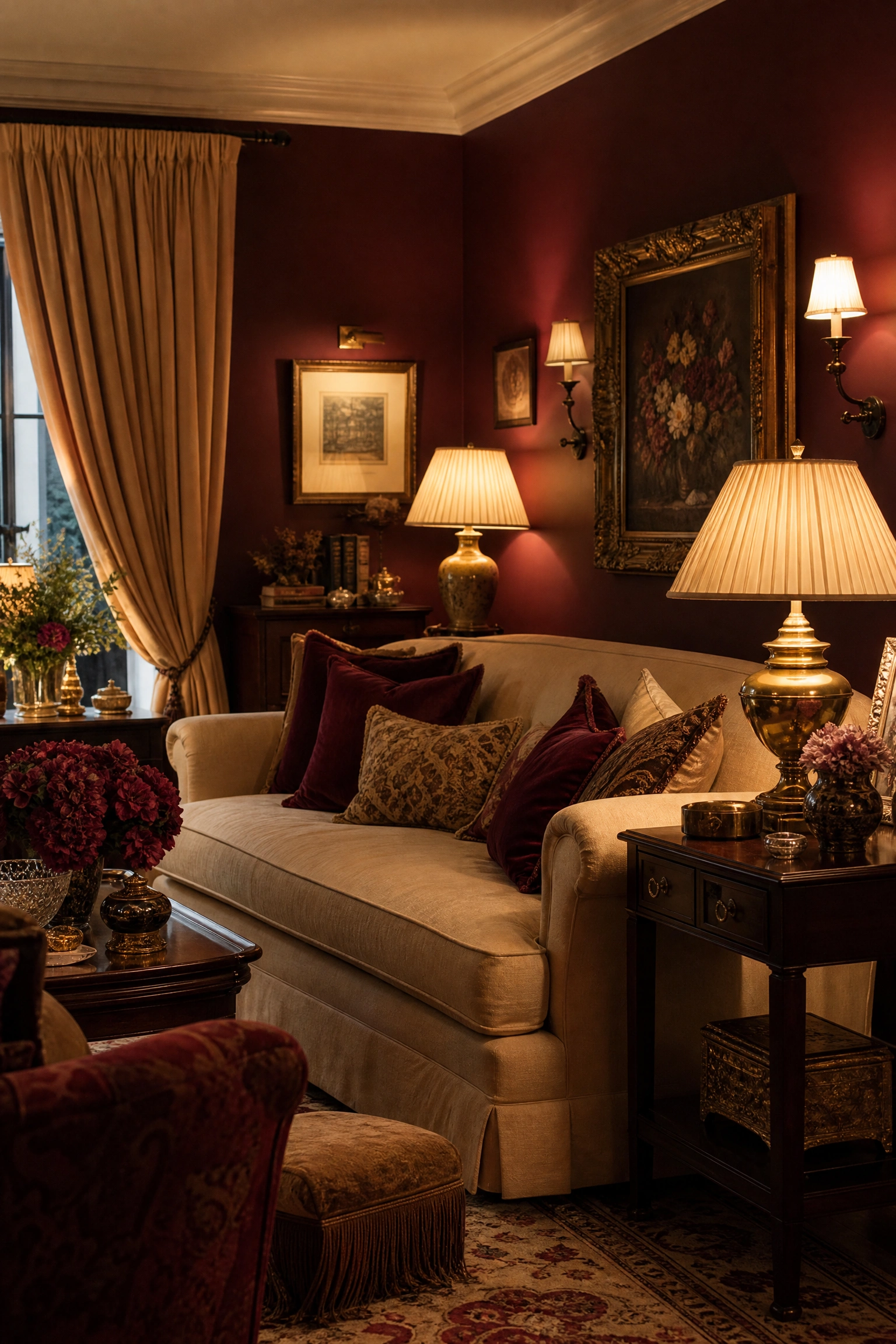
Deep burgundy or oxblood red at 60 percent on the walls or a velvet sofa, warm cream on soft furnishings and curtains at 30 percent, and dark walnut or mahogany wood furniture with antique brass hardware at 10 percent creates a scheme associated with maximalist, old-money, and rich traditional living rooms. It is a bold commitment that rewards those who go all in and punishes those who hedge.
Pro Move: Burgundy walls need full commitment to look designed rather than accidental. Half-commitment, such as one burgundy accent wall with three pale walls, makes the burgundy look like a mistake that has not been corrected yet. Go burgundy on all four walls or choose the sofa and upholstery approach instead.
19. Sky Blue and Sandy Beige with White Oak and Natural Linen
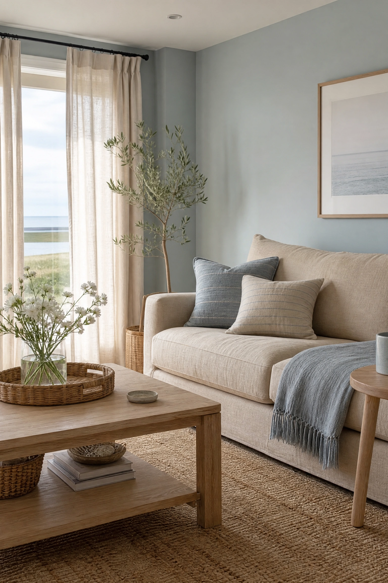
A soft, washed-out sky blue at 60 percent on the walls, sandy beige in the sofa and rug at 30 percent, and white oak furniture with natural undyed linen textiles at 10 percent creates a scheme that reads as calm, coastal, and genuinely restful without resorting to anchor motifs or nautical clichés. It is among the most livable color schemes in this list because neither color demands much from the other.
Designer Advice: Sky blue and sandy beige works best when the blue has a gray undertone rather than a pure sky-blue clarity. A grayed-down sky blue, such as Farrow and Ball Borrowed Light or Benjamin Moore Pale Blue, reads as considered; a too-vivid sky blue reads as a child’s bedroom or a beach theme.
20. Warm Rust and Ivory with Dark Slate and Matte Black
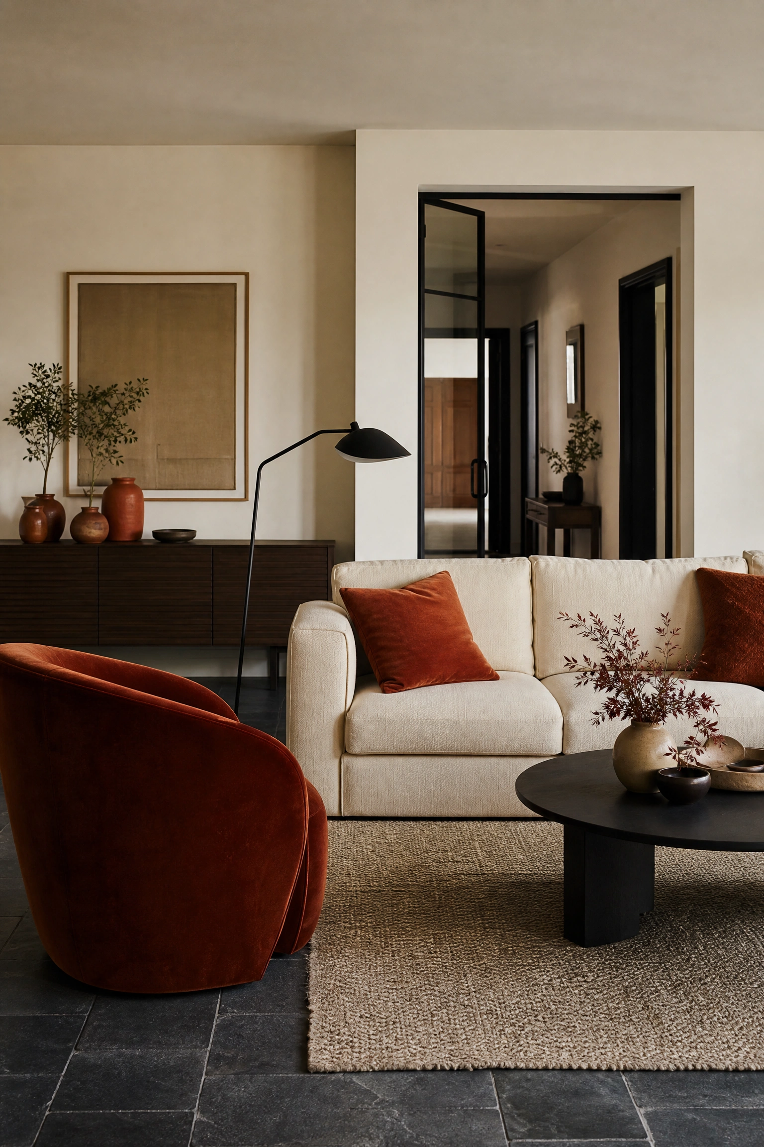
Warm rust or burnt orange used at 10 to 20 percent in a statement chair, large ceramic vessels, and woven cushions, against an ivory or bone wall color at 60 percent, dark slate flooring at 30 percent, and matte black in furniture legs and light fixtures creates a scheme that feels distinctly contemporary and slightly edgy without being aggressive. Rust is the accent color that makes neutral rooms feel genuinely alive.
Quick Tip: Rust works at 10 to 20 percent of the room. Above that threshold it starts to dominate and the room shifts from a contemporary neutral with a warm accent to a room that feels like it is primarily rust-colored. Two rust cushions, one ceramic, and a statement chair is exactly the right level of exposure.
21. Moody Sage and Warm Gray with Linen and Aged Bronze
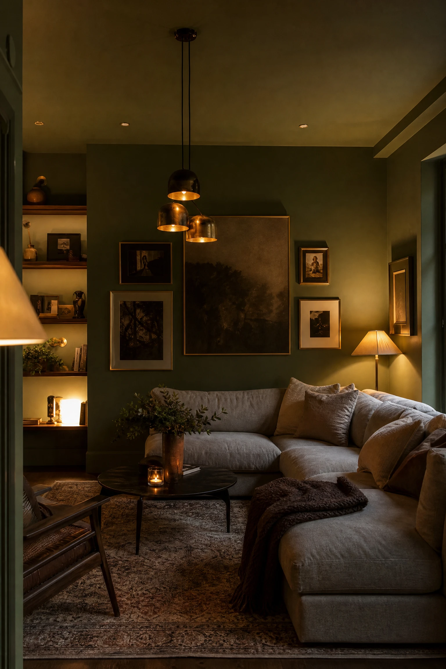
A deeper, moodier sage green at LRV 25 to 35 on all four walls and ceiling in a color-drenched approach, with warm gray in upholstery and a linen sofa at 30 percent, and aged bronze in light fixtures, picture frames, and plant stands at 10 percent creates one of the most enveloping living room schemes available. The color-drenched approach, where walls and ceiling are the same shade, amplifies the effect dramatically.
Reality Check: A color-drenched moody sage living room needs genuine natural light, ideally from a south or west-facing window, to read as atmospheric rather than dark and heavy. In a north-facing room with limited light, this scheme works only if you plan a generous number of warm-toned artificial light sources to compensate.
22. Warm Caramel and Ivory with Walnut and Cream
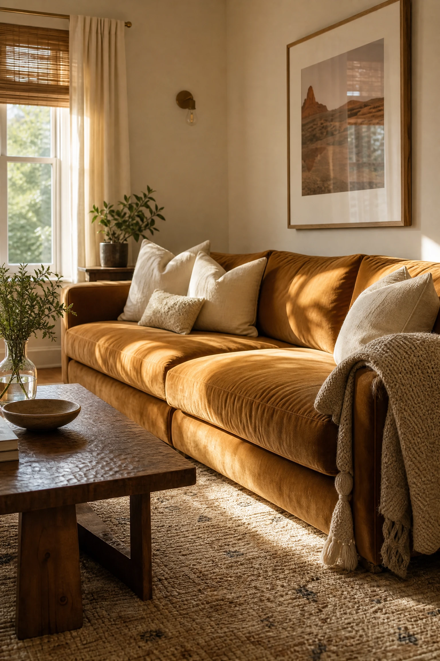
A warm caramel or butterscotch on the sofa and one key upholstered piece at 60 percent, ivory walls and ceiling at 30 percent, and walnut wood in the coffee table, shelving, and flooring at 10 percent creates a scheme that is among the most welcoming and approachable in this list. It sits within the earthy cocooning palette that interior designers have consistently identified as the defining direction of 2026.
Designer Advice: Caramel and ivory is a scheme that lives and dies by the quality of the soft furnishings. Average linen cushions in an average caramel room look forgettable. The same scheme with well-chosen textured cushions, a genuine wool throw, and a handwoven rug looks genuinely rich. Invest in the textiles here, not the paint.
23. Deep Teal and Off-White with Warm Wood and Pendant Lighting
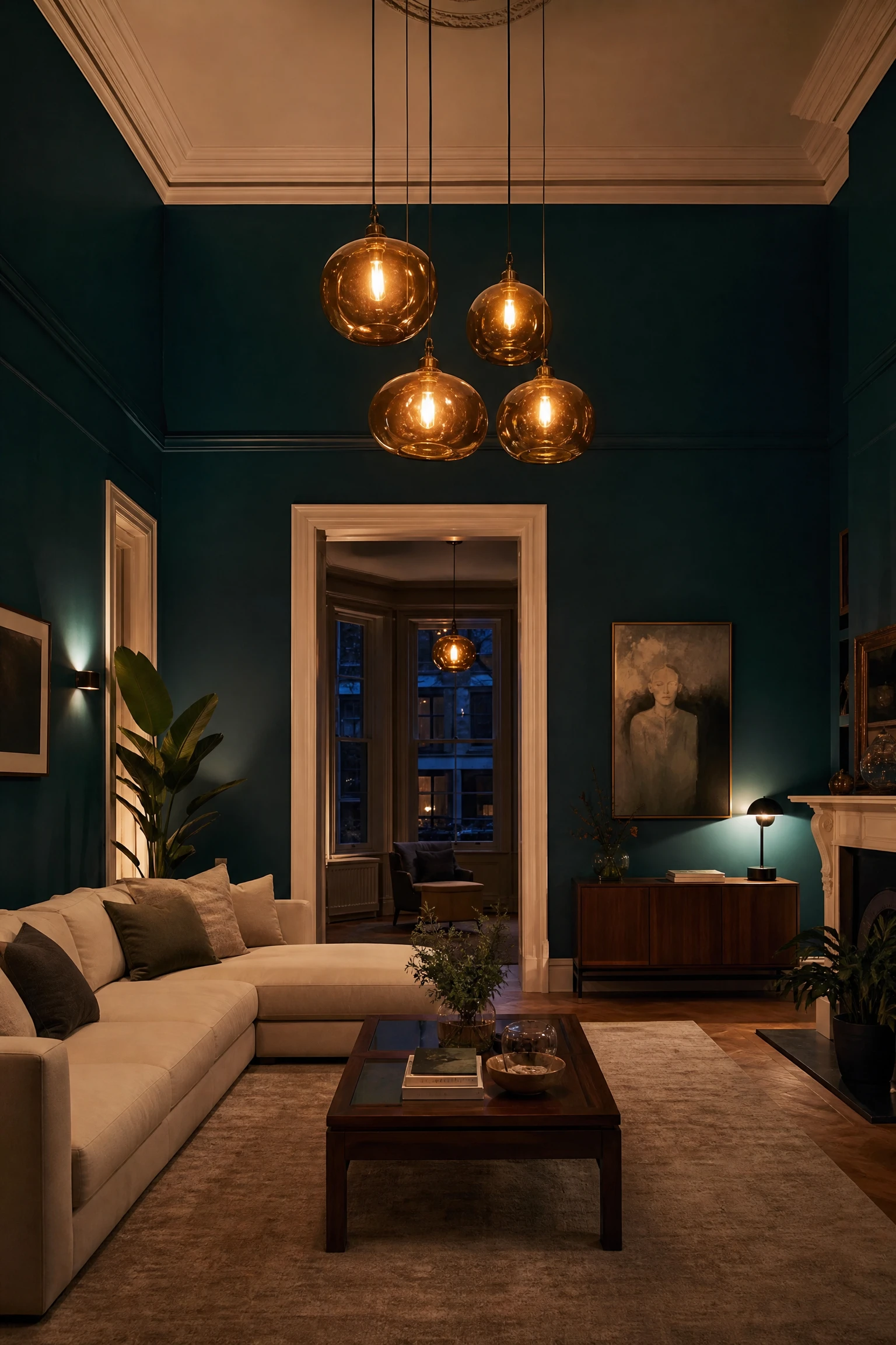
Deep teal, darker and richer than the dusty blue-green discussed earlier, used on all four walls or as a full sofa color at 60 percent, with off-white trim and ceiling at 30 percent, and warm wood in a coffee table, sideboard, or floating shelves at 10 percent creates a scheme with genuine drama and presence. Pendant lighting in amber glass or rattan is the detail that keeps deep teal from tipping into corporate or clinical territory.
Heads Up: Deep teal on all four walls is a high-commitment choice that looks extraordinary in the right room and suffocating in the wrong one. The right room has a ceiling height of at least 9 feet, at least one substantial window, and a minimum floor area of 200 square feet. In a small, low-ceilinged room, use deep teal on one wall only.
24. Warm White and Rattan with Black Accents and Greenery
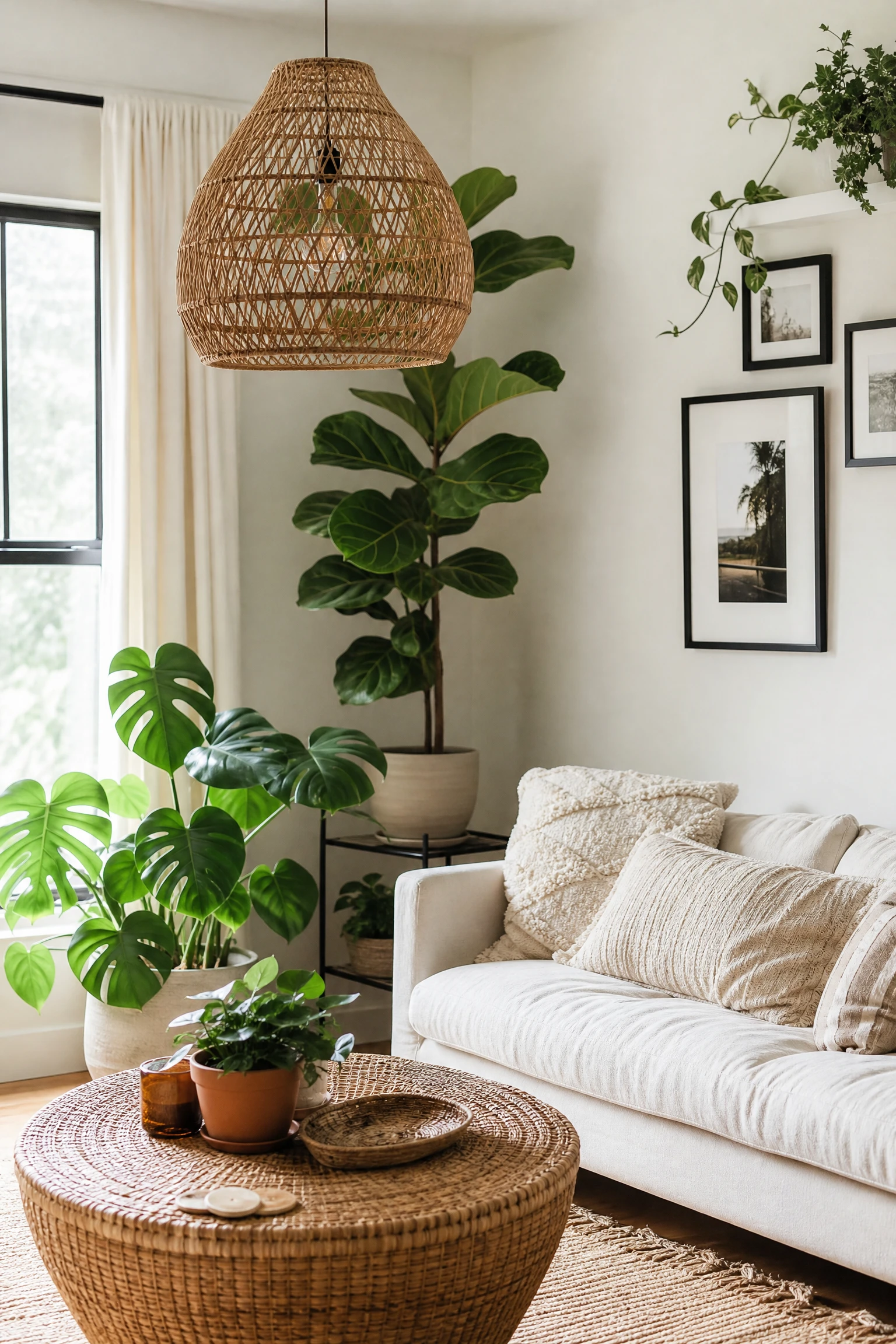
A warm white base at 60 percent, rattan and woven natural materials in furniture, lampshades, and accessories at 30 percent, and matte black in plant stands, picture frames, and a coffee table at 10 percent with abundant live greenery creates a scheme that has become one of the most widely photographed living room aesthetics of recent years. It reads as effortless, organic, and genuinely personal.
Pro Move: The greenery in this scheme is doing structural design work, not just decoration. Large-scale plants, a fiddle leaf fig, a monstera, or a tall snake plant at floor level, give the scheme its visual anchor and its sense of life. Small succulents on a shelf are not a substitute. Go large and go real rather than fake.
25. Soft Lilac and Warm White with Aged Wood and Washed Linen
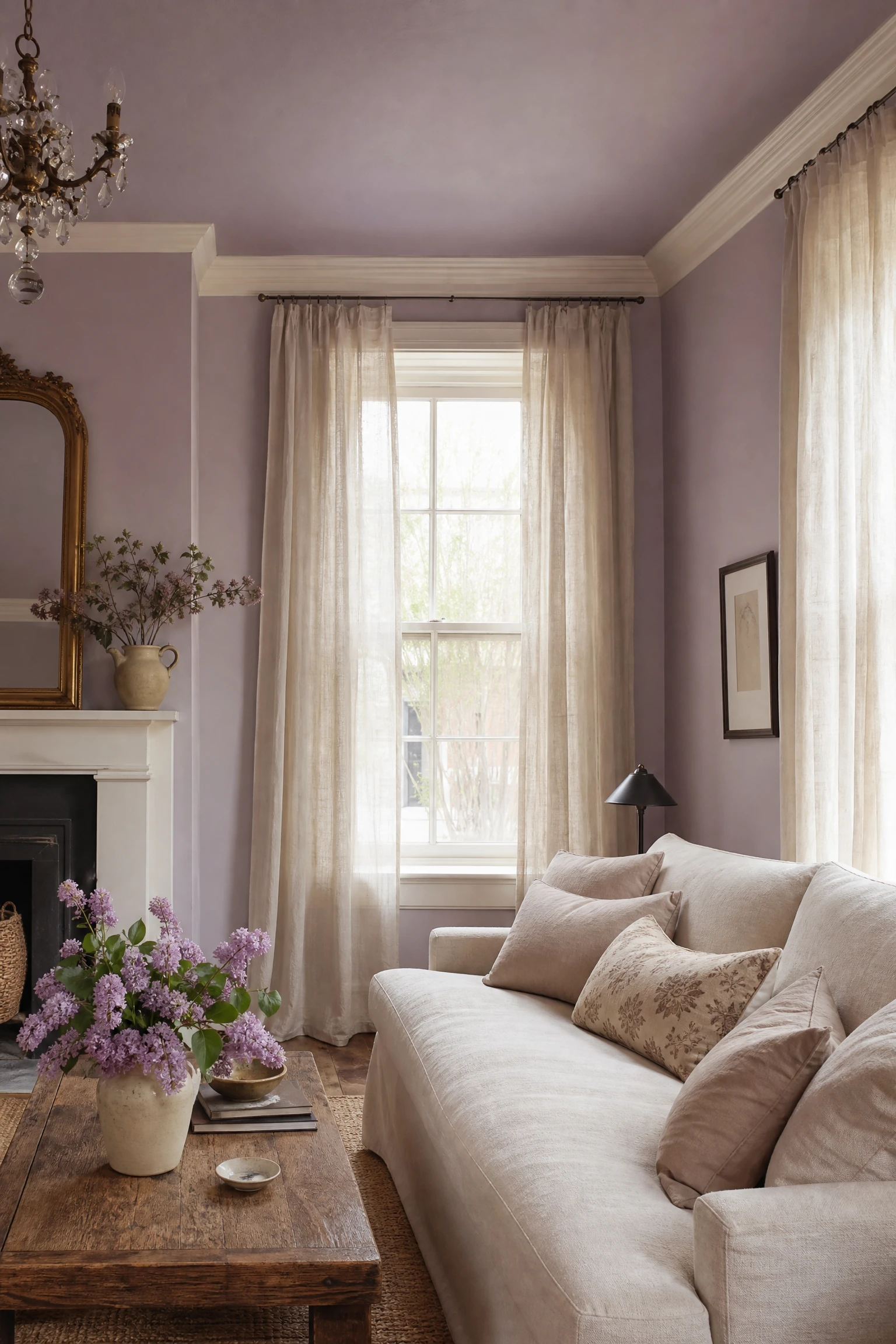
Soft lilac or wisteria at 60 percent on the walls, warm white on the ceiling and trim at 30 percent, and aged wood in natural brown tones with washed, undyed linen in cushions and curtains at 10 percent creates a scheme that feels romantic and light without tipping into overly sweet or feminine territory. The aged wood is the critical grounding element that keeps lilac from reading as a child’s room.
Quick Tip: Lilac works best as a whole-room wall color rather than an accent. A single lilac wall surrounded by white or gray walls reads as unresolved. When lilac wraps all four walls including the ceiling in a light shade, it creates the enveloping, immersive quality that makes the scheme work. Commit to it fully.
26. Warm Mushroom and Greige with Velvet and Aged Brass
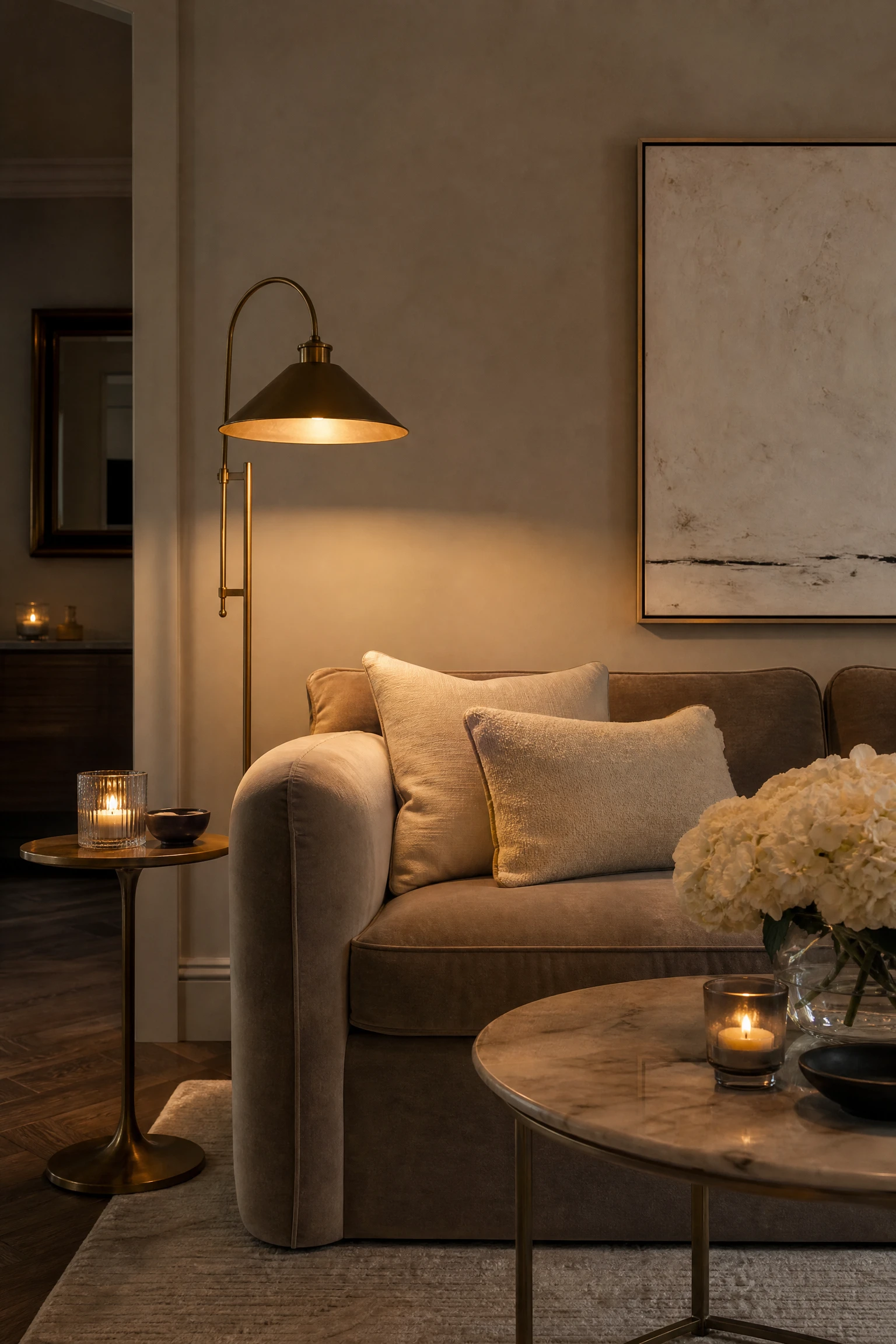
A warm mushroom or greige at 60 percent on the walls, a velvet sofa in a slightly deeper mushroom or warm taupe at 30 percent, and aged brass hardware, lamp bases, and decorative objects at 10 percent creates a scheme of considered understatement that suits apartments, period homes, and contemporary houses in equal measure. It is the scheme most closely associated with the quiet luxury aesthetic that has defined high-end interior design since 2023.
Designer Advice: Mushroom and greige schemes fail when the tones are all too similar in value without enough variation in texture and material. The distinction between a beautiful quiet luxury room and a beige room that just looks beige is entirely in the layering of materials. Velvet, linen, marble, brass, and polished plaster together create the scheme; flat paint and one fabric do not.
27. Warm Red and Ivory with Dark Wood and Gold Leaf
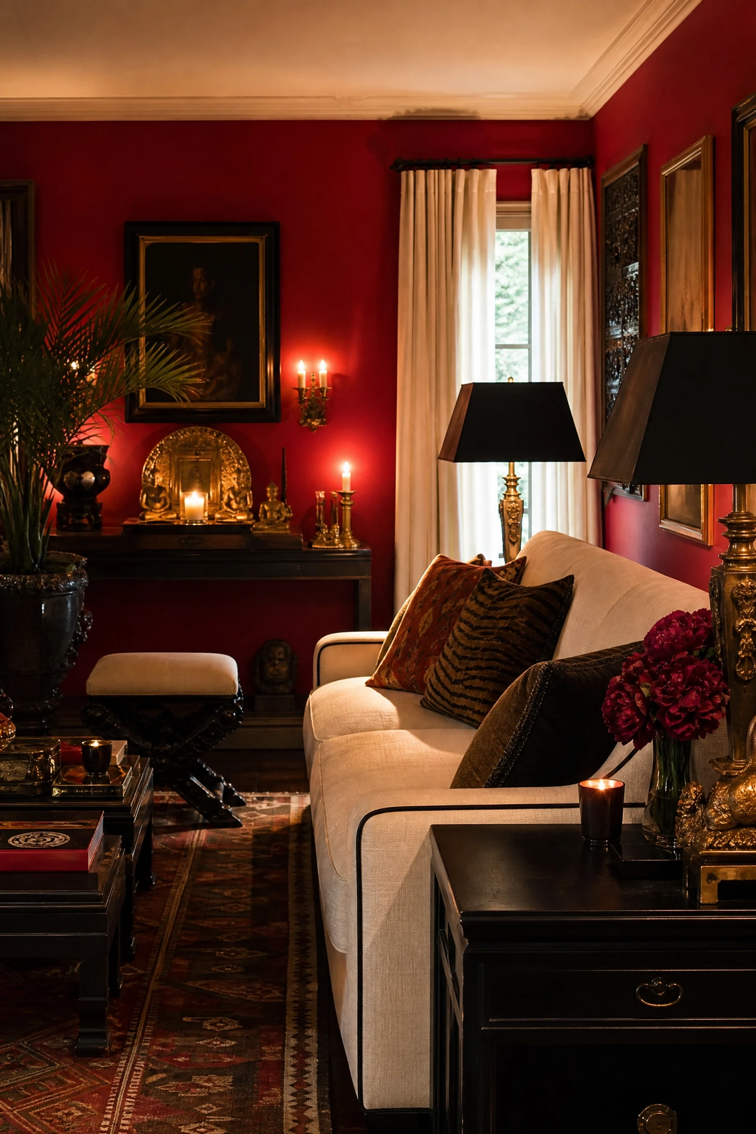
A deep, warm red such as vermillion, lacquer red, or a brick-toned Chinese red, used at 60 percent on all four walls or a large sectional, with ivory in curtains and soft furnishings at 30 percent, and dark ebonized wood furniture with gold leaf or gilded accessories at 10 percent creates a scheme of exceptional richness and confidence. This is the palette of grand, globally influenced maximalist living rooms and it asks the designer to commit without reservation.
Reality Check: Warm red is one of the most energizing colors in the spectrum, which is genuinely wonderful for a sociable living room and genuinely difficult for a room that also needs to serve as a relaxing space. If your living room is also where you unwind after work, consider using red only on one wall or exclusively through the sofa rather than across all four walls.
28. Warm Charcoal and Sage Green with Cream and Burnished Copper
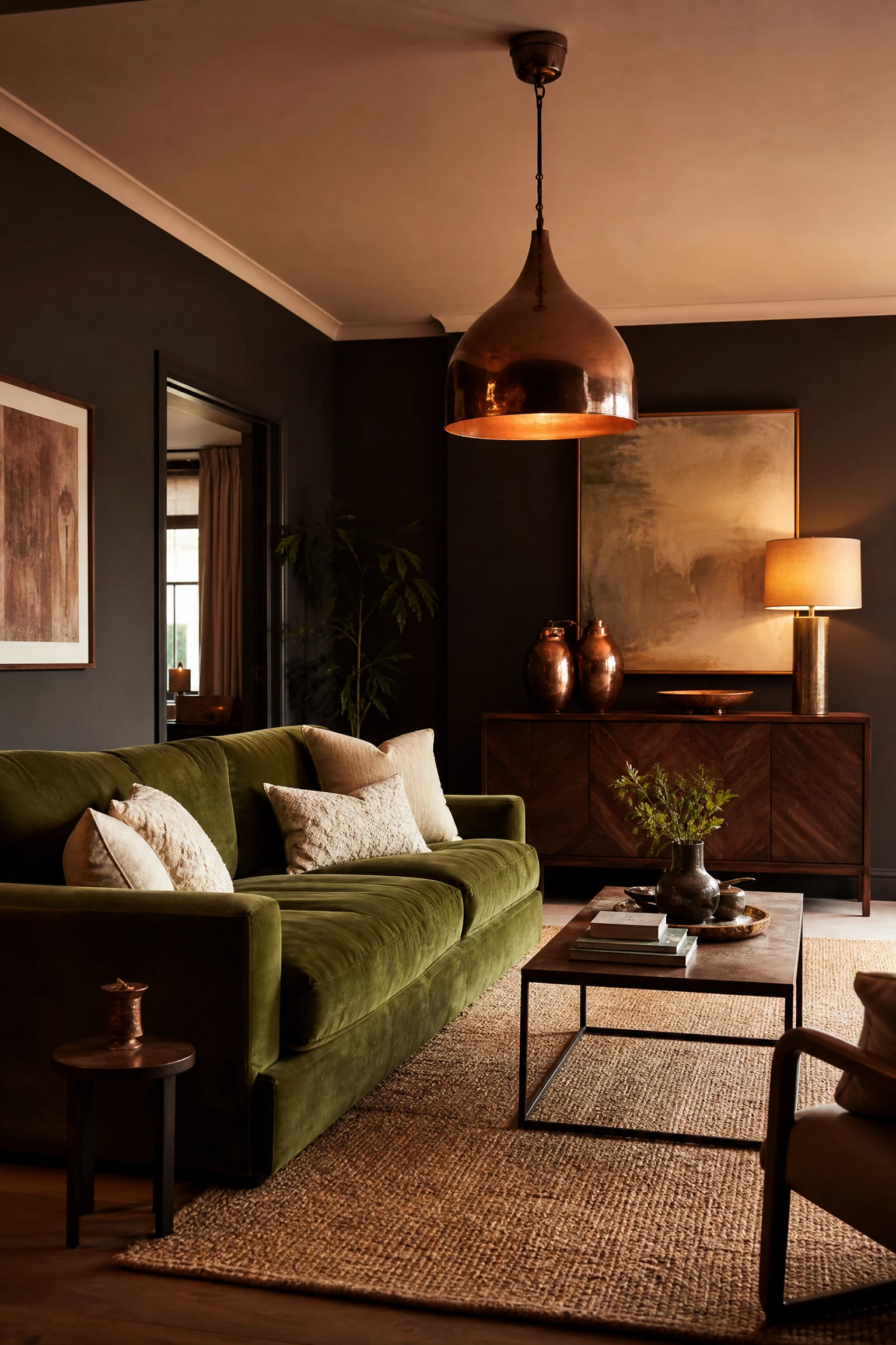
Warm charcoal at 60 percent on the walls, sage green in a velvet sofa or large upholstered chair at 30 percent, and cream in textiles with burnished copper in lighting, vases, and candleholders at 10 percent creates a scheme of considered, mature earthiness that feels genuinely current without chasing any single trend. The copper is a warmer, redder alternative to brass and gives the room an organic, handmade quality that mass-produced brass finishes rarely achieve.
Pro Move: Burnished copper, unlike polished copper, does not need to be kept shining to look good. The patina it develops over time is part of its appeal in this scheme. Buy copper accessories in an already-aged or hand-beaten finish and resist the urge to polish them. The lived-in quality is the point.